Configuration of the monitor detail views
The view of the various detail windows that can be activated in the monitor can be configured for each monitor. This page describes the configuration options.
There are 3 detail views that can be configured:
-
View for the popup ("detailView_popupConfig")
-
View when the process is expanded ("detailView_inlineConfig")
-
Split view ("detailView_eastConfig").
All 3 views can be configured equally.
Example configuration (total)
Example configuration
"bottom": {
"type": "childGrid",
"config": {
"columns": [
{
"dataIndex": "DOKUMENTID",
"header": "Dokument-ID",
"width": 200
},
{
"dataIndex": "text",
"flex": 1,
"header": "Nachricht",
"width": 200
},
{
"dataIndex": "reference",
"header": "Datei",
"width": 200
}
],
"localized": {
"title": "Ein Titel"
},
"collapsible": false,
"height": 150
}
},
"center": {
"type": "tabPanel",
"config": {
"subItems": [
{
"type": "childGrid",
"config": {
"columns": [
{
"dataIndex": "status",
"header": "Status",
"width": 150
},
{
"dataIndex": "childid",
"header": "Nr."
},
{
"dataIndex": "timestamp",
"header": "Datum",
"renderer": "Ext.util.Format.dateRenderer('d.m.Y H:i:s')"
},
{
"dataIndex": "text",
"flex": 1,
"header": "Nachricht",
"minWidth": 200
},
{
"dataIndex": "DOKUMENTID",
"header": "Datei",
"width": 200
},
{
"dataIndex": "",
"header": "Empf\u00e4nger",
"width": 150
},
{
"dataIndex": "",
"header": "Absender",
"width": 150
}
],
"sorters": [
{
"dataIndex": "Status",
"direction": "ASC"
}
],
"localized": {
"title": "Ein Titel"
}
}
},
{
"type": "fileViewer",
"config": {
"tabTitle": "Verarbeitungsschritt {serialNumber}"
}
},
{
"type": "processPanel",
"config": {
"group": [
{
"fieldWidth": 100,
"flex": 1,
"item": [
{
"name": "PROCESSID",
"title": "Prozess"
},
{
"name": "TEXT",
"title": "Beschreibung"
},
{
"name": "timestamp",
"title": "Lieferbeginn"
}
],
"labelWidth": 70,
"title": "Aktueller Vorgang"
},
{
"flex": 1,
"item": [
{
"name": "PARTNER",
"title": "Parnter"
},
{
"name": "LFEZ_NAME",
"title": "Lieferant"
},
{
"name": "VNB_NAME",
"title": "Netzbetreiber"
},
{
"name": "BGV_NAME",
"title": "BGV"
},
{
"name": "ZAEHLPUNKT",
"title": "Messpunkt"
}
],
"labelWidth": 100,
"title": "Versorgungsszenario"
}
],
"layout": {
"align": "stretch",
"type": "hbox"
},
"title": "Prozessinformationen"
}
}
]
}
},
"right": {
"type": "actionPanel",
"config": {
"localized": {
"title": "Ein Titel"
},
"collapsible": false,
"width": 190
}
},
"top": {
"type": "processPanel",
"config": {
"group": [
{
"fieldWidth": 100,
"flex": 1,
"item": [
{
"name": "Status",
"title": "Status"
},
{
"name": "FRIST",
"title": "Frist"
},
{
"name": "ID",
"title": "ProzessID"
},
{
"name": "timestamp",
"renderer": "Ext.util.Format.dateRenderer('d.m.Y H:i:s')",
"title": "Datum"
}
],
"labelWidth": 100,
"title": "Prozessstatus"
},
{
"fieldWidth": 100,
"flex": 1,
"item": [
{
"name": "PARTNER",
"title": "Parnter"
},
{
"name": "Lieferant",
"title": "MANDANTID"
},
{
"name": "LASTUPDATE",
"title": "Letzte Akualisierung"
},
{
"name": "ZAEHLPUNKT",
"title": "Messpunkt"
}
],
"labelWidth": 100,
"title": "Prozessinfos"
}
],
"layout": "hbox",
"layoutConfig": {
"align": "stretch",
"pack": "start",
"padding": 5
},
"title": "Statusinformationen",
"collapsible": false,
"height": 220
}
}The individual areas that can be defined are based on the border layout of ExtJs (see example for border layout in ExtJs and see documentation on border layout).
It looks as follows:
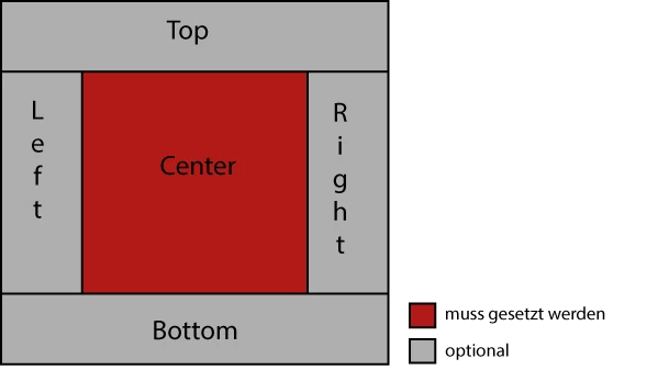
-
center
(object)
center area of the detail area -
top
(object, optional)
area above the center area -
bottom
(object, optional)
area below the center area -
left
(object, optional)
Area to the left of the center area -
right
(object, optional)
Area to the right of the center area
|
The use of the center area is mandatory. All other areas can be used, but do not have to be. |
There are general configurations in the detail area that can be set as an ExtJs container is createdhttps://docs.sencha.com/extjs/7.1.0/classic/Ext.container.Container.html[(see Container documentation]). These are based on standard ExtJS configurations.
Among other things, the following can be set:
-
paddingOfElements
(number, optional)
Padding for all elements is set the same (all elements in center, top, bottom, left and right) -
title
(string as template, optional)
Title, which can only be set in the popup. This title can be built like a templatehttps://docs.sencha.com/extjs/7.1.0/classic/Ext.XTemplate.html[(see template documentation]) so that data from the current process is displayed (e.g. the process ID). A dataIndex can be defined in curly brackets which is to be displayed, e.g.E.g. "Details of the process {PROCESSID}", where "PROCESSID" is a date of the process and is displayed according to the line clicked on. -
hideEmptyValues
Hiding all fields that do not contain any values. -
Can contain other configurations that can also be configured in an ExtJs (e.g. width, height,…), see the documentation for the container.), see documentation Container
Below the center, top, bottom, left and right areas, the elements are defined as follows:
-
type
(string)
ID of the element to be added (see table: "Types of elements") -
config
(object)
Configuration of the object (is optional for some elements), depends on the element below (see section Configuration of elements)
Types of elements (type)
The following elements can be defined in each area of the detail view. The type defines the type of element to be created.
Each element is composed as follows in the configuration:
-
type
(string)
Type ID of the element -
config
(object)
Configuration of the element
"type": "childGrid",
"config": {}| Type ID | Description |
|---|---|
|
Is attached to a tab panel as a sub-element. The files are opened at this point when the "Show message" button is clicked. |
|
Panel in which any widgets can be integrated. Specification of the widget via "widgetId" |
|
Creates a table with defined columns. |
|
Creates a tab panel. |
|
Integration of interfaces. Specification of the xtype/alias via "formId" |
|
Listing of process data in boxes, see ProcessPanel configuration. |
|
All actions that can be performed with the process are displayed as buttons. |
|
All jump columns are displayed as buttons. |
|
Enables plugins to be assigned to this location. If no "plugin" type is set, plugins are stored in the tab panel. |
|
Integration of forms from the Forms. |
|
Further elements can be attached under a "tabPanel", which are listed in this table. They are each displayed as a tab. |
Configuration of the elements (config)
An element is defined by its type ("type") and its configuration ("config"). The "config" of the elements is described here.
All elements (except "fileViewer") can contain further configurations that are equivalent to the configurations in ExtJS (matching the element in ExtJs).
Each element is composed as follows in the configuration:
-
type
(string)
Type ID of the element -
config
(object)
Configuration of the element
"type": "childGrid",
"config": {}
The elements listed here are all under "config".
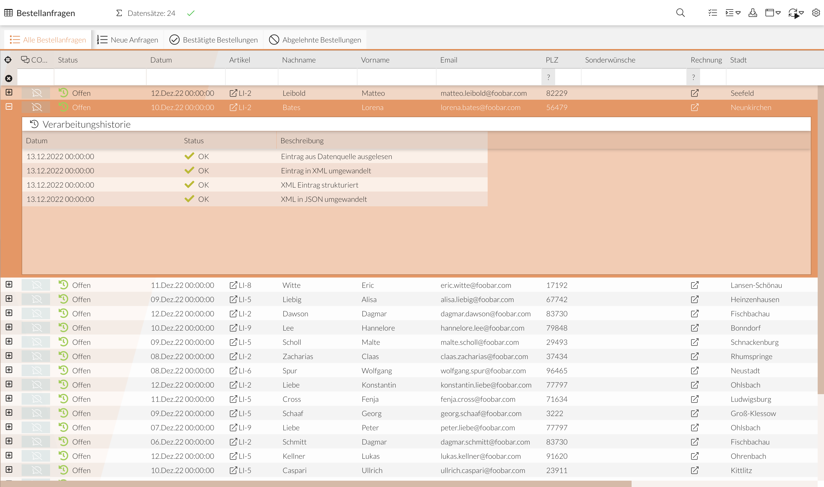
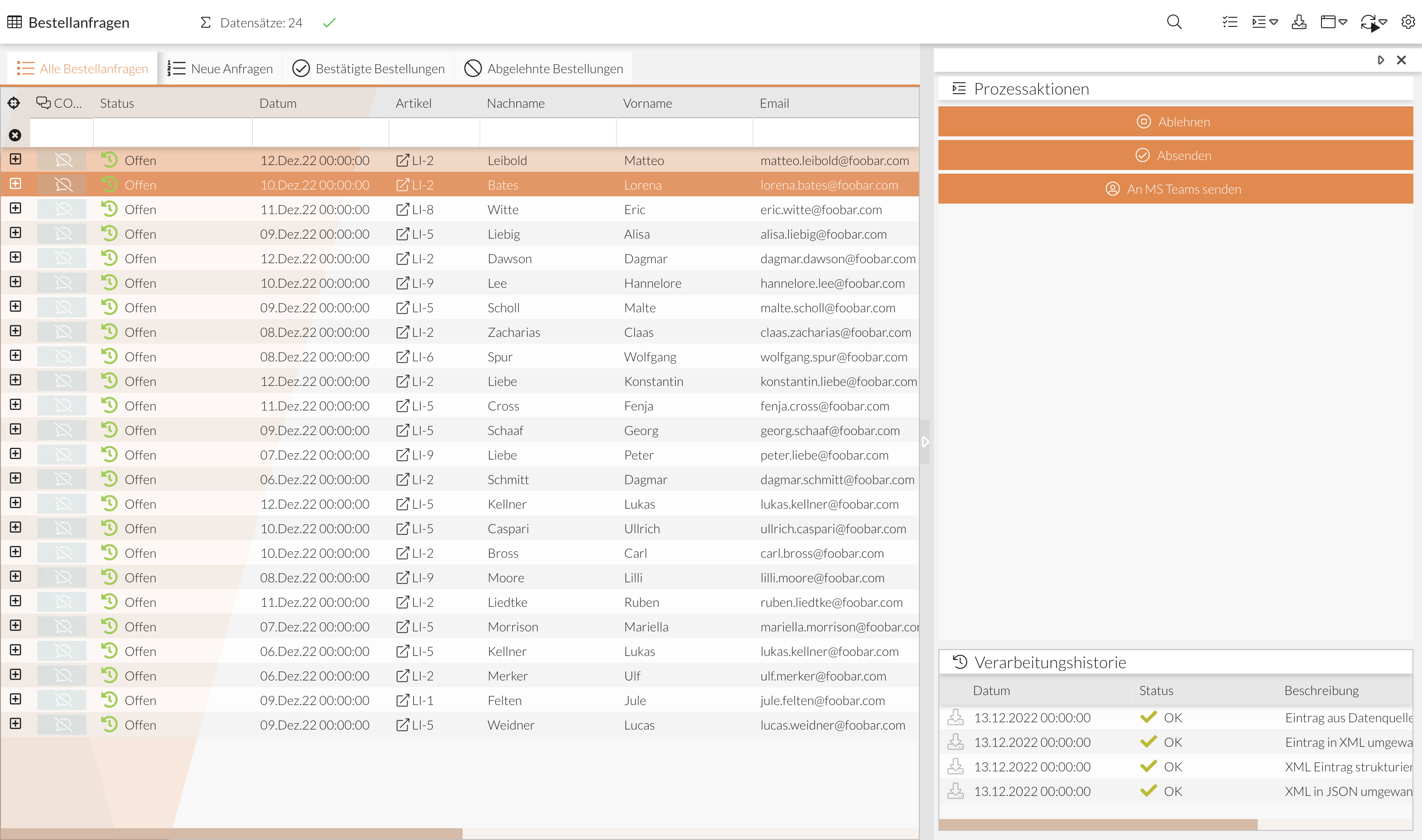
Table (childGrid)
A table with defined columns is created. An ExtJs grid is created, seehttps://docs.sencha.com/extjs/7.1.0/classic/Ext.grid.Panel.html[(ExtJs grid documentation]).
The columns are automatically created from the monitor setting Monitor_ColumnHistoryConfig.
However, these can be overwritten at this point, see the following example.
{
  "type": "childGrid",
  "config": {
    "columns": [
      {
        "dataIndex": "status",
        "header": "Status"
      },
      {
        "dataIndex": "timestamp",
        "header": "Datum",
        "formatter": "date('d.m.Y H:i:s')"
      },
      {
        "dataIndex": "text",
        "flex": 1,
        "header": "Remark"
      },
      {
        "dataIndex": "mimetype",
        "header": "Mime type"
      }
    ],
    "sorters": [
      {
        "dataIndex": "Status",
        "direction": "ASC"
      },
      {
        "dataIndex": "timestamp",
        "direction": "DESC"
      }
    ],
    "setActionColumn": true,
    "localized": {
      "title": "Ein Titel"
    },
    "collapsible": false,
    "height": 200
  }
}-
columns
(array, 1..n)
Columns of the table-
dataIndex
(string)
ID of the record which is to display the column -
header
(string)
Display name of the column -
cellWrap
(boolean, fixed value, optional)
true: can be set if the text in the column is to be wrapped if it is too long (default is false) -
formatter
(string, optional)
Ext.util.Format function. "htmlDecode" is used as the default to ignore HTML content. "trim" can be used to activate HTML, for example. -
xtype
(string, optional)
Ext.grid.column.Column component. The default value is an empty string(""). By setting the value to "gridActionColumn", buttons can be generated to start process actions (see Process action buttons) -
can contain other configurations that can also be configured in an ExtJs (e.g. width, flex)
-
Analogous to the table in the main view of the monitor module, custom renderers can also be used in the ChildGrid (see Custom Renderer).
The functions for the renderers are stored in the monitor setting Monitor_CustomRenderer.
|
Renderer methods defined by the renderer attribute in the column are not interpreted. |
-
localized
(object)
Indicates a language-dependent configuration.-
title
(string, optional)
Title of the view. It is possible to specify a "language key", which is then converted into the current language.
-
-
setActionColumn
(boolean, optional)
Defines whether the action columns "Show file" and "Download file" should be displayed (screenshot below).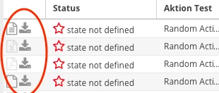
Set to true by default.
The icons for "Show file" change depending on the mimetype (see file panel). -
textSelectable
(boolean, optional)
Can be set to make the text in a table selectable.
Default value is false. -
sorters
(array, optional)
Sorting the columns - one or more columns can be sorted.-
dataIndex
(string)
ID of the column to be sorted. -
direction (string)
Sorting-
ASC
Sort in ascending order -
DESC
Sort in descending order
-
-
-
filter
(string, optional)
Filters the results list. Example:"filter": "record.get('REFERENCE') !== null", -
May contain other configurations that can also be configured in an ExtJs (e.g. width, title).
Plugins (plugin)
Any plugins can be added to the detailed view. If there is no element of the type "plugin" in the configuration, these are added to the first tabPanel in the detail view. It is recommended to explicitly control the position of the plugins by placing a plugin element. This is then provided as a pluginhook.
hookSubId - multiple plugin elements
The hook in the detail view supports the use of hookSubId to use multiple plugin elements and make them distinguishable for the plugin configuration.
To do this, a context with a hookSubId must be specified in the config area of the element.
{
  "type": "plugin",
  "config": {
    "context": {
      "hookSubId": "myHookSubId"
    }
  }
}
For a plugin to be displayed in this hook, a hookSubId must also be specified in the plugin configuration in the plugin configuration field.
{
  "hookSubId": "meineHookSubId"
}
Display within the tab panel
If the plugin element is integrated within subItems in the tab panel, you can control whether each plugin should be displayed as a separate tab or whether all plugins should be displayed in one tab.
The pluginTarget attribute is set in config for this purpose.
Display in a tab - pluginTarget self (default)
If no pluginTarget is defined, "self" is the default. In this case, a tab is created in the tag panel in which all plugins are displayed one below the other.
{
    "type": "plugin",
    "config": {
        "pluginTarget": "self",
        "title": "Plugins in einem Tab"
    }
}
Display as individual tabs - pluginTarget ^
To display each plugin as an individual tab, "^" must be set as the pluginTarget. Each plugin should have a title so that it is displayed correctly in the tab. If this is not the case, this should be set via the plugins configuration.
{
"type": "plugin",
    "config": {
      "pluginTarget": "^"
    }
}
Tab panel (tabPanel)
A tab panel is created with one or more sub-elements, each of which is displayed in the tabs. An ExtJs TabPanel is createdhttps://docs.sencha.com/extjs/7.1.0/classic/Ext.tab.Panel.html[(see documentation]).
{
  "center": {
    "type": "tabPanel",
    "config": {
      "subItems": [
        {
          "type": "processPanel",
          "config": {
            "widgetType": "wpFormularErfassungPanel"
          }
        },
        {
          "type": "childGrid",
          "config": {
            "columns": [
              {
                "dataIndex": "reference",
                "flex": 1,
                "header": "Dateireferenz",
                "renderer": "(function(value, meta, record){meta.tdAttr = 'data-qtip=\"' + value + '\"'; return value;})"
              }
            ],
            "filter": "record.get('REFERENCE') !== null",
            "setActionColumn": true,
            "localized": {
              "title": "Ein Titel"
            }
          }
        },
        {
          "type": "fileViewer",
          "config": {
            "tabTitle": "Verarbeitungsschritt {CHILDID}"
          }
        },
        {
          "type": "processPanel",
          "config": {}
        }
      ]
    }
  }
}-
subItems
(array, 1..n)
Elements within the tab panel. These elements are the defined elements (see table Types of elements (type)). -
May contain other configurations that can also be configured in an ExtJs (e.g. width, title, layout).
Container with action buttons (actionPanel)
An ExtJs panelhttps://docs.sencha.com/extjs/7.1.0/classic/Ext.panel.Panel.html[(see documentation]) with the buttons for the Process actions that can be executed on the process is created. No buttons are displayed if the fields for the actions are empty (null or an empty string).
Buttons are also displayed for process starter processes that have the startWithContext option activated.
The configuration parameter closeOnAction can be used to control whether the current window (only in the pop-up view) should be closed when the action is executed.
{
  "type": "actionPanel",
  "config": {
    "localized": {
      "title": "Ein Titel"
    },
    "width": 150,
    "closeOnAction": true
  }
}
Can contain configurations that can also be configured in an ExtJs (e.g. width, title), see documentation.
File panel (fileViewer)
This is where the files are opened when "Show message" is clicked (in a ChildGrid the "actionColumns"). Can only be arranged below a TabPanel.
{
    "type": "fileViewer",
    "config": {
      "tabTitle": "Verarbeitungsschritt {CHILDID}"
    }
}
-
tabTitle
(string, as template)
Title of the tab that is opened by clicking on "Show message" (in which the content of the file is displayed). A dataIndex can be defined in curly brackets, which is displayed, e.g. "Processing step {CHCH}".E.g. "Processing step {CHILDID}", where "CHILDID" is a date of the process details and is displayed to match the line clicked onhttps://docs.sencha.com/extjs/7.1.0/classic/Ext.XTemplate.html[(see template documentation])
The panel displays the files using the "MIMETYPE" column.
Supported mimetypes:
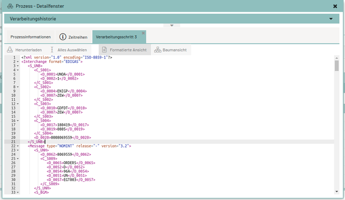
application/edifact = line break of the message based on ' text/xml = display xml in a tree structure New from 2.0.5: "image/png", "image/jpeg", "image/bmp", "image/gif", "image/jpg", "application/pdf"
Without mimetype or if the mimetype is unknown, the file is displayed as plain text. If the message can be converted to XML, the tree structure is automatically selected.
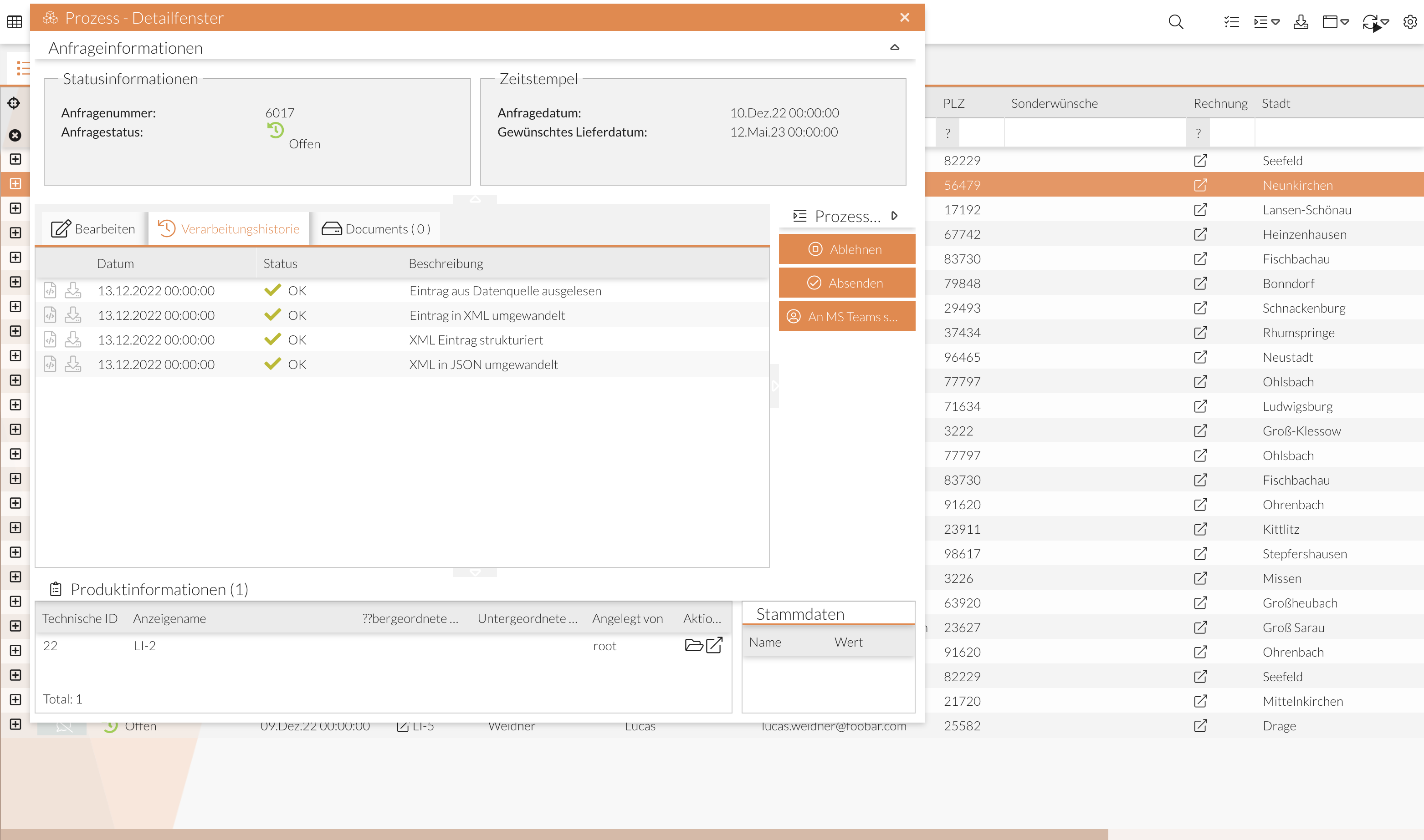
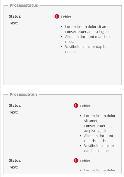
Display of process data (processPanel)
The process panel displays process data. It is used to display the data from a process. These can be grouped or simply displayed one below the other.
Option 1: Grouping the elements ("group")
The data of the process can be grouped. Several groups can be displayed one below the other or next to each other. The group of a ProcessPanel is then displayed in a box (see screenshot).
The group can be given a title for a better overview.
Adjustments to the processPanel:
-
Example of grouping the values of a process.
3 groups have been created here: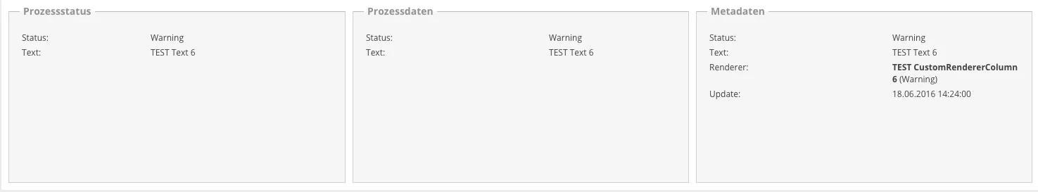
-
Distinction between
labelWidthandfieldWidth: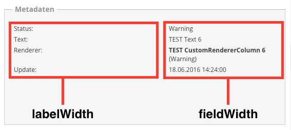
-
Change of
minWidth: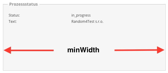
-
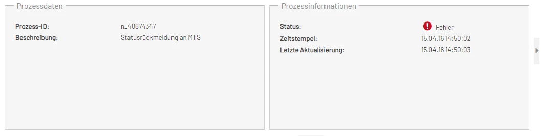
Example for processPanel with items:
-
Distinction between
labelWidthandfieldWidth: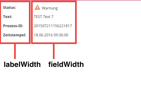
-
Division of the groups with 50% each:
-
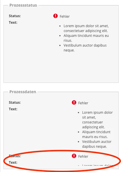
Content of the group is truncated:
-
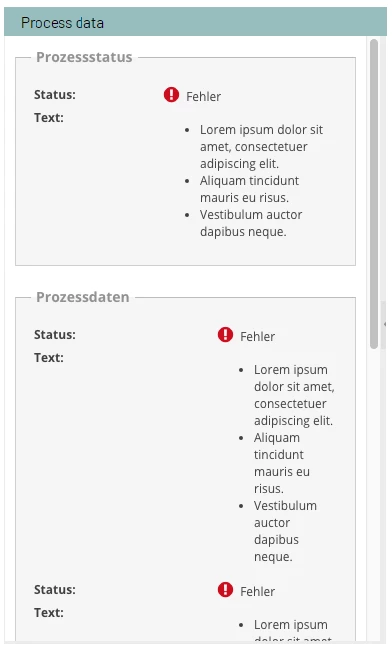
ProcessPanel with scrollbar:
{
  "type": "processPanel",
  "config": {
    "group": [
      {
        "fieldWidth": 100,
        "flex": 1,
        "item": [
          {
            "name": "Status",
            "title": "Status"
          },
          {
            "name": "Text"
          }
        ],
        "labelWidth": 70,
        "title": "Prozessstatus"
      },
      {
        "flex": 1,
        "item": [
          {
            "name": "Status",
            "title": "Status"
          },
          {
            "name": "Text"
          }
        ],
        "labelWidth": 100,
        "title": "Prozessdaten"
      },
      {
        "flex": 1,
        "item": [
          {
            "name": "Status",
            "title": "Status"
          },
          {
            "name": "Text"
          },
          {
            "name": "CUSTOMRENDERERCOLUMN",
            "title": "Renderer"
          },
          {
            "name": "LASTUPDATE",
            "title": "Update"
          }
        ],
        "labelWidth": 100,
        "title": "Metadaten"
      }
    ],
    "layout": {
  "align": "stretch",
      "type": "hbox"
    },

    "localized": {
      "title": "Ein Titel"
    }
  }
}
Description:
An ExtJs Panelhttps://docs.sencha.com/extjs/7.1.0/classic/Ext.panel.Panel.html[(see documentation]) is created. An ExtJs FieldSet is created for each group (see documentation), which contains the configured data of the process.
-
group
(array, 1..n)
Grouping of process data. The data is listed one below the other.-
item
(array, 1..n)
Listing of the data to be displayed.-
name
(string)
Column name of the item to be displayed. -
title (string, optional)
Title/Label of the element to be displayed. Default is the value in "name".
-
-
fieldWidth
(number, optional)
Width of the field for the value (specified in pixels). If the value is smaller than the width that the value actually requires, this value is ignored. -
labelWith
(number, optional)
Width for the Label (specified in pixels). If the value is smaller than the width that the Label actually requires, this value is ignored. -
minWidth (number, optional)
Minimum width for the group. Default is the sum offieldWidthandlabelWidth(this value is necessary so that values in the FieldSet are displayed completely, otherwise the values are not displayed completely) -
title
(string, optional)
Title of the group.
-
-
layout
(object, optional)
Layout of the groups, which is based on the layout of ExtJs (e.g. "hbox" for the side-by-side arrangement), see panel layout configuration. Default is:
{
    "type": "hbox",
    "align": "stretch"
}
-
localized
-
title
(string)
Title of the panel
-
Option 2: Simple listing of values ("item")
The data of the process can be listed one below the other.
 {
  "type": "processPanel",
  "config": {
    "flex": 1,
    "item": [
      {
        "name": "Status",
        "title": "Status"
      },
      {
        "name": "Text"
      },
      {
        "name": "PROCESSID",
        "title": "Prozess-ID"
      },
      {
        "name": "TIMESTAMP",
        "title": "Zeitstempel"
      }
    ],
    "labelWidth": 100,
    "fieldWidth": 150,
    "localized": {
        "title": "Ein Titel"
     }
    }
  }
Description
An Ext Component is created herehttps://docs.sencha.com/extjs/7.1.0/classic/Ext.Component.html[(see documentation]), which contains the data.
-
item
(array, 1..n)
List of the data to be displayed.-
name
(string)
Column name of the element to be displayed. -
title
(string, optional)
Title/Label of the element to be displayed. Default is the value in "name".
-
-
fieldWidth
(number, optional)
Width of the field for the value (specified in pixels). -
labelWith
(number, optional)
Width for the Labels (specified in pixels).
Display jump columns (jumpPanel)
An ExtJs panelhttps://docs.sencha.com/extjs/7.1.0/classic/Ext.panel.Panel.html[(see documentation]) in which the buttons for the jump columns that have been configured in the monitor are created (see Configuring jump columns for data management).
{
    "type": "jumpPanel",
    "config": {
        "tabTitle": "Jump Columns",
        "bodyPadding": 10
    }
}-
"config"
Empfängt alle Konfigurationsattribute des ExtJS Panel’s (wie in diesem Beispiel "bodyPadding").-
"tabTitle"
Setzt der Komponente einen Titel, der beispielsweise im Tab-Panel zum Vorschein kommt.
-
Integration of Forms (forms)
With the type forms it is possible to embed individual components of the Forms module.
The data record on which the detailed view is opened is available in Forms at /data/records/0/ and can thus be linked to the individual form fields.
General configuration parameters
The following configuration parameters are possible for all variants:
title-
Tab title for display below the
tabPanelcomponent. iconCls-
Tab icon for display below the
tabPanelcomponent. ignoreUpdates-
If
true, changes to the displayed monitor data set (process data) are not transferred to the form.
This is useful if the data changes very frequently and the changes are not relevant for the display of the form content.
Default:false debug-
If
true, the debug view of the form is activated.
Default:false
Integration via moduleId
As a prerequisite for integrating a form via moduleId, a Forms component must first be created in the admin area.
The ID of this component is then referenced in the configuration of the detailed view under moudleId.
moduleId{
"type": "forms",
"config": {
"moduleId": "ID_IHRER_FORMS_KOMPONENTE",
"title": "Titel z.B. für die Anzeige im TabPanel",
"iconCls": "x-fa fa-bug",
"ignoreUpdates": false
}
}|
This variant is recommended, as the Forms configuration is stored centrally in the Forms administration. |
Integration via formUrl
Loads the Form configuration from an external URL.
This corresponds to the setting formUrl in the Forms module.
Integration via formConfig
A valid Form configuration can be stored directly here.
Integration via formId and formVersion
Loads a form directly from the Forms repository.
This corresponds to the setting formId and the setting formVersion in the Forms module.