Customizing the dashboard view
This section describes all the settings and configurations that are made in the module view itself.
For more information on configuring the modules and module components in the administration area, see Configuration of the Process Dashboard.
To access the module view of the Process Dashboard, you must have created a component in the administration area. From there, you can use the icon to jump to the module view or you can select the module component in the navigation if you have included the component in the navigation.
See also Dashboard quick functions
Create new dashboard
A corresponding function icon is available in the toolbar to create an additional dashboard:
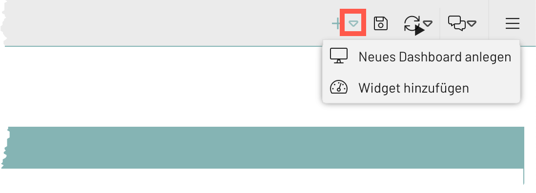
The new dashboard can be configured in the same way as when creating a new dashboard component in the administration area, see Dashboard component configuration.
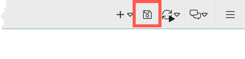
Save dashboard
To save a newly created dashboard or to save updated configurations of an existing dashboard, a save function must be used via the toolbar:
Change layout
Two layout options are available for the process dashboard: "Columns" and *"Table"*(setting layout).
Column layout
The column layout (default) makes it possible to divide the dashboard into vertical columns, whereby each column can contain several widgets. This layout is particularly suitable if content is to be displayed next to each other in columns and all content is to be displayed at first glance.
Features:
-
Any number of widgets per column.
-
Dynamic adjustment of the column width possible.
-
The height of the individual widgets has no effect on other columns.
-
Clear and flexible arrangement of the widgets.
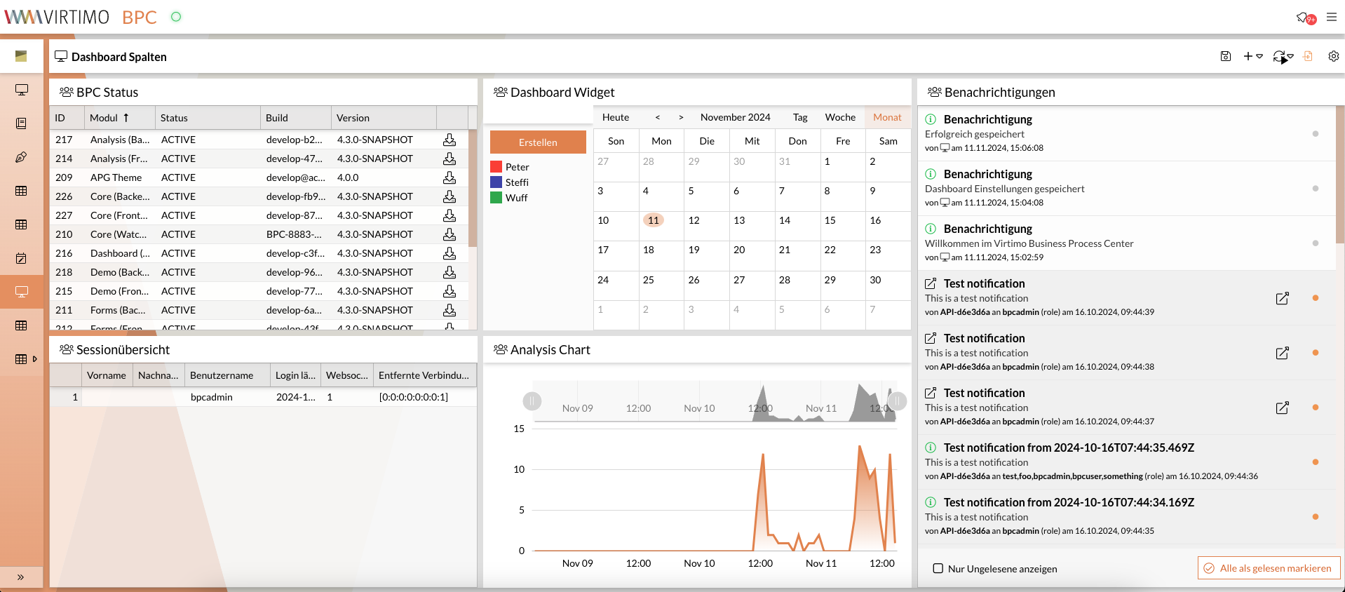
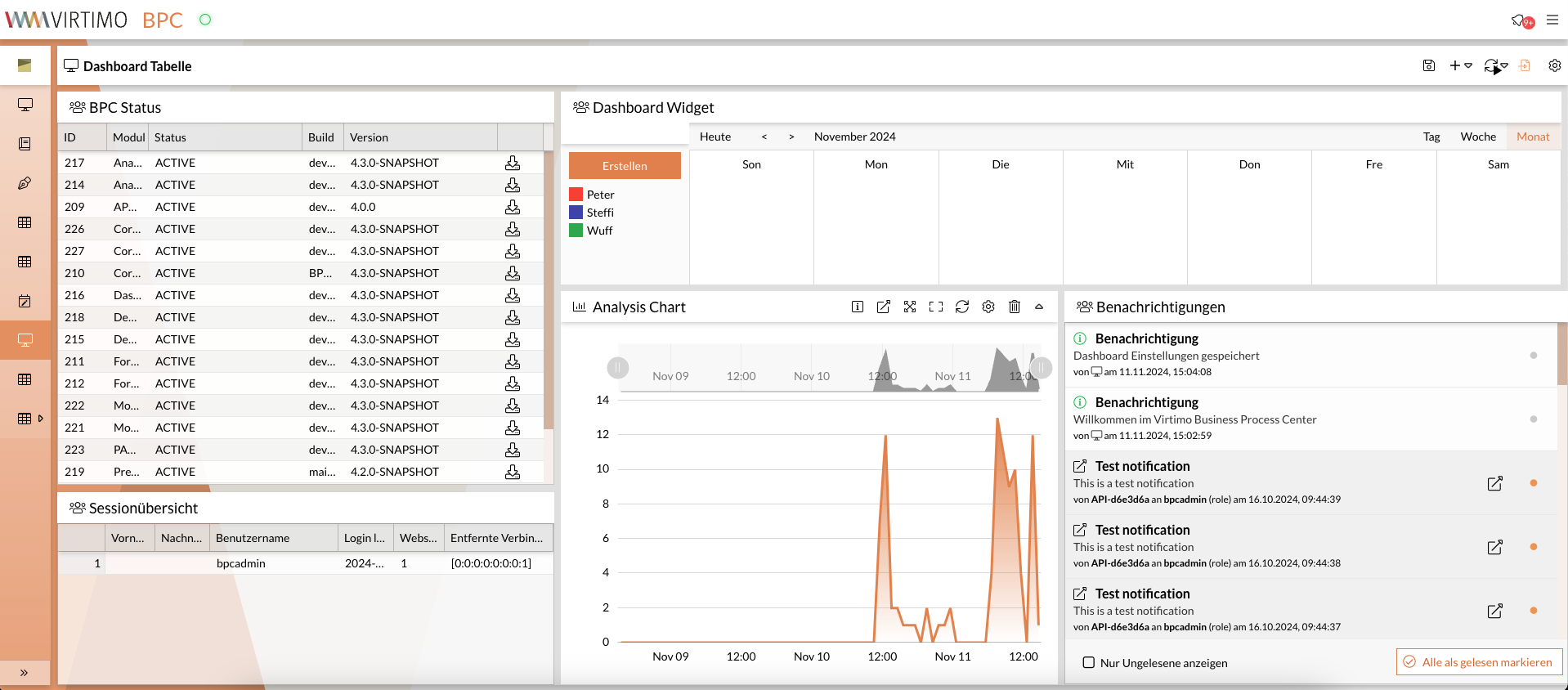
Table layout
The table layout enables a precise arrangement of widgets in a grid of rows and columns, with each cell containing a single widget. This layout is particularly suitable if a more complex arrangement is required and the number or size of the widgets requires scrolling in the dashboard.
Features:
-
Fixed cell structure with one widget per cell.
-
Possibility to extend widgets over several cells (e.g. over two columns or two rows).
-
Suitable for dashboards that require a structured, table-like display.
-
Scrolling if the size or number of widgets extends beyond the edge of the screen.
Widgets
Dashboard widgets integrate content from other modules and can thus provide an overview of differently distributed data and information on a page. They also allow you to select specific content directly and jump directly to the corresponding details within the relevant module.
Specify number of widgets
The dashboard can be divided into areas (columns or columns and rows in the table layout) by the administrator so that several widgets can be integrated on a dashboard at the same time.
In the column layout, a column can contain several widgets.
In the table layout, each cell contains exactly one widget.
The number of columns (and rows in the table layout) can be defined in the administration area via the settings.
In addition, new widgets can always be added by specifying the column via the icon.
Add widget
To integrate a new widget into a dashboard view, a corresponding function icon is available in the toolbar.
The following steps must be carried out to integrate a widget into the dashboard:
-
Open the dashboard module.
-
icon in the toolbar or click the button on the page display.
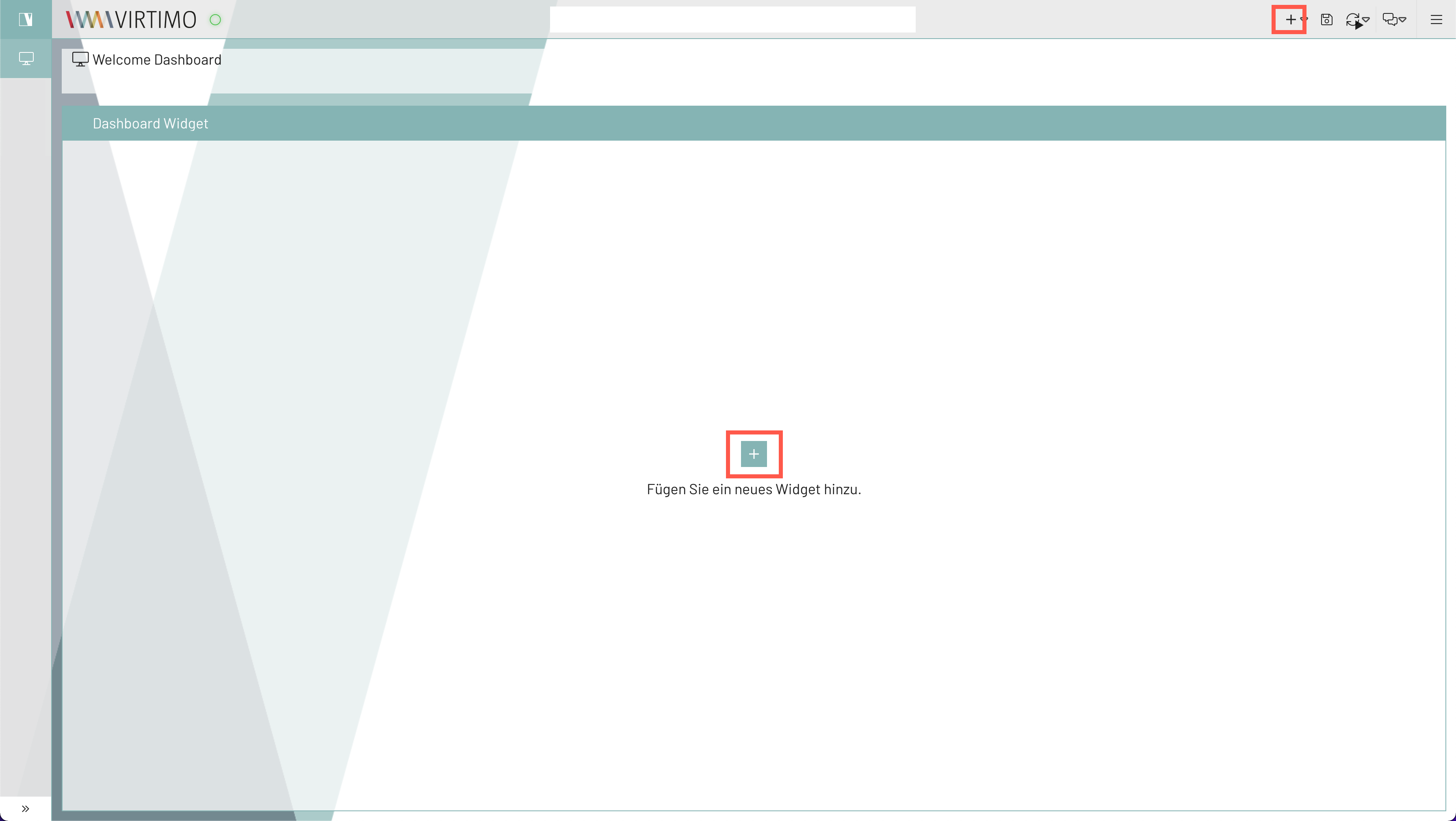
-
Select the module for which you want to create a widget on the dashboard.
-
Select the column in which the widget is to be inserted (here, for example, in the first column).
-
Click the Add button.
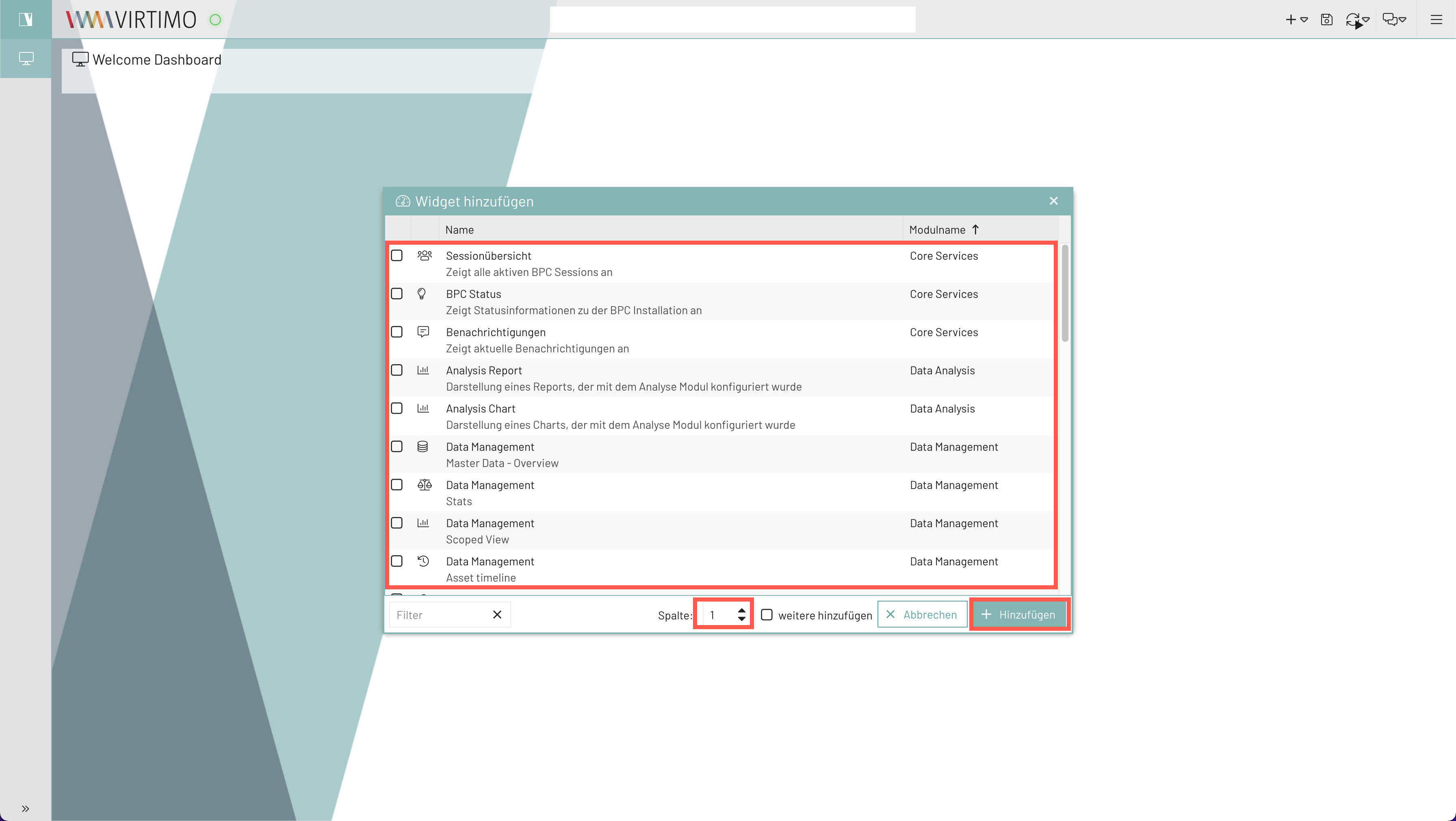
-
Save dashboard (see Save dashboard).
Widget functions
If you move the mouse pointer over a widget, the widget functions are displayed. The functions are independent of the content of the widget.
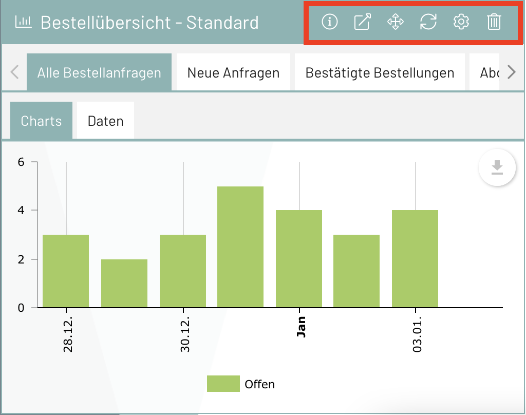
| Icon | Description |
|---|---|
(only for monitoring widgets) |
|
If available, a more detailed description or explanation of the widget appears as a tooltip. |
|
Opens the corresponding module from which the information displayed in the widget originates. |
|
Opens a menu with the options to move the widget up/down/left/right. |
|
(Only for table layout) |
|
Refreshes the content of the widget. |
|
Opens a window for widget configuration, which determines the content and its display in the widget. |
|
Removes the widget from the dashboard. |
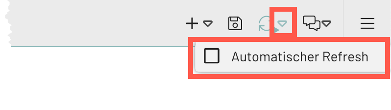
Refresh view or set automatic refresh //// The automatic refresh can be set to set automatic refresh
The user can specify whether the widget contents of the dashboard are updated automatically or whether the information displayed should be updated manually.
-
Click the arrow next to the refresh symbol in the toolbar.
-
Check the box.
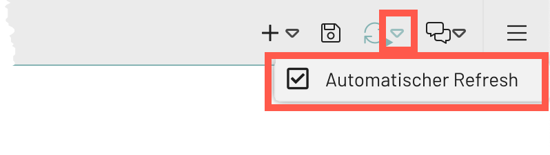
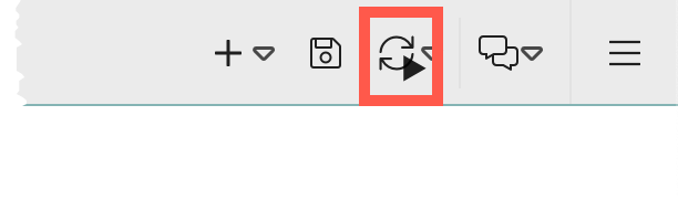
-
Click the arrow next to the refresh icon in the toolbar.
-
Deselect the checkbox.
To refresh the view manually, click on the refresh icon.