Application examples
Here you will find examples of charts and reports that demonstrate the functionality of the Analysis module using a fictitious company that manufactures and sells various products. The module is used to display and graphically prepare company-relevant information. The general procedure includes the creation of data records, their display in charts and the summary of these charts in reports.
To install these examples in a running system, you can use the instructions in the deployment operation section, which can be found at Deployment. To do this, the corresponding JSON file must be imported, which is provided under Analysis examples.
Data sets
The first step in using the Analysis module is to create a data set.
Some data sets have been created with JSON as the data source. In most use cases, however, this data comes from a backend system (see possible data sources).
The next step is to visualize this data in charts and reports.
Charts
The next step in using the Analysis module is to create charts.
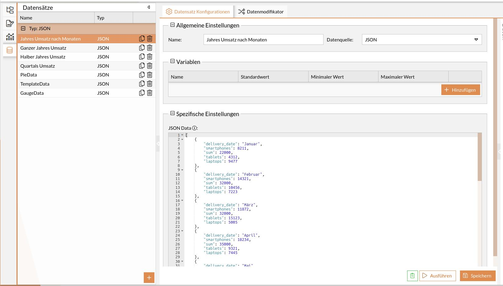
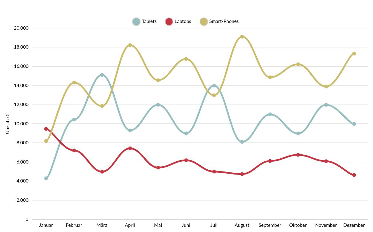
Sales per product as a classic line chart
The sales of three products are to be displayed in a line chart.
A data set is made up of a list of entries. The first entry for display in the chart could look like this:
[
{
"delivery_date": "Januar",
"smartphones": 8211,
"sum": 22000,
"tablets": 4312,
"laptops": 9477
}
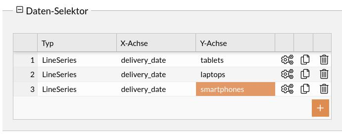
]The attributes to be visualized, including the assignment of the X and Y axes, are referenced in the data selector.
Display view of the entire chart configuration (classic bar chart)
{
  "dataSetId": "1630446788845456",
  "name": "Monats Umsatz",
  "chartType": "xy",
  "id": "1734426407287",
  "config": {
    "cursor": {
      "type": "XYCursor"
    },
    "data": [],
    "yAxes": [
      {
        "type": "ValueAxis",
        "title": {
          "text": "Umsatz/€"
        },
        "dataFields": {}
      }
    ],
    "series": [
      {
        "strokeWidth": 5,
        "stacked": true,
        "fillOpacity": 0,
        "name": "Tablets",
        "id": "s0",
        "type": "LineSeries",
        "tensionX": 0.8,
        "dataFields": {
          "dateX": "delivery_date",
          "id": "s0",
          "valueY": "tablets",
          "categoryX": "delivery_date"
        },
        "bullets": [
          {
            "children": [
              {
                "verticalCenter": "middle",
                "width": 10,
                "type": "Circle",
                "horizontalCenter": "middle",
                "height": 10
              }
            ]
          }
        ]
      },
      {
        "type": "LineSeries",
        "tensionX": 0.8,
        "id": "s1",
        "dataFields": {
          "categoryX": "delivery_date",
          "valueY": "laptops"
        },
        "name": "Laptops",
        "strokeWidth": 5,
        "bullets": [
          {
            "children": [
              {
                "verticalCenter": "middle",
                "width": 10,
                "type": "Circle",
                "horizontalCenter": "middle",
                "height": 10
              }
            ]
          }
        ]
      },
      {
        "type": "LineSeries",
        "id": "s2",
        "tensionX": 0.8,
        "dataFields": {
          "categoryX": "delivery_date",
          "valueY": "smartphones"
        },
        "strokeWidth": 5,
        "name": "Smart-Phones",
        "bullets": [
          {
            "children": [
              {
                "verticalCenter": "middle",
                "width": 10,
                "type": "Circle",
                "horizontalCenter": "middle",
                "height": 10
              }
            ]
          }
        ]
      }
    ],
    "background": {
      "fill": "rgba(255,255,255,1)"
    },
    "legend": {
      "hidden": false,
      "useDefaultMarker": true,
      "position": "top",
      "type": "Legend",
      "markers": {
        "children": [
          {
            "strokeWidth": 2,
            "cornerRadiusBottomRight": 12,
            "cornerRadiusTopRight": 12,
            "cornerRadiusBottomLeft": 12,
            "stroke": "#ccc",
            "cornerRadiusTopLeft": 12,
            "strokeOpacity": 1
          }
        ]
      },
      "labels": {
        "fontSize": 14
      }
    },
    "xAxes": [
      {
        "renderer": {
          "grid": {
            "disabled": true
          },
          "minGridDistance": 10
        },
        "dateFormatter": {
          "dateFormat": "MM"
        },
        "type": "CategoryAxis",
        "title": {
          "text": "Monat"
        },
        "dataFields": {
          "category": "delivery_date"
        }
      }
    ],
    "dateFormatter": {
      "inputDateFormat": "yyyy-MM-dd"
    },
    "titles": [
      {
        "fontSize": 25,
        "marginBottom": 30
      }
    ],
    "colors": {
      "saturation": 1,
      "list": [
        "#96bebe",
        "#c63441",
        "#cbbc6b"
      ]
    },
    "exporting": {
      "menu": {}
    }
  },
  "animationActive": true
}
Sales per product as a stacked bar chart
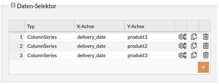
The sales of three products are to be displayed in a stacked bar chart.
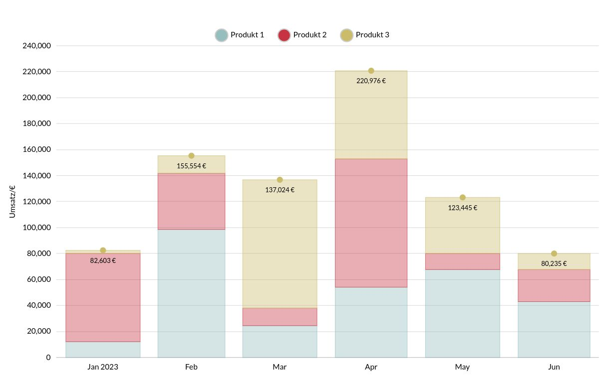
The first entry for the display in the chart could look as follows:
[
    {
        "produkt2": 67890,
        "produkt1": 12345,
        "delivery_date": "2023-01-01",
        "produkt3": 2468,
        "sum": 82603
    }
]
The attributes to be visualized, including the assignment of the X and Y axes, are referenced in the data selector.
Display view of the entire chart configuration (stacked bar chart)
{
    "dataSetId": "1630446788882",
    "name": "Halb-Jahres Umsatz Balken gestapelt",
    "chartType": "xy",
    "id": "1627025905499",
    "config": {
        "cursor": {
            "type": "XYCursor"
        },
        "data": [],
        "yAxes": [
            {
                "type": "ValueAxis",
                "title": {
                    "text": "Umsatz/€"
                }
            }
        ],
        "series": [
            {
                "strokeWidth": 0.5,
                "stacked": true,
                "fillOpacity": 0.4,
                "name": "Produkt A",
                "id": "s0",
                "type": "ColumnSeries",
                "dataFields": {
                    "dateX": "delivery_date",
                    "id": "s0",
                    "valueY": "produkt1"
                }
            },
            {
                "strokeWidth": 0.5,
                "stacked": true,
                "fillOpacity": 0.4,
                "name": "Produkt B",
                "id": "s1",
                "type": "ColumnSeries",
                "dataFields": {
                    "dateX": "delivery_date",
                    "id": "s0",
                    "valueY": "produkt2"
                }
            },
            {
                "strokeWidth": 0.5,
                "stacked": true,
                "fillOpacity": 0.4,
                "name": "Produkt C",
                "id": "s2",
                "type": "ColumnSeries",
                "dataFields": {
                    "dateX": "delivery_date",
                    "id": "s3",
                    "valueY": "produkt3"
                },
                "bullets": [
                    {
                        "type": "CircleBullet"
                    },
                    {
                        "label": {
                            "dy": 20,
                            "fontSize": 12,
                            "text": "{sum} €"
                        },
                        "type": "LabelBullet"
                    }
                ]
            }
        ],
        "background": {
            "fill": "rgba(255,255,255,1)"
        },
        "legend": {
            "useDefaultMarker": true,
            "position": "top",
            "type": "Legend",
            "markers": {
                "children": [
                    {
                        "strokeWidth": 2,
                        "cornerRadiusBottomRight": 12,
                        "cornerRadiusTopRight": 12,
                        "cornerRadiusBottomLeft": 12,
                        "stroke": "#ccc",
                        "cornerRadiusTopLeft": 12,
                        "strokeOpacity": 1
                    }
                ]
            },
            "labels": {
                "fontSize": 14
            }
        },
        "xAxes": [
            {
                "renderer": {
                    "grid": {
                        "disabled": true
                    },
                    "minGridDistance": 10
                },
                "dateFormatter": {
                    "dateFormat": "MM"
                },
                "type": "DateAxis",
                "title": {
                    "text": "Monat"
                },
                "dataFields": {
                    "date": "delivery_date"
                }
            }
        ],
        "dateFormatter": {
            "inputDateFormat": "yyyy-MM-dd"
        },
        "titles": [
            {
                "fontSize": 25,
                "marginBottom": 30
            }
        ],
        "colors": {
            "saturation": 1,
            "list": [
                "#96bebe",
                "#c63441",
                "#cbbc6b"
            ]
        }
    },
    "animationActive": true
}
Proportional sales per product as a pie chart
The proportional sales of various products are to be displayed in a pie chart.
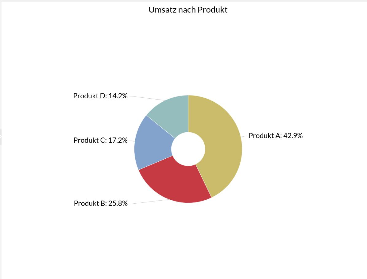
The data for the presentation in the chart could look as follows:
[
    {
        "litres": 501.9,
        "country": "Produkt A"
    },
    {
        "litres": 301.9,
        "country": "Produkt B"
    },
    {
        "litres": 201.1,
        "country": "Produkt C"
    },
    {
        "litres": 165.8,
        "country": "Produkt D"
    }
]
The attributes to be visualized are referenced in the data selector.
Display view of the entire chart configuration (pie chart)
{
"dataSetId": "1689056665616",
"name": "Umsatz nach Produkt",
"chartType": "pie",
"id": "1689056665616",
"enabled3D": false,
"config": {
"cursor": {},
"depth": 30,
"data": [],
"series": [
{
"slices": {
"strokeWidth": 1,
"stroke": "#ffff",
"strokeOpacity": 0.7
},
"alignLabels": true,
"id": "extModel2261-1",
"category": "country",
"type": "PieSeries",
"value": "litres",
"colors": {
"list": [
"#cbbc6b",
"#c63441",
"#81A2CC",
"#96bebe",
"#e18b50",
"#dcd9d2",
"#958f77"
]
},
"dataFields": {
"depthValue": "value",
"category": "country",
"value": "litres"
},
"labels": {
"fontSize": 21
}
}
],
"background": {
"fill": "rgba(255,255,255,1)"
},
"legend": {
"disabled": true
},
"angle": 45,
"titles": [
{
"fontSize": 25,
"text": "Umsatz nach Produkt"
}
],
"radius": 160,
"innerRadius": 50
}
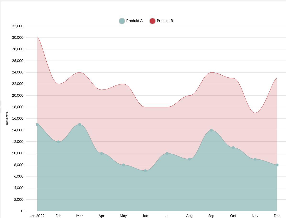
}Total monthly sales - line chart/bar chart
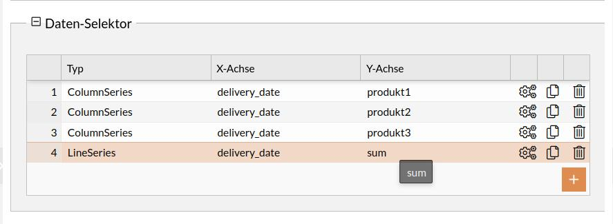
The sales of various products should be displayed in a bar chart and the total as a line chart.
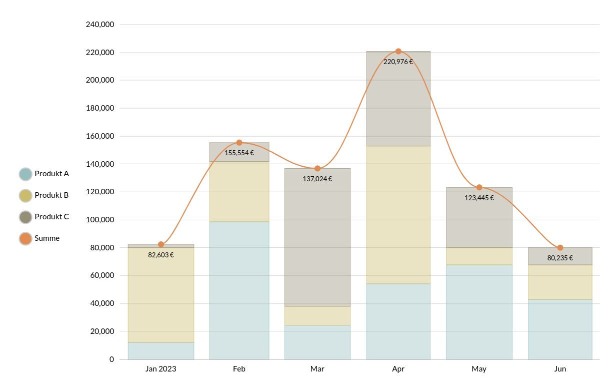
The first entry for the display in the chart could look like this:
[
    {
        "produkt2": 67890,
        "produkt1": 12345,
        "delivery_date": "2023-01-01",
        "produkt3": 2468,
        "sum": 82603
    }
]
The attributes to be visualized, including the assignment of the X and Y axes, are referenced in the data selector.
Display view of the entire chart configuration (combined line/bar chart)
{
"dataSetId": "1630446788882",
"name": "Timeline Balken + Linie",
"chartType": "xy",
"id": "1627025905477",
"config": {
"cursor": {
"type": "XYCursor"
},
"data": [],
"yAxes": [
{
"type": "ValueAxis"
}
],
"series": [
{
"strokeWidth": 0.5,
"stacked": true,
"fillOpacity": 0.4,
"name": "Produkt A",
"id": "s0",
"type": "ColumnSeries",
"dataFields": {
"dateX": "delivery_date",
"id": "s0",
"valueY": "produkt1"
}
},
{
"strokeWidth": 0.5,
"stacked": true,
"fillOpacity": 0.4,
"name": "Produkt B",
"id": "s1",
"type": "ColumnSeries",
"dataFields": {
"dateX": "delivery_date",
"id": "s0",
"valueY": "produkt2"
}
},
{
"strokeWidth": 0.5,
"stacked": true,
"fillOpacity": 0.4,
"name": "Produkt C",
"id": "s2",
"type": "ColumnSeries",
"dataFields": {
"dateX": "delivery_date",
"id": "s3",
"valueY": "produkt3"
}
},
{
"strokeWidth": 2,
"stacked": true,
"fillOpacity": 0,
"name": "Summe",
"id": "s3",
"type": "LineSeries",
"tensionX": 0.8,
"dataFields": {
"dateX": "delivery_date",
"id": "s3",
"valueY": "sum"
},
"bullets": [
{
"type": "CircleBullet"
},
{
"label": {
"dy": 20,
"fontSize": 12,
"text": "{sum} €"
},
"type": "LabelBullet"
}
]
}
],
"background": {
"fill": "rgba(255,255,255,1)"
},
"legend": {
"useDefaultMarker": true,
"position": "left",
"type": "Legend",
"markers": {
"children": [
{
"strokeWidth": 2,
"cornerRadiusBottomRight": 12,
"cornerRadiusTopRight": 12,
"cornerRadiusBottomLeft": 12,
"stroke": "#ccc",
"cornerRadiusTopLeft": 12,
"strokeOpacity": 1
}
]
},
"labels": {
"fontSize": 14
}
},
"xAxes": [
{
"renderer": {
"grid": {
"disabled": true
},
"minGridDistance": 10
},
"dateFormatter": {
"dateFormat": "MM"
},
"type": "DateAxis",
"title": {
"text": "Monat"
},
"dataFields": {
"date": "delivery_date"
}
}
],
"dateFormatter": {
"inputDateFormat": "yyyy-MM-dd"
},
"titles": [
{
"fontSize": 25,
"marginBottom": 30
}
],
"colors": {
"saturation": 1,
"list": [
"#96bebe",
"#cbbc6b",
"#958f77",
"#e18b50",
"#c63441",
"#dcd9d2"
]
},
"exporting": {
"menu": {}
}
},
"animationActive": true
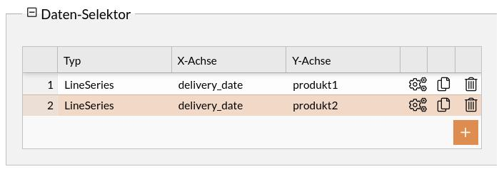
}Annual sales per product as a line chart
The sales of two different products are to be displayed in a stacked line chart.
The first entry in the data set for display in the chart could look like this:
 {
        "produkt2": 15000,
        "produkt1": 15000,
        "delivery_date": "2022-01-01",
        "produkt3": 2000,
        "sum": 32000
    }
The attributes to be visualized, including the assignment of the X and Y axes, are referenced in the data selector.
Display view of the entire chart configuration
{
"dataSetId": "1630446788833",
"name": "Jahresumsatz Linien",
"chartType": "xy",
"id": "1627025905433",
"config": {
"cursor": {
"type": "XYCursor"
},
"data": [],
"yAxes": [
{
"type": "ValueAxis",
"title": {
"text": "Umsatz/€"
}
}
],
"series": [
{
"strokeWidth": 2,
"stacked": true,
"fillOpacity": 0.8,
"name": "Produkt A",
"id": "s0",
"type": "LineSeries",
"tensionX": 0.8,
"dataFields": {
"dateX": "delivery_date",
"id": "s0",
"valueY": "produkt1"
},
"bullets": [
{
"type": "CircleBullet"
}
]
},
{
"strokeWidth": 1,
"stacked": true,
"fillOpacity": 0.2,
"name": "Produkt B",
"id": "s1",
"type": "LineSeries",
"tensionX": 0.8,
"dataFields": {
"dateX": "delivery_date",
"id": "s0",
"valueY": "produkt2"
}
}
],
"background": {
"fill": "rgba(255,255,255,1)"
},
"legend": {
"useDefaultMarker": true,
"position": "top",
"type": "Legend",
"markers": {
"children": [
{
"strokeWidth": 2,
"cornerRadiusBottomRight": 12,
"cornerRadiusTopRight": 12,
"cornerRadiusBottomLeft": 12,
"stroke": "#ccc",
"cornerRadiusTopLeft": 12,
"strokeOpacity": 1
}
]
},
"labels": {
"fontSize": 14
}
},
"xAxes": [
{
"renderer": {
"grid": {
"disabled": true
},
"minGridDistance": 10
},
"dateFormatter": {
"dateFormat": "MM"
},
"type": "DateAxis",
"title": {
"text": "Monat"
},
"dataFields": {
"date": "delivery_date"
}
}
],
"dateFormatter": {
"inputDateFormat": "yyyy-MM-dd"
},
"titles": [
{
"fontSize": 25,
"marginBottom": 30
}
],
"colors": {
"saturation": 1,
"list": [
"#96bebe",
"#c63441",
"#cbbc6b"
]
}
},
"animationActive": true
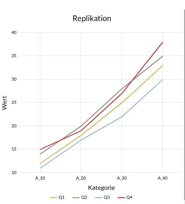
}Displaying data from a replication
Data from a replication is to be displayed in a line chart.
The following input data is available:
[
    {
        "Q": 1,
        "A_10": 12,
        "A_20": 18,
        "A_30": 25,
        "A_40": 33
    },
    {
        "Q": 2,
        "A_10": 14,
        "A_20": 20,
        "A_30": 28,
        "A_40": 35
    },
    {
        "Q": 3,
        "A_10": 11,
        "A_20": 17,
        "A_30": 22,
        "A_40": 30
    },
    {
        "Q": 4,
        "A_10": 15,
        "A_20": 19,
        "A_30": 27,
        "A_40": 38
    }
]
Procedure for importing the data:
-
Navigate to the data set editor
-
Create a new data set
-
Unique naming
-
JSON as data source
-
Copy and paste input data into the JSON data field
To display this data in a meaningful way in an XY with multiple lines, the data must be available in the following form:
[
    {
            "x": "A_10",
            "Q1": 12,
            "Q2": 14,
            "Q3": 11,
            "Q4": 15
    },
...
]
For this reason, a data modifier is used.
Procedure for modifying the data:
-
Switch to the Data modifier tab
-
Click the plus icon to add a new modifier
-
Select JavaScript as the type
-
Insert the following script
function modify (data, vars) {
   const result = helper(data);
   return result;
}

function helper (inputData) {
   const xKeys = ["A_10", "A_20", "A_30", "A_40"];

   return xKeys.map(key => {
      const xValue = key;
      const obj = { x: xValue };

      inputData.forEach(row => {
        obj[`Q${row.Q}`] = row[key];
      });
      return obj;
    });
}
Damit werden die Daten in die gewünschte Form gebracht
|
Die Kategorien (A_10,A_20 …) sind fest kodiert und müssen je nach Anwendung angepasst werden. |
Im Nächsten Schritt wird das Chart erstellt
Vorgehen zur Erstellung des Charts:
-
Navigation zu Chart Editor
-
Neuen Chart erstellen
-
XYChart als Chart-Typ auswählen
-
Im ChartTyp Selektor auf das Zahnrad-Icon klicken
-
Folgende Chart Konfiguration einfügen
{
    "dataSetId": "1765747188364",
    "name": "Replizierte Daten",
    "chartType": "xy",
    "id": "1765746224249",
    "config": {
        "cursor": {
            "type": "XYCursor",
            "behavior": "zoomX"
        },
        "data": [],
        "yAxes": [
            {
                "type": "ValueAxis",
                "title": {
                    "fontSize": 20,
                    "text": "Wert"
                },
                "dataFields": {}
            }
        ],
        "series": [
            {
                "strokeWidth": 3,
                "name": "Q1",
                "id": "s0",
                "type": "LineSeries",
                "dataFields": {
                    "valueY": "Q1",
                    "categoryX": "x"
                }
            },
            {
                "strokeWidth": 3,
                "name": "Q2",
                "id": "s1",
                "type": "LineSeries",
                "dataFields": {
                    "valueY": "Q2",
                    "categoryX": "x"
                }
            },
            {
                "strokeWidth": 3,
                "name": "Q3",
                "id": "s2",
                "type": "LineSeries",
                "dataFields": {
                    "valueY": "Q3",
                    "categoryX": "x"
                }
            },
            {
                "strokeWidth": 3,
                "name": "Q4",
                "id": "s4",
                "type": "LineSeries",
                "dataFields": {
                    "valueY": "Q4",
                    "categoryX": "x"
                }
            }
        ],
        "background": {
            "fill": "rgba(255,255,255,0)"
        },
        "legend": {},
        "xAxes": [
            {
                "renderer": {
                    "minGridDistance": 10
                },
                "type": "CategoryAxis",
                "title": {
                    "fontSize": 20,
                    "text": "Kategorie"
                },
                "dataFields": {
                    "category": "x"
                }
            }
        ],
        "colors": {
            "list": [
                "#cbbc6b",
                "#958f77",
                "#96bebe",
                "#c63441"
            ]
        },
        "titles": [
            {
                "text": "Replikation",
                "fontSize": 25,
                "marginBottom": 30
            }
        ]
    }
}|
Die |
Das Chart sieht dann wie folgt aus:
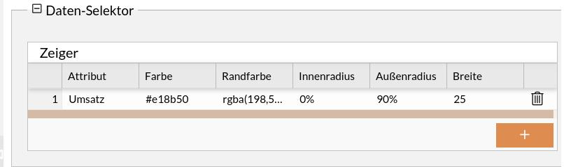
Bewertung des Umsatzes - Tacho-Diagramm
Es sollen der aktuelle Jahresumsatz in einem Tachometer-Diagramm dargestellt werden.
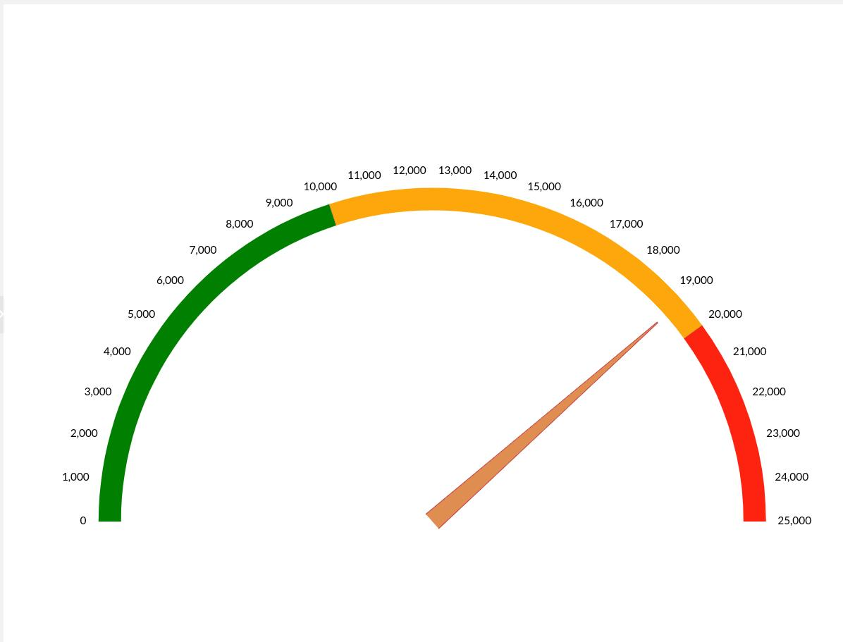
Die Daten für die Darstellung im Chart könnten wie folgt aussehen:
{
    "Umsatz": 19240
}
Das zu visualisierende Attribut, wird im Daten-Selektor referenziert.
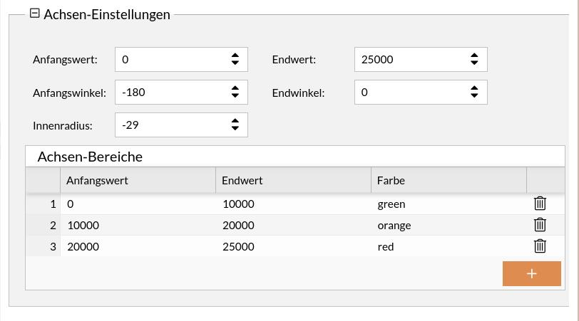
Ausserdem können die farbigen Achsenbereiche in den Achsen-Einstellungen vorgenommen werden:
Ansicht der gesamten Chart-Konfiguration anzeigen
{
    "dataSetId": "1697797863548",
    "name": "Umsatz",
    "chartType": "gauge",
    "id": "1627025905488",
    "config": {
        "startAngle": -180,
        "gaugeSeries": [
            {
                "startWidth": 25,
                "pin": {
                    "disabled": true
                },
                "id": 1697798046911,
                "type": "ClockHand",
                "fill": "#e18b50",
                "innerRadius": "0%",
                "radius": "90%",
                "value": 0,
                "stroke": "rgba(198,52,65,1)",
                "dataAttribute": "Umsatz"
            }
        ],
        "background": {
            "fill": "rgba(255,255,255,1)"
        },
        "xAxes": [
            {
                "strictMinMax": true,
                "axisRanges": [
                    {
                        "endValue": 10000,
                        "axisFill": {
                            "fillOpacity": 1,
                            "fill": "green"
                        },
                        "opacitiy": 1,
                        "value": "0",
                        "color": "green",
                        "id": "extModel2614-1"
                    },
                    {
                        "endValue": 20000,
                        "axisFill": {
                            "fillOpacity": 1,
                            "fill": "orange"
                        },
                        "opacitiy": 1,
                        "value": 10000,
                        "color": "orange",
                        "id": "extModel2614-2"
                    },
                    {
                        "endValue": 25000,
                        "axisFill": {
                            "fillOpacity": 1,
                            "fill": "red"
                        },
                        "opacitiy": 1,
                        "value": 20000,
                        "color": "red",
                        "id": "extModel2614-3"
                    }
                ],
                "min": 0,
                "max": 25000,
                "type": "ValueAxis"
            }
        ],
        "endAngle": 0,
        "titles": [
            {
                "fontSize": 25,
                "marginBottom": 30,
                "text": ""
            }
        ],
        "innerRadius": -29
    }
}
Umsatz pro Produkt und Monat - Tabelle
Es sollen die Umsätze von verschiedenen Produkten in einer Tabelle dargestellt werden.
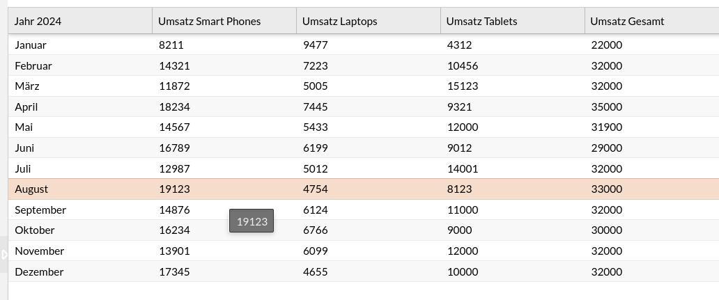
Der erste Eintrag für die Darstellung in der Tabelle könnte wie folgt aussehen:
[
{
"delivery_date": "Januar",
"smartphones": 8211,
"sum": 22000,
"tablets": 4312,
"laptops": 9477
}
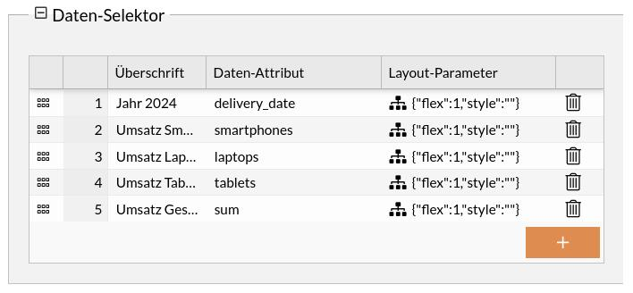
]Die zu visualisierenden Spalten, werden im Daten-Selektor referenziert.
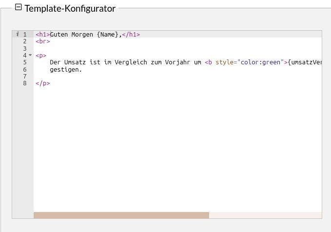
Mitteilung an Mitarbeiter über Jahresumsatz - Template-Diagramm
Es soll die Mitteilung an den fiktiven Mitarbeiter Albert über der Jahresumsatz bzw. dessen Anstieg angezeigt werden.
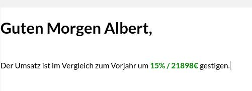
Die zugrunde liegenden Daten könnten wie folgt aussehen:
{
    "umsatzVergleichProzentual": 15,
    "umsatzVergleichAbsolut": 21898,
    "Name": "Albert"
}
The message to be displayed is created via the template configurator.
The underlying syntax is the ExtJS XTemplate. Further information on its use can be found here.
Reports and catalog
Various sample reports are available in the report editor. These reports contain various charts (from the previous section) that have been inserted in different arrangements. For further details(see report editor) All reports can in turn be viewed in the catalog. For further details(see catalog editor)