Configuring Monitor Columns
Column configuration in the monitor is performed using the setting column_config.
The setting consists of a JSON array in which an object is specified for each column.
It looks something like this:
[
	{
		SPALTEN_KONFIGURATION_FUER_SPALTE_1
	},
	{
		SPALTEN_KONFIGURATION_FUER_SPALTE_2
	},
	{
		SPALTEN_KONFIGURATION_FUER_SPALTE_n
	}
]|
The following column configurations apply only to the table in the monitor. They cannot be applied to the column configurations of the tables in the detail views. For the column configurations in the detail views, see also: Configuring Monitor Detail Views. |
Automatic Column Configuration
If no column configuration exists when a monitor is created, one is generated automatically.
If you want to regenerate the column_config, you can do so by saving an empty JSON array ([]) as the value for column_config.
Alternatively, you can reset the configuration by clicking the Delete button at the end of the row (followed by saving).
Configuring a Column
The configuration of a column is encapsulated in a JSON object. It can include the following attributes:
| Attribute | Data Type | Description | ||
|---|---|---|---|---|
|
text |
This is the column or field name in the data source whose value is to be displayed.
|
||
|
text |
This is the label for the column header. |
||
|
text |
Defines an icon that is displayed in the column header.
A FontAwesome CSS class is expected, e.g., |
||
|
boolean |
Controls the initial visibility of the column.
The default value is |
||
|
boolean |
If this value is |
||
|
number |
Defines the width of the column in pixels.
|
||
|
text |
Defines the column type.
Possible values include, for example, |
||
|
boolean/text |
Controls the column display or renderer.
See Renderer ( |
||
|
JSON |
Defines the filter for the column.
|
Additional Attributes
In addition to the attributes listed above, other, more specific attributes can be configured.
| Attribute | Data Type | Description | ||
|---|---|---|---|---|
|
string |
This attribute can be used to customize the display of date, time, or numeric values.
Condition: The attribute Examples
|
||
|
string |
This attribute allows the use of a method from |
||
|
boolean |
Allows text breaks (line breaks) in a cell.
The following are considered line breaks:
|
||
|
string|string[] |
Restricts the visibility of the column to one or more roles. If a list of roles is specified, the current user must have at least one of the roles. .Example |
||
|
string|string[] |
Restricts the visibility of the column to one or more organizations. If a list of organizations is specified, the current user must be assigned to at least one of the organizations. .Example |
||
|
string|string[] |
Restricts the visibility of the column to one or more permissions. If a list of permissions is specified, the current user must have at least one of the permissions. .Example |
||
|
string |
This is the ID of the Flow component that the system references, which writes data to the monitor.
Example
|
||
|
boolean |
If
|
||
|
string |
Defines the icon displayed next to the text.
The default value is
|
Renderer (customRenderer)
The following description refers to the customRenderer attribute in the column configuration.
There are three different configuration options.
Boolean Value
Specifying ` false ` means no renderer is used.
With ` true , the monitor component configuration (`Monitor_CustomRenderer) first searches for a renderer with a matching name.
Matching is performed via Renderername = Dataindex der Spalte (e.g., ` PROCESSID ` = ` PROCESSID`).
The purpose is to display different renderers for different values in the same column.
If no renderer with a matching name is found, the defaultRenderer is used.
Monitor_ColumnConfig[
{
"filter": {
"source": "raw",
"type": "dynamicList"
},
"hidden": false,
"dataIndex": "STATUS",
"hideable": true,
"width": 200,
"customRenderer": true, (1)
"minWidth": 64,
"text": "STATUS"
}
]| 1 | Boolean value for customRenderer. |
Monitor_CustomRenderer{
"STATUS": { (1)
"iconOnly": false,
"valueMap": {
"xx": { (2)
"color": "#cbbc6b",
"label": "signedxx",
"iconCls": "fal fa-chevron-circle-right"
},
"test": { (3)
"color": "green",
"iconCls": "fal fa-star-o"
},
"!": { (4)
"color": "#FF0000",
"label": "EMPTY FIELD",
"iconCls": "fal fa-info-circle fa-fw fa-ln"
},
"*": { (5)
"color": "yellow",
"label": "RENDERED FALLBACK VALUE",
"iconCls": "fal fa-info-circle fa-fw fa-ln"
}
}
},
"defaultRenderer": { (6)
"iconOnly": false,
"valueMap": {
"info": {
"color": "green",
"label": "INFO",
"iconCls": "fal fa-info-circle fa-fw fa-ln"
},
"debug": {
"color": "#D49A6A",
"label": "DEBUG",
"iconCls": "fal fa-info-circle fa-fw fa-ln"
}
}
}
}| 1 | Column name. |
| 2 | CustomRenderer for the value xx. |
| 3 | Renderer for the value test. |
| 4 | Renderer for fields with empty values. |
| 5 | Fallback renderer for all other values. |
| 6 | Used when no specific renderer is found for the column (STATUS). |
|
Specifying the Renderer Name
If you specify the renderer’s name as a string, a search is performed in column_customerRenderer for a renderer with the specified name.
.Example:
"customRenderer": "TEST-RENDERER" expects an entry "TEST-RENDERER" in column_customRenderer.
Referencing Custom Renderer Functions
To use custom renderer functions, the syntax MODUL!_!FUNKTION must be used during configuration.
This specification is converted to the form MODUL.Module.FUNKTION().
This function is evaluated, and the renderer function is expected as the return value.
To use a custom function, it must be loaded when the monitor is called.
This can be done, for example, by including a custom BPC module or via the configuration "view_additionalFiles" (see Core Services Settings).
"customRenderer": "bpcCustomRenderer!_!uppercase"Ext.define("bpcCustomRenderer.Module", {
singleton: true,
uppercase: function () {
return function (value, meta, record) {
return String(value).toUpperCase();
};
}
});If no renderer is defined, the system checks whether the respective column has a ` dataIndex STATUS .
If so, the ` `defaultRenderer ` from the object is used.
Additional column configuration parameters can be found directly in the ExtJS documentation.
Formatter
The following description refers to the ` formatter ` attribute in the column configuration.
Translate
If the formatter attribute in the column configuration is set to "translate", the values in this column will be translated, provided a corresponding translation is available.
{
    "formatter": "translate",
    "dataIndex": "STATUS",
    "text": "STATUS"
}
Date
If, for example, the formatter attribute in the column configuration is set to "date(Y-m-d)", the values of this column are displayed in the monitor as dates in the specified format.
{
    "formatter": "date(Y-m-d)",
    "dataIndex": "timestamp",
    "text": "Time"
}
Rounding
If, for example, the attribute formatter is set to "round(2)" in the column configuration, the values in this column are rounded to two decimal places.
Case
If, for example, the attribute formatter is set to "lowercase" in the column configuration, the values in this column are displayed in lowercase.
This configuration also works similarly with uppercase.
{
    "formatter": "lowercase"
}{
"formatter": "uppercase"
}For more information on formatting in monitor columns, see the ExtJS documentation.
Column Types
The column type is defined by the setting of the xtype.
If no xtype is specified, it is a simple text column.
xtype of the column |
Filter.type-Option |
Description |
|---|---|---|
|
Column for downloading content from the SQL table. |
|
|
A column whose value can be manipulated in the frontend via JavaScript. |
|
|
Checkbox column. |
|
|
A column that combines all ProcessAction columns into a single column and displays a button or dropdown for these actions. |
|
|
|
Column for the structured display of JSON data (OpenSearch |
Template column (templatecolumn)
The templatecolumn allows you to modify the column’s value in the frontend.
For example, you can shorten it, convert it, or enrich it with values from other columns.
This can be used, for example, to create a hyperlink column.
To create a column with a hyperlink, you can define the xtype templatecolumn and the template tpl in the column’s ColumnConfig.
Placeholders enclosed in curly braces can be used to access all data (columns) of the current record (the current row) via their dataIndex.
If functions are to be applied to the value, square brackets must also be inserted within the curly braces.
In this case, values. must be prepended to dataIndizes.
{
    "text": "Jira-Link",
    "dataIndex": "JIRA",
    "xtype": "templatecolumn",
    "tpl": "<a target=\"_blank\" href=\"{JIRA}\">{[values.JIRA.substr(values.JIRA.lastIndexOf('/') + 1)]}</a>",
    "width": 300,
    "minWidth": 64
}
In this example, a column with the dataIndex "JIRA" is created, which contains a Jira link in OpenSearch.
In BPC, the column is populated with a hyperlink that opens in a new window (target="_blank").
Its href is the value of the column itself: {JIRA}.
The text of the link is truncated to the substring after the last slash using the JavaScript function values.JIRA.substr(values.JIRA.lastIndexOf('/') + 1).
This is achieved in the template via {[values.JIRA.substr(values.JIRA.lastIndexOf('/') + 1)]}.
Filtering Template Columns
|
Filtering a |
A standard text filter (type: "text") always filters only the raw data of the field specified in the dataIndex.
The rendered template is not taken into account here.
The dynamicList filter behaves differently:
. It attempts to apply the column template (tpl) to the values in the suggestion list.
. However, the filter renderer does not have access to the complete data record of the monitor row.
It only knows the value of the ` dataIndex` field (available as value) and the number of occurrences (count).
. If the column template accesses other fields in the data record (e.g., {PROCESSID}), rendering in the filter suggestion list fails.
The solution is to define a separate, customized template specifically for the filter.
This is done using the ` tpl ` property within the ` filter` configuration.
This filter template can then only access the available data (value and count).
{
    "text": "Ticket",
    "dataIndex": "TICKET_NR",
    "xtype": "templatecolumn",
    "tpl": "<b>Ticket: </b>{TICKET_NR} (ID: {PROCESSID})", (1)
    "filter": {
        "source": "raw",
        "type": "dynamicList",
        "tpl": "<b>Ticket: </b>{value} ({count})", (2)
    }
}| 1 | The column template accesses TICKET_NR (from dataIndex) and PROCESSID (another field in the dataset). |
| 2 | The filter template can only access value (the value of TICKET_NR) and count. Access to PROCESSID would not be possible here. |
Date Column (datecolumn)
With this column type, the system attempts to interpret the column’s value as a date and display it in a formatted manner.
The date format can be controlled using the format attribute.
The syntax for the format can be found in the ExtJS documentation.
If no format is specified for the column, the date format of the monitor instance is used.
Process Action Column (gridActionColumn)
If action columns are configured in a monitor that can be executed via the toolbar or the context menu, it is possible to create an action button for each row by adding this column.
Multiple action columns, as well as multiple action entries within a single column, are grouped into a dropdown menu.
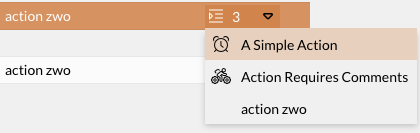
The number of actions is displayed on the button.
If only one action is available, it can be started directly by clicking the button.
The column can accept the additional parameter ` showIconOnly , which accepts ` `true ` or ` false ` as values.
This controls whether the button displays the full text per column or only the icon and the number of available actions.
The default value is ` false`.
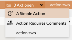
{
    "dataIndex": "Action",
    "xtype": "gridActionColumn",
    "showIconOnly": false
}
{
    "dataIndex": "Action",
    "xtype": "gridActionColumn",
    "showIconOnly": true
}
Attachment Column (attachmentcolumn)
This column type can be used to directly provide a download button for columns that contain a file.
To do this, the JSON setting ` fileConfig ` must be configured in the column field with the fields ` columnFileName ` and ` columnContentType `.
This setting defines the name of the column, the filename, or the content type.
{
    "filter": {
        "source": "raw",
        "type": "text"
    },
    "xtype": "attachmentcolumn",
    "hidden": false,
    "dataIndex": "REFFILE",
    "hideable": true,
    "width": 200,
    "customRenderer": false,
    "minWidth": 64,
    "text": "REFFILE",
    "fileConfig": {
        "columnFileName": "filename",
        "columnContentType": "contentType"
    }
}
Optionally, in fileConfig, the setting ` dataSource ` can be used to specify that files always come from a specific source.
Possible sources include file storage, OpenSearch, or a backend Connection (e.g., INUBIT).
{
    "fileConfig": {
        "columnFileName": "filename",
        "columnContentType": "contentType",
        "dataSource": "OpenSearch"
    }
}
The following options are available: FileStorage, OpenSearch, BackendConnection, and auto.
In the case of auto (default), the system attempts to determine the source based on the contents of the file column.
If files are to be downloaded via an HTTP proxy connection, the monitor setting httpProxy_referenceEndpoint must also be configured.
This configures the HTTP proxy connection, including the download endpoint.
JSON Column (jsonColumn)
The jsonColumn is used to display structured JSON data in the monitor. It is specifically designed for OpenSearch object and flat_object fields that are stored in the database as true JSON structures (rather than serialized JSON strings).
The column offers the following display options:
-
Single nested value: If a specific path within the JSON object is to be displayed, this can be configured using the separate attribute
jsonPath. -
Compact JSON display: If the resolved value is an object or an array (i.e., not a primitive type), the structure is automatically formatted as a compact JSON string, displayed in the grid with HTML encoding, and provided as a tooltip.
{
  "xtype": "jsonColumn",
  "dataIndex": "related_fields",
  "jsonPath": "test.engagement.product.name", (1)
  "text": "Produktname"
}| 1 | test.engagement.product.name is an example path to the JSON structure referenced at dataIndex (separated by periods). If set, the path is resolved relative to dataIndex. |
Checkbox Column (bpcCheckColumn)
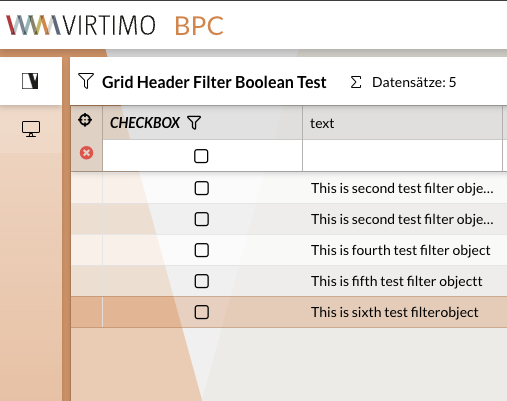
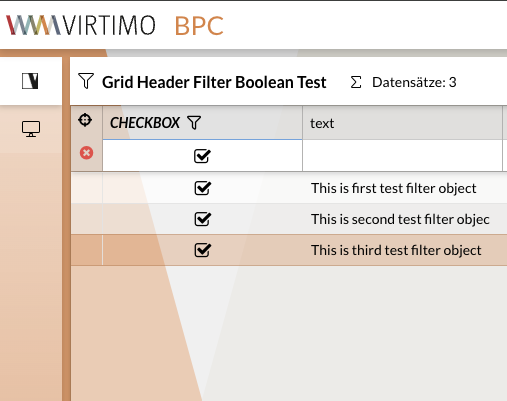
It is possible to define a column for boolean values that displays a checkbox instead of the value. The values for "true" are:
-
true -
'true' -
1 -
'1' -
'ja'
To use a corresponding filter for the column, type must be set to 'check' within filter.
Example
|
|
|
Jump Column (bpcModuleJumpColumn)
To jump from the monitor to another module (e.g., another monitor), an additional column with the xtype bpcModuleJumpColumn must be inserted in the column_config.
In this column, the ID of the target module is entered under targetModule.
The column is then displayed with an icon in each row of the monitor.
Clicking the icon executes the jump.
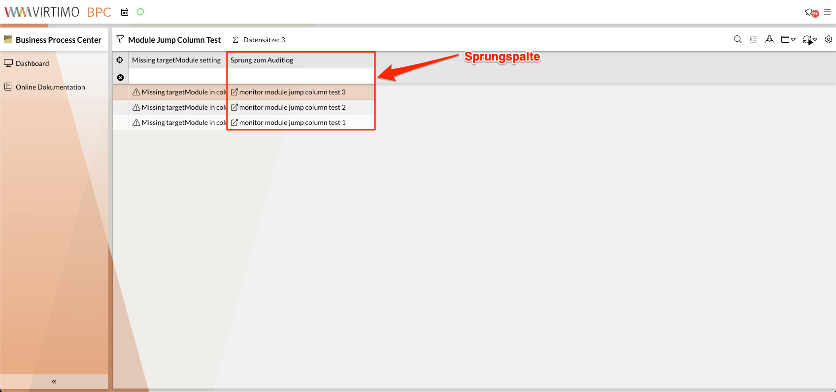
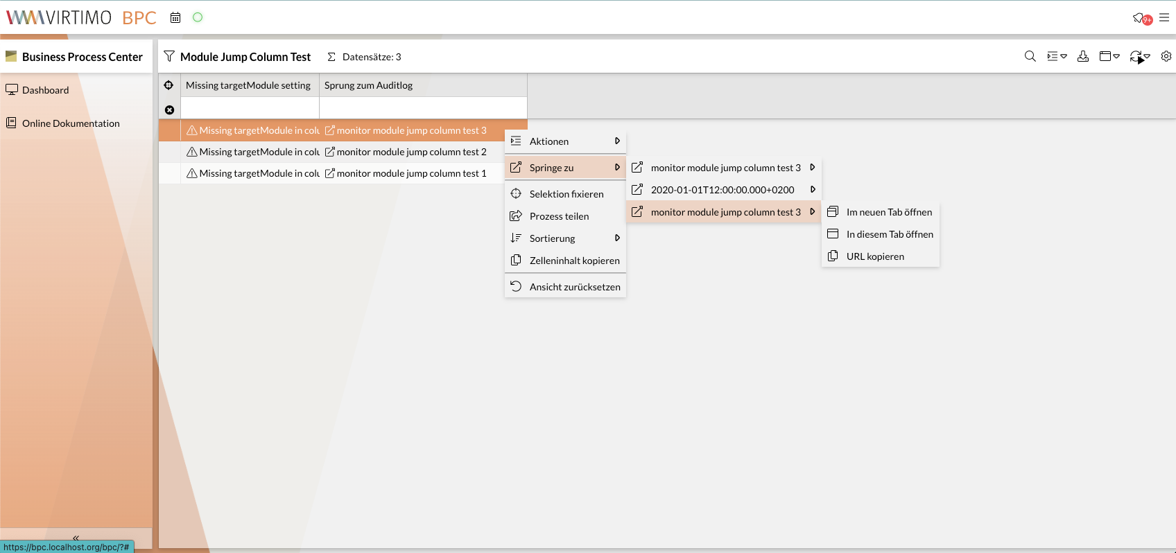
It is also possible to trigger the jump to the target module via the context menu. In the context menu, the target module can be opened in three different modes:
-
Im neuen Tab öffnen: The target module is opened in a new tab. -
In diesem Tab öffnen: The target module is opened in the same tab. -
URL kopieren: The URL of the target module is copied to the clipboard.
|
You can disable the jump options |
If sourceColumn and targetColumn are specified, the current value from the sourceColumn is set as a filter on the targetColumn column in the target monitor when jumping.
column_config {
"targetModule": "auditlog",
"xtype": "bpcModuleJumpColumn",
"dataIndex": "text",
"targetColumn": "action",
"width": 300,
"text": "Sprung zum Auditlog",
"sourceColumn": "auditlog_action"
}Configuration Parameters
| Name | Example Value | Description |
|---|---|---|
|
|
This specification is mandatory for using the jump column. |
|
|
Reference to the data field in the data source.
If the field in the current data record (row) contains no value, no link is provided.
This value is often identical to |
|
|
Should be set uniquely if |
|
|
ID of the module to be jumped to. Can also be the ID of the source monitor if the current view is to be filtered. |
|
|
Specifies the data field to be filtered in the target monitor. |
|
|
Is appended to the URL route of the target module and can be evaluated separately by the module. |
|
|
Optional JSON configuration passed to the target module. |
|
|
Specifies the data field whose value is used for the target monitor’s filter.
This value is often identical to |
|
|
Specifies whether a link icon should be displayed in the cell.
Default: |
|
|
Specifies whether the current value (see |
|
|
Operator for the filter on the target monitor.
Default: |
|
|
Specifies the data type to be filtered by.
Default: |
|
|
Specifies the filter type to be set.
Default: |
|
|
If this value is |
|
|
Name of the function that should process the jump parameters. The returned value must not contain any circular references. Must be supported by the target module. |
|
|
For the "Data Management" target module.
The column content is interpreted as |
|
|
For the "Data Management" target module.
For |
|
|
Only for the "External Content" target module. A template that is evaluated with the current data record. The result is appended to the URL of the “External Content” module. |
|
|
Label for the column header. |
|
|
Icon displayed in the column header. |
|
Omit or specify |
|
|
|
Icon displayed in the cell.
Default: |
|
|
Splits the string at the separator and creates individual links.
In this case, |
|
|
Opens the target module in a new tab.
Default: |
|
Disables the advanced jump options in the context menu. |
|
|
Icon displayed in the jump column menu item. |
|
|
Text displayed in the jump column menu item. A template can be used. This allows you to combine column configuration attributes, the source column value, and translations with static content in any way you like. +
.Example
+
Assuming that the column value is |

Configure Jump Column for Data Management
Jumps from a monitor to an artifact in Data Management are possible via their display names or their technical IDs (assets).
Please note that the display name is a configuration detail of Data Management.
If the display name is selected for the link and later changed, this causes problems with the jump columns configured to use it.
To prevent this, the display name could be marked as unchangeable in Data Management.
You can check what the display name looks like directly in Data Management in the “Display Name” column.
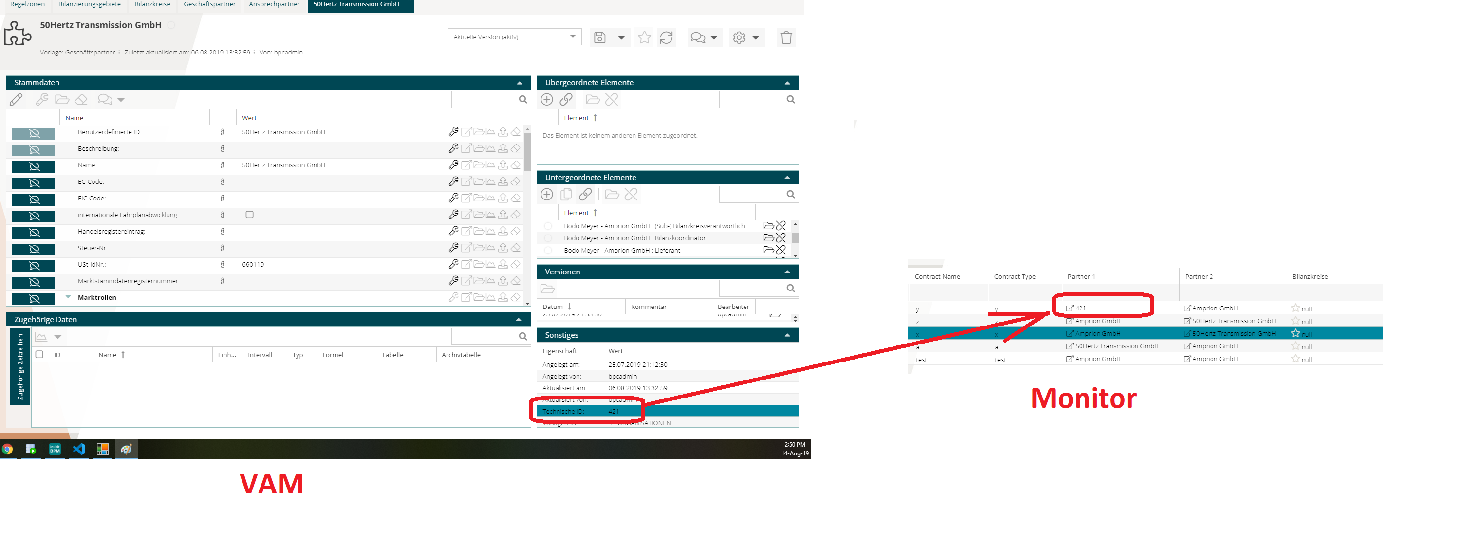
A second method is configuration via assets, as shown in the image.
To do this, vamLinkType must be set to assets.
The image also shows where assets can be found.
In this case, the Data Management artifact whose technical ID matches the value in the monitor is linked.
Filter Types
Each column should contain a configuration for the filter in the monitor.
This configuration includes at least the attribute type and, depending on that, the attribute source.
Additional attributes may be included depending on the filter type.
The attribute type specifies the filter to be used.
These filters are described individually below.
The filter type is not necessarily tied to the data or column type; however, not all combinations are meaningful.
|
To disable the filter for a column, the |
Renderers in Filters
If a CustomRenderer has been defined for a column, it is also applied to the suggestion list in the filter field.
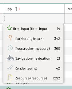
First, the rendered value is displayed, followed by the source value in parentheses, and finally—if known—the number of records with that value.
If you do not want the source value to be displayed, you can hide it by specifying ` "hideRawValue": true ` in the filter configuration.
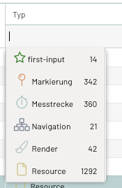
List Filter (type = dynamiclist)
The dynamicList filter allows the user to select filter values from an automatically generated list.
The list is compiled from all values for this column available in the monitor.
If this list of results is incomplete, a warning is displayed indicating the number of values not shown.
If all values are to be displayed, the filter can either be set to remote or the maxQuerySize Parameter can be increased.
|
This filter type can only be used with |
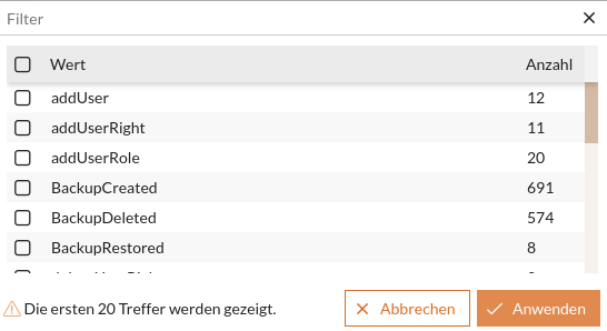
Local filter (default)
To use this filter, the queryMode Parameter must be omitted or set to local.
When the filter field is opened, the results list is loaded once.
By default, only the first 100 unique values and their rendered representations are included.
However, the length of the results list can be controlled using the ` maxQuerySize` parameter (maximum: 1000).
If the suggestion list should include more values (e.g., 250), the following setting should be configured:
{
    "filter": {
      "type": "dynamiclist",
      "fieldConfig": {
        "queryMode": "local",
        "maxQuerySize" : 250
      }
    }
  }
However, this means that when typing text, suggestions will no longer be based on the rendered values, but only on the raw values in the underlying database.
Remote Filter
To use this filter, the Parameter queryMode must be set to remote.
After opening the filter field, the results list is reloaded every time you type in the filter field.
By default, only the first 100 unique values and their rendered representations are included.
The length of the results list can be controlled using the ` maxQuerySize` Parameter (maximum: 1000).
If the suggestion list should include more values (e.g., 250), the following setting should be configured:
{
    "filter": {
      "type": "dynamiclist",
      "fieldConfig": {
        "queryMode": "remote",
        "maxQuerySize" : 250
      }
    }
  }
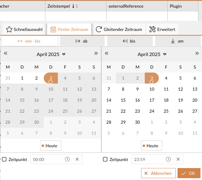
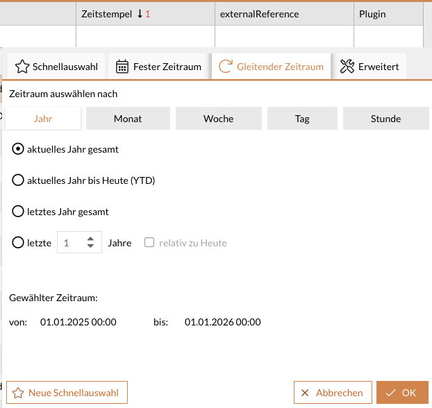
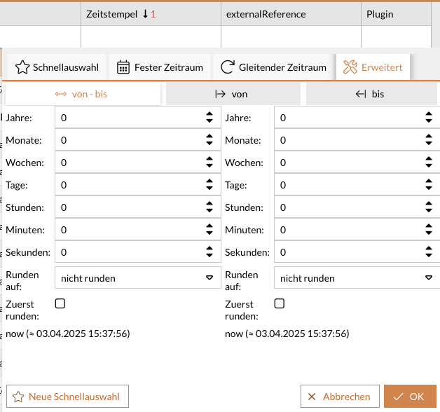
Time Period Filter (type = daterange)
This filter provides a selection component for absolute and relative time periods.
The quick selection of rolling time periods can be configured using the configuration parameter dateRange_favorites.
The component can be customized as needed using the fieldConfig on the columns.
{
    "filter": {
      "source": "raw",
      "fieldConfig": {
        "absoluteDefaultStartTime":"00:00:00",
        "absoluteDefaultEndTime":"23:59:59"
      },
      "type": "daterange"
    },
    "xtype": "datecolumn",
    "hidden": false,
    "dataIndex": "timestampUTC",
    "hideable": true,
    "width": 200,
    "customRenderer": false,
    "localized": {
      "text": "CORE_TIME"
    },
    "minWidth": 64
  }
Numeric Filter (type = number)
This filter allows you to filter using numeric values.
The default operator can be defined in ColumnConfig.
If none is defined, = is the default operator.
You can also set the operator (>, <, =, ⇐, >=) via the column menu.
{
    "filter": {
      "type": "number",
      "operator": ">"
    }
  }
JSON Filter (type = json)
The JSON filter enables filtering within structured JSON data fields. It allows the user to define and combine multiple filter criteria (key-value pairs) for a single column simultaneously.
-
Dynamic Key Detection: When opened, the picker automatically loads all unique keys for this column that are present in the data source.
-
Combined filters: You can enter an individual filter value for each key in the picker’s grid. The entered filters are transmitted to the backend as combined store filters in the format
<columnId>.<key>. -
Overview in the column header: Active filters are summarized concisely in the column header (e.g.,
key: value (+X weitere)). A mouseover tooltip clearly lists all active filter details.
{
  "dataIndex": "related_fields",
  "xtype": "jsonColumn",
  "text": "Strukturierte Daten",
  "filter": {
    "type": "json"
  }
}