Themes Variable
Basic variable for a quick result
If you want to create an individual theme, open the file companyConfig.scss in the theme folder at …\packages\local\bpc-theme-[customer]\sass\var.
The variables in the theme template are commented so that the assignment and function is clear.
If the value in the template should not differ from the base theme, then the corresponding variable must also be commented out.
//In this file you define all the Basics for the Company Theme

//Please choose if you want to use a Light or dark theme
$LightTheme: true; (1)

//Decide if you want a neutral color for Panel headers and borders - default = false
$CompanyNeutralPanels: false; (2)

//primary color for buttons and selections
$CompanyMainColor: darken(#96bebe, 5%); (3)
$CompanyMainContrastColor: white; //used for text on top of the Main Color (4)

//[OPTIONAL]- define a different color for the action buttons
$CompanyButtonColor: $CompanyMainColor; (5)
$CompanyButtonContrastColor: $CompanyMainContrastColor; (6)

//Logo
$CompanyLogo: "/bpc-theme-template/resources/images/galaxy.svg"; (7)
$CompanyLogoWidth: 48px; (8)
$CompanyLogoSpace: 10px; (9)

//Icon
$CompanyIcon: "images/white_icon.png"; // for darker main colors (10)

$CompanyProductText: "Template Inc."; (11)
$CompanyProductTextSize: 26px; (12)| 1 | Helles (true) oder dunkles Design (false) |
| 2 | Farbige Panel-Headers ($CompanyNeutralPanels: true/false) |
| 3 | Wahl der Hauptfarbe |
| 4 | Wahl der Kontrastfarbe |
| 5 | Hintergrundfarbe der Buttons |
| 6 | Kontrastfarbe der Buttons |
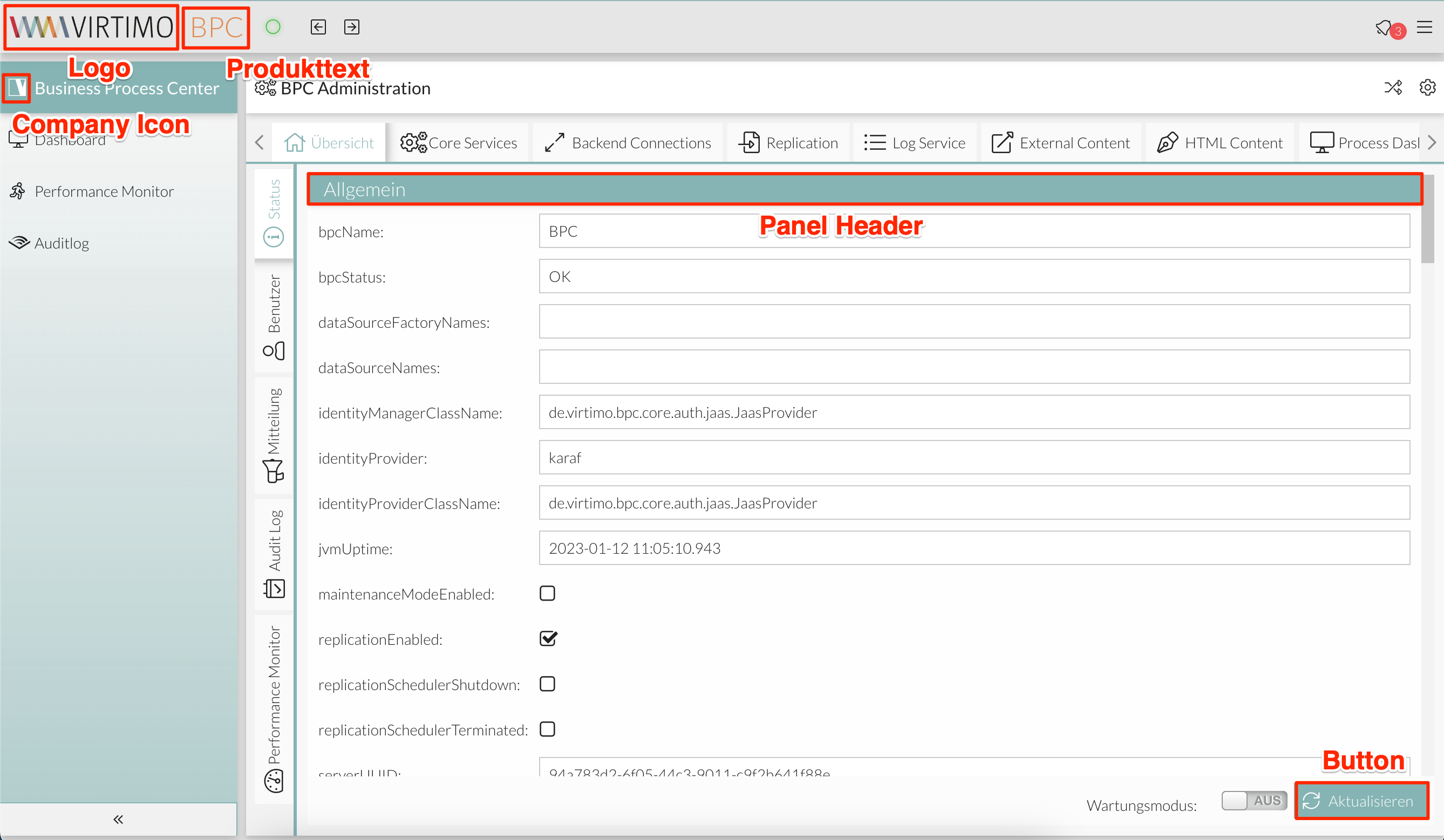
| 7 | Wahl eines Logos für die BPC-Toolbar. Bitte beachten Sie, dass alle Pfade absolut angegeben werden sollten. |
| 8 | Breite des Logos |
| 9 | Margin vom Logo zu dem nächsten Element nach dem Logo, z.B. zu dem Produktnamen |
| 10 | Definition eines Icons von der Firma, welches im BPC verwendbar ist. Die CSS-Klasse des Icons lautet: .companyIcon. |
| 11 | Text, der neben dem Logo stehen soll, z.B. für Produktnamen |
| 12 | Größe des Produkttextes |
In den meisten Fällen lässt sich damit in kurzer Zeit ein Kunden-Theme erstellen.
Beispiel:
|
Company-Icon wird als Icon für die Applikation "Business Process Center" verwendet. Dazu muss man in der Navigationseinstellung dem Feld Icon den Wert "companyIcon" setzen. In dem Beispiel wird das Virtimo-Icon als Company-Icon gesetzt. |
Fortgeschrittene Konfigurationen
Möchte man aber mehr Kontrolle über die Farben in der Anwendung haben, sind die Optionen in der Datei advancedConfig.scss anzupassen.
Nachfolgend sind die Konfigurationsmöglichkeiten und Beispiele aufgeführt.
Haupt- und Kontrastfarbe für ausgewählte Komponenten
Ausgewählte UI-Komponenten, z.B. aktive Tabs, aktive Tabellenzeilen, Schaltflächen (sofern nicht anders definiert), einige Symbole, Hervorhebungen in Menüs und auf Tabellen, lassen sich mit folgenden Variablen anpassen:
// Primärefarbe für Komponenten
$VirtimoMainColor: red;
// Schriftfarbe auf der Primärfarbe
$VirtimoMainContrastColor: white;
Haupt- und Kontrastfarbe für Buttons
Die Hintergrundfarbe und Text-Farbe von Buttons lassen sich mit folgenden Variablen anpassen:
$VirtimoButtonColor: red;
$VirtimoButtonContrastColor: white;
Schriftfarbe
Die Farbe von Text allgemein und Icons lässt sich mit folgender Variable anpassen:
$VirtimoTextColor: red;
Haupt- und Kontrastfarbe der Panel-Header
Die Panel-Headers sind standardmäßig weiß. Diese Farbe lässt sich mit folgenden Variablen anpassen:
$VirtimoPanelColor: red;
$VirtimoPanelTextColor: white;
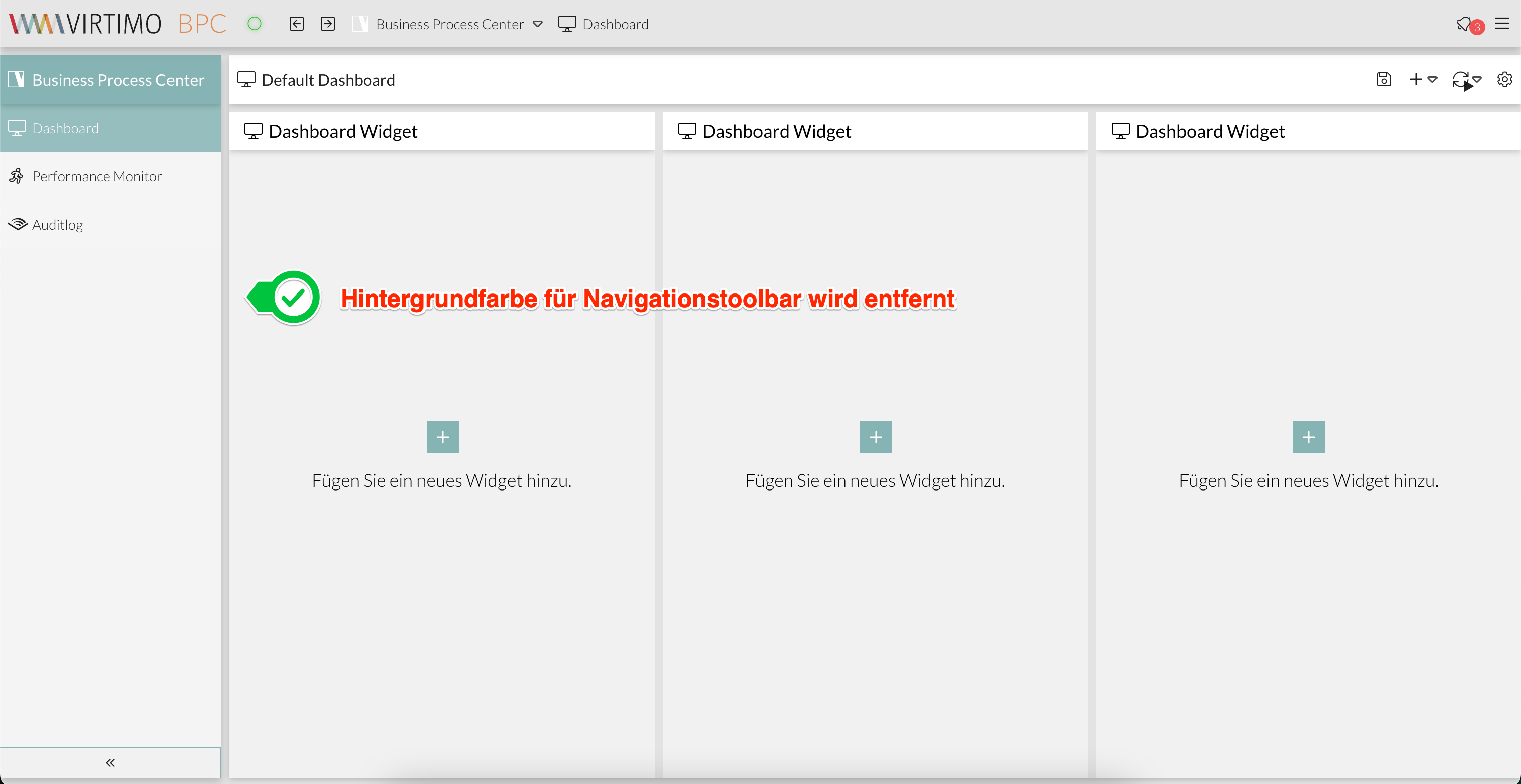
Hintergrundfarbe der BPC-Toolbar
Die Farbe der Toolbar lässt sich mit folgender Variable anpassen:
$VirtimoToolBarBackgroundColor: red;
Farbe des Buttons zum Wechseln von Applikationsbereichen
Die Hintergrund- und Text-Farbe vom Applikationsbereich-Switcher lassen sich mit folgenden Variablen anpassen:
$bpcApplicationAreaSwitchButtonBackgroundColor: red;
$bpcApplicationAreaSwitchButtonColor: white;
Hintergrundfarbe und Farbverlauf der Navigationsleiste
Die Navigationsleiste ist standardmäßig transparent und hat einen Farbverlauf der Hauptfarbe als Hintergrundeffekt.
ExtJS Variablen
Es besteht die Möglichkeit, mit ExtJS SASS Variablen die Farbe der UI-Komponenten im BPC anzupassen. Diese Option ist jedoch nur für erfahrene Experten in der Entwicklung mit ExtJS empfohlen.
Nachfolgend sind Beispiele von ExtJS SASS Klassen aufgeführt. Weitere Variablen sind in der ExtJS offiziellen Dokumentation zu finden (siehe ExtJS - Theming Components)
Window
//************ Window
//background
$window-header-background-color : dynamic($VirtimoMainColor);
$window-body-background-color: dynamic($lighterBackgroundColor);
//text color
$window-header-color: dynamic($VirtimoMainContrastColor);
$window-header-glyph-color : dynamic($VirtimoMainContrastColor);
$window-body-color: dynamic($color);
$messagebox-info-glyph-color: dynamic($color);

//borders
$window_border_color: $VirtimoBorderColor;
Grid
//background
$grid-header-background-color: dynamic(darken($mainViewBackgroundColor,10%));
$grid-row-cell-background-color: dynamic(rgba($mainViewBackgroundColor,0.7));
$grid-row-cell-alt-background-color: dynamic(darken($mainViewBackgroundColor, 5%));
$grid-row-cell-over-background-color: dynamic($VirtimoHighLightColorHover);
$grid-row-cell-focus-background-color: dynamic(transparent);
$grid-row-cell-selected-background-color: dynamic($VirtimoHighLightColorPressed);
$grid-grouped-header-background-color:  dynamic(darken($mainViewBackgroundColor,15%));
//text color
$grid-header-trigger-glyph-color: dynamic($color);
$grid-header-sort-glyph-color: dynamic($color);
$grid-column-header-color: dynamic($color);
$grid-column-header-focus-color: dynamic($color);
$grid-row-cell-color: dynamic($color);
$grid-row-cell-over-color: dynamic($color);
$grid-row-cell-selected-color: dynamic($VirtimoMainContrastColor);
$grid-actioncolumn-icon-glyph-color: dynamic($color);
$grid-checkcolumn-glyph-color: dynamic($color);
$grid-grouped-title-color: dynamic($color);
$grid-grouped-title-glyph-color: dynamic($color);
//borders
$grid-row-cell-border-color: dynamic(transparent);
$grid-row-cell-over-border-color: dynamic(transparent);
$grid-row-cell-selected-border-color: dynamic(transparent);
$grid-row-cell-focus-border-color: dynamic(transparent);
$grid-grouped-header-border-color:  dynamic(rgba($mainBorderColor,0.7));

//***********Grid* Editor
//background
$grid-row-editor-background-color: $darkerBackgroundColor;

//************ Tree
$tree-glyph-color: dynamic($VirtimoMainColor);

//************ TABS
//background
$tab-base-color: dynamic(lighten($darkerBackgroundColor, 10%));
$tab-base-color-active: dynamic($VirtimoMainColor);
$tab-base-color-over: dynamic($VirtimoHighLightColorHover);
$tab-base-color-focus-active: dynamic($VirtimoMainColor);
$tab-base-color-focus-over: dynamic(lighten($VirtimoMainColor,10%));
$tab-outline-offset-focus: dynamic($VirtimoMainColor);
$tabbar-base-color: dynamic($darkerBackgroundColor);
//text color
$tab-color: dynamic($color);
$tab-color-over: dynamic($color);
$tab-color-focus: dynamic($color);
$tab-color-focus-over: dynamic($color);
$tab-color-active: dynamic($VirtimoMainContrastColor);
$tab-color-focus-active: dynamic($VirtimoMainContrastColor);
$tabbar-scroller-glyph-color: dynamic($color);
$box-scroller-menu-arrow-base-text-color: dynamic($color);
// close icon color for closable tabs
$tab-closable-icon-glyph-color: dynamic($tab-color);
$tab-closable-icon-glyph-color-over: dynamic($tab-color-over);
$tab-closable-icon-glyph-color-focus-over: dynamic($tab-color-over);
$tab-closable-icon-glyph-color-active: dynamic($tab-color-active);
Combobox selection
//************ DropDown List
//background
$boundlist-background-color: dynamic($darkerBackgroundColor);
$boundlist-item-over-background-color: dynamic($VirtimoHighLightColorHover);
$boundlist-item-selected-background-color: dynamic($VirtimoHighLightColorPressed);
//text color
$boundlist-item-over-text-color: dynamic($color);
$boundlist-item-text-color: dynamic($color);
$boundlist-item-selected-text-color: dynamic($VirtimoMainContrastColor); //dynamic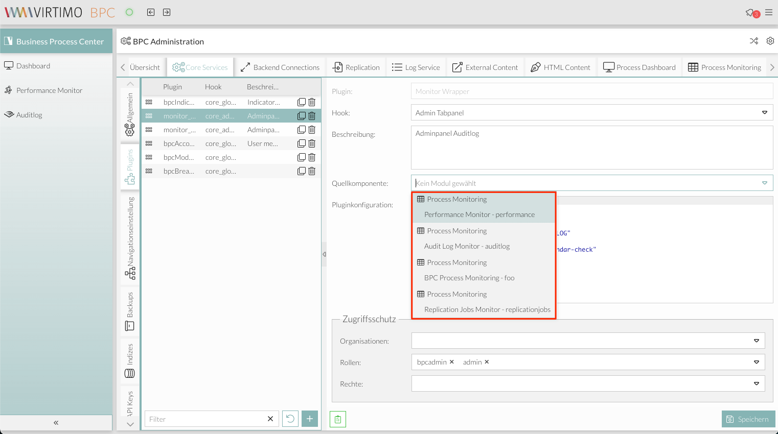
Menu
//background
$menu-background-color: dynamic($darkerBackgroundColor);
$menu-item-active-background-color: dynamic($VirtimoHighLightColorPressed);
//text color
$menu-item-color: dynamic($color);
$menu-item-checkbox-glyph-color: dynamic($color);
$menu-text-color: dynamic($color);
$menu-glyph-color: dynamic($color);
$menu-item-arrow-glyph-color: dynamic($color);
$menu-item-active-text-color: dynamic($VirtimoMainContrastColor);
//borders
$menu-separator-background-color: dynamic($mainBorderColor);
$menu-separator-border-color: dynamic($mainBorderColor);
Date Picker
//background
$datepicker-header-background-color: dynamic(darken($mainViewBackgroundColor,5%));
$datepicker-background-color: dynamic($darkerBackgroundColor);
$datepicker-item-selected-background-color: $VirtimoHighLightColorPressed;
$datepicker-item-hover-background-color : dynamic($VirtimoHighLightColorHover);
$datepicker-month-button-over-background-color : dynamic($VirtimoHighLightColorHover);
$datepicker-monthpicker-item-selected-background-color : dynamic($VirtimoHighLightColorPressed);
//text color
$datepicker-arrow-glyph-color: dynamic($color);
$datepicker-month-button-arrow-glyph-color: dynamic($color);
$datepicker-item-selected-color: dynamic($VirtimoMainContrastColor);
$datepicker-monthpicker-item-selected-color :$VirtimoMainContrastColor;
Form Field
//************  Formfields
// formfields
$formfieldColor: dynamic($lighterBackgroundColor);
//backgrounds
$form-field-background-color: dynamic($formfieldColor);
$form-field-invalid-background-color: dynamic($formfieldColor);
$tag-field-item-background-color: dynamic($formfieldColor);
$fieldset-background-color: dynamic(rgba( darken($formfieldColor, 15%), 0.8));
//Text and glyph color
$form-field-color: dynamic($color);
$form-field-empty-color: dynamic($color);
$form-text-field-color: dynamic($color);
$form-label-font-color: dynamic($color);
$form-file-field-color:dynamic($color);
$form-trigger-glyph-color: dynamic($color);
$form-checkbox-glyph-color: dynamic($color);;
$form-toolbar-label-font-color: dynamic($color);
$tag-field-item-color: dynamic($color);
$tag-field-item-close-icon-glyph-color:dynamic($color);
$fieldset-header-color: dynamic($color);
//borders
$fieldset-border-color: dynamic($mainBorderColor);
$form-field-border-color: dynamic($mainBorderColor);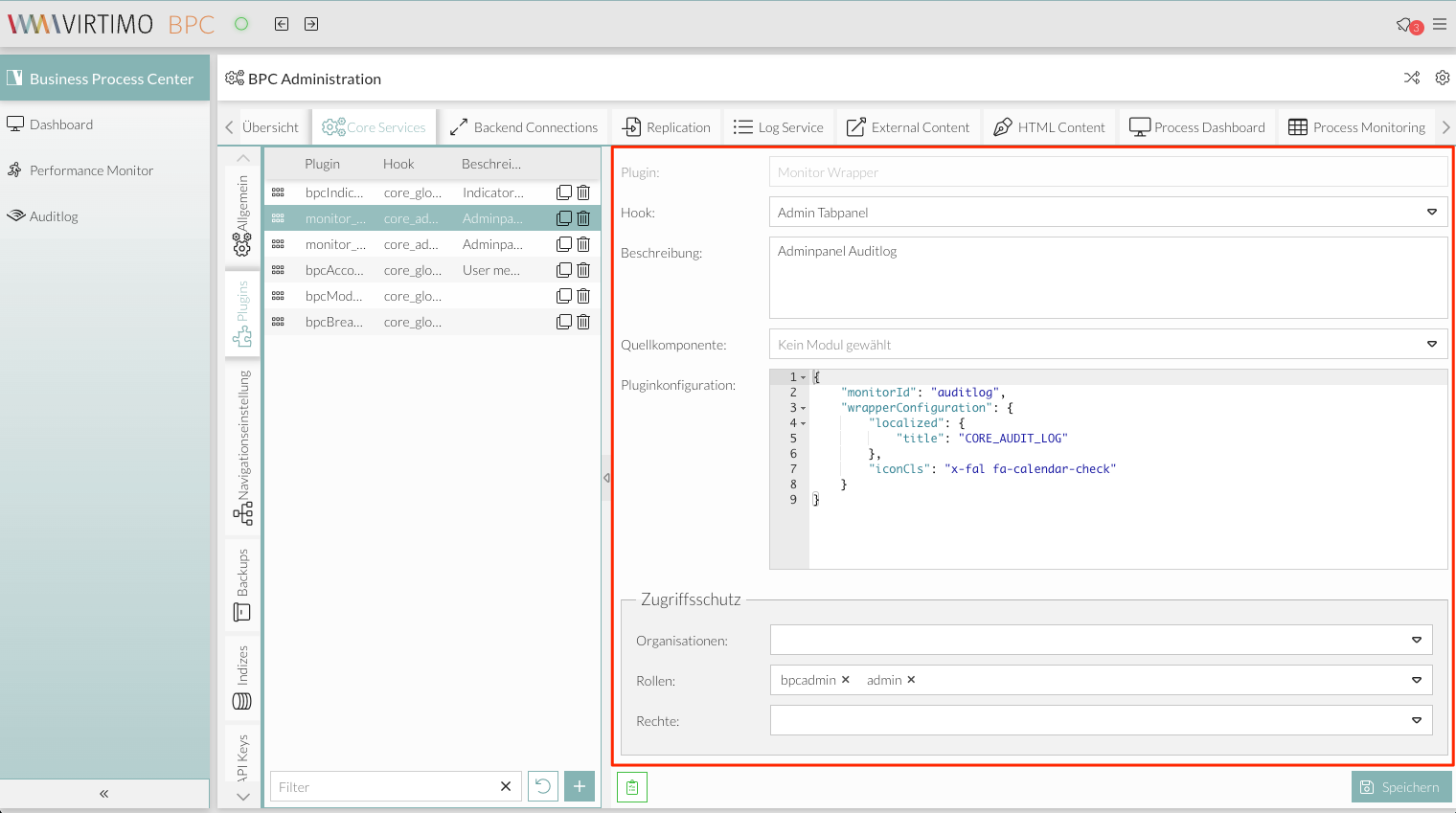