Configuring the Monitor Columns
Column configuration in the monitor is done via the setting column_config.
The setting consists of a JSON array in which an object is specified for each column.
It looks something like this:
[
	{
		SPALTEN_KONFIGURATION_FUER_SPALTE_1
	},
	{
		SPALTEN_KONFIGURATION_FUER_SPALTE_2
	},
	{
		SPALTEN_KONFIGURATION_FUER_SPALTE_n
	}
]|
The following column configurations apply only to the table in the monitor and cannot be applied to the column configurations of the tables in the detail views. For column configurations in the detail views, see also: Configuring Monitor Detail Views. |
Configuring a Column
A column’s configuration is defined in a JSON object and can include the following attributes:
| Attribute | Data Type | Description | ||
|---|---|---|---|---|
dataIndex |
text |
Column/field name of the data source whose value is to be displayed.
|
||
text |
text |
Column header label |
||
headerIconCls |
text |
Icon displayed in the column header. |
||
hidden |
boolean |
Initial visibility of the column. |
||
hideable |
boolean |
If this value is false, the user cannot change the visibility. |
||
width |
number |
Width of the column in pixels. |
||
xtype |
text |
Configuration of the column type, e.g., datecolumn, bpcCheckColumn, booleancolumn, actioncolumn, attachmentcolumn. |
||
customRenderer |
boolean/text |
Controls the column display or renderer. |
||
filter |
JSON |
|
In addition to the automatically set object attributes, you can set the following values:
| Attribute | Data type | Description | ||
|---|---|---|---|---|
format |
string |
This attribute allows you to customize the display of date values, time values, or numbers. Examples: |
||
formatter |
string |
This attribute allows the use of a method from Ext.util.Format to format the value. "formatter": "fileSize" |
||
cellWrap |
boolean |
Allows text breaks (line breaks) within a cell. |
||
role |
string|string[] |
Restricts column visibility to a specific role. If a list of roles is specified, the current user must have at least one of those roles. Example: "role": ["bpcadmin"] |
||
organisation |
string|string[] |
Restricts column visibility to a specific organization. If a list of organizations is specified, the current user must be assigned to at least one of the organizations. Example: "organisation": ["banker"] |
||
right |
string|string[] |
Limits column visibility to a right. If a list of rights is specified, the current user must have at least one of the rights. Example: "right": ["to_something_right"] |
||
flowId |
string |
ID of the flow component that the system references, which writes data to the monitor.
Example: "flowId": "mein-iguasu" |
||
hideUnknownObjects |
boolean |
If
|
||
linkIcon |
string |
Defines the icon displayed next to the text. Example: "linkIcon": "x-fal fa-fire"
|
Renderer (customRenderer)
The following description refers to the customRenderer attribute in the column configuration.
There are three different configuration options.
Boolean value
Setting this to false means no renderer is used.
When true , the monitor component’s configuration (see screenshot on the right) first searches for a renderer with a matching name.
Matching is based on renderer name = column data index (e.g., PROCESSID = PROCESSID).
Purpose: to display different renderers for different values in the same column.
If no renderer with a matching name is found, the "defaultRenderer" is used.
|
Specifying the renderer name
If you specify the renderer name as a string, there are two options:
A search is performed in column_customerRenderer for a renderer with the specified name.
Example:
"customRenderer": "TEST-RENDERER" expects an entry named "TEST-RENDERER" in "column_customRenderer".
Referencing Custom Renderer Functions
To use custom renderer functions, the following syntax must be used in the configuration:
MODUL!_!FUNKTION
This specification is converted to the following form: MODUL.Module.FUNKTION()
This function is evaluated, and the renderer function is expected as the return value.
To use a custom function, it must be loaded when the monitor is called.
This can be done, for example, by including a custom BPC module or using the configuration `"view_additionalFiles" (see Core Services).
The following function can be configured as a renderer as follows:
"customRenderer": "bpcCustomRenderer!_!uppercase"
Ext.define("bpcCustomRenderer.Module", {
    singleton: true,

    uppercase: function () {
        return function (value, meta, record) {
            return String(value).toUpperCase();
        };
    }

});
If not defined, the system checks whether the respective column has the dataIndex “STATUS,” and if so, the defaultRenderer from the object is used.
Additional column configuration parameters can be found directly in the ExtJS documentation.
Formatter
The following description refers to the formatter attribute in the column configuration.
Translate
If the formatter attribute is set to "translate" in the column configuration, the values of this column are translated, provided a corresponding translation is available.
    {
        "formatter": "translate",
        "dataIndex": "STATUS",
        "text": "STATUS"
    }
Datum
Wird in der Spaltenkonfiguration das Attribut formatter beispielsweise auf "date(Y-m-d)" gesetzt, werden die Werte dieser Spalte im Monitor als Datum im angegebenen Format dargestellt.
    {
        "formatter": "date(Y-m-d)",
        "dataIndex": "timestamp",
        "text": "Time"
    }
Runden
Wird in der Spaltenkonfiguration das Attribut formatter beispielsweise auf "round(2)" gesetzt, so werden die Werte dieser Spalte auf 2 Nachkommastellen gerundet.
Klein/Großschreibung
Wird in der Spaltenkonfiguration das Attribut formatter beispielsweise auf "lowercase" gesetzt, so werden die Werte dieser Spalte auf in lowercase dargestellt. Analog geht diese Konfiguration auch mit uppercase
    {
        "formatter": "lowercase"
} {
"formatter": "uppercase"
}Für weitergehende Informationen zu Formatierung in Monitorspalten siehe ExtJS Dokumentation
Spaltentypen
Der Spaltentyp wird durch die Einstellung des xtype definiert.
Ist kein xtype angegeben, handelt es sich um eine einfache Textspalte.
Optionen:
| xtype der Spalte | Filter.Type-Option | Beschreibung |
|---|---|---|
datecolumn |
date |
Komplexes Datumsfeld |
datecolumn |
simpleDate |
Einfaches, schnelles Datumssuchfeld, welches den Filter auf den angegebenen Tag setzt. |
attachmentcolumn |
Spalte zum Download von Inhalten aus der SQL-Tabelle. |
|
templatecolumn |
Eine Spalte, deren Wert im Frontend via JS manipuliert werden kann. |
|
bpcCheckColumn |
Checkbox-Spalte |
|
gridActionColumn |
Eine Spalte, die alle ProcessAction-Spalten in einer Spalte kombiniert und einen Button oder Dropdown für diese Actions anzeigt. |
TemplateColumn - xtype = templatecolumn
Die templatecolumn bietet die Möglichkeit den Wert der Spalte im Frontend zu modifizieren und bspw. zu kürzen, umzuwandeln oder um Werte aus anderen Spalten anzureichern.
Hiermit kann bspw. eine Hyperlink-Spalte erzeugt werden.
Um eine Spalte mit Hyperlink zu erzeugen, kann in der ColumnConfig der Spalte der xtype templatecolumn gegeben und das Template tpl definiert werden.
Über die Platzhalter mit den geschweiften Klammern können auf sämtliche Daten (Spalten) des aktuellen Record (der aktuellen Zeile) mit deren dataIndex zugegriffen werden.
Sollen noch Funktionen auf den Wert angewendet werden, müssen innerhalb der geschweiften noch eckige Klammern eingefügt werden.
Dann allerdings muss den dataIndizes noch "values." vorangestellt werden.
Bspw. eine Jira-Ticket-Spalte:
{
    "text": "Jira-Link",
    "dataIndex": "JIRA",
    "xtype": "templatecolumn",
    "tpl": "<a target=\"_blank\" href=\"{JIRA}\">{[values.JIRA.substr(values.JIRA.lastIndexOf('/') + 1)]}</a>",
    "width": 300,
    "minWidth": 64
}
In this example, a column with the dataIndex "JIRA" is created, which contains a Jira link in OpenSearch.
In BPC, the column is populated with a hyperlink that opens (target=\"_blank\") in a new window, where the href is the value of the column itself: {JIRA}
The link text is truncated to the substring after the last slash using the JS function values.JIRA.substr(values.JIRA.lastIndexOf('/') + 1).
This is achieved in the template via {[values.JIRA.substr(values.JIRA.lastIndexOf('/') + 1)]}.
Date - xtype = datecolumn
An attempt is made to interpret the column’s value as a date and display it in a formatted manner.
The date format can be controlled using the format attribute.
The syntax for the format can be found here.
If no format is specified for the column, the date format of the monitor instance is used.
Process Action Column - xtype = gridActionColumn
If action columns are configured in a monitor that can be executed via the toolbar or the context menu, it is possible to create an action button for each row by adding this column.
Multiple action columns and multiple action entries within a single column are grouped into a dropdown menu. The number of actions is displayed on the button.
If only one action is available, it can be started directly by clicking the button.
The column can accept an additional Parameter: showIconOnly, which takes true or false
This controls whether the button displays the full text per column or just the icon and the number of available actions.
The default value is false.
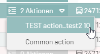
{
    "dataIndex": "Action",
    "xtype": "gridActionColumn",
    "showIconOnly": false
}
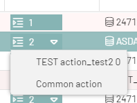
{
    "dataIndex": "Action",
    "xtype": "gridActionColumn",
    "showIconOnly": true
}
Attachment Column
This column type can be used to directly provide a download button for columns that contain a file.
The following monitor settings are used.
-
inubit_baseUrl
-
inubit_referenceEndpoint
-
inubit_proxyId
-
column_id
-
column_file
{
    "filter": {
                "source": "raw",
                "type": "text"
                },
    "xtype": "attachmentcolumn",
    "hidden": false,
    "dataIndex": "REFFILE",
    "hideable": true,
    "width": 200,
    "customRenderer": false,
    "minWidth": 64,
    "text": "REFFILE"
}
bpcCheckColumn
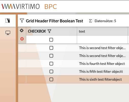
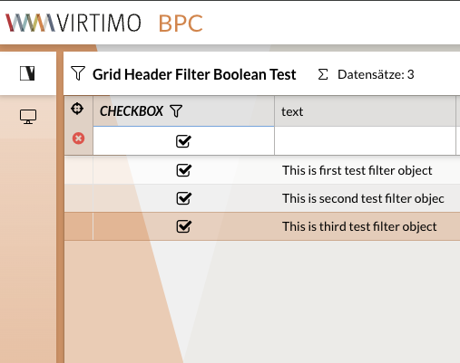
It is also possible to define a column for boolean values that displays a checkbox instead of the value.
The values for "true" are:
-
true
-
'true'
-
1
-
'1'
-
'yes'
To use a corresponding filter for the column, type must be set to 'check' within filter.
Example
|
|
|
Jump Column (JumpColumn)
To jump from the monitor to another module (e.g., another monitor), an additional column with the xtype ` bpcModuleJumpColumn ` must be inserted in the column_config.
In this column, the ID of the target module is entered under "targetModule".
The column is then displayed with an icon in each row of the monitor.
Clicking the icon executes the jump.
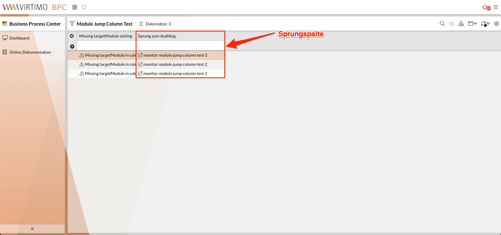
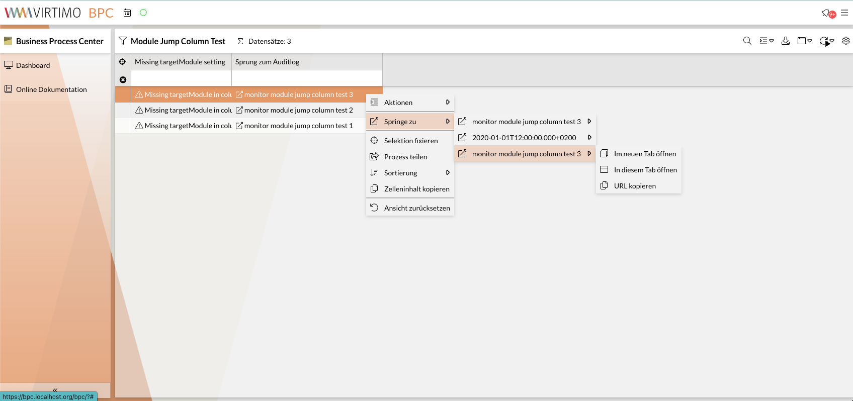
It is also possible to trigger the jump to the target module from the context menu. In the context menu, the target module can be opened in three different modes:
-
Im neuen Tab öffnen: The target module is opened in a new tab. -
Im diesem Tab öffnen: The target module is opened in the same tab. -
URL kopieren: The URL of the target module is copied to the clipboard.
|
It is possible to disable the jump options |
If "sourceColumn" and "targetColumn" are specified, the current value from "sourceColumn" is set as a filter in the target monitor on the "targetColumn" column when jumping.
(...)
 {
    "targetModule": "auditlog",
    "xtype": "bpcModuleJumpColumn",
    "dataIndex": "text",
    "targetColumn": "action",
    "width": 300,
    "text": "Sprung zum Auditlog",
    "sourceColumn": "auditlog_action"
  },
(...)
Configuration parameters
| Name | Example value | Description |
|---|---|---|
xtype |
bpcModuleJumpColumn |
This parameter is required to use the jump column. |
dataIndex |
PROCESSID |
Reference to the data field in the data source. |
stateId |
jumpPROCESSID |
should be set (uniquely) if dataIndex occurs multiple times (e.g., because a normal column with the same dataIndex is also used). |
targetModule |
4711 |
ID of the module to be jumped to. Can also be the ID of the source monitor if the current view is to be filtered. |
targetColumn |
PROCESSID |
Specifies the data field to be filtered in the target monitor. |
targetRoute |
"optional/route" |
Appended to the URL route of the target module and can be evaluated separately by the module. |
targetConfig |
|
Optional JSON configuration passed to the target module. |
sourceColumn |
PROCESSID |
Specifies the data field whose value is used for the target monitor’s filter (often contains the same value as "dataIndex"). |
showIcon |
false |
Specifies whether a link icon should be displayed in the cell. |
showValue |
false |
Specifies whether the current value (see "dataIndex") should be displayed in the cell. |
filterOperation |
=* |
Operator for the filter on the target monitor. |
filterSourceType |
analyzed, lowercase |
Specifies the data type to be filtered by. |
filterType |
date, dynamiclist |
Specifies the filter type to be set. |
forceNewInstance |
true |
If this value is true, the target module is always created anew, even if it has already been displayed. |
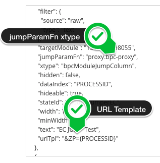
jumpParamFn |
proxy.BPC-proxy |
Name of the function that is to process the jump parameters. The returned value must not contain any circular references. (Must be supported by the target module) |
vamLinkType |
customIds |
For the "Data Management" target module.
The jump column content is interpreted as "id" (for "assets") or "customId" (for "customIds") |
vamTemplateCustomId |
ZAEHLPUNKT |
For the "Data Management" target module.
When using |
urlTpl |
&KEY={COLUMN_NAME} |
Only for the "External Content" target module. A template that is evaluated with the current data record. The result is appended to the URL of the "External Content" module. |
text |
Link |
Column header label |
headerIconCls |
x-fal fa-table |
Icon displayed in the column header |
filter |
Omit or specify |
|
iconCls |
x-fal fa-table |
Icon displayed in the cell. |
separator |
"," |
Splits the string at the separator and creates individual links.
In this case, |
openNewTab |
true |
Opens the target module in a new tab. |
false |
Disables the advanced jump options in the context menu |
|
jumpMenuIconCls |
Icon displayed in the jump column menu item |
|
jumpMenuText |
Text displayed in the jump column menu item. A template can be used. This allows you to combine column configuration attributes, the value of the source column, and translations with static content in any way you like. Example: Assuming that the column value is |
Configure jump column for Data Management
Jumps from a monitor to an artifact located in Data Management are possible via their display names and their technical IDs (“assets”). It is important to note that the display name is a configuration detail of Data Management. This means that if you select the display name for the link but later change it, this change will cause problems for jump columns that have since been configured to use it. To prevent this, you can set the display name in Data Management to “unchangeable” so that it cannot be modified at will later on. You can check what the display name looks like directly in Data Management in the “Display Name” column.
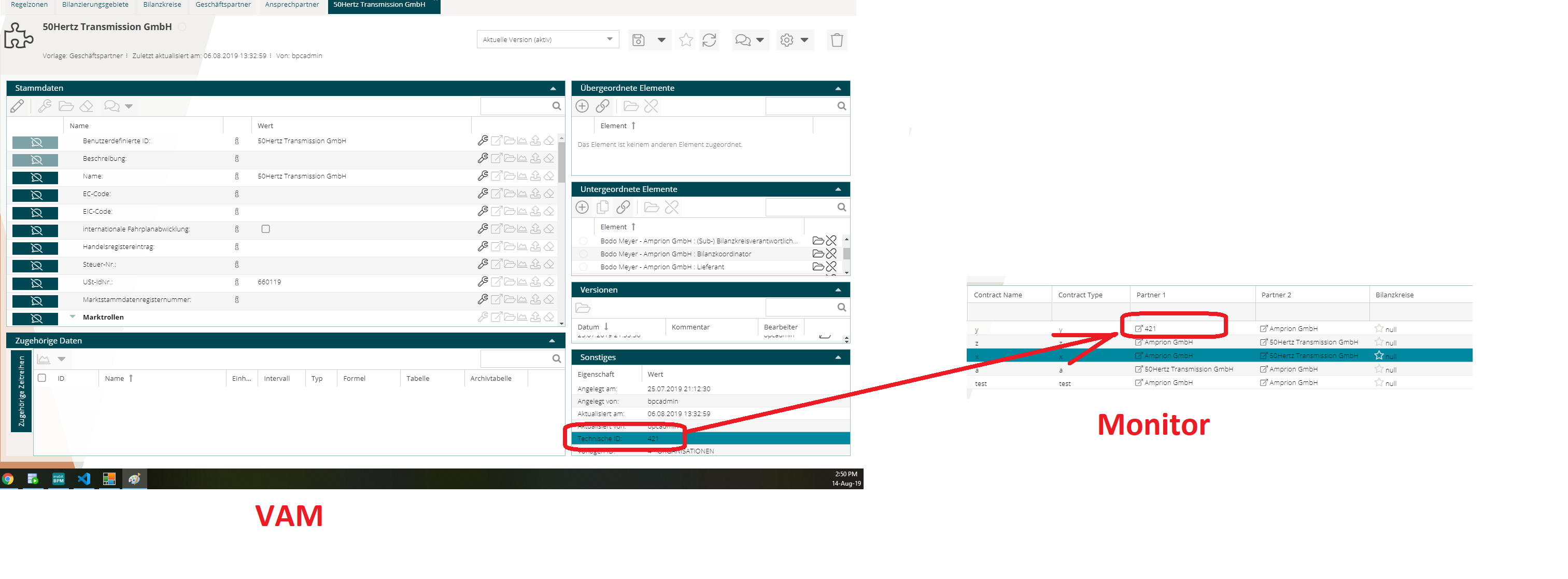
A second method is via the config assets, as shown in the image.
To do this, set ` vamLinkType ` to ` assets `.
The image also shows where to find the assets.
In this case, the Data Management artifact whose TechnicalID matches the value in the monitor is linked.
Filter Types
Each column should contain a configuration for the filter in the monitor.
This configuration includes at least the attribute type and, depending on that, the attribute source.
Additional attributes may be included depending on the filter type.
The type attribute specifies the filter to be used.
These filters are described individually below.
The filter type is not necessarily tied to the data or column type; however, not all combinations are meaningful.
|
Disable filters |
Renderer in Filter
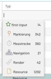
If a CustomRenderer has been defined for a column, it is also applied to the suggestion list in the filter field.
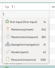
First, the rendered value is displayed, followed by the source value in parentheses, and finally—if known—the number of records with that value.
If you do not want the source value to be displayed, you can hide it by specifying ` "hideRawValue":true ` in the filter configuration.
List Filter - type = dynamiclist
The dynamic list filter allows the user to select filter values from an automatically generated list.
The list is compiled from all values available in the monitor for this column.
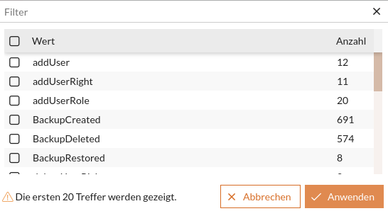
If this list of results is incomplete, a warning displaying the number of values will be shown.
If all values are to be displayed, the filter can either be set to remote or the maxQuerySize Parameter can be increased.
|
This filter type can only be used with |
Local Filter - default
To use this filter, the Parameter queryMode must be omitted or set to local .
When the filter field is opened, the results list is loaded once.
By default, only the first 100 unique values and their rendered representations are included.
However, the length of the results list can be controlled using the maxQuerySize Parameter (maximum 1000).
If the suggestion list is to include more values (in this case, 250), the following settings should be configured.
{
    "filter": {
    (...)
      "type": "dynamiclist",
      "fieldConfig": {
        "queryMode": "local",

        "maxQuerySize" : 250
      }
    },
    (...)
  },
However, this means that when typing text, you will no longer receive suggestions based on the rendered values, but only based on the raw values in the underlying database.
Remote Filter
To use this filter, the Parameter queryMode must be set to remote.
After opening the filter field, the results list is reloaded every time you type in the filter field.
By default, only the first 100 unique values and their rendered representations are included.
However, the length of the results list can be controlled using the ` maxQuerySize` Parameter (maximum 1,000).
If the suggestion list should include more values (in this case, 250), then the following settings should be configured.
{
    "filter": {
    (...)
      "type": "dynamiclist",
      "fieldConfig": {
        "queryMode": "remote",
        "maxQuerySize" : 250
      }
    },
    (...)
  },
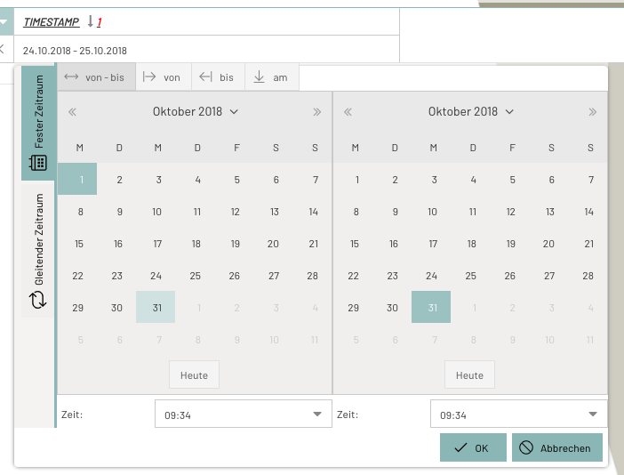
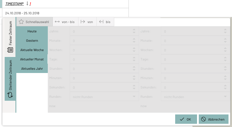
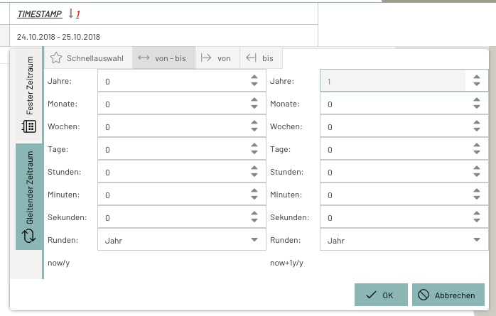
Time Period Filter - type = daterange
Selection component for both absolute and relative time periods.
The quick selection of rolling time periods can be configured using the configuration parameter dateRange_favorites.
The component can be customized as needed using the fieldConfig in the columns.
{
    "filter": {
      "source": "raw",
      "fieldConfig": {
        "absoluteDefaultStartTime":"00:00:00",
        "absoluteDefaultEndTime":"23:59:59"
      },
      "type": "daterange"
    },
    "xtype": "datecolumn",
    "hidden": false,
    "dataIndex": "timestampUTC",
    "hideable": true,
    "width": 200,
    "customRenderer": false,
    "localized": {
      "text": "CORE_TIME"
    },
    "minWidth": 64
  }
Numeric Filter - type = number
Enables filtering using numeric values.
The default operator can be defined in the ColumnConfig. If none is defined, = is the default operator.
The column menu can also be used to set the operator (>, <, =, \,⇐,>=)
{
    "filter": {
    (...)
      "type": "number",
      "operator": ">"
    },
    (...)
}Automatic Column Configuration
If no column configuration exists (the monitor is being created), it is created automatically.
If you want to regenerate the column_config, you can do so by saving an empty JSON array ("[]") as the value for column_config or by resetting it using the Delete button at the end of the row (followed by saving).
