Client Generator User Interface
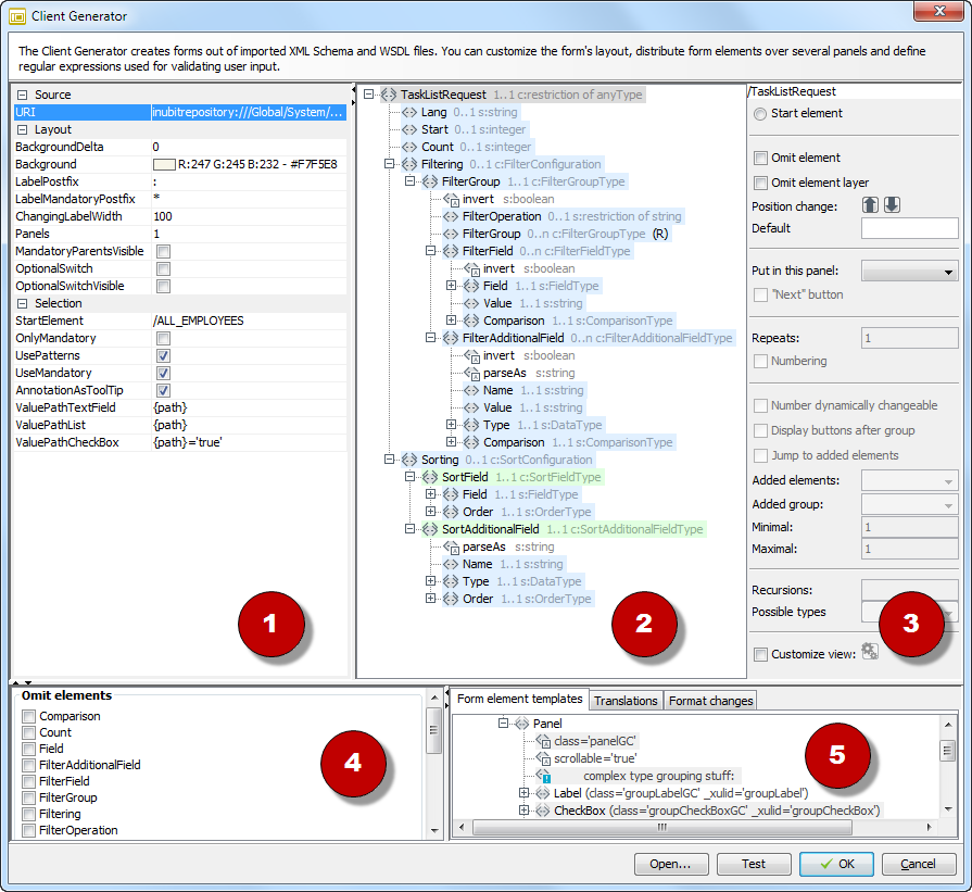
The Client Generator includes the following areas:
-
Basic settings:
All settings in this area apply to the entire file:
-
Source: The path to the loaded schema or WSDL file.
-
Layout:
-
BackgroundDeltaandBackground:Backgroundspecifies the background color for nested group elements; activated ifBackgroundDeltais defined and at least two nested group elements exist. For positive values forBackgroundDeltathe background color brightness decreases for the inner group, for negative values the brightness increases. -
LabelPostfix: A character displayed by default after a form label. -
LabelMandatoryPostfix: A character identifying mandatory fields as mandatory. Set to a cardinality of1…1for all elements. -
ChangingLabelWidth: Defines for nested groups that the element labels of a group are aligned to the left and displayed completely. To do so, for each group the value of the Border attribute is subtracted from the value defined here. -
Panel: Number of panels in the form. In the form, a panel is displayed as a tab. -
OptionalSwitch: When selected, optional groups (ComplexTypetype elements with a cardinality of0…unbounded) are replaced by a checkbox and a label name. The group’s elements are displayed when the checkbox is selected in the form. -
OptionalSwitchVisible: Use only whenOptionalSwitchis activated! Ensures that the checkbox is selected when the form is displayed so that all elements in the group are visible. -
MandatoryParentsVisible: Use only whenOptionalSwitchis activated! When the form is viewed and this option has been selected, optional groups are always displayed if elements in the group are mandatory fields (cardinality of1…1).
-
-
Selection:
-
StartElement: Displays the element selected as the root element for the form. -
OnlyMandatory: When selected, only mandatory fields are displayed in the form. -
UsePatterns: When selected, form field input must conform to the pattern defined in the schema. -
UseMandatory: When selected, mandatory fields that have not been filled out are highlighted in color, and the Submit and Next buttons are deactivated.
-
-
AnnotationsAsToolTip: Uses schema annotations as tooltips, which will be displayed when the cursor hovers over the element. The annotation element must be placed in the element to which it refers and must contain a documentation element, such as<complexTypename="Tooltip"><annotation><documentation xml:lang="de">All tooltips …
-
-
Display: Displays the loaded schema or WSDL file.
-
Element (group) configuration: Configures the element selected in the display.
-
Display field: Displays the XPath to the selected element in the current display. All the following settings are applied to this element.
-
Start element: Defines the selected element as the root element for the form.
-
Omit element: No form elements are generated for the selected element and its child elements.
-
Omit element layer: No form elements are generated for the selected element. Form elements are, however, generated for the child elements.
-
Position change: Changes the sequence of the selected element and thus the sequence of the form element.
-
Put in this panel: Specifies in which tab the selected element is displayed. The number of panels in area 1 must be defined.
-
Next button: Adds a button to the currently indicated panel that leads to the next panel. This button does not need to be added to the last panel.
-
Repeats: Generates at least the specified number of instances for the selected element upon displaying. If the input message contains several elements, more instances are generated. This can only be applied to groups (ComplexTypes).
-
Numbering: Adds consecutive numbering to generated instances.
-
Change number dynamically: Adds +/- buttons above the selected elements to help the user generate additional instances of the element. This can only be applied to groups (ComplexTypes).
-
Generate buttons after group: Adds the buttons after the group instead of before.
-
Jump to added elements: Scrolls the form to where the element was added. This is helpful when more elements can be generated than fit onto one screen page.
-
Added group: Select adds a red border around the new element; this border is only removed after the element has been edited. Highlight briefly highlights the new element in color.
-
Minimum/Maximum: You can manually increase restrictions on existing limits for the occurrence of an element. A maximum of -1 means that any number of elements can be added.
-
Recursions: Defines the maximum recursion depth for recursively defined elements.
-
Customize view: When selected, you can click the button located next to the option to open an editor in which you can edit the form elements to be created. For instance, you can add a
labelattribute to a label element, and its value will be used as a label in the form (instead of the otherwise mandatory element name). These changes remain effective even after the form has been regenerated.
-
-
Omit elements: For the selected elements, no form elements will be created (regardless of their position in the* hierarchy).
-
This area consists of the following tabs:
-
Form element templates: Contains templates for all form elements to be generated. You can change the templates and thus the generation of the forms. The class attributes specify the CSS classes, which in turn define the layout of the form you are creating.
To use customized CSS classes, reference CSS classes in the class attributes, and define these class values as an internal resource in the Web Application Connector.
-
Translations: For translating labels generated from the elements.
-
Format changes: Customizes the date formats used.
-