Form Designer User Interface
Form Mapping in the Task Generator
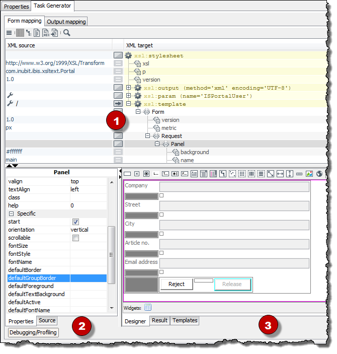
In the Form Mapping tab you define how XML input messages are mapped to the XML request out of which the form for display in the INUBIT Workbench or browser is created.
-
Mapping table
Displays the XSLT style sheet, which you create for mapping the input messages to the XML response:
-
XML source
Contains values, XPath expressions and functions. These mostly originate from the XML source area and are dragged and dropped into the column.
-
XML target
Contains XSLT commands (elements and attributes), which are the result of the Drag’n’Drop actions in the Designer.
-
-
Input
-
Properties
For defining the properties of the form element that is selected in the Designer tab or in the XML target area.
Finish entering values by pressing the return key. Use the context menu to restore default values.
-
Source
For loading and displaying an input message.
-
-
Output
-
Designer
For creating the form by dragging and dropping elements from the toolbar to the designer’s workspace.
Refer to Form Elements in the Toolbar
-
Result
Displays the result after testing the mapping.
-
Templates
Contains all form elements as XML.
-
Mapping the Source to Elements in the Designer
-
When mapping a source element to a designer element with a label attribute, you can decide, if you want to apply the source element’s name or value.
-
When mapping to Designer elements, the dialog that appears is the same as for mapping directly to the mapping table. You can decide between for-each, if, value-of, or copy. Hence, you can map an element that occurs more than once directly to a group in the Designer using for‑each.
Absolute Layout in the Designer
-
You can move elements directly between groups of different layouts by using drag-and-drop without being forced to place them before in one of these groups.
-
When using absolute layout, double arrows («) for scaling are displayed in the right or lower (right) corner of the element. In all other layouts, these double arrows appear when pressing the shift key before hovering the mouse the element.
-
By default, elements automatically fit in the grid when moving them at grid ends. In contrast, you can place the element freely by pressing the Ctrl+Shift keys when the element is released.
Output Mapping in the Task Generator
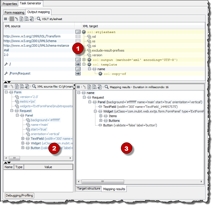
In the Output Mapping tab you define how the XML response coming from the modified form is mapped to the XML format, which is expected by the next module in the workflow.
-
Mapping table
Displays the XSLT style sheet that you create for mapping the XML Response to the output XML format.
-
XML source file
Shows the original request and the response that the browser has sent back to the Task Generator after the form was edited and submitted.
-
XML target file
-
Target structure
For loading an XML file that is already structured in a way as expected by the subsequent module, and which is used as template when creating the output mapping.
-
Mapping result
Structure and contents of the output message of the Task Generators.
-
Form Elements in the Toolbar
The toolbar in the Form Designer offers the following buttons for creating form elements:

The explanations in the following table refer to the buttons on the toolbar, from left to right:
| Button | Name | Use |
|---|---|---|

|
Button |
Button that triggers an action |

|
Checkbox |
Enables/disables one option in a group element |

|
Radio button |
Selects one of several options; all options in a group element are always displayed |

|
Label |
Label, such as for a text field |

|
Textfield |
Text input field |

|
Passwordfield |
Password input field; for security reasons, all characters entered are displayed as asterisks (*) |

|
FileField |
Generates form fields for uploading files (input field and button with a Search label). When the form is submitted, the uploaded files are base64-encoded and written to the XML response. |

|
Textarea |
The input field for longer texts. |

|
Combobox |
Expandable list for selecting options; one of the options can be selected as a default and always be displayed. The list can also be edited. |

|
List |
A list of options from which one can be selected. |

|
Tree |
Tree view with nodes that can be expanded and collapsed. |

|
Group - Absolute Layout |
Sorts by pixels all form elements in this group as specified by the user. The size of the absolute group is not automatically adjusted to the content; you should therefore enable the scrollbar if needed (scrollable attribute). Groups can be nested. |

|
Group - Table Layout |
Generates a table with three columns and three rows (more can be added). Helpful for aligning form elements. Groups can be nested. |

|
Group - Horizontal Layout |
Horizontally arranges all form elements dragged into this group one below the other; groups can be nested. |

|
Group - Vertical Layout |
Vertically arranges all form elements dragged into this group one below the other; groups can be nested. |

|
Filler |
Generates a square area whose side length can be specified |

|
Filler h |
Generates a horizontal space whose width can be specified |

|
Filler v |
Generates a vertical space whose height can be specified |

|
Separator |
Horizontal or vertical separator line, depending on the value of the orientation attribute |

|
Image |
For displaying images in the form. There are the following options:
|

|
Web (only for Theme Web) |
Adds a |

|
Panel |
Adds a new panel. |
Theme |
Specifies the layout for the form:
|
Properties of Form Elements in the Task Generator
The elements of the attribute that is currently selected in the form can be viewed in the Properties tab. The attributes are divided into the following areas:
-
Misc area
-
Specific area
-
Conditional area
Misc area
-
nameFor referencing an element via its name. The name must consist of XML-compliant characters, because it is used as XML tag in the response.
Until a name is assigned, an ID, such as CheckBox_7592354, is automatically assigned to the element.
Alternatively, you can reference elements via their position, refer to path.
You can only use the
nameattribute if the element does not have apathattribute. -
pathFor referencing an element via its position.
With the
pathattribute you can create, for example multidimensional structures, because the fields in the response are generated in the corresponding XML structure.Example:
-
path=/Order|0/Goods|0/Book|1. -
In the response, the following structure is emitted:
<Path>
    <Order>
        <Goods>
            <Book>false</Book>
        </Goods>
    </Order>
</Path>
The index does not refer to the named element, as with XPath, but to all elements on this level. With it, the complete order is reconstructed.
Alternatively, you can reference elements via their name, refer to name.
You can only use the
path attribute, if the element does not have anameattribute!
-
-
enabledEnables/disables the form element.
-
foregroundWhen you click this field, a button appears at the end of the input line. Click this button to open a color selector. This color specifies the text color.
-
backgroundBackground color of the element.
-
widthWidth of the element (integer) Invalid width entries are set to 1.
-
heightHeight of the element (integer)
-
borderThe width of the border that is to be drawn around the element (integer). The border color is the color set as a background for the panel.
-
tooltipText that is displayed when the cursor hovers over the element in the form. A tooltip is made up of no more than 80 characters because some Web browsers cannot display longer texts.
-
halignHorizontal alignment: left-aligned (left), centered (center), or right-aligned (right).
-
valignVertical alignment: top, centered, bottom
Specific area
If a Panel element is selected, the specific attribute will impact the properties of all elements for which no values have been entered.
There are also a number of additional Specific attributes. The following list includes those attributes and values that are not self-explanatory:
-
label: The label of an element, such as a button. -
escape-
true: special and control characters are html-encoded or devalued. -
false: special and control characters are not html-encoded or devalued. Formatting by using HTML tags such as<b>bold</b>or<i>italics</i> `is possible in the `labelattribute of alabelelement.
-
-
event: Select an event, or enter the name of the panel to be displayed when the event is triggered.The following events are available:
-
<Panel_Name>For navigating from one panel to the next, used for example on a Next button.
-
back():Jumps back to the panel last displayed.
-
-
submit(value): Sends the form. The data included in the form are sent to the Task Generator module as an XML message. If a form contains several buttons, the value can be used to identify the event trigger and determine the action that follows. The character string is issued as value of thesubmitterattribute in the response. -
cancel(): Cancels the display of the form. The task remains in the task list. -
get(componentname):Searches the element whose name is given in brackets and analyzes the contents of the element that it currently displays.
Example:
The combo box
cbcontains a list with the names of all existing panels. For the Show button, the eventget(CB)is defined. When users select a list entry and click the Show button, then the currently displayed value of the combo box is analyzed and the corresponding panel is displayed.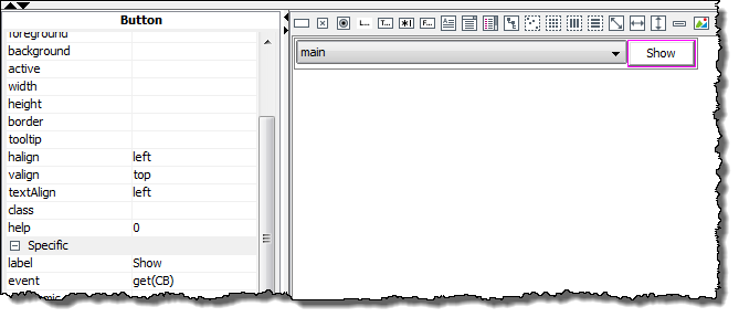
-
browse()Opens a file explorer. The path and name of the selected file are returned and written to a text field. Only for forms that are displayed in the INUBIT Workbench.
-
execute(profileName|URL)For forms that are displayed by the INUBIT Workbench a profile name must be specified. The indicated profile is executed. The profile name must be the name of an application profile that is defined in the Configuration > Application profile menu in the Configuration tab.
For forms displayed in a Web browser a URL must be specified.
-
validate -
stateChangeChanges the portlet’s size after its submitting the form according to the selected value. This function can be used, for example, for providing a portlet in a minimized and thus space-saving state and for enlarging it up to its complete size not until the first user entry.
-
ajaxUpdates the content of the form containing the button, without reloading the entire website.This function accelerates the reaction of web applications on user actions and prevents the need to transfer static data again, which has not changed.
Do not use the options
ajaxandajaxGroupin groups that contain a FileField for uploading a file! Both options are not functional in these contexts.
|
Using Ajax submits you can also let update parts of a form instead of the complete form, refer to Updating Portlets and Form Sections using Ajax. |
-
ajaxGroupFor updating the content of selected form groups without reloading the entire website.
-
jumpDefines the entry point in the Technical Workflow, where the data for the ajax group update is preprocessed.
Refer to Updating a Form Section with Ajax
-
mnenomic(Only for forms that are displayed in the INUBIT Workbench in the Tasklist tab)
Elements such as buttons, that can trigger events, are automatically assigned a shortcut. In the element label, the letter that can be typed on the keyboard to trigger the event without using the mouse is underlined. In Linux, the underlined letter is always displayed. In Windows, press the ALT key to display the shortcuts.
-
scrollableBy default, the panel is located in a container having a horizontal and vertical scrollbar (
scrollable="true"). Scrollbars permit that the entire form can be edited even if the screen is smaller than the panel. By usingscrollable="false"you switch off the scrollbars. -
mandatoryDesignates an element as a mandatory field.
-
maxlength(only for text and file fields)Maximum length of field content
-
tabindex(only for editable and selectable elements)Order in which the fields can be accessed by using the Tab key
-
patternContains a regular expression that defines the pattern of the permitted user input.
Example: Using regular expressions you can define the structure of a number which must include special characters and a restricted number of digits.
-
TextArea searchText='SearchString'(Only for displaying tasks in the INUBIT Workbench)Searches for text and highlights it in the component
-
TextArea Highlight(Only for displaying tasks in the INUBIT Workbench)
The Highlight element can appear any number of times under TextArea. The element has the following attributes:
-
start='Number'
-
stop='Number'
You can use either stop or length. Number = integer.
-
length='Number'
-
color='#xxxxxx'
-
-
Tree searchXPath='Expression':(Only for displaying tasks in the INUBIT Workbench)
Searches for and highlights the appropriate XPath, such as
/*/Row[3] -
disableBackAttribute of the
Formelement. When selected, then using the Back button in a sequence of forms is prevented. After clicking the Back button the browser immediately tries to display the form containing the clicked Back button.In order to use this function, JavaScript must be activated.
Conditional area
-
visibleThe element is visible only for portal users having the given rights.
-
enabledThe element can only be modified or clicked by portal users having a role with the given rights.