Using and Creating Widgets
Widgets are re-usable control elements for graphical user interfaces of web applications, e.g. calendar, toolbars, menus, RSS feeds or tables.
The INUBIT Widget framework enables you to create your own widgets. For your widgets, you can, for example, use the functions of the Ext JS framework that is delivered with the INUBIT software. The Ext JS framework is a client-side JavaScript or Ajax framework and offers an extensive collection of control elements.
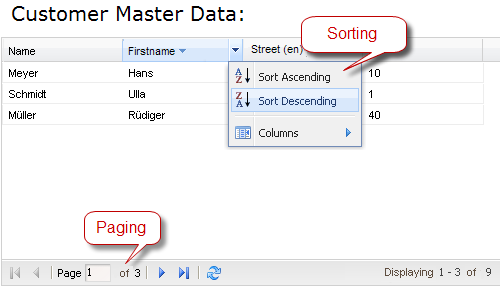
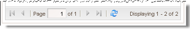
The INUBIT software scope of delivery includes the ready-to-use Grid widget. This widget displays the data as a table and offers, among other functions, paging and sorting on the basis of the Ext JS grid, for example:
Functional principle
A widget consists of HTML, JavaScript and CSS code. In the INUBIT software, this code is generated dynamically in the execution of the task generator, just like the normal form in which the widget is embedded:
-
The XML structure of the form that is displayed in the Form mapping tab of the task generator also contains the XML structure of the widget. For the included Grid widget, for example, an XML table structure is generated which contains additional data for the configuration of the table, such as for paging, the maximum number of data records displayed on a page.
This XML structure is usually filled dynamically with data from the input message.
-
A widget-specific XSLT style sheet generates the HTML code from the XML structure. This HTML code is then displayed in the form in the browser. In addition to the XSLT commands, the widget-specific XSLT style sheet also contains JavaScript and CSS code used to implement the functionality and the layout of the widget.
The XML structure and the XSLT style sheet of the widget are stored in the repository. Hence, the XML structure of the form remains compact and readable in the task generator and the widget can be re-used in other task generators.
Just like in other GUI components, widgets are integrated into a form using Drag-and-Drop.
You can use the same widget several times on the same page even on different panels.
|
If usage of multiple widgets causing rendering issue, make sure to use unique names in each component or meta (if present). |
Using and Configuring the Grid Widget in the Task Generator
The Grid widget enables you to display your web application data in table form. The Grid widget is based on the functions of the Ext JS framework and offers the following features:
-
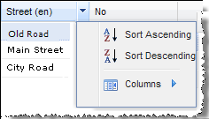
Sorting
Sort column content in ascending or descending order:
Depending on the configuration of the table, sorting takes place on the server or the client.
Refer to
-
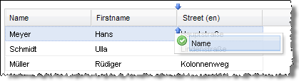
Changing the order of the columns
Using Drag-and-Drop:
-
Showing/hiding columns
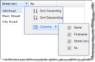
-
Paging
Large quantities of data can be split and displayed page-by-page. The amount of data displayed on a page can be configured; the data is dynamically loaded using Ajax calls.
Proceed as follows
-
In the task generator, display the Form mapping tab.
-
Drag the Grid icon from the widget bar of the designer into its work area:
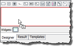
The XML target area shows the expected XML structure of the grid:
You can statically or dynamically fill the XML structure of the grid with data. The following sections provide some examples.
Refer to:
Task Generator Example: Dynamic Table with Client-Side Sorting without Paging
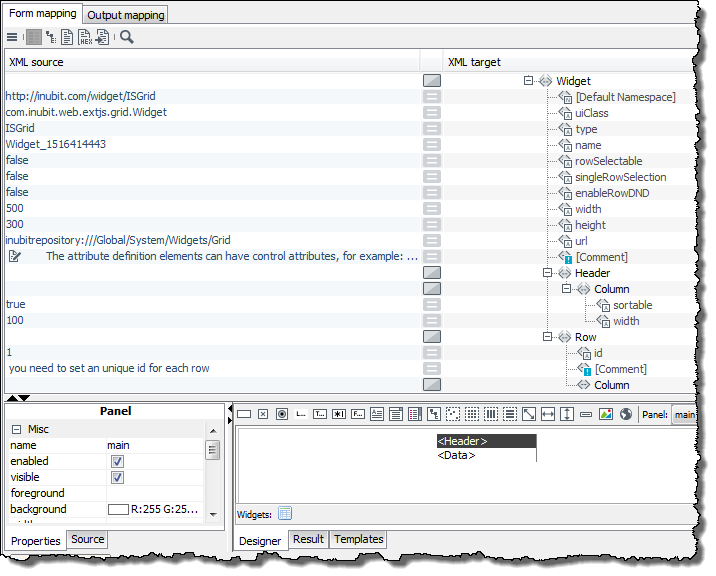
The following graphic shows the form mapping of a table that is filled through XML input messages. The number of rows and columns is defined by the XML input messages:
Sorting by table columns is available automatically as long as the sortable attribute of the Column elements has the value true.
Task Generator Example: Dynamic Table with Paging and Server-Side Sorting
In order to use the paging mechanism and server-side sorting, it must be possible to load the data in the Grid widget from a data source.
To do so, the workflow that implements your Grid widget as an instance must be structured as in the following graphic:
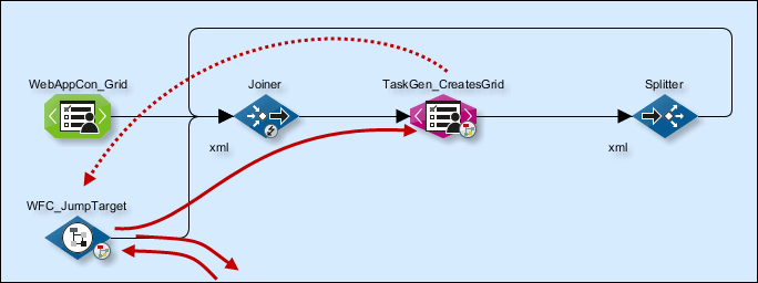
The task generator that generates the grid widget is connected to the data source via a path: In the depicted workflow, this path starts with the WFC_JumpTarget Workflow Connector and leads to a Database Connector in a sub-workflow, and from there back to the task generator.
The branch-in point in this path, that is, the ID of the first module, is entered in the Grid widget.
User actions such as the display of the Grid form or the sorting of data trigger a request in the task generator. The content of the request depends on the user action: For a sort action, for example, the request contains the following information:
-
First data record that is supposed to be displayed on the page
-
Number of all data records that are supposed to be displayed on the page
-
Selected sorting criterion (ascending/descending)
The request is transferred to the first module in the path and forwarded from there. The Database Connector evaluates the request and makes the data available. Following that, the requested data is sent to the task generator and displayed in the table.
Defining the branch-in point in the path to the data source
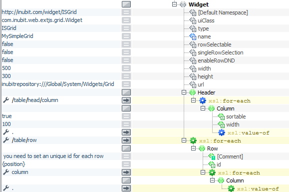
The following graphic shows the form mapping of the table:
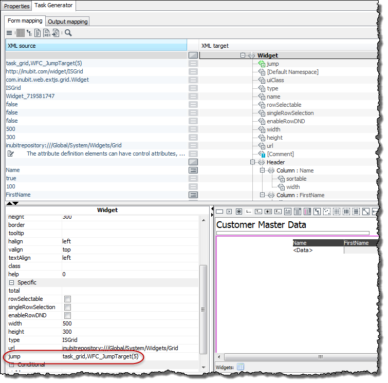
You define the first module in the path to the data source in the Properties tab using the jump attribute of the widget
element: A click a blank cell next to the attribute opens a dialog in which you choose the module.
|
The module must be located in the same workflow as the task generator! |
Whether and which modules are located between the branch-in point and the data source depends on whether the request has to be formatted further. This can be necessary, for example, if you want to have the data sorted on the server side.
Defining the number of displayed data records
You define the number of data records per page in the Properties tab using the start and limit attributes of the
Header element:
-
start: Number of the first displayed data record -
limit: Number of displayed data records
Configuring server-side sorting
You have to implement the sorting manually. If you are using a database as the data source, you can implement the sort criteria, for example, by using the corresponding SQL commands.
Sorting criteria are included in the request that is sent to the data source. You can display the request by opening the watch point preceding the data source in watch mode.
Creating a Widget and Integrating it into the INUBIT Software in the Task Generator
Files required
To develop your own widget, you have to create the following files:
| Name | Function |
|---|---|
|
XML structure of the widgets. This has two functions:
|
|
XSLT style sheet for displaying the widget in the web application. It contains, e.g., HTML, JavaScript code (possibly Ext JS framework code) for the functions of the widget and layout information (as CSS references). Refer to Example: Widget.xsl |
|
XSLT style sheet for displaying the widget in the web application in Business Process Center (BPC). It contains, e.g., HTML, JavaScript code (possibly Ext JS framework code) for the functions of the widget and layout information (as CSS references). Refer to Example: Widget_bpc.xsl |
|
Graphic for the widget icon in the toolbar of the task generator. You can use the icon to drag & drop the XML structure to the desired position on the form. The graphic must be available in gif-format and have a max. height of 14 pixels. |
|
Optional.
Java class for displaying the widget in the Form mapping tab of the task generator.
The class must implement If you are not providing a Java class, you must remove the If no Java class is available, the designer shows a placeholder instead of the widget. This does not affect the functionality of the widget. |
The files should be made available in the global area of the repository at Global > System > Widgets in a separate folder and must be readable anonymously. Alternatively, the files can also be made available in any other repository folder outside the Global folder.
Refer to
-
Ext JS examples:
-
Ext JS 6:
https://<server>:<port>/html/js/extjs6/ -
Ext JS 7:
https://<server>:<port>/html/js/extjs7/
-
-
Ext JS homepage, refer to https://www.sencha.com/
Proceed as follows
-
Use the
Widget.xmlandWidget.xsl(Widget_bpc.xslfor BPC portal users) files of the supplied Grid widget as templates: Download these files from the Repository directory at Global > System > Widgets > Grid. -
Open the
Widget.xmlfile and adjust the XML structure. Note the comments in the file; they explain the use of the different XML elements. -
Adapt the
Widget.xslfile (Widget_bpc.xslfor BPC portal users). Also, note the comments in this file. -
Generate an icon called
Widget.gif. -
In the Repository, create a new directory underneath Global > System> Widgets. Add all files to this directory. Make sure that the files can be read anonymously.
-
If you want to use the widget immediately, you have to make the icon visible first: Open a task generator, in the Module Editor on the local side, display the Form mapping tab and choose Burger menu> View > Reload external elements.
Otherwise, the widget is only available once you restart the INUBIT Workbench.
Example: Date picker widget
A date picker widget makes it easier to enter a date:
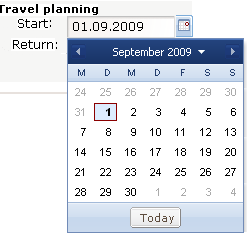
The date picker uses the Ext JS framework, and it is based on the DateField class.
Example: Widget.xml
<?xml version="1.0" encoding="UTF-8"?>
<wd:Description xmlns:wd="http://inubit.com/widget/schema" type="ExtDateField" uiClass="com.inubit.web.extjs.form.ExtDateFieldWidget" namespace="http://inubit.com/widget/ExtForm" prefix="">
    <Widget>
        <wd:Attributes>
            <!-- Keep in mind that, if you are using several date pickers in a form, every instance
            must have a unique name-->
            <name/>
        </wd:Attributes>
        <DateField>
            <wd:Attributes>
                <!-- The date field should be 300 px wide; the text field can have all attributes of a
                "normal" text field -->
                <width>300</width>
            </wd:Attributes>
        </DateField>
        <Meta>
            <wd:Attributes>
                <!-- The format value can be defined in the designer and defines in which format the date
                is displayed, permissible values are specified by the Ext JS framework -->
                <format/>
            </wd:Attributes>
        </Meta>
    </Widget>
</wd:Description>
Example: Widget.xsl
<?xml version="1.0" encoding="UTF-8"?>
<xsl:stylesheet xmlns:xsl="http://www.w3.org/1999/XSL/Transform" version="2.0">
    <xsl:output method="html" encoding="UTF-8"/>
    <xsl:template match="extform:Widget[@type='ExtDateField']">
        <xsl:variable name="wid" select="concat($ns,@name)"/>
        <xsl:variable name="tf">
            <TextField name="{@name}" xmlns="">
                <xsl:for-each select="extform:DateField/@*[name()!='name']">
                    <xsl:attribute name="{local-name(.)}">
                        <xsl:value-of select="."/>
                    </xsl:attribute>
                </xsl:for-each>
                <xsl:value-of select="extform:DateField"/>
            </TextField>
        </xsl:variable>
        <script language="javascript" type="text/javascript">
            addCssIS('/html/js/extjs/resources/css/ext-all.css');
            addCssIS('/html/js/extjs/resources/css/xtheme-gray.css');
        </script>
        <xsl:apply-templates select="$tf/TextField"/>
        <script language="javascript" type="text/javascript">
            Ext.onReady(function(){
            try {
            new Ext.form.DateField({
            applyTo: '<xsl:value-of select="$wid"/>'
            <xsl:if test="extform:DefaultTextField/@mandatory = 'true'">
                ,allowBlank: false
            </xsl:if>
            <xsl:if test="extform:Meta/@format != ''">
                ,format: '<xsl:value-of select="extform:Meta/@format"/>'
            </xsl:if>
            });
            }
            catch(e) {
            showMessageIS('Error in ExtDateField widget!',e);
            }
            });
        </script>
    </xsl:template>
</xsl:stylesheet>
Example: Widget_bpc.xsl
<?xml version="1.0" encoding="UTF-8"?>
<xsl:stylesheet xmlns:xsl="http://www.w3.org/1999/XSL/Transform" xmlns:isgrid="http://inubit.com/widget/ISGrid" xmlns:inubit="http://inubit.com/xsl" version="2.0">
<!-- The widget namespace must be identical with the one defined in the Widget.xml -->
<!--$Id: Widget_bpc.xsl,v 1.0 2022/01/24 $-->
<xsl:output method="html" encoding="UTF-8"/>
<!-- need to set this params, will be filled from outside -->
<xsl:param name="initDataISGrid"/>
<xsl:param name="jumpDataISGrid"/>
<!-- Dummy variables to test this script in an XSLT-Converter; they are set from outside on execution time -->
<!--<xsl:variable name="proxy"></xsl:variable>-->
<!--<xsl:variable name="lang"></xsl:variable>-->
<!--<xsl:variable name="ns"></xsl:variable>-->
<!--<xsl:function name="inubit:translate"><xsl:param name="element"/></xsl:function>-->
<!-- The value of the type attribute must be the same as the widget type defined in the widget.xml -->
<xsl:template match="isgrid:Widget[@type='ISGrid']">
<!-- Portlet namespace und unique name of the widget are used as identifier -->
<xsl:variable name="wid" select="concat($ns,@name)"/>
<!-- div for the grid widget; EXT JS will fill it -->
<div id="{$wid}">
<input type="hidden" id="{concat($wid, '_content')}" name="{concat(@name, '_content')}" value=""/>
</div>
<!-- JavaScript and XSLT code of the widget; for this grid widget EXT JS code is used -->
<script language="javascript" type="text/javascript">
Ext.require([
'Ext.data.*',
'Ext.grid.*',
'Ext.util.*',
'Ext.toolbar.Paging',
'Ext.tip.QuickTipManager'
]);
Ext.onReady(function() {
try {
<!-- Count of columns is needed multiple times -->
<xsl:variable name="columnCount" select="count(isgrid:Header/isgrid:Column)"/>
<!-- Create the Data Model -->
if(typeof(<xsl:value-of select="concat($ns,@id)"/>DataModel) == 'undefined'){
Ext.define('<xsl:value-of select="concat($ns,@id)"/>DataModel', {
extend: 'Ext.data.Model',
proxy: {
type: 'ajax',
reader: 'xml'
},
fields: [
<xsl:for-each select="isgrid:Header/isgrid:Column">
{name: '<xsl:value-of select="inubit:translate(.)"/>', mapping: 'Column:nth(<xsl:value-of
select="position()"/>)'}
<xsl:if test="position()<$columnCount">,</xsl:if>
</xsl:for-each>
<xsl:choose>
<xsl:when test="not(@itemId)">
,{name: 'id', mapping: '@id' }
</xsl:when>
<xsl:otherwise>
,{name: 'id', mapping: '@itemId' }
</xsl:otherwise>
</xsl:choose>
]
})
};
<!-- Create the Data Store -->
<xsl:value-of select="$wid"/>storeExtJsIS = Ext.create('Ext.data.Store', {
<!-- need to sort over all data on the server side -->
<xsl:if test="not(isgrid:Row)">remoteSort: true,</xsl:if>
<xsl:if test="not(isgrid:Row)">pageSize: <xsl:value-of select="isgrid:Header/@limit"/>,
</xsl:if>
model: '<xsl:value-of select="concat($ns,@id)"/>DataModel',
proxy: {
type: 'ajax',
<xsl:choose>
<xsl:when test="isgrid:Row">
<!-- load the init data, that is mapped directly in the form -->
url: '<xsl:value-of select="$initDataISGrid"/><xsl:value-of select="@name"/>',
</xsl:when>
<xsl:otherwise>
<!-- load the first data from jump; this is for paging purpose -->
url: '<xsl:value-of select="$jumpDataISGrid"/><xsl:value-of select="@name"/>',
</xsl:otherwise>
</xsl:choose>
reader: {
type: 'xml',
root: 'Widget',
// records will have a "Row" tag
record: 'Row',
<xsl:choose>
<xsl:when test="not(@itemId)">
idProperty: '@id',
</xsl:when>
<xsl:otherwise>
idProperty: '@itemId',
</xsl:otherwise>
</xsl:choose>
totalProperty: '@total'
},
simpleSortMode : true
}
});
<!-- If there are no rows, paging with a jump in the workflow is used to load data -->
<xsl:if test="not(isgrid:Row)">
<!-- paging bar -->
var <xsl:value-of select="$wid"/>pagingBarExtJsIS = Ext.create('Ext.toolbar.Paging',{
store: <xsl:value-of select="$wid"/>storeExtJsIS,
displayInfo: true,
emptyMsg: '-'
});
</xsl:if>
<!-- Create the Grid -->
if(Ext.Element.cache['<xsl:value-of select="$wid"/>']){
Ext.Element.cache['<xsl:value-of select="$wid"/>'].destroy(); }
<xsl:value-of select="$wid"/>gridExtJsIS = new Ext.grid.GridPanel({
store: <xsl:value-of select="$wid"/>storeExtJsIS
,itemId: '<xsl:value-of select="$wid"/>gridExtJsIS'
,columns: [
<xsl:for-each select="isgrid:Header/isgrid:Column">
{header: '<xsl:value-of select="inubit:translate(.)"/>'
<xsl:if test="@width">
,width:
<xsl:value-of select="@width"/>
</xsl:if>
,dataIndex: '<xsl:value-of select="inubit:translate(.)"/>'
,sortable: <xsl:value-of select="not(@sortable='false')"/>}
<xsl:if test="position()<$columnCount">,</xsl:if>
</xsl:for-each>
]
<xsl:if test="@enableRowDND='true'">,viewConfig: { plugins: { ptype: 'gridviewdragdrop' } }</xsl:if>
<xsl:if test="@rowSelectable='true'">,selModel: { selType: 'checkboxmodel'<xsl:if
test="@singleRowSelection='true'">, mode : "SINGLE"</xsl:if>}
,listeners: {select: function(selModel, record, index, options) {
var selectedrow = <xsl:value-of select="concat($wid, 'gridExtJsIS')"/>.getSelectionModel().getSelection();
var result='';
Ext.each(selectedrow, function (item) {
result=result + "<"+item.id+ ">on</"+item.id+">";
});
document.getElementById('<xsl:value-of select="concat($wid, '_content')"/>').value =result; }}
</xsl:if>
,renderTo: '<xsl:value-of select="$wid"/>',
inubitBpcWebAppNs: '<xsl:value-of select="$ns"/>'
,
<xsl:choose>
...
</xsl:choose>
</script>
</xsl:template>
</xsl:stylesheet>