Navigation Settings
In addition to the web application framework, the Business Process Center provides further core functions for designing, controlling, and monitoring your applications. One of the central functions is the management of application areas, page structures, and other navigation settings, such as the assignment of visibility permissions.
Function Description
The structure of the application can be configured via navigation settings. There, you can create application areas and their associated modules and links to external pages, which will be displayed in the navigation bar according to your settings.
Overview
Navigating to Navigation Settings
To navigate to the navigation settings, first select the “Core Services” tab in the settings panel, then “Navigation Settings”:
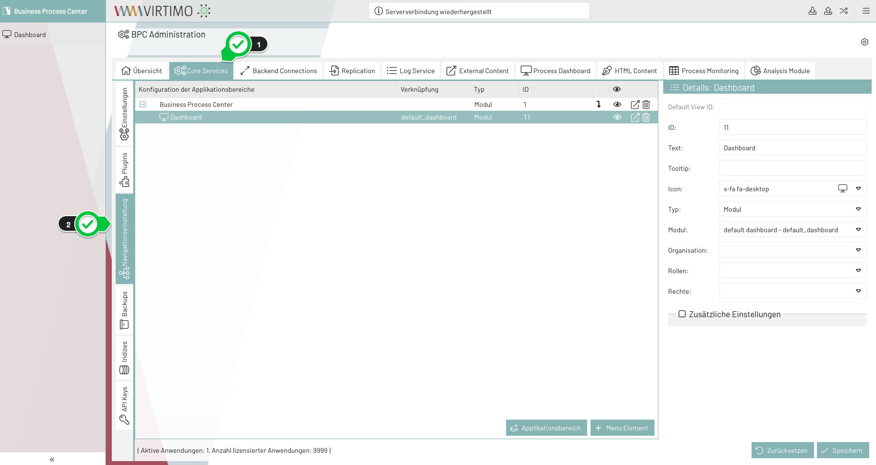
The most important components of the navigation settings:
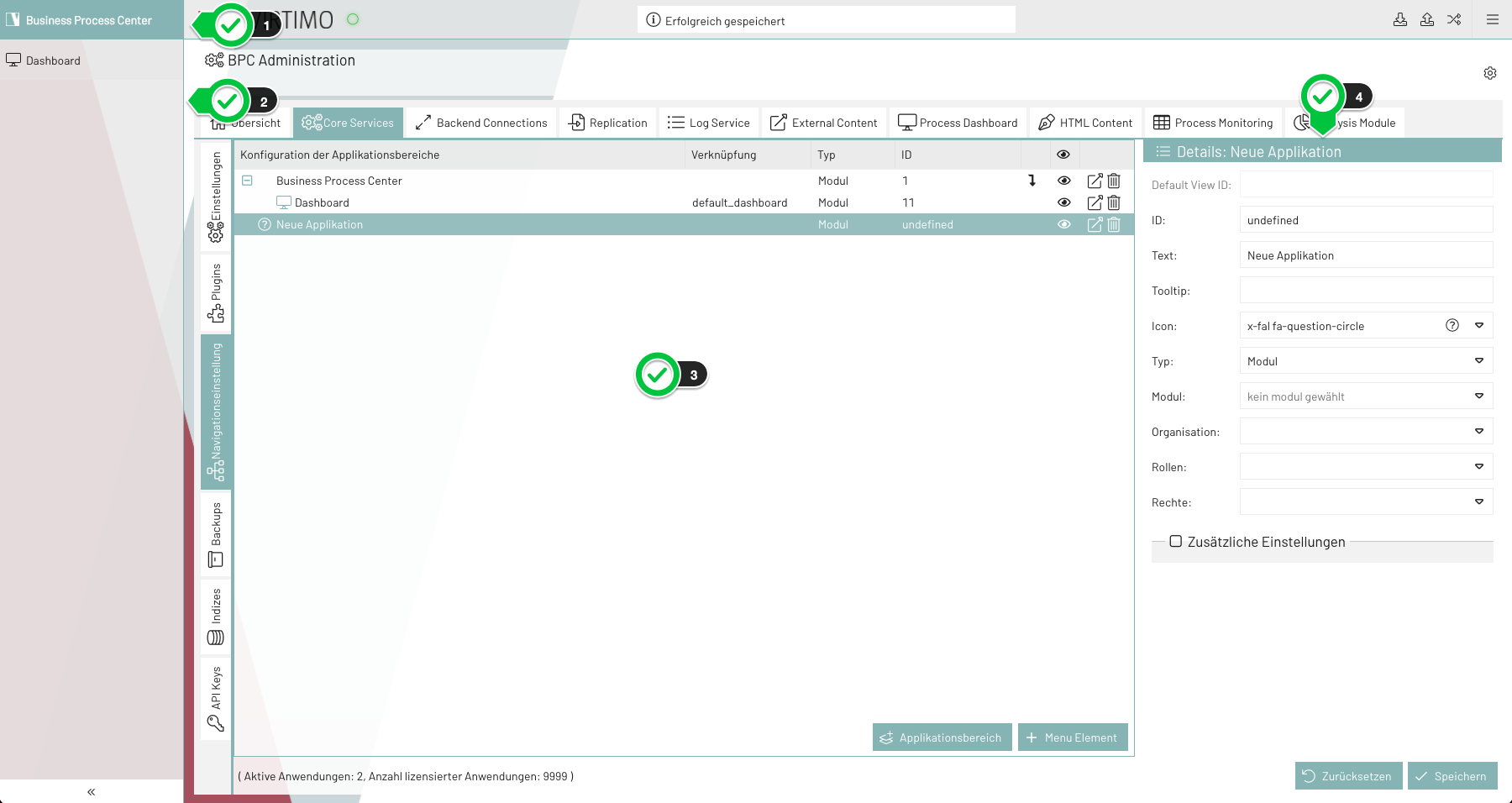
-
Application Area Selection: The list of application areas is displayed here when you hover over or click on it (only if the application contains at least two areas)
-
Navigation Bar: The configured navigation elements in the current area are displayed here.
-
Navigation Settings Panel: Overview of the navigation settings for application areas and navigation elements.
-
Content Panel: Overview of the settings for a navigation element.
Creating an Application Area
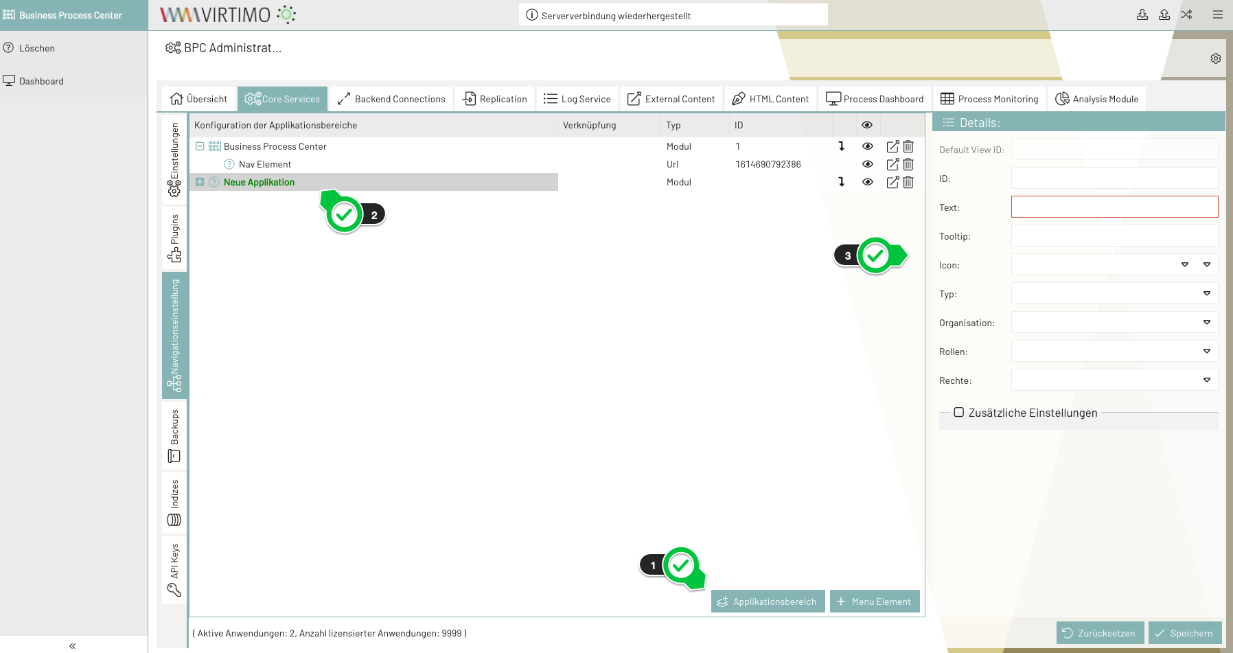
-
Click “Application Area”
The new application area is created, and the corresponding navigation element is displayed in the overview. -
Configuring the Navigation Element
Creating a Navigation Element
-
Click on “Menu Element”
The new navigation element is displayed in the overview -
Configuring the navigation element
|
A navigation element can be moved to different levels using drag & drop |
Configuration options
| Setting | Type | Description |
|---|---|---|
ID |
Text |
ID of a navigation element. This ID is usually assigned by the application. However, the ID can also be edited manually. Duplicate IDs are not allowed. |
Text |
Text, Language Key |
Label of a navigation element that is displayed in the navigation bar. Multilingual support is available. To enable this, you can use a “Language Key” from the Language Key list. |
Tooltip |
Text, Language Key |
Quick information about a navigation element. It is displayed when you move the mouse over a navigation element in the navigation bar. Multilingual support is available. To do this, you can use a “Language Key” included in the Language Key list. |
Icon |
Icon Picker |
Icon for a navigation element. This icon is visible in the navigation bar alongside the name of the navigation element |
Type |
Drop-down list |
Type of a navigation element.
|
Module |
Module drop-down list |
The module to which the navigation element is linked. |
URL |
Text |
URL to which the navigation element is linked. |
Target |
_blank, _self. More information: |
Specifies where the new page will open. |
Organization/Roles/Permissions |
Drop-down list |
Specifies which users are allowed to view the navigation element |
ViewMode |
Drop-down list: Tabbed, Vertical, Menu. |
Display mode for the child elements of a navigation element. |
Spacer
There is a maximum of one spacer per level. Depending on the level’s viewMode, the following should happen:
-
tabbed
All elements after the spacer are created as right-aligned tabs (please check if this is even possible; if not, then don’t do it) -
menu
An Ext.menu.Separator is inserted*here* -
vertical
All elements after the spacer are arranged at the bottom (technically, you just add an invisible element with “flex: 1”)
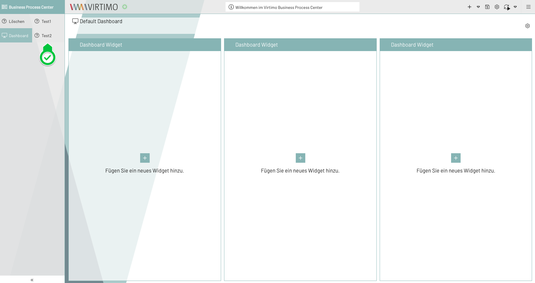
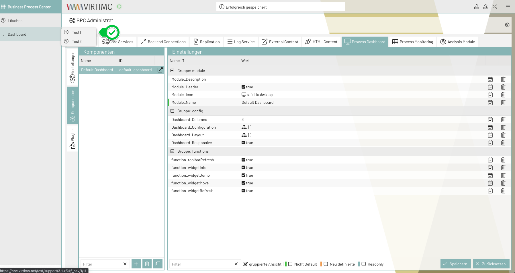
View Mode
-
tabbed: The child elements are displayed in tabs
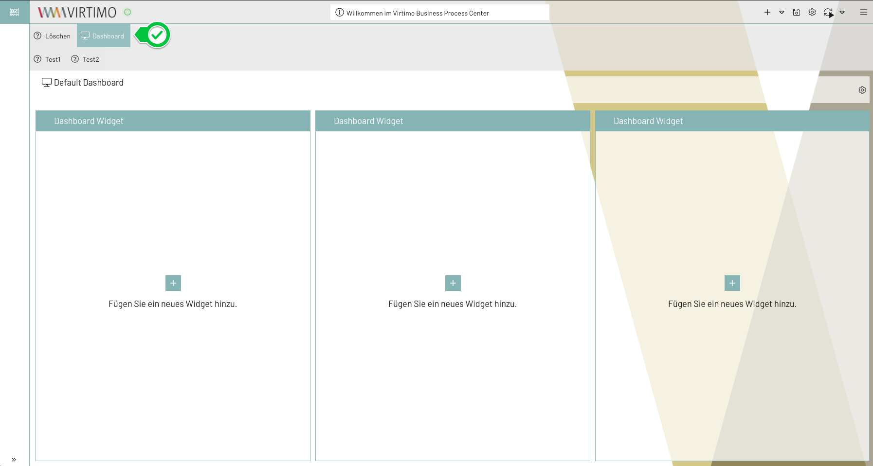
-
vertical: The child elements are displayed vertically in the navigation bar
-
menu: The child elements are displayed in the menu
Drag & Drop
In the navigation settings, elements can be moved via drag & drop to interactively adjust the structure, even after the navigation was originally created. Depending on the element type, different rules apply regarding where it can be placed.
General Behavior
Each navigation element has a specific type (e.g., application area, module, URL, placeholder, folder), which determines where that element may be located within the navigation structure. When moving an element, the user interface visually indicates whether a drop is permitted.
Application Areas
-
Application areas may only be located at the root level (top level of the navigation).
-
They can be or reordered —for example, before or after other application areas.
-
Dropping at deeper levels (e.g., within a folder or module) is not permitted.
