User Account Menu
Menu or toolbar (depending on where the plugin is assigned) to display the current user. It contains submenus to navigate to the user information page, change the password, or log out.
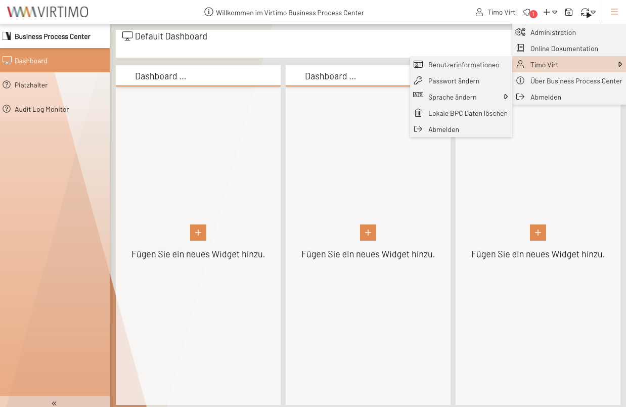
Illustration 1. Example view of the User Account Menu in the application toolbar (right)
Example configuration
{
         "userTextTpl"        : "Benutzer: {global.userSession.firstName}", (1)
         "userTooltipTpl"     : "{global.userSession.firstName} {global.userSession.lastName} ({global.userSession.loginName})", (2)
         "changeLanguage"     : true, (3)
         "accountPage"        : true, (4)
         "logout"             : false, (5)
         "changePw"           : true, (6)
         "icon"               : true, (7)
         "deleteLocalStorage" : true, (8)
         "cookieSettings"     : true, (9)
         "link"               : false, (10)
         "linkTarget"         : "popup,width=320,height=320", (11)
         "linkUrl"            : "https://example.com/auth/realms/MY_REALM/account", (12)
         "linkText"           : "Account Management", (13)
         "linkIconCls"        : "x-fal fa-user-edit", (14)
         "buttonLogout"       : false, (15)
         "avatar"             : true (16)
}| 1 | Text label for the menu button. Information in the UserSession can be accessed here using XTemplate syntax. If the value is left blank, the first and last names of the current user are displayed. For more details on XTemplate syntax and its use, see the XTemplate Syntax page | ||
| 2 | Content of the tooltip available for the menu button. XTemplate syntax can also be used here. | ||
| 3 | If true, then all available languages are displayed in the menu, and You can change the current language by making a selection. |
||
| 4 | If true, a menu item labeled “ Benutzerinformationen ” is displayed, which takes the user to the user information page. |
||
| 5 | If true, a “Log Out” menu item is displayed. |
||
| 6 | If true, a “Change Password” menu item is displayed.
|
||
| 7 | If true, an icon is displayed before the text (userTextTpl). |
||
| 8 | If true, a menu item is displayed that allows users to clear data from the local browser cache. |
||
| 9 | If true, a menu item is displayed that allows users to access their cookie settings. |
||
| 10 | If true, a menu item is displayed that links to linkUrl. |
||
| 11 | Specifies how the link should be opened.
All valid target values can be entered here to open the link, for example, in a new tab or window.
If the value contains the term popup, a browser popup is created, and all windowFeatures can be used to, for example, adjust the position and size of the popup. |
||
| 12 | Link destination. | ||
| 13 | Text content for the menu item representing the link. | ||
| 14 | Icon displayed next to the menu item for the link. | ||
| 15 | Additional logout button directly next to the account menu. This is only displayed if the account menu is not nested within another menu (e.g., the global menu). | ||
| 16 | Display an avatar instead of a button.
The avatar is a circular representation of the logged-in user’s initials.
Alternatively, an image can also be displayed.
To enable this, your Identity Provider (OIDC or Keycloak) must correctly set the ` picture ` attribute.
To load images, it may be necessary to include the source servers in the Content Security Policy header.
Avatar display does not work within a menu. |
Keywords:
