Developing Button Types Provided by BPC
The various buttons in the BPC system provide a consistent, user-friendly interface that has been specifically optimized for different use cases and user interactions. The following is an overview of the button types and their properties.
Overview of All Buttons
The following overview shows the various button styles available in this project, including primary, secondary, destructive, and transparent.
Each of these buttons is designed to support clear user guidance across different use cases and priorities.
The colors and styles automatically adapt to the theme’s primary color, ensuring they blend visually and consistently into the design.
Below you’ll find a detailed description of all types, supplemented by the corresponding code examples.

|
Each button style in the theme is available in three sizes: small, medium, and large. These sizes are implemented using specific mixins that adjust the button’s visual properties according to the selected size. This feature is available for all button styles. |
|
For each button implementation, |
Available Button Types
Transparent Button
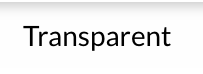
The transparent button in Ext JS is based on the ` extjs-button-[size]-ui ` mixin and uses the ` `$ui property with the value ` `"transparent". This button is defined in various sizes and does not display a background.
{
    text    : "Transparent",
    iconCls : "x-fal fa-trash-alt",
    ui      : "transparent"
}
Default Button and Default Toolbar Button
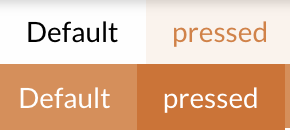
If no specific UI name is specified, a default button is available that exists in various states, such as Standard and Pressed.
The "Pressed" state can be controlled using the ` pressed ` property, which can take either the value ` true ` or ` false `.
There are two variants of the default button:
-
Toolbar Default Button: This button is not filled and is used by default in toolbars.
-
Normal Default Button: This button is filled and is used outside of toolbars.
As the name suggests, the default button is created automatically if no specific style is defined:
{
    text : "Default"
}
The following images show the default button in various states:
-
Toolbar Default / Toolbar Default Pressed and Standard Default / Standard Default Pressed:
Primary Button
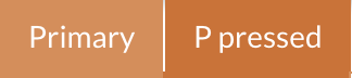
The primary button is used for high-priority actions and should clearly indicate the main action of an interface to users.
The UI style primary also defines colors and background colors that are coordinated with the theme’s primary color, making the button ideal for user guidance.
The following code definition specifies the UI properties of the primary button.
It includes the color, the icon (glyph), and background colors that change depending on states such as hover and pressed:
{
    text : "Primary",
    ui   : "primary"
},
{
    text         : "P pressed",
    ui           : "primary",
    enableToggle : true,
    pressed      : true
}
Secondary Button
The secondary button is intended for less prominent actions and is typically placed next to a primary button.
It features subtle coloring and stands out gently on mouseover and when focused, allowing for user guidance without distraction.
The button style is defined using the secondary UI style. This ensures that the button displays appropriate colors in its default and hover states.
{
    text : "Secondary",
    ui   : "secondary"
},
{
    text         : "S pressed",
    ui           : "secondary",
    enableToggle : true,
    pressed      : true
}
The secondary button comes in various variants, including a destructive variant that can be defined as follows, for example:
{
    xtype   : "button",
    ui      : "destructiveSecondary",
    iconCls : "x-fal fa-trash-alt",
    text    : "Small",
    scale   : "small"
},
This version retains the secondary color scheme but includes additional visual cues that indicate destructive actions.
This makes it possible to customize the secondary button for all UI needs while maintaining a clear differentiation of button functions.


Destructive Button
The destructive button is intended for actions that may have critical consequences, such as deleting content.
The button stands out with a striking color scheme that emphasizes the potential consequences of the action.
The following section shows the code snippet required for implementation.
{
    text    : "Destructive",
    ui      : "destructive",
    iconCls : "x-fal fa-trash-alt"
}
Destructive Secondary Button
The “ destructiveSecondary ” button is similar to the “ destructive ” button, but uses a white background and a red border.
This makes the button appear slightly more subtle, while still conveying the significance of the action.
This type of button is suitable for less prominent, yet still important, destructive actions. The following section shows the code required for implementation.
{
    text    : "Destructive Secondary",
    iconCls : "x-fal fa-trash-alt",
    ui      : "destructiveSecondary"
}

Style Definition via ui and Customization for Your Own Modules
The ui attribute is used to specify the desired styling for components. This attribute allows you to choose from predefined styles or define your own.
If specific modules require custom designs, these can be implemented using custom themes.
With a custom theme, you can define new styles that apply specifically to the respective module.
This is done by adding and managing custom ui configurations in the SCSS files.
|
For more details on creating custom themes and defining styles, see this guide to theme development |
By using the ui attribute and custom themes, you can flexibly customize and extend the appearance.
