Monitor Widgets for the Dashboard
The Monitor module provides various widgets for the Process Dashboard.
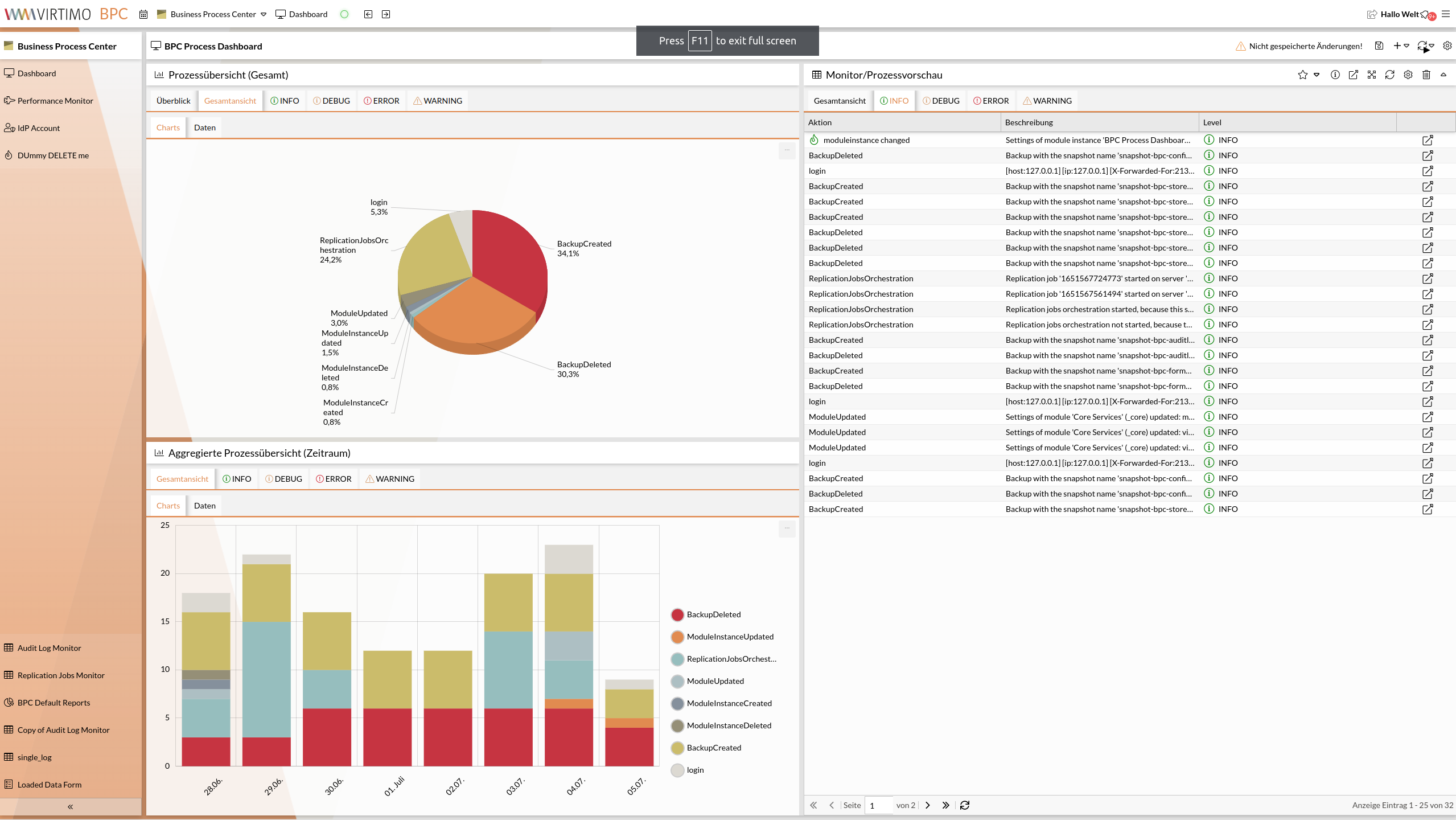
When adding a monitor widget to the dashboard, you can choose from the following types:
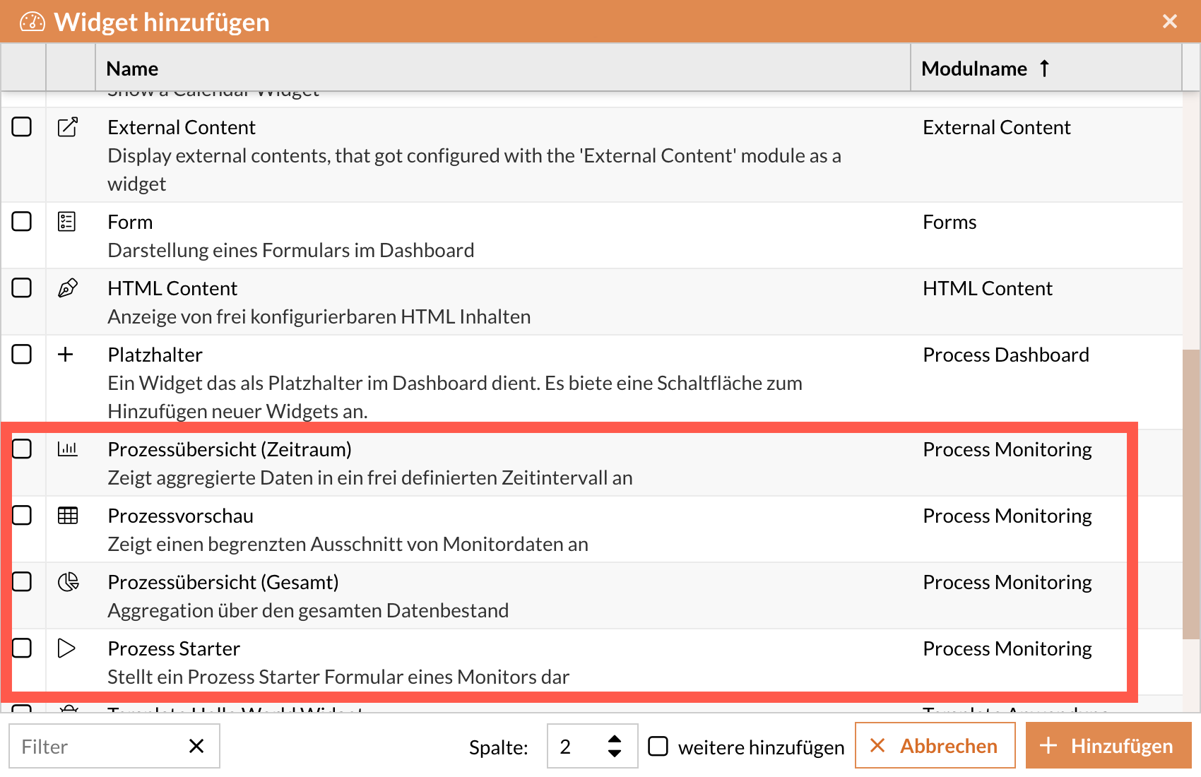
All Monitor widgets have configurations that can be set directly on the widget.
When a new widget is created, default values appropriate for that widget type are already set.
The number of settings and their labels may vary depending on the type.
Widget Configuration Dialog
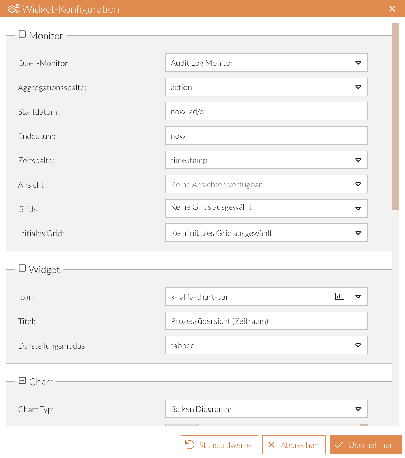
You can access the widget configuration in the relevant dashboard module by clicking the icon in the widget header (see Widget Functions). This opens the Widget Configuration dialog.
Reset Values
Reset individual values:
When you hover over a row, the icon appears for each row. Click it to reset the value for that row to its default.
Reset all values:
To reset all input values, click the Default Values button.
Save settings
-
Click the Apply button.
-
Save the dashboard view (see Save Dashboard).
Process Preview
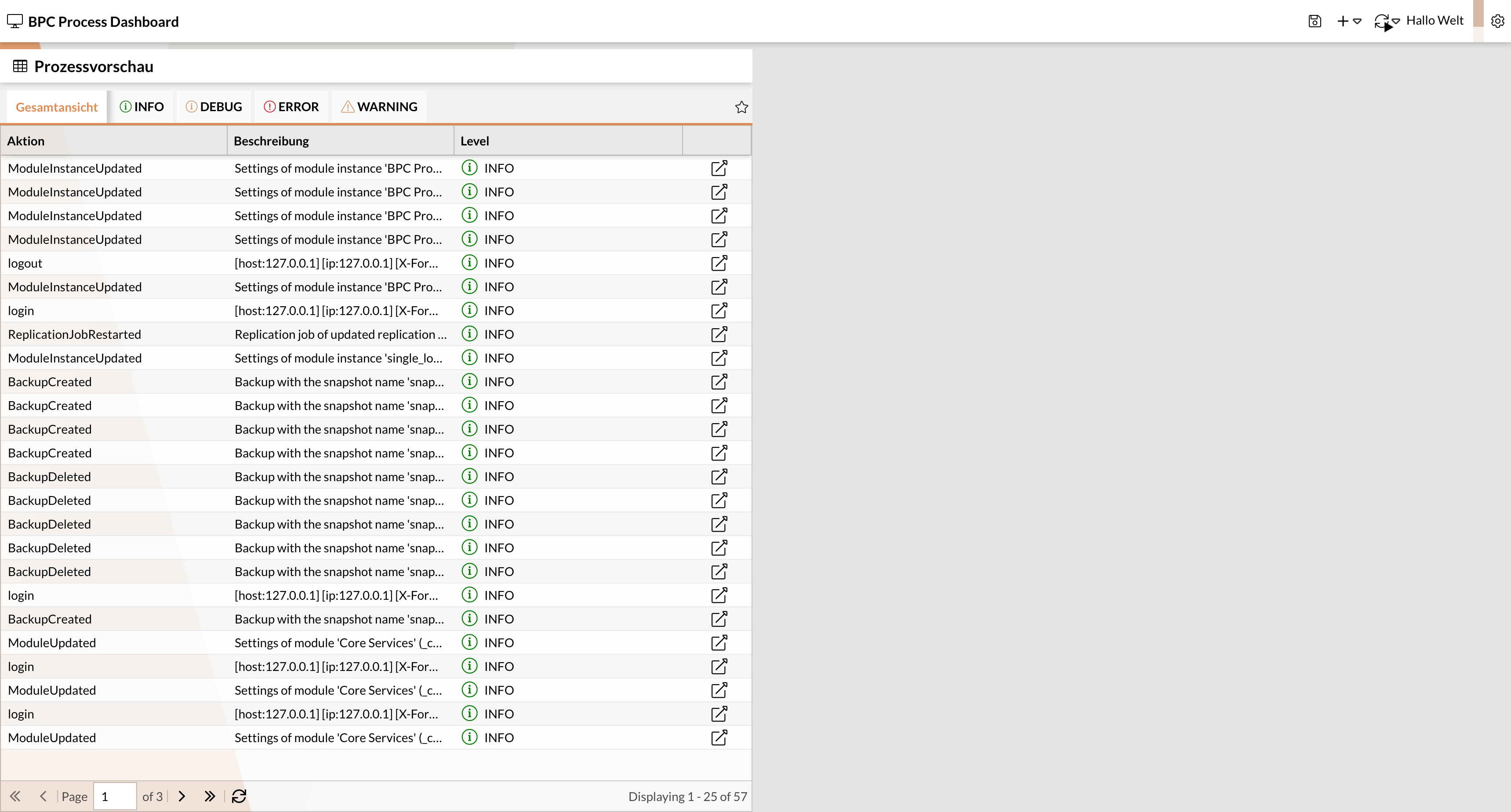
This widget provides a data snapshot from a monitor.
You can configure which columns are displayed and the time period from which the data should be retrieved.
It is also possible to navigate directly to the monitor module via a link so that only the previously selected data set is displayed.
| Setting | Type (default) | Description |
|---|---|---|
Monitor |
||
Source Monitor |
Combo box (Audit Log Monitor) |
Monitor component to which the widget refers |
Columns |
Drop-down list (Empty selection) |
Monitor columns to be displayed in the widget |
Jump column |
Checkbox (active) |
If active, a jump icon is added to each data record to navigate to a specific entry in the monitor. |
Start Date |
Text field (now-1h) |
The start date, which serves as a filter for the displayed data. |
End Date |
Text field (now) |
The end date, which serves as a filter for the displayed data. |
Time column |
Combo box (timestamp) |
Monitor column that holds the date to which the widget refers. |
View |
Combo box (empty selection) |
Monitor view to be referenced in the widget. |
Grids |
Drop-down list (empty selection) |
If multiple grids have been enabled and configured in the selected source monitor, this drop-down list is used to select which grids appear in the tab panel. By default, all available grids are displayed automatically. |
Initial Grid |
Combo Box (Empty Selection) |
If multiple grids have been enabled and configured in the selected source monitor, this combo box is used to select which grid is initially active in the tab panel. |
Widget |
||
Icon |
Icon Picker (x-fal fa-table) |
Select the icon to be displayed in the widget header |
Title |
Text Field (Monitor/Process Preview) |
Enter the title to be displayed in the widget header |
Data |
||
Number of Records |
Numeric Field (25) |
Maximum number of records displayed per page |
Refresh buffer |
Numeric field (10) |
Interval in seconds at which the widget is refreshed when new data is available. |
Monitor Detail Double-Click |
Checkbox (inactive) |
If the inline detail view has been enabled in the selected source monitor ( |
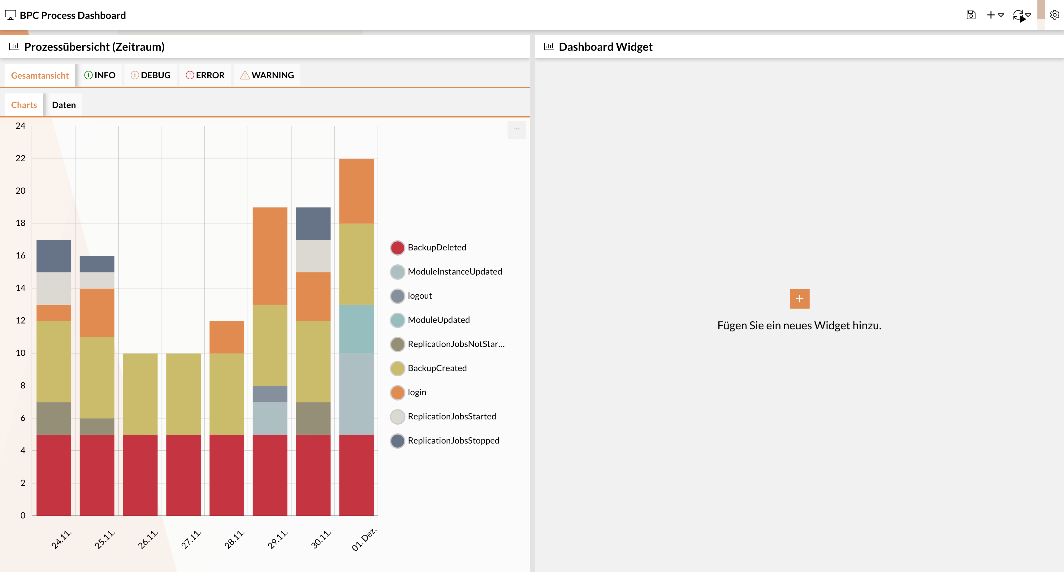
Process Overview (Time Period)
This widget aggregates data based on a column (e.g., "Status") from a defined time period and displays it in a bar or line Diagram.
| Setting | Type (default value) | Description | ||
|---|---|---|---|---|
Monitor |
||||
Source Monitor |
Combo box (Audit Log Monitor) |
Monitor component to which the widget refers |
||
Aggregation Column |
Combo box (STATUS) |
Column by which the data should be aggregated |
||
Start Date |
Text field (now-1h) |
The start date, which serves as a filter for the displayed data. (See OpenSearch notation) |
||
End date |
Text field (now) |
The end date, which serves as a filter for the displayed data. (See OpenSearch syntax) |
||
Time column |
Combo box (timestamp) |
Monitor column that holds the date to which the widget refers. |
||
View |
Combo box (empty selection) |
Monitor view to be referenced in the widget. |
||
Grids |
Drop-down list (empty selection) |
If multiple grids have been enabled and configured in the selected source monitor, this drop-down list is used to select which grids appear in the tab panel. By default, all available grids are displayed automatically. |
||
Initial Grid |
Combo Box (Empty Selection) |
If multiple grids have been enabled and configured in the selected source monitor, this combo box is used to select which grid is initially active in the tab panel. |
||
Widget |
||||
Icon |
Icon Picker (x-fal fa-table) |
Select the icon to be displayed in the widget header. |
||
Title |
Text Field (Monitor/Process Preview) |
Enter the title to be displayed in the widget header. |
||
Display Mode |
Combo Box (tabbed) |
Select the layout for the Diagram and the data table. |
||
Chart |
||||
Chart type |
Combo box (bar chart) |
Selection from the available chart types. |
||
Chart configuration |
JSON field (Default Diagram Configuration for Line and Bar Diagrams) |
JSON configuration of the chart. |
||
Hidden graphs |
Combo box (No selection) |
List of graphs initially hidden. These can be shown again as needed via the legend and remain visible even after a browser refresh. |
||
Graph Order |
Drop-down list (empty selection) |
Controls the order in which the data is displayed in the chart (or data table). The order from the drop-down list is applied. |
||
Interval |
Combo box (Day) |
Interval over which the data is aggregated. Possible values range from "Second" to "Year".
|
||
Date format |
Text field (dd.MM.yyyy or MM/dd/yyyy) |
Date format displayed in the tooltip when you hover over the time series in the Diagram. When creating the widget, the value is set based on the language selected in BPC. (For German: dd.MM.yyyy; for English: MM/dd/yyyy) |
||
Data |
||||
Date format |
Text field (d.m.) |
Format for displaying the date in the data table. |
||
Refresh Buffer |
Numeric Field (10) |
Interval in seconds at which the widget is refreshed when new data is available. |
||
Checkbox (inactive) |
Controls whether entries that fall after the selected end date are included in the total row of the data table |
|||
Previous Data |
Checkbox (inactive) |
Controls whether entries that fall before the selected start date are included in the total row of the data table |
||
Hide zero values |
Checkbox (inactive) |
When enabled, spaces are displayed in the data table instead of the numeric value "0" |
||
Hide empty rows |
checkbox (inactive) |
Rows for which no data exists can be hidden in the table using this setting. |
||
Excluded Values |
Drop-down list (empty selection) |
Values included in this list are completely excluded from the widget and cannot be displayed by the user. |
||
Alignment |
Combo box (center) |
Controls the alignment of the entries in the data table. |
||
Total Row Position |
Combo box (Embedded) |
Controls the position of the total row.
|
||
Diagram
In the process overview, you can display values over a specific time period as a Diagram and as a Data Table. You can switch between the two views using the tabs.
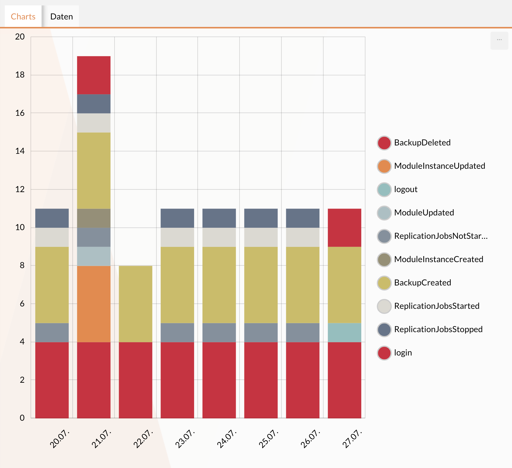
Default Diagram Configuration for Line and Bar Diagrams
The default diagram configuration for the bar/line diagram can be found in the following JSON. For more details, see the amCharts 4 Documentation.
{
  "categoryAxis": {
    "renderer": {
      "labels": {
        "template": {
          "rotation": 315
        }
      }
    },
    "gridIntervals": [
      {
        "timeUnit": "day",
        "count": 1
      }
    ],
    "dateFormats": {
      "day": "dd.MM."
    }
  },
  "valueAxis": {},
  "legend": {
    "type": "Legend",
    "position": "right",
    "labels": {
      "fontSize": 14
    },
    "useDefaultMarker": true,
    "markers": {
      "children": [
        {
          "cornerRadiusTopLeft": 12,
          "cornerRadiusTopRight": 12,
          "cornerRadiusBottomRight": 12,
          "cornerRadiusBottomLeft": 12,
          "strokeWidth": 2,
          "strokeOpacity": 1,
          "stroke": "#ccc"
        }
      ]
    }
  },
  "exporting": {
    "menu": {}
  }
}
Customizing the Legend
By default, the legend is located to the right of the Diagram.
However, it can be customized by editing the postion attribute at legend.
Possible values are "top," "bottom," "left," and "right."
{
  "legend": {
    "type": "Legend",
    "position": "right",
    "labels": {
      "fontSize": 14
    },
    "useDefaultMarker" : true
  }
}
By default, the legend also uses round markers for the data series.
If you prefer square markers, you can configure them by setting the attribute useDefaultMarker at legend to false.
The font size in the legend is set to 14 pixels by default.
This can be edited under legend' → `labels → fontSize.
Individual charts can be shown or hidden by clicking in the legend. The status of hidden graphs is saved in local storage, so your selection is retained when the page is reloaded. If key widget settings are changed—such as the underlying monitor or the aggregation column—all graphs are automatically displayed again.
Customize the date format on the X-axis
Under dateFormats → Resolution (in this case, “day”), you can configure the date format for the X-axis.
For more information on configuration, see Amcharts Date Formatter
{
   "dateFormats": {
      "day": "dd.MM."
    }
}
Data Table
The data table displays the chart values for the selected time period in a table.
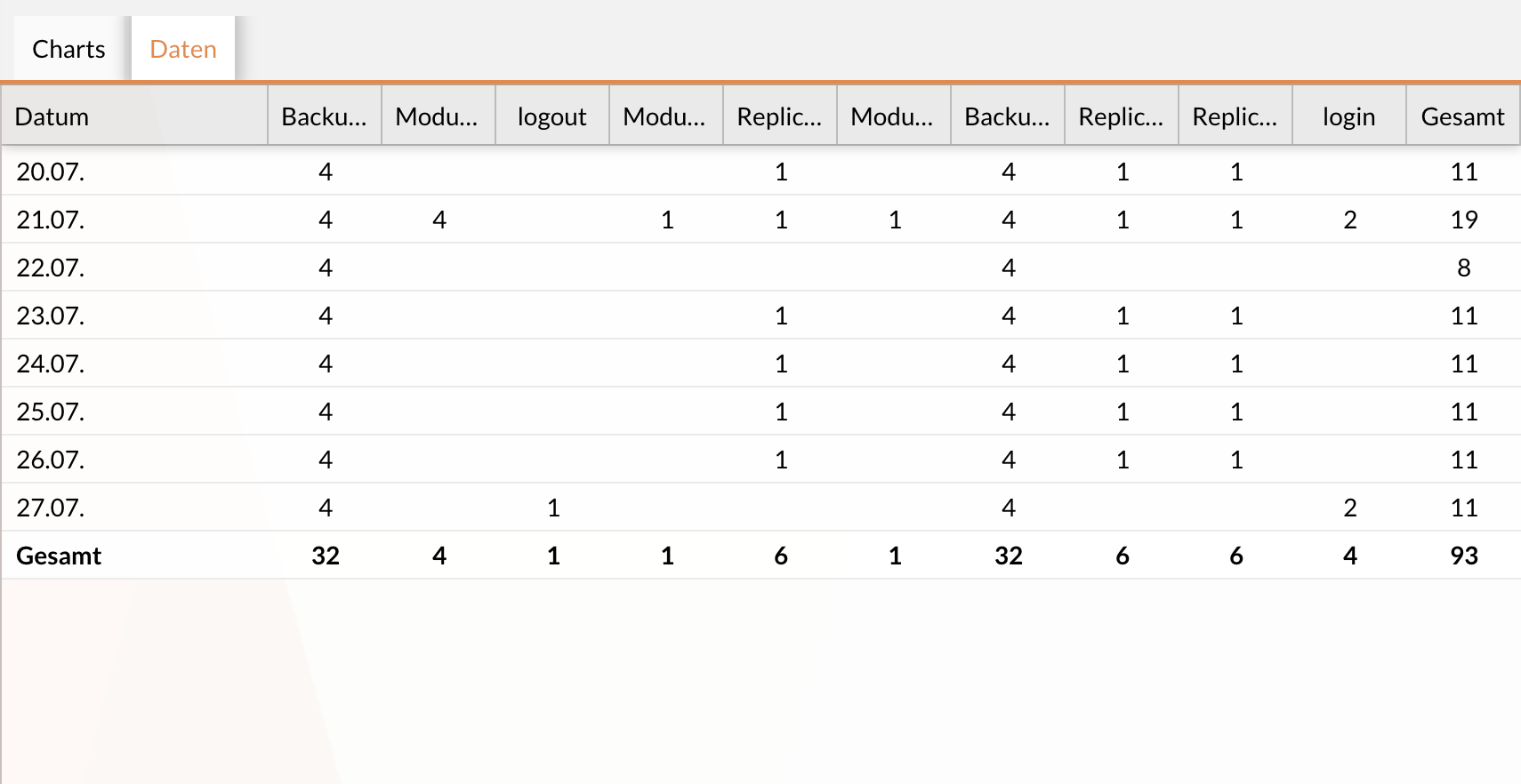
Adjustments to the table and cell layouts can be made using the settings in the "Data" section of the widget configuration.
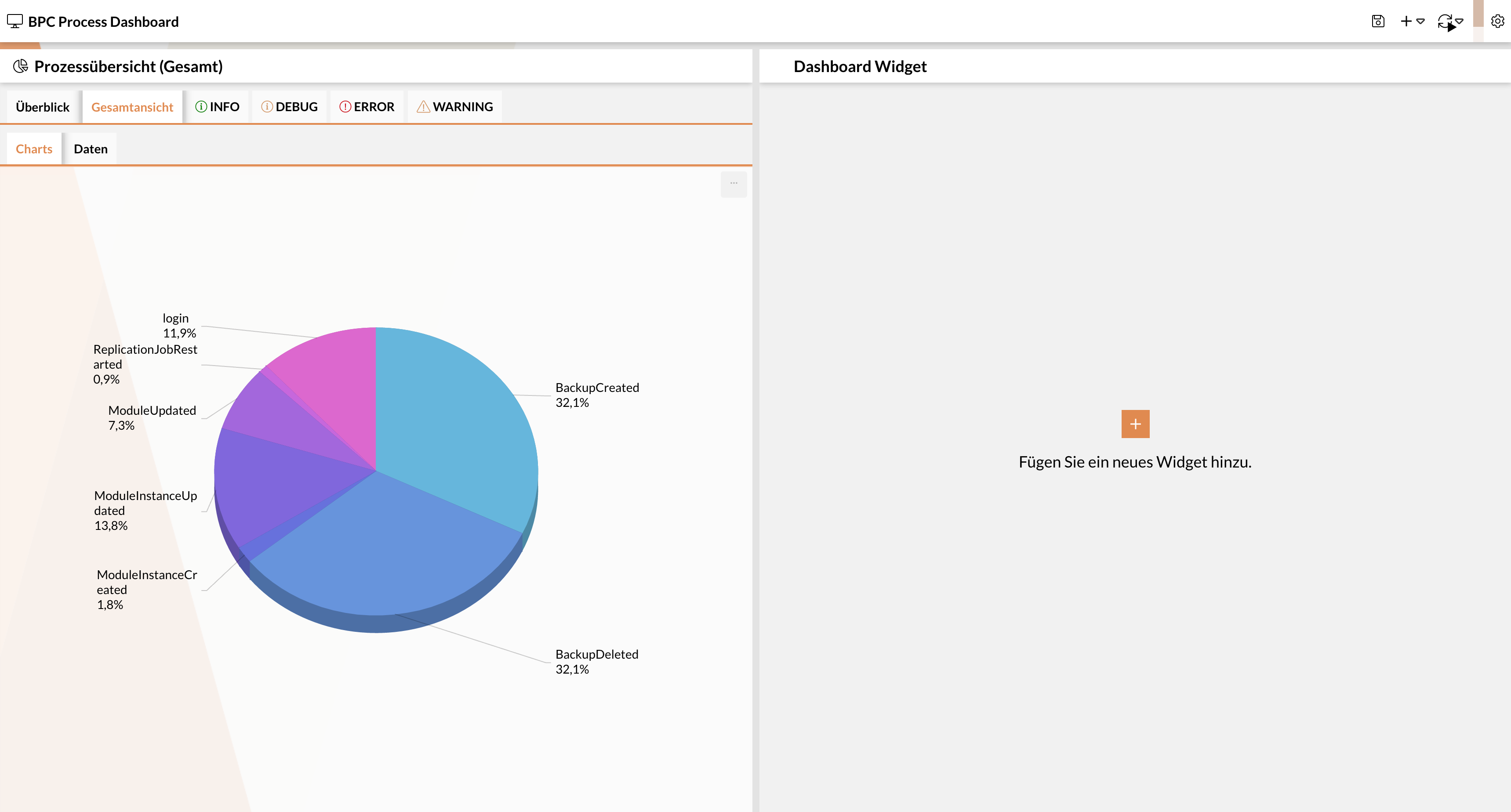
Process Overview (Overall)
This widget aggregates data based on a column (e.g., status) and displays it in a pie chart. Optionally, the time period can also be narrowed down.
| Setting | Input Field (Default Value) | Description |
|---|---|---|
Monitor |
||
Source Monitor |
Combo Box (Audit Log Monitor) |
Monitor component to which the widget refers. |
Aggregation Column |
Combo Box (STATUS) |
Column by which the data should be aggregated. |
Start Date |
Text Field (now-1h) |
Start date used as a filter for the displayed data. See OpenSearch syntax |
End date |
Text field (now) |
End date that serves as a filter for the displayed data. See OpenSearch syntax |
Time column |
Combo box (timestamp) |
Monitor column that holds the date to which the widget refers. |
View |
Combo box (empty selection) |
Monitor view to be referenced in the widget. |
Grids |
Drop-down list (empty selection) |
If multiple grids have been enabled and configured in the selected source monitor, this drop-down list is used to select which grids appear in the tab panel. By default, all available grids are displayed automatically. |
Initial Grid |
Combo Box (Empty Selection) |
If multiple grids have been enabled and configured in the selected source monitor, this combo box is used to control which grid is initially active in the tab panel. |
Widget |
||
Icon |
Icon Picker (x-fal fa-table) |
Select the icon to be displayed in the widget header. |
Title |
Text Field (Monitor/Process Preview) |
Enter the title to be displayed in the widget header. |
Display Mode |
Combo Box (tabbed) |
Select the layout for the Diagram and data table. |
Chart |
||
3D |
Checkbox (active) |
Controls whether the Diagram is displayed in 3D. |
Chart configuration |
JSON field (Default Diagram Configuration for Line and Bar Diagrams) |
JSON configuration of the Diagram. |
Hidden graphs |
Combo box (empty selection) |
List of all Diagrams that are initially hidden. Graphs can be shown again via the legend. The p-down list is applied. ** |
Data |
||
Update buffer |
Numeric field (10) |
Interval in seconds at which the widget is updated when new data is available. |
Hide zero values |
Checkbox (inactive) |
When active, spaces are displayed in the data table instead of the numeric value 0 |
Excluded values |
Drop-down list (empty selection) |
Values included in this list are completely excluded from the widget and cannot be displayed by the user. |
Alignment |
Combo box (center) |
Possible values: "left", "right", "center" |
Alignment |
Combo box (center) |
Controls the alignment of the entries in the data table. Possible values: "left", "right", "center" |
Total Row Position |
Combo Box (Embedded) |
Controls the position of the total row.
|
Default Diagram Configuration for the Pie Diagram
The default diagram configuration for the pie diagram can be found in the following JSON. For further details, see the amCharts 4 Documentation
{
    "labelRadius": 2,
    "language": "de",
    "export": {
        "language": "de",
        "enabled": true
    },
    "marginTop": 5
}
Process Starter
This widget represents a Process Starter. It can be used to start processes directly.
| Name | Type | Description |
|---|---|---|
Monitor |
|
Monitor from which Process Starters should be offered. |
Icon |
icon |
Selection of the icon to be displayed in the widget header |
processKey |
string / text |
Process ID from the process starter configuration If this value is not set, You can select a process starter from a list of available options. |
Title |
string / text |
Title of the widget in the dashboard |
Views in Monitor Widgets
For the "Process Preview," "Process Overview (Time Period)," and "Process Overview (Total)," including the preconfigured filters and/or sort orders, can also be displayed and used within the widget.
To use Monitor views in the widget, they must first be configured in the selected source Monitor (see Manage Process Views). In the “Process Preview,” “Process Overview (Time Period),” and “Process Overview (Total)” widgets, monitor views can be referenced, allowing the filters and/or sort orders configured in the view to be used within the widget.
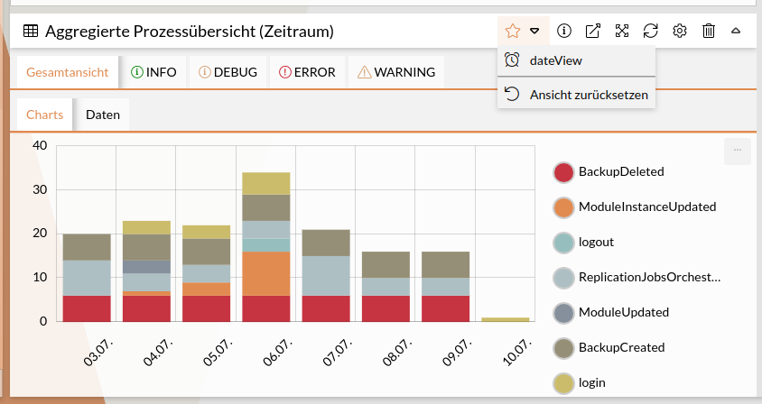
This is done in the configuration panel under the "View" drop-down menu. Alternatively, you can use the quick selection () from the widget header.
|
If a view contains filters based on the time column, these are not applied in the widget. Filtering based on the time column in the widget is performed by configuring the start and end dates. |
