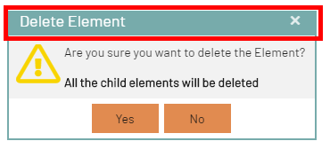
Developing a BPC Theme
There are two different approaches: Basic (for consultants) and Advanced (for developers).
Creating a Theme Repository
To create a custom client theme, you must create a new repository based on an existing template. The following section describes the steps required to create and customize such a repository.
Fork the Template
To create a customer theme and have a personal copy of the repository under your own account, you must fork this repository in Bitbucket:
The naming should follow the convention “BPC-theme-[customer]” and is explained further below.
|
Make sure you perform the fork in the workspace |
Rename the template files according to your needs
Here is an example of the process for creating a new Virtimo theme:
-
Rename the folder at
packages/local/bpc-theme-[name]to the name of the theme you are working on. -
Go to the
packages/local/bpc-theme-[name]package.jsonfile and edit the “name” property. -
At
packages/local/bpc-theme-[name], edit the theme name in thebuild.xmlfile. -
Go to the
packages/local/resourcesfolder, locateloginBackgrounds.json, and adjust the path for the login background images. -
Go to the
packages/local/resourcesfolder, locatethemeConfig.json, and edit the path for the favicon image. -
Open the file
gradle.propertiesand edit the packageName and symbolicName properties.
Alternatively, you can search the project for “theme-template” and replace it with the name of the theme you are working on. This way, you can ensure that you have replaced everything necessary.
|
See also Theme Configuration with JSON Files |
Setting Up the Development Environment
-
ExtJS should be available in your project and can be obtained directly from Bitbucket via npm.
-
You can build the theme and test whether everything works using:
./gradlew --stacktrace(on Linux/Mac) orgradlew --stacktrace(on Windows). -
For more detailed information on setting up the development environment, see the README for the respective project.
-
You’ll also find a comprehensive overview of various methods for deploying modules and themes in BPC, as well as specific instructions for building and testing modules and themes (see Backend Connections) (See Deploying BPC Modules and Themes)
Basic Theming - for quick results
In the theme folder at …\packages\local\bpc-theme-[customer]\sass\var`, you’ll find the companyConfig.scss file.
This is your main configuration file for the process.
//In this file you define all the Basics for the Company Theme

//Please choose if you want to use a Light or dark theme
$LightTheme:  true;

//Decide if you want a neutral color for Panel headers and borders - default = false
$CompanyNeutralPanels:false;

//primary color for buttons and selections
$CompanyMainColor: darken(#96bebe, 5%);
$VirtimoMainColor: blue;
$CompanyMainContrastColor: #ffffff; //used for text on top of the Main Color

//[OPTIONAL]- define a different color for the action buttons
$CompanyButtonColor: $CompanyMainColor;
$CompanyButtonContrastColor: $CompanyMainContrastColor;

//Logo
$CompanyLogo: "../bpc-theme-template/resources/images/galaxy.svg";
//$CompanyLogo: url(images/logo_light.png); //for dark themes
$CompanyLogoWidth: 48px;
$CompanyLogoSpace: 10px;

//Icon
$CompanyIcon: "images/white_icon.png"; // for darker main colors

$CompanyProductText: "Template Inc.";
$CompanyProductTextSize: 26px;
There are options for a LightTheme or a DarkTheme ($LightTheme).
There is an option to decide whether panels should be colored ($CompanyNeutralPanels).
Two options for color settings: primary color ($CompanyMainColor) and its contrast color ($CompanyMainContrastColor).
[OPTIONAL] Two options for color settings: primary color ($CompanyButtonColor) and its contrast color ($CompanyButtonContrastColor).
And the path for the logo ($CompanyLogo) and the icon ($CompanyIcon).
This should be sufficient for most theming cases.
Color Gradient
A color gradient is often used for the vertical navigation bar, which can be customized with the following variable:
$navToolbarBackgroundImage: linear-gradient(180deg, rgba($VirtimoMainColor,0.0) 0%, rgba($VirtimoMainColor,0.6) 100%);This variable defines a linear color gradient that runs from top to bottom (180 degrees). The gradient starts at 0% with a fully transparent version of the main color ($VirtimoMainColor) and ends at 100% with a version of the same color that is 60% transparent. This creates a smooth transition that serves as the background for the navigation bar.
If you do not want a color gradient, you can set this variable to none to disable the gradient.
Light and Dark Mode
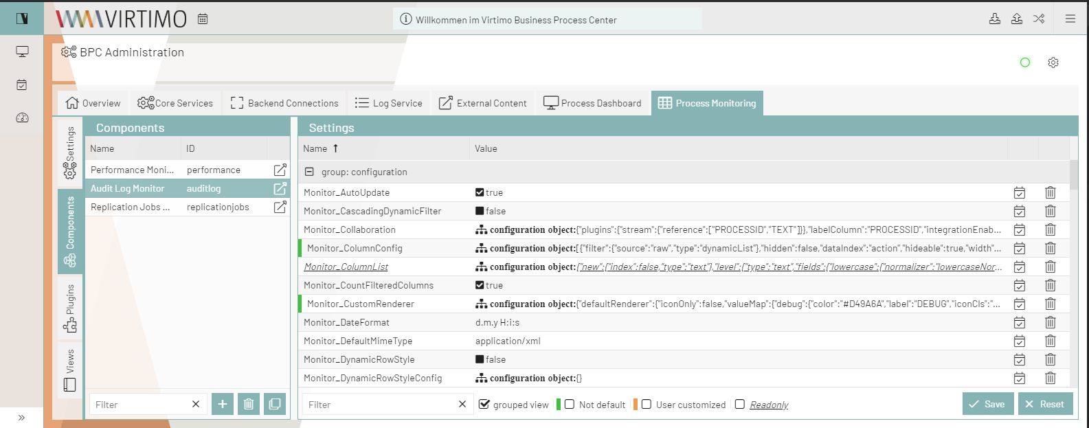
If you want to keep the LightTheme, simply set the variable $LightTheme to true:
$LightTheme: true;
If you want to enable the DarkTheme, simply set the variable $LightTheme to false:
$LightTheme: false;
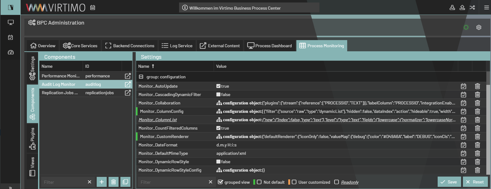
All background colors, borders, and other elements respond to this adjustment and change to a white background (#FFFFFF) for the LightTheme and a dark gray (#333333) for the DarkTheme.
All text colors, icons, and glyphs are assigned a contrasting color to ensure sufficient contrast (default for LightTheme: rgba(0,0,0,.87); DarkTheme: rgba(255,255,255,.87)).
Colored or Neutral Panels
Specify whether you want a neutral color for panel headers and borders—default = false $CompanyNeutralPanels:false;
If you set this variable to its default value, the headers and borders throughout the client will use the primary color as the background and border color.
If you change $CompanyNeutralPanels to true:
The background of the headers and the borders will be converted to a uniform gray, always taking into account the theme you are using. The text color adjusts automatically.
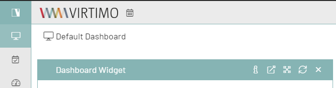
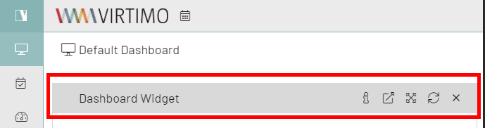
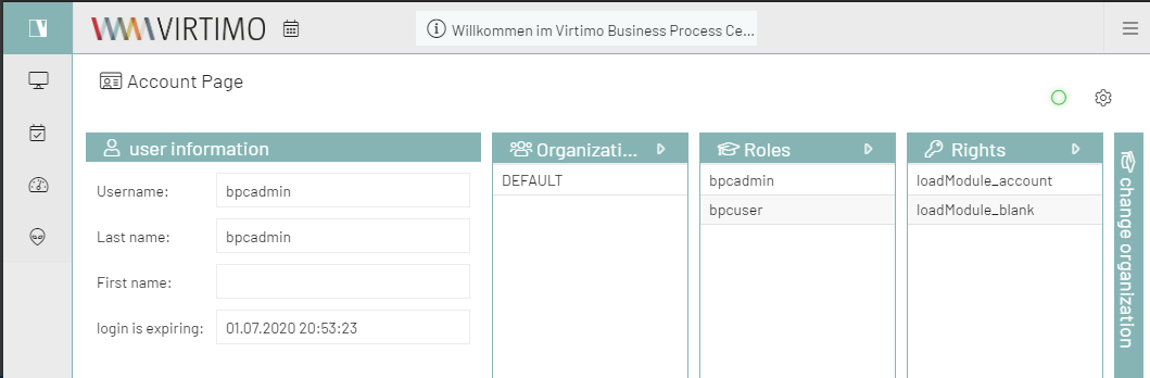
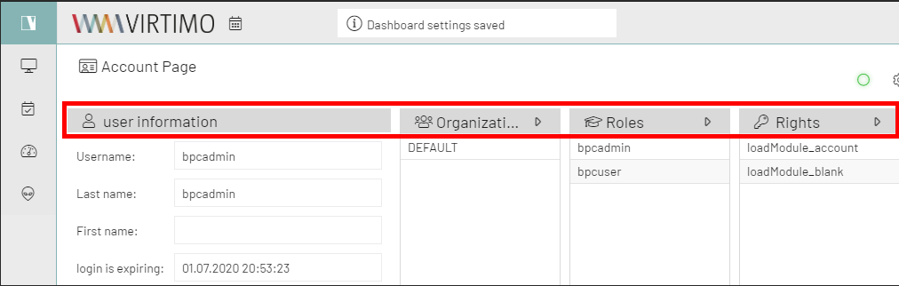
This is useful for customers who need particularly vibrant colors.
Highlight/Primary Color
//primary color for buttons and selections
$CompanyMainColor: #E08A50;
$CompanyMainContrastColor: #ffffff; //used for text on top of the Main Color
To set a primary color, you must edit the $CompanyMainColor in the file companyConfig.scss.
This must be a hex color code.
You must also define the $CompanyMainContrastColor for text above the defined color.
This color should contrast well with the selected color (#ffffff or #111111 works best)
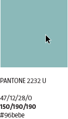
In this example, the color used is $CompanyMainColor: darken(#96bebe, 5%);.
It is one of Virtimo’s corporate colors, darkened by 5% using a Sass function.
The main color is used as the highlight color for most colored elements in the client. It is also used for hover colors and various icons, buttons, etc.
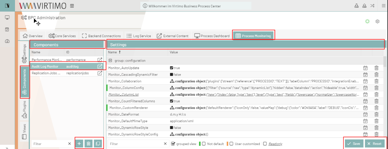
If you want to set a main color for a client theme, simply insert the hex color code as follows: $CompanyMainColor: #96bebe;
Manipulating Colors
You can customize the color by lightening or darkening the original client color using these functions:
lighten([color], [percentage]); or darken([color], [percentage]);
Example:
$CompanyMainColor: lighten(#96bebe, 10%);
$CompanyMainColor: darken(#96bebe, 10%);
|
For more information on color manipulation, see here: Sass Documentation - Colors |
[OPTIONAL] Button Color
//[OPTIONAL]- define a different color for the action buttons
$CompanyButtonColor: $CompanyMainColor; //background for the buttons
$CompanyButtonContrastColor: $CompanyMainContrastColor; //textcolor for the buttons
The button colors inherit their colors from $CompanyMainColor and $CompanyMainContrastColor.
If you want to change the default color of the buttons in the client, you can do so by changing $CompanyButtonColor and $CompanyButtonContrastColor from variables to hex color codes.
Please make sure the text color has sufficient contrast.
//[OPTIONAL]- define a different color for the action buttons
$CompanyButtonColor: #e18b50; //background for the buttons
$CompanyButtonContrastColor: #111111; //textcolor for the buttons
Here, Virtimo orange was used.
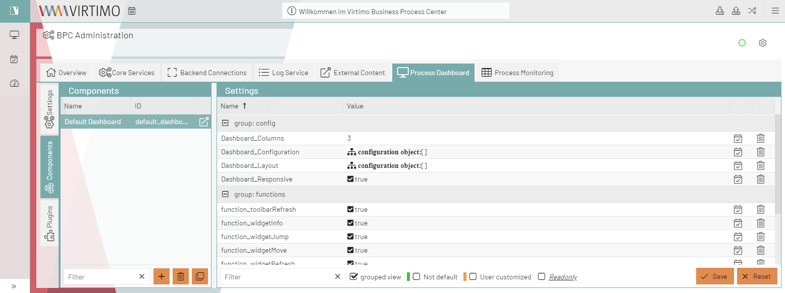
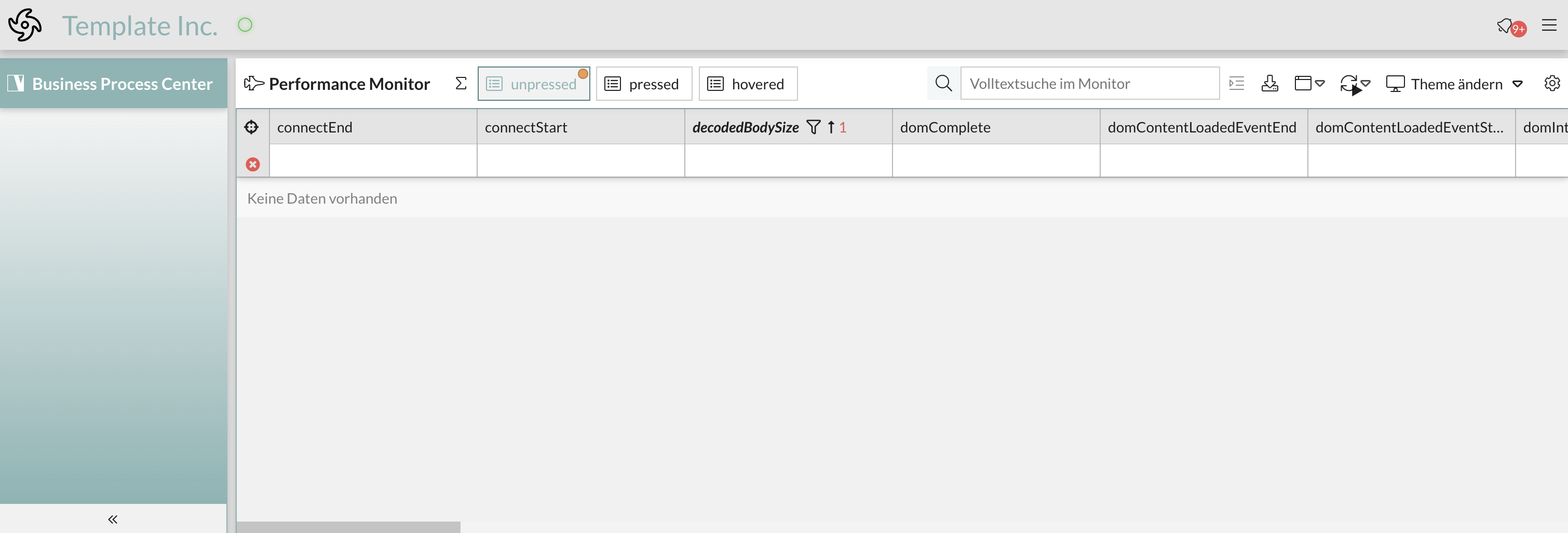
The client now looks like this:
      :
image::core:dev/bpc-theme/example-button-2.png[]
      :
image::core:dev/bpc-theme/example-button-3.png[]
The buttons at the bottom of each dialog box, as well as the buttons in the AppToolBar that the mouse pointer hovers over, are now orange.
Logo, Icon & Background
Company Logo
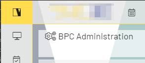
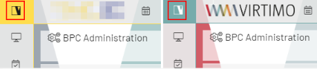
The height of the logo is always 32px. The width is variable.
In the theme folder at …\packages\local\bpc-theme-NAME\resources\images, you will find the logo.png and logo_light.png, bg_1.jpg, and bg_2.jpg.
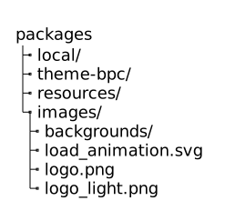
You only need to replace these files with your client’s logo and background. If the logo has a different name, you’ll need to adjust the URL path in companyConfig.scss and, if necessary, adjust the width.
//Logo
$CompanyLogo: "../bpc-theme-template/resources/images/galaxy.svg";
//$CompanyLogo: url(images/logo_light.png); //for dark themes
$CompanyLogoWidth: 48px;
$CompanyLogoSpace: 10px;
If you use different names or numbers for backgrounds, you’ll need to update loginBackgrounds.json (…\packages\local\bpc-theme-<customer>\resources):
{
  "comment_backgroundImagesList": "List of URLs to use as background on the loginscreen",
  "backgroundImagesList": [
    {
      "url": "/bpc-theme-template/resources/images/bg_1.jpg",
    },
    {
      "url": "/bpc-theme-template/resources/images/bg_2.jpg",
    }
  ],

  "favIcon": "/bpc-theme-template/resources/images/favicon.png",
  "comment_applicationBackgroundImage": "URL to Application background image; this example is a transparent pixel image",
  "applicationBackgroundImage": "data:image/png;base64,iVBORw0KGgoAAAANSUhEUgAAAAEAAAABCAQAAAC1HAwCAAAAC0lEQVR42mNkYAAAAAYAAjCB0C8AAAAASUVORK5CYII="
  "hideLogoInLogin": false
}
Issue with SCSS variables in Base.scss and solution
Background
The Base.scss file currently uses SCSS variables to define styles such as colors and layouts. However, these variables are retrieved from the BPC-theme at build time, not from the customer-specific themes. This results in changes to customer-specific themes being ignored, since the SCSS variables are defined statically at build time.
Problem
The problem occurs because SCSS variables are static and are compiled only once during the build process. Changes made after this process are not taken into account, since the variables are already set. To resolve this limitation, SCSS variables should be replaced with CSS variables. If you have any questions or need CSS variables, please contact Support. CSS variables are dynamic and can be adjusted at runtime, which allows custom themes to be loaded and applied correctly.
Available CSS Variables
In the BPC environment, CSS variables are defined in several files that are used to customize styles. The most important sources are:
-
cssVariables.scss: This file is located in the corresponding theme directory and contains all global CSS variables used for the theme’s design.
-
FE Monitor: In the FE Monitor, you’ll also find CSS variables responsible for specific UI components and their customizations. These variables are important if you want to make custom adjustments to specific interface elements.
-
BPC Theme: The BPC theme also contains predefined CSS variables that are used by default throughout the application. These variables provide a foundation upon which custom themes can be built.
-
Customer Theme: Finally, CSS variables can also be defined in the specific customer theme. These variables can be created specifically to meet a customer’s individual requirements and customizations.
Checking Files: To find the available CSS variables, you should search through all the files mentioned, particularly cssVariables.scss, the FE Monitor, and the BPC theme. Additionally, you can use the browser developer tools to view the CSS variables currently being applied and check their values.
Important: If you need a specific CSS variable that is not listed in cssVariables.scss, or if you have questions about its use, please do not hesitate to contact support. The BPC team is ready to provide support and, if necessary, add additional variables to the base theme.
Advanced Theming - for a deeper technical understanding
In the theme folder at …\packages\local\theme-bpc\sass\var, you’ll find the important files for customizing the client’s appearance.
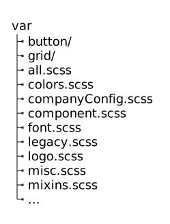
How the Styles Are Structured
The all.scss file imports all necessary files into a single Sass stylesheet.
//@import "legacy";
@import "companyConfig";
@import "colors";
@import "mixins";
@import "font";
@import "logo";
@import "misc";
The order is very important. This is because most of the variables and styles defined in these files inherit information from one another.
-
So we first set the company variables in companyConfig.scss → these provide the information needed to define all colors.
-
The colors.scss file → all other styles will receive color information from here.
-
The mixins.scss file contains useful mixin functions.
-
In the font.scss file, we set the font size and font family.
-
The logo.scss file defines the styles for the logo and icon.
-
The misc.scss file overrides some Sencha styles and also defines styles for custom components or custom client-side behavior. This file does not set variables, but rather defines styles for classes by using the defined variables.
//************ Notification fields (Willkommen im BPC)

.bpcNotification {
  color: $color;
  background-color: $lighterBackground;
}
Changing Colors - advancedConfig.scss
Required Settings
At the beginning of this file, you’ll find the important variables that inherit the $Company[..] variables from companyConfig.scss, as well as the toggle for light and dark themes.
//primary color for buttons and selections
$VirtimoMainColor: dynamic($CompanyMainColor);
$VirtimoMainContrastColor: $CompanyMainContrastColor; //used for text on top of the Main Color

//main background color - automated via $LightTheme
$VirtimoBackgroundColor: dynamic(if($LightTheme, #FFF, #333));  //if $LightTheme is true, use #fff else use #333
//text colors - automated via $LightTheme
$VirtimoTextColor: dynamic(if($LightTheme, rgba(0,0,0,.87) ,rgba(255,255,255,.87))); //if $LightTheme is true, use rgba(0,0,0,.87) else use rgba(255,255,255,.87);

//buttons
$VirtimoButtonColor: dynamic($CompanyButtonColor);
$VirtimoButtonContrastColor: dynamic($CompanyButtonContrastColor);| Variable Name | Description | Definition in companyConfig.scss | Usage |
|---|---|---|---|
$Virtimo-MainColor |
This is the highlight color. Anything that is colored uses this variable: active tabs, active table rows, buttons (unless otherwise defined), some icons, highlights in menus and tables, etc. |
$Company-MainColor |
|
$Virtimo-MainContrastColor |
The text color for all elements that appear on top of this color. This should be black or white, depending on the main background color. This differs from the $VirtimoTextcolor. |
$Company-MainContrastColor |
See above |
$Virtimo-BackgroundColor |
This is the universal background color for the entire client. It is generated via an if statement. Use $LightTheme → #FFF if NOT $LightTheme → #333. You can also set the hex code. But then the themes wouldn’t work. |
$LightTheme |
|
$VirtimoTextColor |
The universal text color throughout the client. It is determined by an if statement. Use black if $LightTheme → black; otherwise, use black. You can also set the hex code. But then the themes wouldn’t work. |
$LightTheme |
|
$VirtimoButtonColor |
This is the background color for the main buttons in dialogs. |
$CompanyButtonColor |
|
$VirtimoButtonContrastColor |
The text color on each button. This should be black or white, depending on the button’s background color. |
$Company-ButtonContrastColor |
See above |
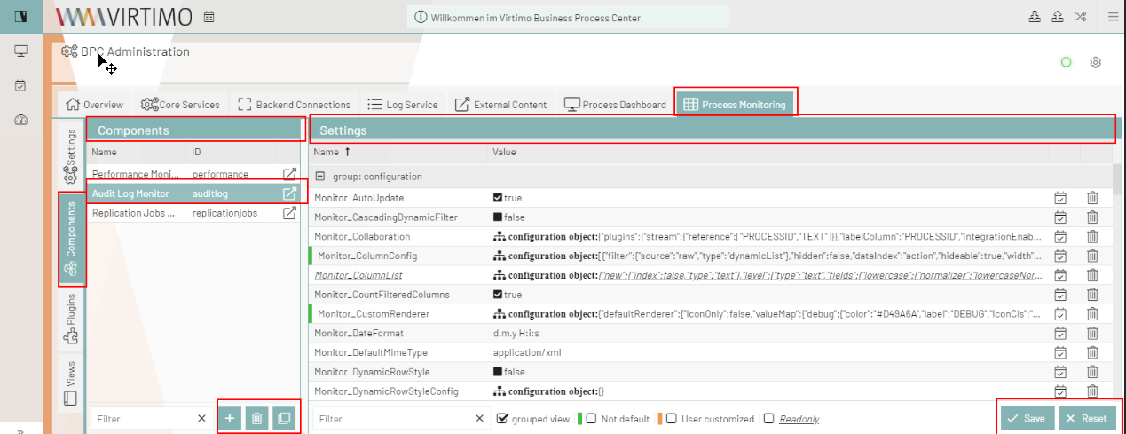

Optional Settings
In a second section, you’ll find a number of optional variables for further customization.
/****** [OPTIONAL] In addition you can configure these colors _________________________________________________________

$VirtimoToolBarBackgroundColor: dynamic(darken($VirtimoBackgroundColor, 10%));

$bpcApplicationAreaSwitchButtonBackgroundColor: dynamic($VirtimoMainColor); //VirtimoToolBar Icon (top left)
$bpcApplicationAreaSwitchButtonColor: dynamic($VirtimoMainContrastColor); // Textcolor in Icon

//border colors
$VirtimoBorderColor: dynamic($VirtimoMainColor); //colorful

//Highlighting generated by $VirtimoMainColor
$VirtimoHighlightColor: dynamic($VirtimoMainColor);
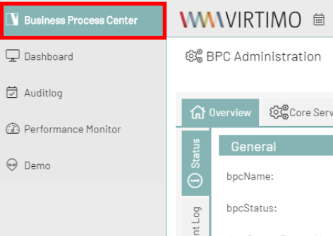
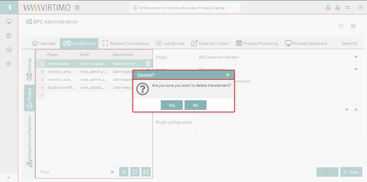
In the following, only these variables are used to generate the rest of the design. There is no need to change any other variables.
| Variable Name | Description | Defined by Another Variable | Usage |
|---|---|---|---|
$VirtimoToolbarBackgroundColor |
This variable takes the background color and modifies it to highlight the toolbar and navigation so that it works in both theme modes. |
$VirtimoBackgroundColor |
|
$BPCApplicationAreaSwitchButtonBackgroundColor |
This variable specifies the background color for the app icon. This color inherits from $VirtimoMainColor. |
$VirtimoMainColor |
|
$BPCApplicationAreaSwitchButtonColor |
Text color for the app icon button |
$VirtimoMainContrastColor |
See above |
$VirtimoBorderColor |
This variable defines the colored borders around dialogs, the app toolbar, and panels. This color inherits from $VirtimoMainColor. |
$VirtimoMainColor |
|
$Virtimo-HighlightColor |
This variable defines the color for hover highlights, selection colors, etc. |
$VirtimoMainColor |
|
Custom Theming for All Components - advancedConfig.scss
If your client wants further customizations, you can override all defined colors according to their preferences.
All you need to do is look up the variables in the theme-BPC colors.scss file for the desired component and override them in the advancedConfig.scss file.
If the original color was declared in a dynamic(); function, you should keep it; otherwise, the new color definition will NOT work.
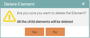
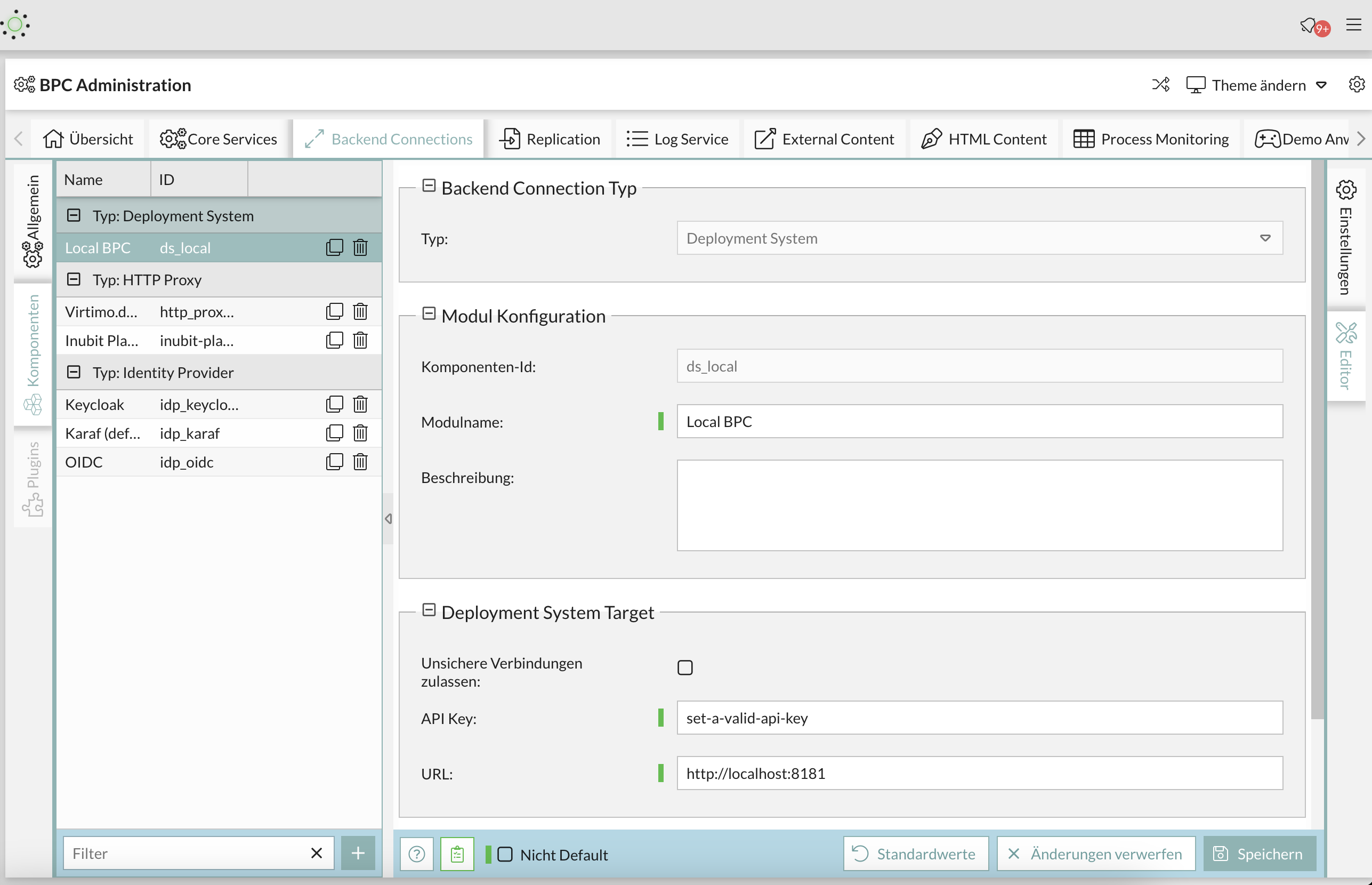
Here is an example for the lower panel area and the text color in the user interface.
The original code in theme-BPC looks like this:
// Unterer Panelbereich Hintergrundfarbe (button toolbar)
$toolbar-footer-background-color: $mainViewBackgroundColor;
$toolbar-background-color:$mainViewBackgroundColor;
Simply copy the variables into your theme and replace the colors with your choice (these can also be hex codes):
// Unterer Panelbereich Hintergrundfarbe (button toolbar)
$toolbar-footer-background-color: lightblue;//$mainViewBackgroundColor;
$toolbar-background-color:$mainViewBackgroundColor;
Result
Another example with the text color:
//text color
$appToolbarColor: red;
$toolbar-scroller-glyph-color: dynamic($color);
$appToolbarColorOver: $VirtimoButtonColor; //colorful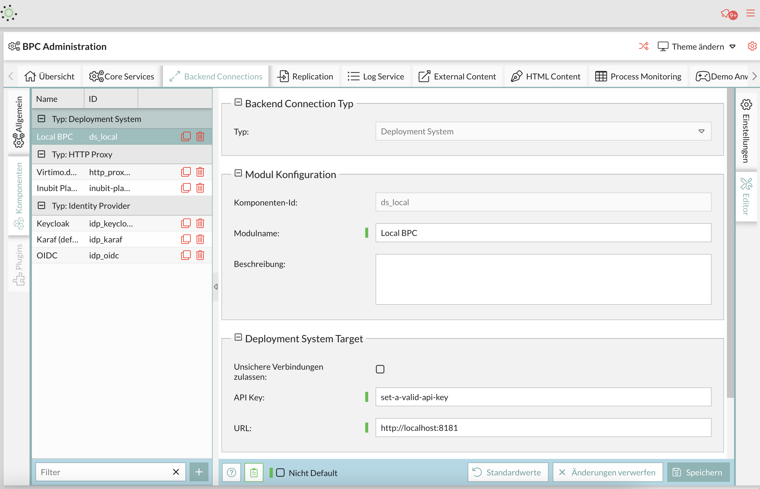
ExtJS Variables
If you want to customize a specific element in the GUI, you can search for that element’s Ext variable by inspecting it in the browser and looking up the component’s name in the Ext documentation for theme variables. For example, if you want to edit something in the menu, you can examine all the variables in ExtJS related to the menu and find the variable you need.
Once you’ve found a variable you want to use, organize your project properly by creating a folder under ` packages/local/bpc-theme-[name]/sass/var ` for each component you want to customize.
This might look like the following:
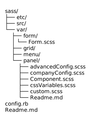
Here is a list of all colors in colors.scss that you can override*
//Apptoolbar (oben)
//background
$appToolbarBackgroundColor: dynamic(rgba($VirtimoToolBarBackgroundColor,0.8));
$appToolbarBackgroundColorOver: $appToolbarBackgroundColor;
//text color
$appToolbarColor: $color;
$toolbar-scroller-glyph-color: dynamic($color);
$appToolbarColorOver: $VirtimoButtonColor; //colorful
//borders
$appToolbarBorderColor: dynamic($bpcApplicationAreaSwitchButtonBackgroundColor);

//Remove implicit spaces
$toolbar-vertical-spacing: 0;
$toolbar-horizontal-spacing: 0;
$toolbar-separator-horizontal-margin: 0px;

// Unterer Panelbereich Hintergrundfarbe (button toolbar)
$toolbar-footer-background-color: $mainViewBackgroundColor;
$toolbar-background-color:$mainViewBackgroundColor;

// Module Navigation Button in Toolbar- BPC-5088
$toolbar-bpcNavBtn-background: dynamic($VirtimoHighLightColorHover);
$toolbar-bpcNavBtn-background-over: dynamic($VirtimoMainColor);
$toolbar-bpcNavBtn-icon: dynamic($color);
$toolbar-bpcNavBtn-icon-over: dynamic($VirtimoMainContrastColor);

// Navigation (links)
//background
$navToolbarBackgroundColor: dynamic(rgba($VirtimoToolBarBackgroundColor,0.8));
$navToolbarBackgroundColorOver: $VirtimoHighLightColorHover;
$navToolbarBackgroundColorActive: $VirtimoHighLightColorPressed;
$navToolbarBackgroundColorFocus: $VirtimoHighLightColorPressed;
$navToolbarBackgroundColorPressed: $VirtimoHighLightColorPressed;
//text color
$navToolbarColor: $color;
$navToolbarColorOver: $color;
$navToolbarColorPressed: $VirtimoMainContrastColor;
$navToolbarColorActive: $VirtimoMainContrastColor;
$navToolbarColorFocus: $VirtimoMainContrastColor;
//borders
$navToolbarBorderColor: dynamic($bpcApplicationAreaSwitchButtonBackgroundColor);

//************ Window
//background
$window-header-background-color : dynamic($VirtimoMainColor);
$window-body-background-color: dynamic($lighterBackgroundColor);
//text color
$window-header-color: dynamic($VirtimoMainContrastColor);
$window-header-glyph-color : dynamic($VirtimoMainContrastColor);
$window-body-color: dynamic($color);
$messagebox-info-glyph-color: dynamic($color);

//borders
$window_border_color: $VirtimoBorderColor;

//************ GRID
//background
$grid-header-background-color: dynamic(darken($mainViewBackgroundColor,10%));
$grid-row-cell-background-color: dynamic(rgba($mainViewBackgroundColor,0.7));
$grid-row-cell-alt-background-color: dynamic(darken($mainViewBackgroundColor, 5%));
$grid-row-cell-over-background-color: dynamic($VirtimoHighLightColorHover);
$grid-row-cell-focus-background-color: dynamic(transparent);
$grid-row-cell-selected-background-color: dynamic($VirtimoHighLightColorPressed);
$grid-grouped-header-background-color:  dynamic(darken($mainViewBackgroundColor,15%));
//text color
$grid-header-trigger-glyph-color: dynamic($color);
$grid-header-sort-glyph-color: dynamic($color);
$grid-column-header-color: dynamic($color);
$grid-column-header-focus-color: dynamic($color);
$grid-row-cell-color: dynamic($color);
$grid-row-cell-over-color: dynamic($color);
$grid-row-cell-selected-color: dynamic($VirtimoMainContrastColor);
$grid-actioncolumn-icon-glyph-color: dynamic($color);
$grid-checkcolumn-glyph-color: dynamic($color);
$grid-grouped-title-color: dynamic($color);
$grid-grouped-title-glyph-color: dynamic($color);
//borders
$grid-row-cell-border-color: dynamic(transparent);
$grid-row-cell-over-border-color: dynamic(transparent);
$grid-row-cell-selected-border-color: dynamic(transparent);
$grid-row-cell-focus-border-color: dynamic(transparent);
$grid-grouped-header-border-color:  dynamic(rgba($mainBorderColor,0.7));

//************Grid Editor
//background
$grid-row-editor-background-color: $darkerBackgroundColor;

//************ Tree
$tree-glyph-color: dynamic($VirtimoMainColor);

//************ TABS
//background
$tab-base-color: dynamic(lighten($darkerBackgroundColor, 10%));
$tab-base-color-active: dynamic($VirtimoMainColor);
$tab-base-color-over: dynamic($VirtimoHighLightColorHover);
$tab-base-color-focus-active: dynamic($VirtimoMainColor);
$tab-base-color-focus-over: dynamic(lighten($VirtimoMainColor,10%));
$tab-outline-offset-focus: dynamic($VirtimoMainColor);
$tabbar-base-color: dynamic($darkerBackgroundColor);
//text color
$tab-color: dynamic($color);
$tab-color-over: dynamic($color);
$tab-color-focus: dynamic($color);
$tab-color-focus-over: dynamic($color);
$tab-color-active: dynamic($VirtimoMainContrastColor);
$tab-color-focus-active: dynamic($VirtimoMainContrastColor);
$tabbar-scroller-glyph-color: dynamic($color);
$box-scroller-menu-arrow-base-text-color: dynamic($color);
// close icon color for closable tabs
$tab-closable-icon-glyph-color: dynamic($tab-color);
$tab-closable-icon-glyph-color-over: dynamic($tab-color-over);
$tab-closable-icon-glyph-color-focus-over: dynamic($tab-color-over);
$tab-closable-icon-glyph-color-active: dynamic($tab-color-active);

//************ DropDown List
//background
$boundlist-background-color: dynamic($darkerBackgroundColor);
$boundlist-item-over-background-color: dynamic($VirtimoHighLightColorHover);
$boundlist-item-selected-background-color:  dynamic($VirtimoHighLightColorPressed);
//text color
$boundlist-item-over-text-color: dynamic($color);
$boundlist-item-text-color: dynamic($color);
$boundlist-item-selected-text-color: dynamic($VirtimoMainContrastColor); //dynamic($VirtimoHighLightColorPressed);

//************ MENU
//background
$menu-background-color: dynamic($darkerBackgroundColor);
$menu-item-active-background-color: dynamic($VirtimoHighLightColorPressed);
//text color
$menu-item-color: dynamic($color);
$menu-item-checkbox-glyph-color: dynamic($color);
$menu-text-color: dynamic($color);
$menu-glyph-color: dynamic($color);
$menu-item-arrow-glyph-color: dynamic($color);
$menu-item-active-text-color: dynamic($VirtimoMainContrastColor);
//borders
$menu-separator-background-color: dynamic($mainBorderColor);
$menu-separator-border-color: dynamic($mainBorderColor);

//************ datePicker
//background
$datepicker-header-background-color: dynamic(darken($mainViewBackgroundColor,5%));
$datepicker-background-color: dynamic($darkerBackgroundColor);
$datepicker-item-selected-background-color: $VirtimoHighLightColorPressed;
$datepicker-item-hover-background-color : dynamic($VirtimoHighLightColorHover);
$datepicker-month-button-over-background-color : dynamic($VirtimoHighLightColorHover);
$datepicker-monthpicker-item-selected-background-color : dynamic($VirtimoHighLightColorPressed);
//text color
$datepicker-arrow-glyph-color: dynamic($color);
$datepicker-month-button-arrow-glyph-color: dynamic($color);
$datepicker-item-selected-color: dynamic($VirtimoMainContrastColor);
$datepicker-monthpicker-item-selected-color: $VirtimoMainContrastColor;

//********Accordion colors
//background
$accordion-background-color : dynamic($mainViewBackgroundColor);
$accordion-header-background-color : dynamic($VirtimoMainColor);
$accordion-header-over-background-color: dynamic($VirtimoMainColor);
//text color
$accordion-tool-glyph-color : dynamic($VirtimoMainContrastColor);
$accordion-header-color: dynamic($VirtimoMainContrastColor);

//************  Formfields
// formfields
$formfieldColor: dynamic($lighterBackgroundColor);
//backgrounds
$form-field-background-color: dynamic($formfieldColor);
$form-field-invalid-background-color: dynamic($formfieldColor);
$tag-field-item-background-color: dynamic($formfieldColor);
$fieldset-background-color: dynamic(rgba(darken($formfieldColor, 15%), 0.8));
//Text and glyph color
$form-field-color: dynamic($color);
$form-field-empty-color: dynamic($color);
$form-text-field-color: dynamic($color);
$form-label-font-color: dynamic($color);
$form-file-field-color:dynamic($color);
$form-trigger-glyph-color: dynamic($color);
$form-checkbox-glyph-color: dynamic($color);;
$form-toolbar-label-font-color: dynamic($color);
$tag-field-item-color: dynamic($color);
$tag-field-item-close-icon-glyph-color:dynamic($color);
$fieldset-header-color: dynamic($color);
//borders
$fieldset-border-color: dynamic($mainBorderColor);
$form-field-border-color: dynamic($mainBorderColor);
Other generated settings
The variables defined above set all the default theme variables that the Sencha theme should use. There are also custom variables that derive their values from the variables in the first two sections.
Here you can see that the main background color, text color, and border color are defined.
These variables are used throughout the client and in multiple components.
As a rule of thumb, you can assume that all variables named $Virtimo[…] use $VirtimoMainColor, $VirtimoButtonColor, or are contrasting colors for these colors.
This makes it easy to identify styles that contain these colors.
//************ General
//background color
$darkerBackgroundColor: dynamic(darken($VirtimoBackgroundColor, 5%));
$lighterBackgroundColor: dynamic(lighten($VirtimoBackgroundColor, 5%));
$body-background-color: dynamic(rgba($VirtimoBackgroundColor, 0.9));
$mainViewBackgroundColor: dynamic(rgba($VirtimoBackgroundColor, 0.5));
$LoginHeaderBackgroundColor: dynamic($darkerBackgroundColor);
// text color
$color: dynamic($VirtimoTextColor);
//borders
$mainBorderColor: dynamic(if($LightTheme, darken($mainViewBackgroundColor, 15%), lighten ($mainViewBackgroundColor, 10%)));
//scrollbar
$scrollbar-color: dynamic(if($LightTheme, darken($VirtimoBackgroundColor, 15%),lighten($Virtimo BackgroundColor, 15% )));
//neutral theme colors
$neutral-color: dynamic($mainBorderColor);
// colorful theme parts
$base-color: dynamic($VirtimoMainColor);
//highlighting
$VirtimoHighlight ColorLight: dynamic(lighten($VirtimoHighlightColor, 10%));
$VirtimoHighLightColorPressed: dynamic(lighten($VirtimoHighlightColor, 5%));
$VirtimoHighLightColorHover: dynamic(rgba($VirtimoHighlightColor, 0.3));
Here is an example:
****** Buttons
//background
$button_default_base_color: dynamic($VirtimoButtonColor);
$button-default-base-color-over: dynamic(lighten($VirtimoButtonColor, 10%));
$button-default-base-color-pressed: dynamic(darken($VirtimoButtonColor, 10%));
//text color
$button-default-color: $VirtimoButtonContrastColor;
$button-default-arrow-glyph-color: dynamic($VirtimoButtonColor);
//borders
$button_default_border_color: transparent;
$button-split-line-width: 0;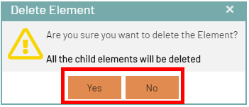
Here is another example for the Panel component:
//********** Panel / Module Header
//backgrounds
$panel_header_background_color: dynamic($VirtimoMainColor);
$panel-frame-background-color: dynamic(rgba($mainViewBackgroundColor, 0.5));
$panel_frame_header_color: dynamic($darkerBackgroundColor);
$panel_frame_header_background_color: dynamic($VirtimoMainColor);
$panel-body-background-color: dynamic(rgba($mainViewBackgroundColor, 0.5));
$border-layout-ct-background-color: dynamic(transparent);
$accordion-background-color: dynamic(transparent);
//text colors
$panel_header_color: dynamic($VirtimoMainContrastColor);
$panel_header_tools_color_over: lighten($panel_header_color, 10%);
$panel_header_tools_color: $panel_header_color;
//borders
$panel_header_border_width: 1px;
$panel_header_border_color: $VirtimoBorderColor;
$panel_body_border_width: 0px;
$panel_border_width: 0px;
$panel-border-color: $VirtimoBorderColor;
$panel_frame_header_padding: 5px 14px 5px 14px;
$panel_header_padding: 3px 15px 3px;