Develop BPC theme
There are two different approaches: Basic (for consultants) and Advanced (for developers).
Create theme repository
To create an individual customer theme, you must create a new repository based on an existing template. The following section describes the steps required to create and customize such a repository.
Template forking
To create a customer theme and have a personal copy of the repository under your own account, you need to fork this repository in Bitbucket:
The naming should follow the convention "bpc-theme-[customer]" and will be explained further.
|
Make sure that you fork in the workspace |
Rename the template files according to your needs
Here is an example of the process of creating a new Virtimo theme:
-
Rename the folder in
packages/local/bpc-theme-[name]to the name of the theme you are working on. -
Go to the
packages/local/bpc-theme-[name]package.jsonfile and edit the "name" property. -
Go to
packages/local/bpc-theme-[name]and edit the name of the theme in thebuild.xmlfile. -
Go to the
packages/local/resourcesfolder, search forloginBackgrounds.jsonand adjust the path for the background images for the login. -
Go to the
packages/local/resourcesfolder, search forthemeConfig.jsonand edit the path for the favicon image. -
Open the file
gradle.propertiesand edit the packageName and symbolicName properties.
Alternatively, you can search for "theme-template" in the project and replace it with the name of the theme you are working on. This way you can make sure that you have replaced everything you need.
|
See also Theme configuration with JSON files |
Preparing the development environment
-
ExtJS should be available in your project and can be obtained directly from Bitbucket via npm.
-
You can build the theme and test whether everything works with:
./gradlew --stacktrace(on Linux/Mac) orgradlew --stacktrace(on Windows). -
Further, more detailed information on preparing the development environment can be found in the readme of the respective project.
-
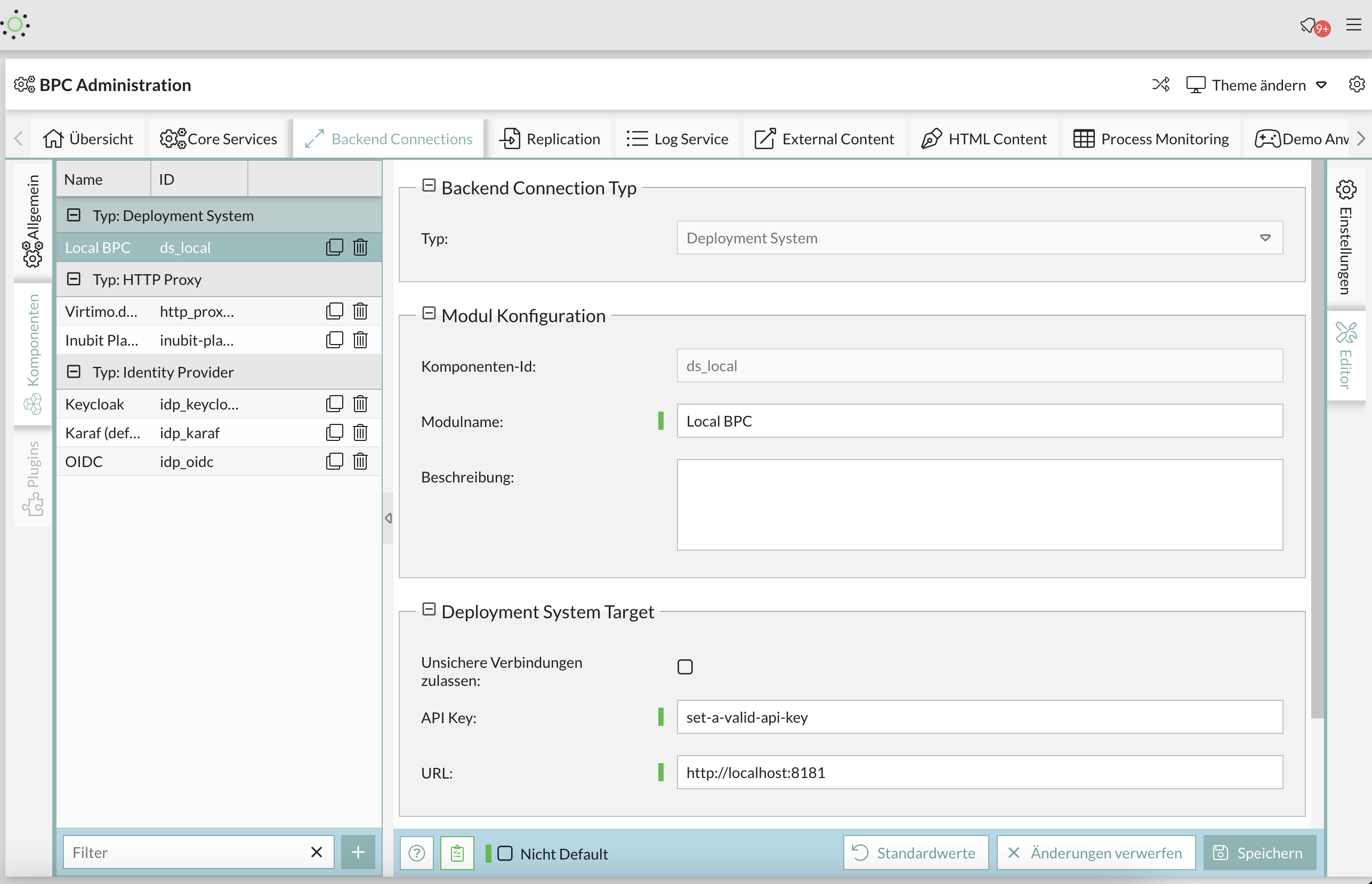
You will also find a comprehensive overview of various methods for deploying modules and themes in BPC, as well as specific instructions for building and testing modules and themes (see Backend Connections) (see Deployment of BPC modules and themes)
Basic Theming - for quick results
In the theme folder under …\packages\local\bpc-theme-[customer]\sass\var` you will find the companyConfig.scss.
This is your main configuration file for the process.
//In this file you define all the Basics for the Company Theme

//Please choose if you want to use a Light or dark theme
$LightTheme: true;

//Decide if you want a neutral color for Panel headers and borders - default = false
$CompanyNeutralPanels:false;

//primary color for buttons and selections
$CompanyMainColor: darken(#96bebe, 5%);
$VirtimoMainColor: blue;
$CompanyMainContrastColor: #ffffff; //used for text on top of the Main Color

//[OPTIONAL]- define a different color for the action buttons
$CompanyButtonColor: $CompanyMainColor;
$CompanyButtonContrastColor: $CompanyMainContrastColor;

//Logo
$CompanyLogo: "../bpc-theme-template/resources/images/galaxy.svg";
//$CompanyLogo: url(images/logo_light.png); //for dark themes
$CompanyLogoWidth: 48px;
$CompanyLogoSpace: 10px;

//Icon
$CompanyIcon: "images/white_icon.png"; // for darker main colors

$CompanyProductText: "Template Inc.";
$CompanyProductTextSize: 26px;
Es gibt Optionen für ein LightTheme oder ein DarkTheme ($LightTheme).
Es gibt eine Option, um zu entscheiden, ob Panels farbig sein sollen ($CompanyNeutralPanels).
Zwei Optionen für Farbeinstellungen: Hauptfarbe ($CompanyMainColor) und ihre Kontrastfarbe ($CompanyMainContrastColor).
[OPTIONAL] Zwei Optionen für die Farbeinstellungen: Hauptfarbe ($CompanyButtonColor) und ihre Kontrastfarbe ($CompanyButtonContrastColor).
Und der Pfad für Logo ($CompanyLogo) und Icon ($CompanyIcon).
Dies dürfte für die meisten Theming-Fälle ausreichend sein.
Farbverlauf
Für die vertikale Navigationsleiste wird oft ein Farbverlauf verwendet, der mit der folgenden Variable angepasst werden kann:
$navToolbarBackgroundImage: linear-gradient(180deg, rgba($VirtimoMainColor,0.0) 0%, rgba($VirtimoMainColor,0.6) 100%);Diese Variable definiert einen linearen Farbverlauf, der von oben nach unten verläuft (180 Grad). Dabei beginnt der Verlauf bei 0% mit einer vollständig transparenten Version der Hauptfarbe ($VirtimoMainColor) und endet bei 100% mit einer zu 60% transparenten Version derselben Farbe. Auf diese Weise entsteht ein sanfter Übergang, der als Hintergrund für die Navigationsleiste dient.
Falls kein Farbverlauf gewünscht ist, kann diese Variable auf none gesetzt werden, um den Verlauf zu deaktivieren.
Light und dark mode
Wenn Sie das LightTheme beibehalten wollen, setzen Sie einfach die Variable $LightTheme auf true:
$LightTheme: true;
Wenn Sie das DarkTheme aktivieren wollen, setzen Sie einfach die Variable $LightTheme auf false:
$LightTheme: false;
Alle Hintergrundfarben, Umrandungen und andere Elemente reagieren auf diese Anpassung und wechseln zu einem weißen Hintergrund (#FFFFFF) für das LightTheme und einem dunklen Grau (#333333) für das DarkTheme.
Alle Textfarben, Icons und Glyphen erhalten eine passende Kontrastfarbe, so dass der Kontrast hoch genug ist (Standard für LightTheme: rgba(0,0,0,.87), DarkTheme rgba(255,255,255,.87)).
Farbige oder neutrale Panels
Legen Sie fest, ob Sie eine neutrale Farbe für Panel-Kopfzeilen und -Ränder wünschen - default = false $CompanyNeutralPanels:false;
Wenn Sie die Variable als Standardwert festlegen, werden die Kopfzeilen und Rahmen auf dem gesamten Client die Hauptfarbe als Hintergrund- und Rahmenfarbe verwenden.
Wenn Sie $CompanyNeutralPanels zu true verändern:
Der Hintergrund der Kopfzeilen und die Rahmen werden in ein gleichmäßiges Grau umgewandelt, immer unter Berücksichtigung des von Ihnen verwendeten Theme. Die Textfarbe passt sich automatisch an.
Dies ist nützlich für Kunden, die besonders leuchtende Farben benötigen.
Hervorhebung/ Hauptfarbe
//primary color for buttons and selections
$CompanyMainColor: #E08A50;
$CompanyMainContrastColor: #ffffff; //used for text on top of the Main Color
Um eine Hauptfarbe festzulegen, müssen Sie die $CompanyMainColor in der Datei companyConfig.scss bearbeiten.
Dies muss ein Hex-Farbcode sein.
Sie müssen auch das $CompanyMainContrastColor definieren, für den Text über der definierten Farbe.
Diese Farbe sollte einen guten Kontrast zur gewählten Farbe haben (#ffffff oder #111111 funktioniert am besten)
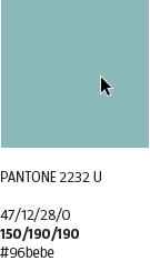
In diesem Beispiel ist die verwendete Farbe $CompanyMainColor: darken(#96bebe, 5%);.
Es handelt sich um eine der virtimo-Firmenfarben, die mit einer Sass-Funktion um 5 % abgedunkelt wurde.
Die Hauptfarbe wird als Hervorhebungsfarbe für die meisten farbigen Elemente im Client verwendet. Sie wird auch für Hover-Farben und verschiedene Icons und Buttons etc. verwendet.
Wenn Sie eine Hauptfarbe für ein Kunden-theme festlegen möchten, fügen Sie einfach den Hex-Farbcode wie folgt ein: $CompanyMainColor: #96bebe;
Manipulieren von Farben
Sie können die Farbe anpassen, indem Sie die ursprüngliche Kundenfarbe mit diesen Funktionen aufhellen oder abdunkeln:
lighten([color], [percentage]); or darken([color], [percentage]);
Beispiel:
$CompanyMainColor: lighten(#96bebe, 10%);
$CompanyMainColor: darken(#96bebe, 10%);
|
Weitere Informationen zur Farbmanipulation finden Sie hier: Sass Dokumentation- Farben |
[OPTIONAL] Button Farbe
//[OPTIONAL]- define a different color for the action buttons
$CompanyButtonColor: $CompanyMainColor; //background for the buttons
$CompanyButtonContrastColor: $CompanyMainContrastColor; //textcolor for the buttons
Die Button-Farben erben die Farbe von $CompanyMainColor und $CompanyMainContrastColor.
Wenn Sie die Standardfarbe der Buttons im Client ändern möchten, können Sie dies tun, indem Sie $CompanyButtonColor und $CompanyButtonContrastColor von Variablen in Hex-Farbcodes ändern.
Bitte stellen Sie sicher, dass die Textfarbe einen ausreichenden Kontrast hat.
//[OPTIONAL]- define a different color for the action buttons
$CompanyButtonColor: #e18b50; //background for the buttons
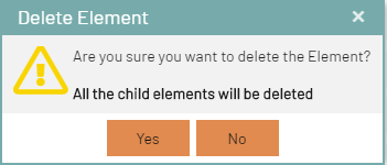
$CompanyButtonContrastColor: #111111; //textcolor for the buttonsHier wurde das Virtimo orange genutzt.
Der Client sieht nun wie folgt aus:
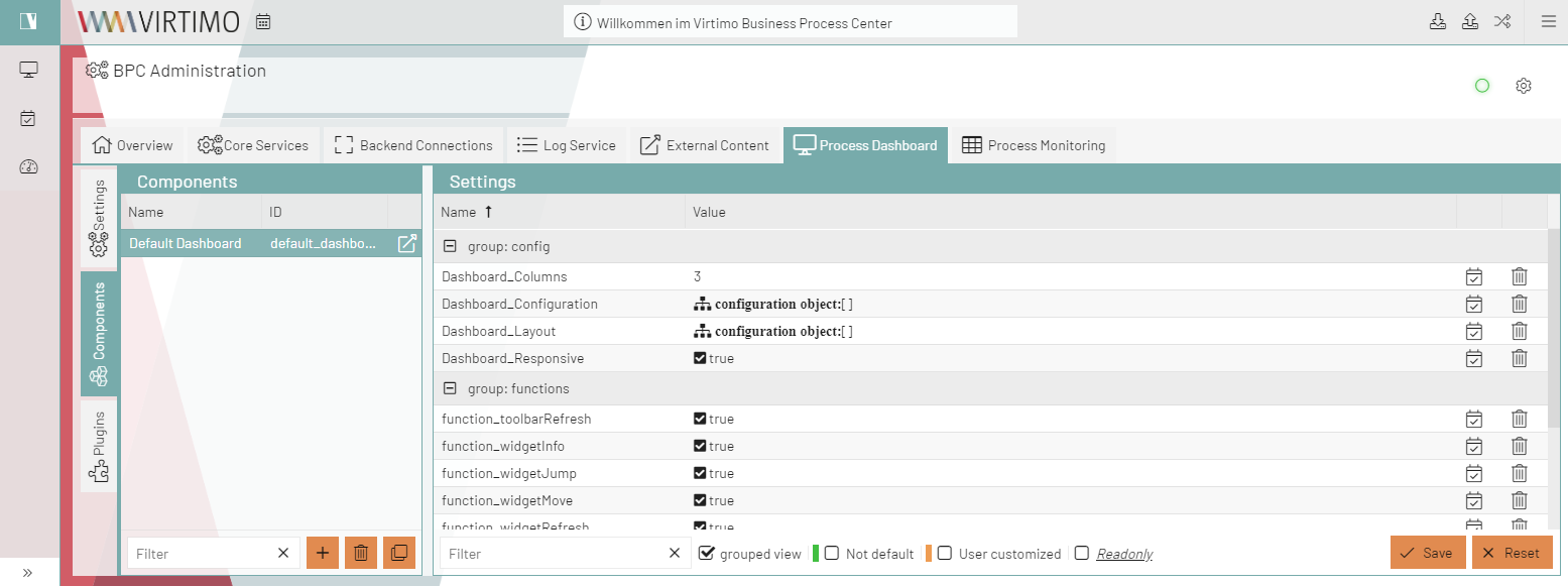
      :
image::core:dev/bpc-theme/example-button-2.png[]
      :
image::core:dev/bpc-theme/example-button-3.png[]
Die Buttons am unteren Rand jedes Dialogfelds sowie die Buttons in der AppToolBar, über die der Mauszeiger bewegt wird, sind jetzt orange.
Logo, Icon & Hintergrund
Firmenlogo
Die Höhe des Logos beträgt immer 32px. Die Breite ist variabel.
Im Theme-Ordner unter …\packages\local\bpc-theme-NAME\resources\images finden Sie das logo.png und logo_light.png, bg_1.jpg und bg_2.jpg.

Sie müssen diese Dateien nur durch das Logo und den Hintergrund Ihres Kunden ersetzen. Wenn der Name des Logos ein anderer ist, müssen Sie den URL-Pfad in der companyConfig.scss anpassen und eventuell die Breite anpassen.
//Logo
$CompanyLogo: "../bpc-theme-template/resources/images/galaxy.svg";
//$CompanyLogo: url(images/logo_light.png); //for dark themes
$CompanyLogoWidth: 48px;
$CompanyLogoSpace: 10px;
Falls Sie andere Namen oder Nummern von Hintergründen verwenden, müssen Sie die loginBackgrounds.json anpassen (…\packages\local\bpc-theme-<customer>\resources):
{
  "comment_backgroundImagesList": "List of URLs to use as background on the loginscreen",
  "backgroundImagesList": [
    {
      "url": "/bpc-theme-template/resources/images/bg_1.jpg",
    },
    {
      "url": "/bpc-theme-template/resources/images/bg_2.jpg",
    }
  ],

  "favIcon": "/bpc-theme-template/resources/images/favicon.png",
  "comment_applicationBackgroundImage": "URL to Application background image; this example is a transparent pixel image",
  "applicationBackgroundImage": "data:image/png;base64,iVBORw0KGgoAAAANSUhEUgAAAAEAAAABCAQAAAC1HAwCAAAAC0lEQVR42mNkYAAAAAYAAjCB0C8AAAAASUVORK5CYII="
  "hideLogoInLogin": false
}
Problem with SCSS variables in Base.scss and solution
Background
SCSS variables are currently used in the Base.scss file to define styles such as colors and layouts. However, these variables are taken from the bpc-theme at build time and not from the customer-specific themes. This means that changes to customer-specific themes are ignored, as the SCSS variables are permanently defined at build time.
Problem
The problem occurs because SCSS variables are static and are only compiled once during the build process. Adjustments made after this process are not taken into account because the variables are already defined. To resolve this limitation, the SCSS variables should be replaced by CSS variables. If you have any questions or need CSS variables, please contact support. CSS variables are dynamic and can be adjusted at runtime, which makes it possible to load and apply customized themes correctly.
Available CSS variables
In the BPC environment, CSS variables are defined in several files that are used to customize styles. The most important sources are:
-
cssVariables.scss: This file is located in the corresponding theme directory and contains all global CSS variables that are used for the design of the theme.
-
FE-Monitor: In the FE-Monitor you will also find CSS variables that are responsible for specific UI components and their customization. These variables are important if you want to make individual adjustments to certain interface elements.
-
BPC theme: The BPC theme also contains predefined CSS variables that are used by default throughout the application. These variables provide a basis on which individual themes can be built.
-
Customer theme: Finally, CSS variables can also be defined in the specific customer theme. These variables can be created specifically for the individual requirements and customizations of a customer.
Check files: To find the available CSS variables, you should search through all the files mentioned, especially cssVariables.scss, the FE monitor and the BPC theme. Additionally, you can use the browser developer tools to view the currently applied CSS variables and check their values.
Important: Should you need a specific CSS variable that is not listed in cssVariables.scss, or if you have any questions about its use, please do not hesitate to contact support. The BPC team is ready to provide support and add additional variables in the base theme if necessary.
Advanced Theming - for a deeper technical understanding
In the theme folder at …\packages\local\theme-bpc\sass\var you will find the important files to change the look of the client.

How the styles are structured
The all.scss file imports all required files into a single Sass styling sheet.
//@import "legacy";
@import "companyConfig";
@import "colors";
@import "mixins";
@import "font";
@import "logo";
@import "misc";
The order is very important. Because most of the variables and styles defined in these files inherit information from each other.
-
So we first set the company variables in companyConfig.scss → these provide information to define all colors.
-
The colors.scss → from here all other styles will receive color information.
-
The file mixins.scss contains useful mixin functions.
-
In the file font.scss we set the font size and the font.
-
The file logo.scss defines the styles for logo and icon.
-
The misc.scss file overrides some Sencha styles and also sets styles for custom components or custom behavior in the client. This file does not set variables, but styles for classes by using the defined variables.
//************ Notification fields (Willkommen im BPC)

.bpcNotification {
  color: $color;
  background-color: $lighterBackground;
}
Farben ändern - advancedConfig.scss
Erforderliche Einstellungen
Am Anfang dieser Datei finden Sie die wichtigen Variablen, die die $Company[..]-Variablen aus der companyConfig.scss übernehmen und auch den Schalter für die helle und dunkle Themenauswahl.
//primary color for buttons and selections
$VirtimoMainColor: dynamic($CompanyMainColor);
$VirtimoMainContrastColor: $CompanyMainContrastColor; //used for text on top of the Main Color

//main background color - automated via $LightTheme
$VirtimoBackgroundColor: dynamic(if($LightTheme, #FFF, #333));  //if $LightTheme is true, use #fff else use #333
//text colors - automated via $LightTheme
$VirtimoTextColor: dynamic(if($LightTheme, rgba(0,0,0,.87) ,rgba(255,255,255,.87))); //if $LightTheme is true, use rgba(0,0,0,.87) else use rgba(255,255,255,.87);

//buttons
$VirtimoButtonColor: dynamic($CompanyButtonColor);
$VirtimoButtonContrastColor: dynamic($CompanyButtonContrastColor);| Variable name | Description | Definition in companyConfig.scss | Usage |
|---|---|---|---|
$VirtimoMainColor |
This is the highlight color. Everything that is colored uses this variable: active tabs, active table rows, buttons (unless otherwise defined), some icons, highlighting in menus and tables, etc. |
$CompanyMainColor |
|
$VirtimoMainContrastColor |
The text color for all elements that are above this color. This should be black or white, depending on the main background color. It is different from the color $VirtimoTextcolor. |
$CompanyMainContrastColor |
See above |
$VirtimoBackgroundColor |
This is the universal background color for the entire client. It is generated via an if condition. If $LightTheme → #FFF use if NOT $LightTheme → #333. You can also set the hex code. But then the themes would not work. |
$LightTheme |
|
$VirtimoTextColor |
The universal text color in the entire client. It is generated via an if condition. If $LightTheme → use black, if NOT $LightTheme → use black. You can also set the hex code. But then the themes would not work. |
$LightTheme |
|
$VirtimoButtonColor |
This is the background color for the main buttons in dialogs. |
$CompanyButtonColor |
|
$VirtimoButtonContrastColor |
The text color on each button. This should be black or white, depending on the background color of the button. |
$CompanyButtonContrastColor |
See above |


Optional settings
In a second section you will find a number of optional variables for further customization options.
/****** [OPTIONAL] In addition you can configure these colors _________________________________________________________

$VirtimoToolBarBackgroundColor: dynamic(darken($VirtimoBackgroundColor, 10%));

$bpcApplicationAreaSwitchButtonBackgroundColor: dynamic($VirtimoMainColor); //VirtimoToolBar Icon (top left)
$bpcApplicationAreaSwitchButtonColor: dynamic($VirtimoMainContrastColor); // Textcolor in Icon

//border colors
$VirtimoBorderColor: dynamic($VirtimoMainColor); //colorful

//Highlighting generated by $VirtimoMainColor
$VirtimoHighlightColor: dynamic($VirtimoMainColor);
Im Folgenden werden nur diese Variablen verwendet, um den Rest der Gestaltung zu erzeugen. Es besteht keine Notwendigkeit, andere Variablen zu ändern.
| Variablen-Name | Beschreibung | Definition durch andere Variable | Verwendung |
|---|---|---|---|
$VirtimoToolbarBackgroundColor |
Diese Variable nimmt die Hintergrundfarbe und ändert sie, um die Symbolleiste und die Navigation hervorzuheben, damit sie in beiden Themes-modi funktioniert. |
$VirtimoBackgroundColor |
|
$bpcApplicationAreaSwitchButtonBackgroundColor |
Die Variable ist die Hintergrundfarbe für das App-Symbol. Diese Farbe erbt von der $VirtimoMainColor. |
$VirtimoMainColor |
|
$bpcApplicationAreaSwitchButtonColor |
Textfarbe für App-Icon-Button |
$VirtimoMainContrastColor |
Siehe oben |
$VirtimoBorderColor |
Diese Variable definiert die farbigen Ränder um Dialoge, die App-Symbolleiste und Panels. Diese Farbe erbt von der $VirtimoMainColor. |
$VirtimoMainColor |
|
$VirtimoHighlightColor |
Die Variable definiert die Farbe für Hover-Hervorhebungen, Auswahlfarben usw. |
$VirtimoMainColor |
|
Benutzerdefiniertes Theming für alle Komponenten - advancedConfig.scss
Wenn Ihr Kunde weitere Anpassungen wünscht, können Sie alle definierten Farben nach seinen Wünschen überschreiben.
Sie müssen nur die Variablen in der Datei theme-bpc colors.scss für die gewünschte Komponente nachschlagen und sie in der Datei advancedConfig.scss überschreiben.
Wenn die ursprüngliche Farbe in einer dynamic(); Funktion deklariert wurde, sollten Sie diese beibehalten, sonst wird die neue Farbdefinition NICHT funktionieren.
Hier ist ein Beispiel für den unteren Panelbereich und der Textfarbe in der Oberfläche.
Der Originalcode in theme-bpc sieht wie folgt aus:
// Unterer Panelbereich Hintergrundfarbe (button toolbar)
$toolbar-footer-background-color: $mainViewBackgroundColor;
$toolbar-background-color:$mainViewBackgroundColor;
Kopieren Sie einfach die Variablen in Ihr Theme und ersetzen Sie die Farben durch Ihre Wahl (dies können auch Hexadezimal-Codes sein):
// Unterer Panelbereich Hintergrundfarbe (button toolbar)
$toolbar-footer-background-color: lightblue;//$mainViewBackgroundColor;
$toolbar-background-color:$mainViewBackgroundColor;
Ergebnis
Weiteres Beispiel mit der Textfarbe:
//text color
$appToolbarColor: red;
$toolbar-scroller-glyph-color: dynamic($color);
$appToolbarColorOver: $VirtimoButtonColor; //colorful
ExtJS Variablen
Wenn Sie ein ganz bestimmtes Element in der GUI anpassen möchten, können Sie nach der Ext-Variable dieses Elements suchen, indem Sie es im Browser inspizieren und den Namen der Komponente in der Ext-Dokumentation für Themenvariablen nachschlagen. Wenn Sie zum Beispiel etwas im Menü bearbeiten wollen, können Sie alle Variablen in ExtJS, die mit dem Menü zusammenhängen, untersuchen und die Variable finden, die Sie benötigen.
Wenn Sie eine Variable gefunden haben, die Sie verwenden möchten, organisieren Sie Ihr Projekt richtig, indem Sie für jede Komponente, die Sie anpassen möchten, einen Ordner unter packages/local/bpc-theme-[name]/sass/var erstellen.
Dies kann wie folgt aussehen:

Hier ist eine Liste aller Farben in der colors.scss, die Sie überschreiben können*
//Apptoolbar (oben)
//background
$appToolbarBackgroundColor: dynamic(rgba($VirtimoToolBarBackgroundColor,0.8));
$appToolbarBackgroundColorOver: $appToolbarBackgroundColor;
//text color
$appToolbarColor: $color;
$toolbar-scroller-glyph-color: dynamic($color);
$appToolbarColorOver: $VirtimoButtonColor; //colorful
//borders
$appToolbarBorderColor: dynamic($bpcApplicationAreaSwitchButtonBackgroundColor);

//Remove implicit spaces
$toolbar-vertical-spacing: 0;
$toolbar-horizontal-spacing: 0;
$toolbar-separator-horizontal-margin: 0px;

// Unterer Panelbereich Hintergrundfarbe (button toolbar)
$toolbar-footer-background-color: $mainViewBackgroundColor;
$toolbar-background-color:$mainViewBackgroundColor;

// Module Navigation Button in Toolbar- BPC-5088
$toolbar-bpcNavBtn-background: dynamic($VirtimoHighLightColorHover);
$toolbar-bpcNavBtn-background-over: dynamic($VirtimoMainColor);
$toolbar-bpcNavBtn-icon: dynamic($color);
$toolbar-bpcNavBtn-icon-over: dynamic($VirtimoMainContrastColor);

// Navigation (links)
//background
$navToolbarBackgroundColor: dynamic(rgba($VirtimoToolBarBackgroundColor,0.8));
$navToolbarBackgroundColorOver: $VirtimoHighLightColorHover;
$navToolbarBackgroundColorActive: $VirtimoHighLightColorPressed;
$navToolbarBackgroundColorFocus: $VirtimoHighLightColorPressed;
$navToolbarBackgroundColorPressed: $VirtimoHighLightColorPressed;
//text color
$navToolbarColor: $color;
$navToolbarColorOver: $color;
$navToolbarColorPressed: $VirtimoMainContrastColor;
$navToolbarColorActive: $VirtimoMainContrastColor;
$navToolbarColorFocus: $VirtimoMainContrastColor;
//borders
$navToolbarBorderColor: dynamic($bpcApplicationAreaSwitchButtonBackgroundColor);

//************ Window
//background
$window-header-background-color : dynamic($VirtimoMainColor);
$window-body-background-color: dynamic($lighterBackgroundColor);
//text color
$window-header-color: dynamic($VirtimoMainContrastColor);
$window-header-glyph-color : dynamic($VirtimoMainContrastColor);
$window-body-color: dynamic($color);
$messagebox-info-glyph-color: dynamic($color);

//borders
$window_border_color: $VirtimoBorderColor;

//************ GRID
//background
$grid-header-background-color: dynamic(darken($mainViewBackgroundColor,10%));
$grid-row-cell-background-color: dynamic(rgba($mainViewBackgroundColor,0.7));
$grid-row-cell-alt-background-color: dynamic(darken($mainViewBackgroundColor, 5%));
$grid-row-cell-over-background-color: dynamic($VirtimoHighLightColorHover);
$grid-row-cell-focus-background-color: dynamic(transparent);
$grid-row-cell-selected-background-color: dynamic($VirtimoHighLightColorPressed);
$grid-grouped-header-background-color:  dynamic(darken($mainViewBackgroundColor,15%));
//text color
$grid-header-trigger-glyph-color: dynamic($color);
$grid-header-sort-glyph-color: dynamic($color);
$grid-column-header-color: dynamic($color);
$grid-column-header-focus-color: dynamic($color);
$grid-row-cell-color: dynamic($color);
$grid-row-cell-over-color: dynamic($color);
$grid-row-cell-selected-color: dynamic($VirtimoMainContrastColor);
$grid-actioncolumn-icon-glyph-color: dynamic($color);
$grid-checkcolumn-glyph-color: dynamic($color);
$grid-grouped-title-color: dynamic($color);
$grid-grouped-title-glyph-color: dynamic($color);
//borders
$grid-row-cell-border-color: dynamic(transparent);
$grid-row-cell-over-border-color: dynamic(transparent);
$grid-row-cell-selected-border-color: dynamic(transparent);
$grid-row-cell-focus-border-color: dynamic(transparent);
$grid-grouped-header-border-color:  dynamic(rgba($mainBorderColor,0.7));

//************Grid Editor
//background
$grid-row-editor-background-color: $darkerBackgroundColor;

//************ Tree
$tree-glyph-color: dynamic($VirtimoMainColor);

//************ TABS
//background
$tab-base-color: dynamic(lighten($darkerBackgroundColor, 10%));
$tab-base-color-active: dynamic($VirtimoMainColor);
$tab-base-color-over: dynamic($VirtimoHighLightColorHover);
$tab-base-color-focus-active: dynamic($VirtimoMainColor);
$tab-base-color-focus-over: dynamic(lighten($VirtimoMainColor,10%));
$tab-outline-offset-focus: dynamic($VirtimoMainColor);
$tabbar-base-color: dynamic($darkerBackgroundColor);
//text color
$tab-color: dynamic($color);
$tab-color-over: dynamic($color);
$tab-color-focus: dynamic($color);
$tab-color-focus-over: dynamic($color);
$tab-color-active: dynamic($VirtimoMainContrastColor);
$tab-color-focus-active: dynamic($VirtimoMainContrastColor);
$tabbar-scroller-glyph-color: dynamic($color);
$box-scroller-menu-arrow-base-text-color: dynamic($color);
// close icon color for closable tabs
$tab-closable-icon-glyph-color: dynamic($tab-color);
$tab-closable-icon-glyph-color-over: dynamic($tab-color-over);
$tab-closable-icon-glyph-color-focus-over: dynamic($tab-color-over);
$tab-closable-icon-glyph-color-active: dynamic($tab-color-active);

//************ DropDown List
//background
$boundlist-background-color: dynamic($darkerBackgroundColor);
$boundlist-item-over-background-color: dynamic($VirtimoHighLightColorHover);
$boundlist-item-selected-background-color:  dynamic($VirtimoHighLightColorPressed);
//text color
$boundlist-item-over-text-color: dynamic($color);
$boundlist-item-text-color: dynamic($color);
$boundlist-item-selected-text-color: dynamic($VirtimoMainContrastColor); //dynamic($VirtimoHighLightColorPressed);

//************ MENU
//background
$menu-background-color: dynamic($darkerBackgroundColor);
$menu-item-active-background-color: dynamic($VirtimoHighLightColorPressed);
//text color
$menu-item-color: dynamic($color);
$menu-item-checkbox-glyph-color: dynamic($color);
$menu-text-color: dynamic($color);
$menu-glyph-color: dynamic($color);
$menu-item-arrow-glyph-color: dynamic($color);
$menu-item-active-text-color: dynamic($VirtimoMainContrastColor);
//borders
$menu-separator-background-color: dynamic($mainBorderColor);
$menu-separator-border-color: dynamic($mainBorderColor);

//************ datePicker
//background
$datepicker-header-background-color: dynamic(darken($mainViewBackgroundColor,5%));
$datepicker-background-color: dynamic($darkerBackgroundColor);
$datepicker-item-selected-background-color: $VirtimoHighLightColorPressed;
$datepicker-item-hover-background-color : dynamic($VirtimoHighLightColorHover);
$datepicker-month-button-over-background-color : dynamic($VirtimoHighLightColorHover);
$datepicker-monthpicker-item-selected-background-color : dynamic($VirtimoHighLightColorPressed);
//text color
$datepicker-arrow-glyph-color: dynamic($color);
$datepicker-month-button-arrow-glyph-color: dynamic($color);
$datepicker-item-selected-color: dynamic($VirtimoMainContrastColor);
$datepicker-monthpicker-item-selected-color: $VirtimoMainContrastColor;

//********Accordion colors
//background
$accordion-background-color : dynamic($mainViewBackgroundColor);
$accordion-header-background-color : dynamic($VirtimoMainColor);
$accordion-header-over-background-color: dynamic($VirtimoMainColor);
//text color
$accordion-tool-glyph-color : dynamic($VirtimoMainContrastColor);
$accordion-header-color: dynamic($VirtimoMainContrastColor);

//************  Formfields
// formfields
$formfieldColor: dynamic($lighterBackgroundColor);
//backgrounds
$form-field-background-color: dynamic($formfieldColor);
$form-field-invalid-background-color: dynamic($formfieldColor);
$tag-field-item-background-color: dynamic($formfieldColor);
$fieldset-background-color: dynamic(rgba(darken($formfieldColor, 15%), 0.8));
//Text and glyph color
$form-field-color: dynamic($color);
$form-field-empty-color: dynamic($color);
$form-text-field-color: dynamic($color);
$form-label-font-color: dynamic($color);
$form-file-field-color:dynamic($color);
$form-trigger-glyph-color: dynamic($color);
$form-checkbox-glyph-color: dynamic($color);;
$form-toolbar-label-font-color: dynamic($color);
$tag-field-item-color: dynamic($color);
$tag-field-item-close-icon-glyph-color:dynamic($color);
$fieldset-header-color: dynamic($color);
//borders
$fieldset-border-color: dynamic($mainBorderColor);
$form-field-border-color: dynamic($mainBorderColor);
Other generated settings
The variables defined above set all the default theme variables that the Sencha theme should use. There are also custom variables that get their value from the variables in the first two sections.
Here you can see that the main background color, the text color and the border color are defined.
These variables are used throughout the client and in multiple components.
As a rule of thumb, you can assume that all variables named $Virtimo[…] use $VirtimoMainColor, $VirtimoButtonColor or are contrast colors for these colors.
This makes it easy to identify styles that contain these colors.
//************ General
//background color
$darkerBackgroundColor: dynamic(darken($VirtimoBackgroundColor, 5%));
$lighterBackgroundColor: dynamic(lighten($VirtimoBackgroundColor, 5%));
$body-background-color: dynamic(rgba($VirtimoBackgroundColor, 0.9));
$mainViewBackgroundColor: dynamic(rgba($VirtimoBackgroundColor, 0.5));
$LoginHeaderBackgroundColor: dynamic($darkerBackgroundColor);
// text color
$color: dynamic($VirtimoTextColor);
//borders
$mainBorderColor: dynamic(if($LightTheme, darken($mainViewBackgroundColor, 15%), lighten ($mainViewBackgroundColor, 10%)));
//scrollbar
$scrollbar-color: dynamic(if($LightTheme, darken($VirtimoBackgroundColor, 15%),lighten($Virtimo BackgroundColor, 15% )));
//neutral theme colors
$neutral-color: dynamic($mainBorderColor);
// colorful theme parts
$base-color: dynamic($VirtimoMainColor);
//highlighting
$VirtimoHighlight ColorLight: dynamic(lighten($VirtimoHighlightColor, 10%));
$VirtimoHighLightColorPressed: dynamic(lighten($VirtimoHighlightColor, 5%));
$VirtimoHighLightColorHover: dynamic(rgba($VirtimoHighlightColor, 0.3));
Here is an example:
****** Buttons
//background
$button_default_base_color: dynamic($VirtimoButtonColor);
$button-default-base-color-over: dynamic(lighten($VirtimoButtonColor, 10%));
$button-default-base-color-pressed: dynamic(darken($VirtimoButtonColor, 10%));
//text color
$button-default-color: $VirtimoButtonContrastColor;
$button-default-arrow-glyph-color: dynamic($VirtimoButtonColor);
//borders
$button_default_border_color: transparent;
$button-split-line-width: 0;
Here is another example for the panel component:
//********** Panel / Module Header
//backgrounds
$panel_header_background_color: dynamic($VirtimoMainColor);
$panel-frame-background-color: dynamic(rgba($mainViewBackgroundColor, 0.5));
$panel_frame_header_color: dynamic($darkerBackgroundColor);
$panel_frame_header_background_color: dynamic($VirtimoMainColor);
$panel-body-background-color: dynamic(rgba($mainViewBackgroundColor, 0.5));
$border-layout-ct-background-color: dynamic(transparent);
$accordion-background-color: dynamic(transparent);
//text colors
$panel_header_color: dynamic($VirtimoMainContrastColor);
$panel_header_tools_color_over: lighten($panel_header_color, 10%);
$panel_header_tools_color: $panel_header_color;
//borders
$panel_header_border_width: 1px;
$panel_header_border_color: $VirtimoBorderColor;
$panel_body_border_width: 0px;
$panel_border_width: 0px;
$panel-border-color: $VirtimoBorderColor;
$panel_frame_header_padding: 5px 14px 5px 14px;
$panel_header_padding: 3px 15px 3px;