Bpc Combo Box
The BPC provides a combo box that offers additional functionalities.
Use
To use the field, only a component with the xtype bpcCombobox must be created.
The store attribute contains an array of objects in which each entry contains a value and a content to be displayed.
The displayField references the attribute in the store in which the content to be displayed is located.
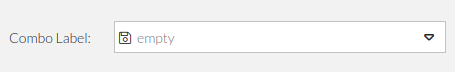
Empty Icon
In addition to the emptyText attribute, a emptyIconCls (for example x-fal fa-save) can also be specified.
|
To activate |
This references an Font Awesome icon which is displayed with the emptyText if the value of the combo box is empty.
  Ext.create({
                  xtype: "bpcComboBox",
                  fieldLabel :"Combo Label",
                  emptyText : "empty",
                  plugins: [
                    {
                      ptype: "bpcInputField"
                    }
                  ],
                  emptyIconCls : "x-fal fa-save",
                  valueField: "value",
                  displayField: "attr",
                  store: [{
                    attr: "first value>",
                    value: "value1"
                  }, {
                    attr: "second value",
                    value: "value2"
                  }]
    })
Keywords: