HTML Content Module (User-Defined Content)
The HTML Content Module allows users to view content made available to them. If they have the appropriate permissions, selected users can create and edit content themselves and make it available to other users.
It is also possible to integrate an HTML Content page into the Process Dashboard as a widget.
To do so, contact your administrator.
Access Rights
In order for a user to access the module or work within it, the necessary permissions must be assigned in the administration area:
|
Users with this permission can access the module. |
|
Users with this role can edit content by clicking the icon in the BPC toolbar. |
|
Users with this role can only edit content with this module ID by clicking the icon in the BPC toolbar. |
Settings
In the administration area, parameters for the HTML Content module can be configured.
These primarily include general settings for the module as well as settings for markup, such as link colors or custom text formats.

| Setting (Key) | Description | Example |
|---|---|---|
Module_Description |
Can be used as a subtitle or description. |
Custom Content |
Module_Header |
Setting to determine whether the module title (Module_Name) and subtitle (Module_Description) are displayed or not. |
true (displayed) |
Module_Icon |
Custom icon displayed before the module title. [NOTE] ==== The module icon does not automatically match the icon in the navigation bar. This is set in the navigation settings in the administration area. ==== |
x-fal fa-books |
Module_Name |
Name or title of the module |
HTML Content Module |
Content |
An overview of the content displayed in the HTML Content module.
The overview updates automatically when users (with editing permissions) make changes directly in the module. |
|
EditorCustomCSS |
CSS stylesheet in which user-defined CSS classes are defined.
These can be integrated into the text editor via the setting |
|
EditorOptions |
JSON object with 2 attributes ("inlineClasses", "linkStyles"). |
|
User-specific CSS classes
Once a CSS class has been defined in the setting EditorCustomCSS, it can be referenced in the setting EditorOptions.
Inline CSS Classes
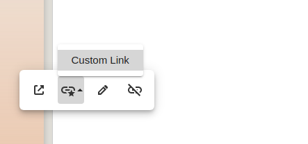
If the CSS class name (e.g., TitleClass) is listed under the attribute (e.g., inlineClasses), it can be accessed in the editor as follows and applied to any element.

Edit Content
|
To create and edit content, you need the appropriate permissions. |
The function icon for editing is located in one of these 3 places: * in the BPC toolbar on the left * in the BPC toolbar on the right * in the module header
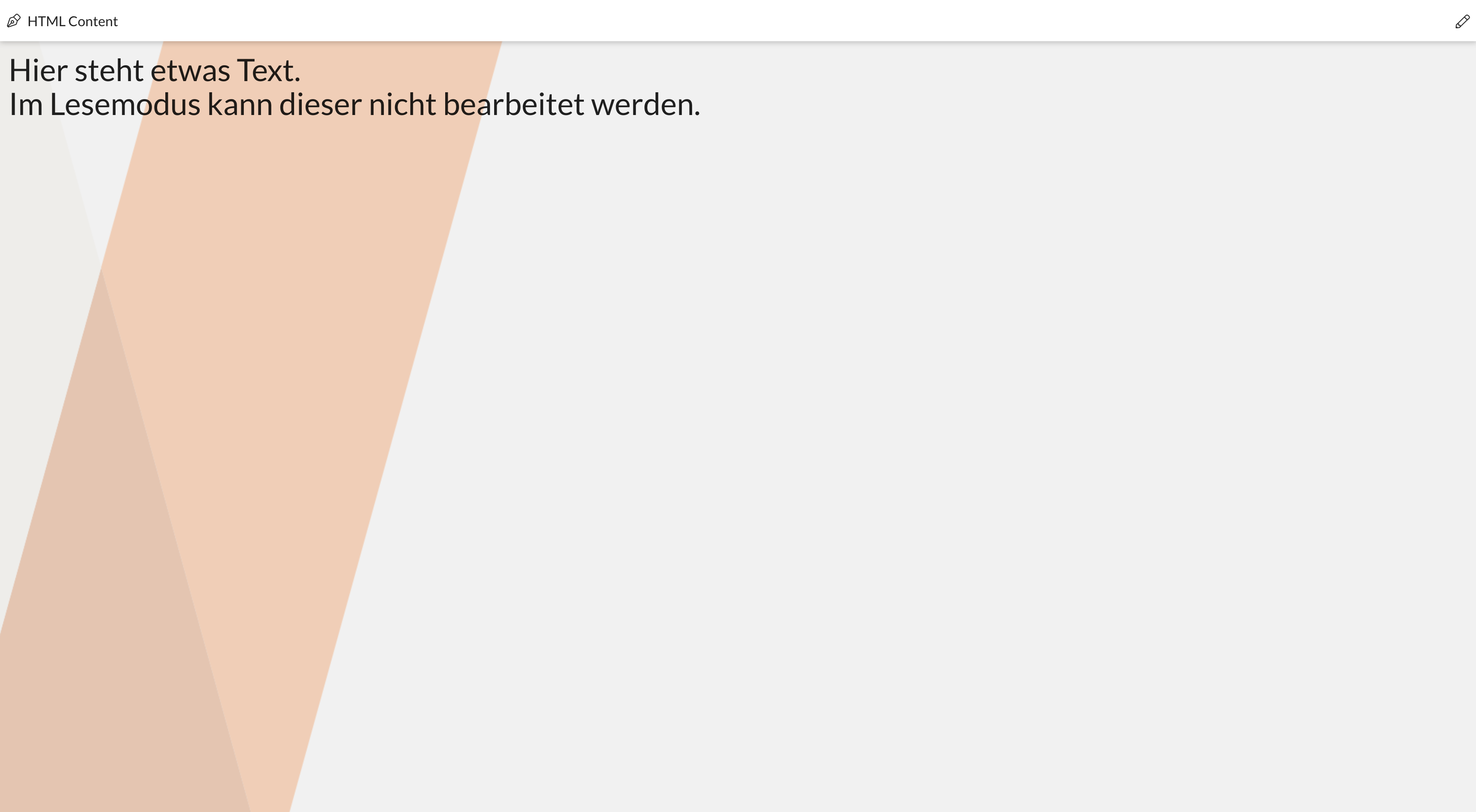
Clicking the icon takes you to the Edit Mode.

Edit Mode
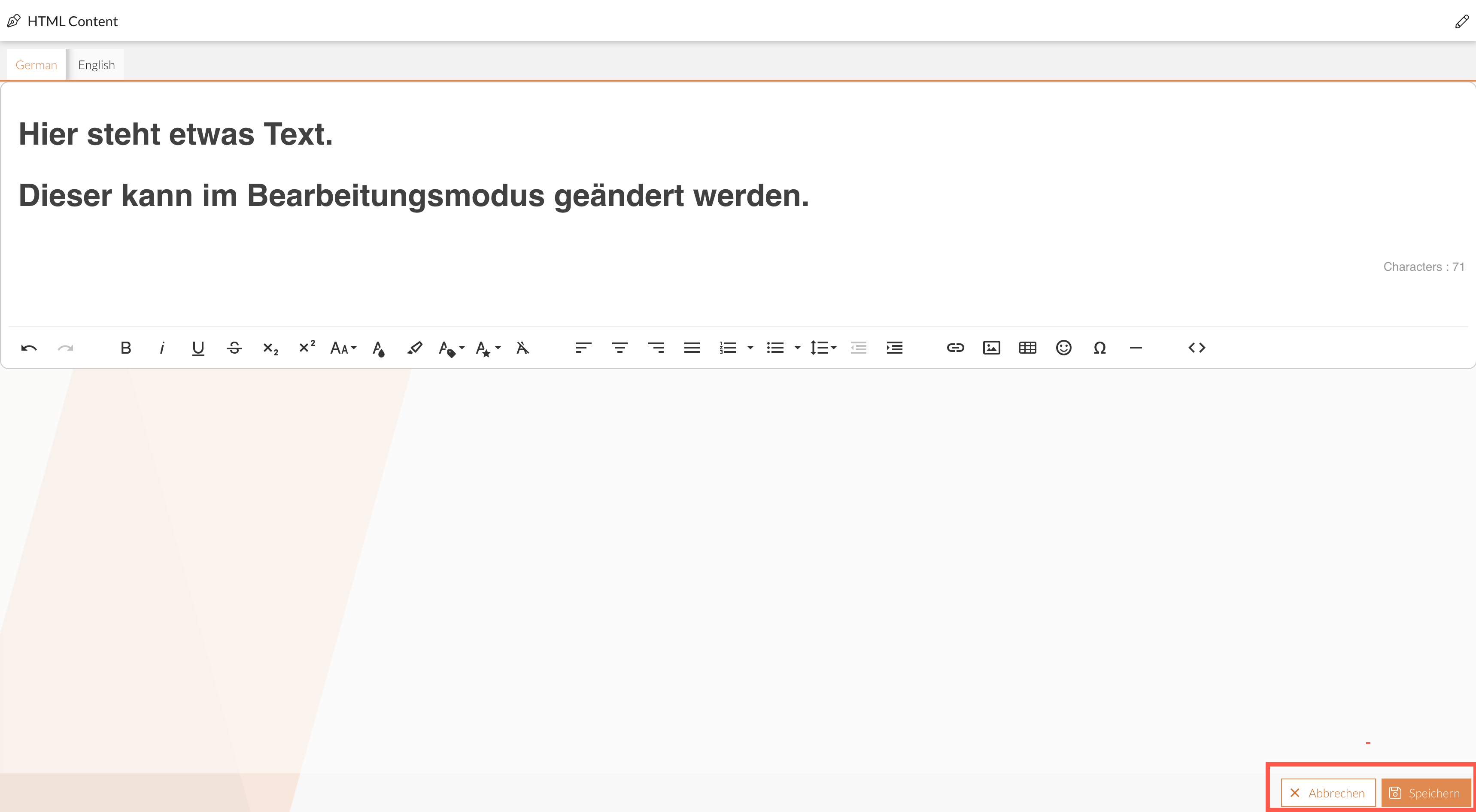
In edit mode, the editor opens, allowing you to create new content or edit existing content.
By default, content is available in English and German. Each available language is displayed in its own tab.

The number and selection of languages can be customized. To do so, contact your administrator.
Editor Features
In the editor, you can create and edit text and add other content such as links or images. The editor’s features are accessible via icons in a toolbar:
| Button | Description |
|---|---|
|
Undoes the last action. |
|
Redoes the action. |
|
Opens a window with keyboard shortcuts that may be helpful in the editor. |
|
Formats the text in bold. |
|
Formats the text in italics. |
|
Formats the text as underlined. |
|
Formats the text as strikethrough. |
|
Formats the text as subscript. |
|
Formats the text as superscript. |
|
Opens a text size selection menu. |
|
Opens a preset menu for text color. |
|
Opens a predefined selection for the background color of the selected text. |
|
Opens a selection of preset formats. |
|
Opens a selection of preset formats. |
|
Removes all formatting from the selected text. |
|
Aligns the current line or all selected lines to the left. |
|
Centers the current line or all selected lines. |
|
Aligns the current line or all selected lines to the right. |
|
Justifies the current line or all selected lines to both sides. |
|
Converts the current line or all selected lines into a numbered list. |
|
Converts the current line or all selected lines into an unordered list. |
|
Opens a selection of different heading and text styles for the current line or all selected lines. |
|
Opens a selection of different text formatting options.
These options can be combined and must be deselected individually to return to normal text. |
|
Opens a selection of different line spacings. |
|
Reduces the indent of the current line or all selected lines. |
|
Increases the indentation of the current line or all selected lines. |
|
Opens a menu to mark quotes and adjust the quote level. |
|
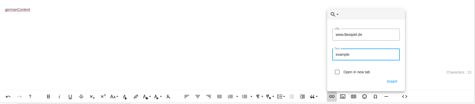
Opens a window where you can enter the URL of a webpage and the text to be displayed in the link. |
|
Opens a window where you can enter the URL of an image. |
|
Opens a window where you can create a table by selecting the number of columns and rows. |
|
Opens a window where you can select an emoticon. |
|
Opens a window where you can select a special character. |
|
Inserts a horizontal line below the current line. |
|
The content is displayed as HTML code and can also be edited there. |


Finish Editing
Once editing is complete, the generated content can be saved or discarded. In both cases, you exit edit mode.
You can view the result of your edits in the Lesemodus.
