Theme Variables
Basic variables for quick results
If you want to create a custom theme, open the file ` companyConfig.scss` in the theme folder at ` …\packages\local\bpc-theme-[customer]\sass\var `.
The variables in the theme template are commented so that their purpose and function are clear.
If the value in the template should not differ from the base theme, the corresponding variable must also be commented out.
//In this file you define all the Basics for the Company Theme

//Please choose if you want to use a Light or dark theme
$LightTheme: true; (1)

//Decide if you want a neutral color for Panel headers and borders - default = false
$CompanyNeutralPanels: false; (2)

//primary color for buttons and selections
$CompanyMainColor: darken(#96bebe, 5%); (3)
$CompanyMainContrastColor: white; //used for text on top of the Main Color (4)

//[OPTIONAL]- define a different color for the action buttons
$CompanyButtonColor: $CompanyMainColor; (5)
$CompanyButtonContrastColor: $CompanyMainContrastColor; (6)

//Logo
$CompanyLogo: "/bpc-theme-template/resources/images/galaxy.svg"; (7)
$CompanyLogoWidth: 48px; (8)
$CompanyLogoSpace: 10px; (9)

//Icon
$CompanyIcon: "images/white_icon.png"; // for darker main colors (10)

$CompanyProductText: "Template Inc."; (11)
$CompanyProductTextSize: 26px; (12)| 1 | Light (true) or dark design (false) |
| 2 | Colored panel headers ($CompanyNeutralPanels: true/false) |
| 3 | Selection of the main color |
| 4 | Selection of the contrast color |
| 5 | Background color of the buttons |
| 6 | Contrast color of the buttons |
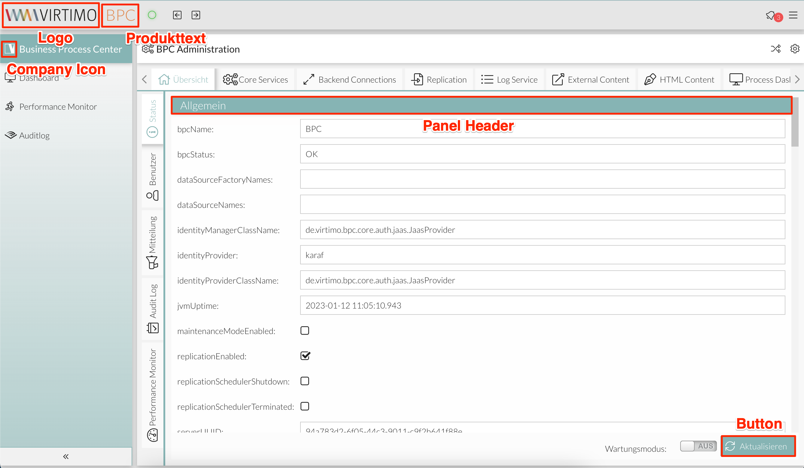
| 7 | Selection of a logo for the BPC toolbar. Please note that all paths should be specified as absolute paths. |
| 8 | Logo width |
| 9 | Margin from the logo to the next element following the logo, e.g., the product name |
| 10 | Defining a company icon that can be used in BPC. The CSS class for the icon is: .companyIcon. |
| 11 | Text to be displayed next to the logo, e.g., for product names |
| 12 | Size of the product text |
In most cases, this allows you to create a custom theme quickly.
Example:
|
The company icon is used as the icon for the "Business Process Center" application. To do this, set the "Icon" field in the navigation settings to "companyIcon." In this example, the Virtimo icon is set as the company icon. |
Advanced Configurations
However, if you want more control over the colors in the application, you need to adjust the options in the file advancedConfig.scss.
The configuration options and examples are listed below.
Primary and Contrast Colors for Selected Components
Selected UI components—such as active tabs, active table rows, buttons (unless otherwise defined), certain icons, and highlights in menus and tables—can be customized using the following variables:
// Primärefarbe für Komponenten
$VirtimoMainColor: red;
// Schriftfarbe auf der Primärfarbe
$VirtimoMainContrastColor: white;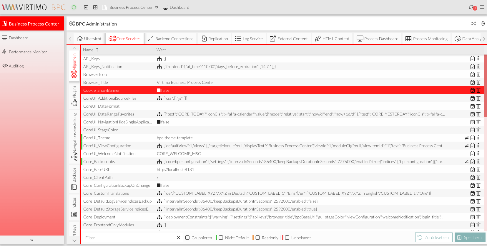
Primary and contrast colors for buttons
The background and text colors of buttons can be customized using the following variables:
$VirtimoButtonColor: red;
$VirtimoButtonContrastColor: white;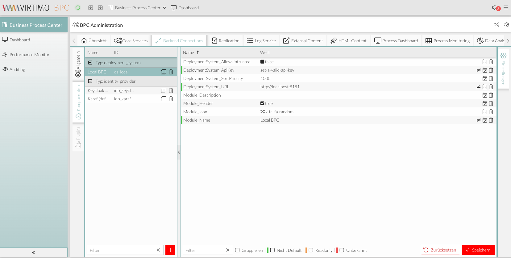
Text Color
The color of text in general and icons can be customized using the following variable:
$VirtimoTextColor: red;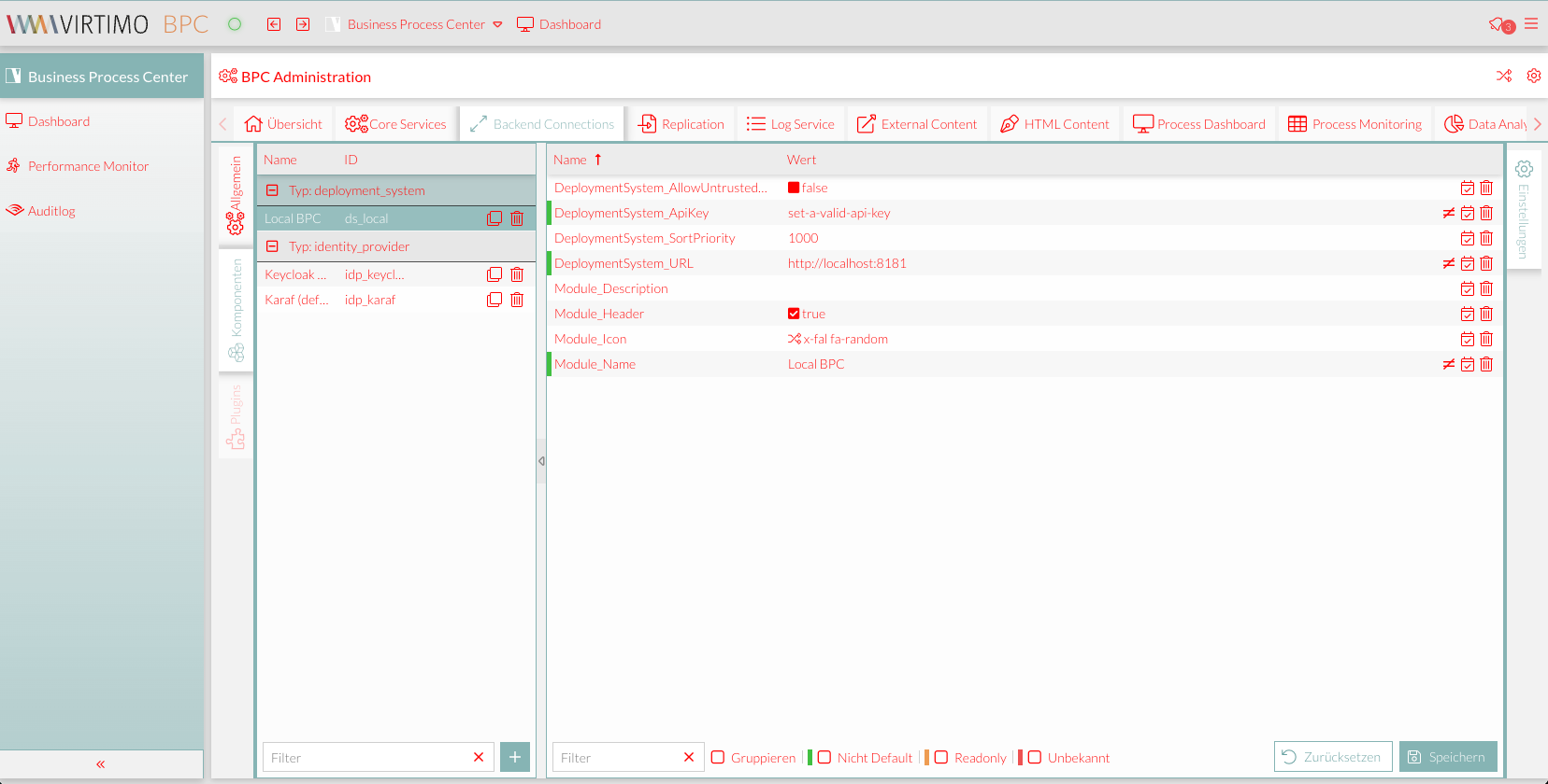
Primary and Contrast Colors for Panel Headers
Panel headers are white by default. This color can be customized using the following variables:
$VirtimoPanelColor: red;
$VirtimoPanelTextColor: white;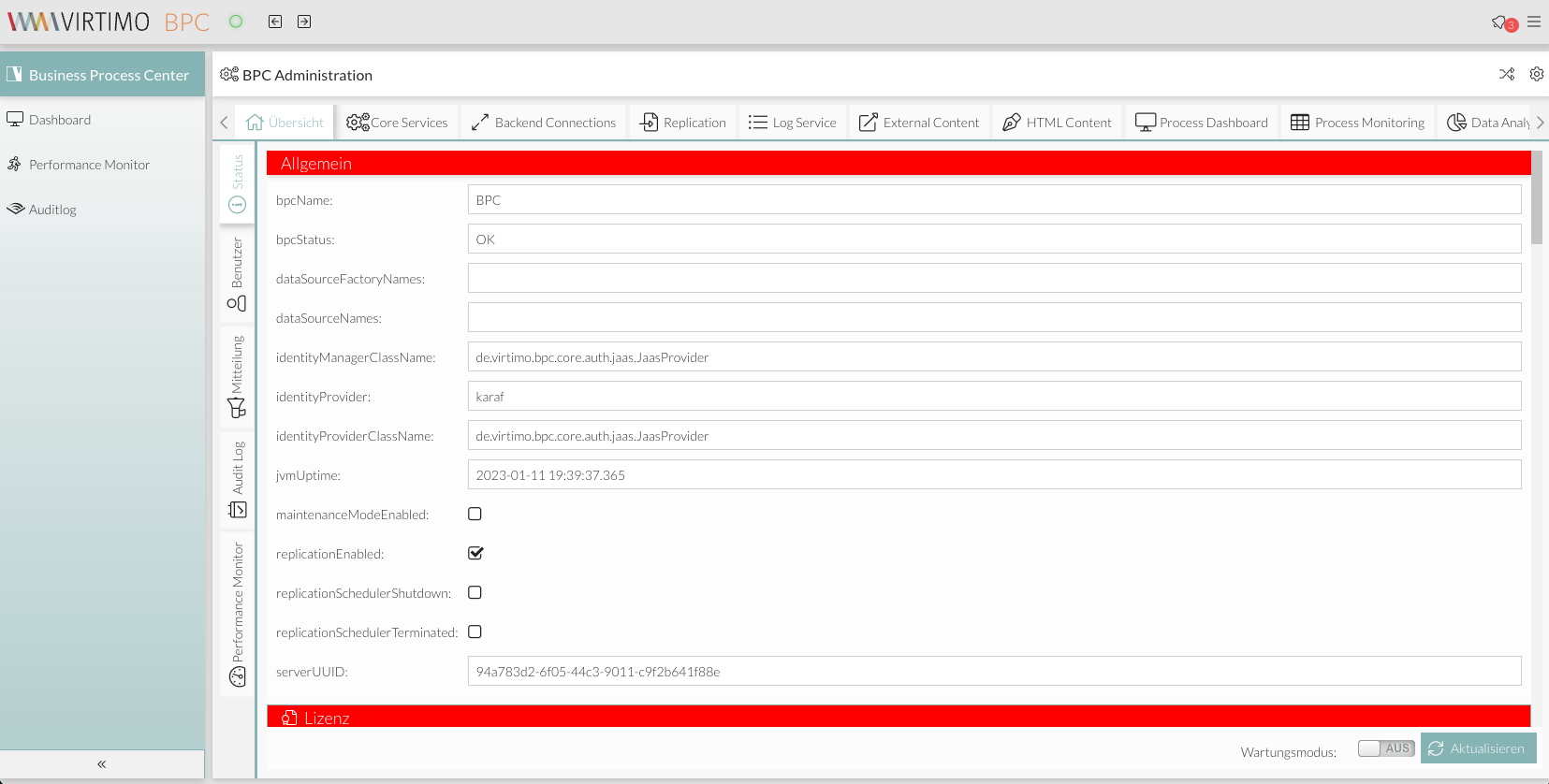
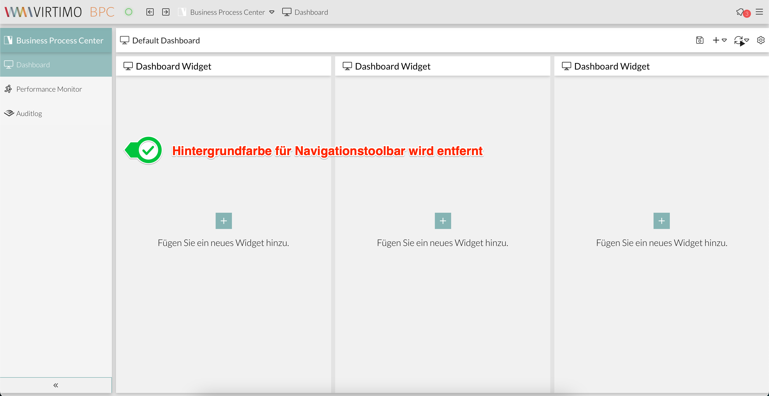
Background color of the BPC toolbar
The toolbar color can be customized using the following variable:
$VirtimoToolBarBackgroundColor: red;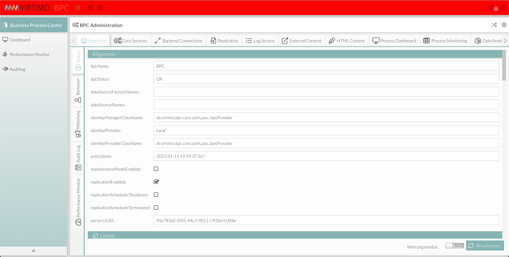
Color of the button for switching between application areas
The background and text colors of the application area switcher can be customized using the following variables:
$bpcApplicationAreaSwitchButtonBackgroundColor: red;
$bpcApplicationAreaSwitchButtonColor: white;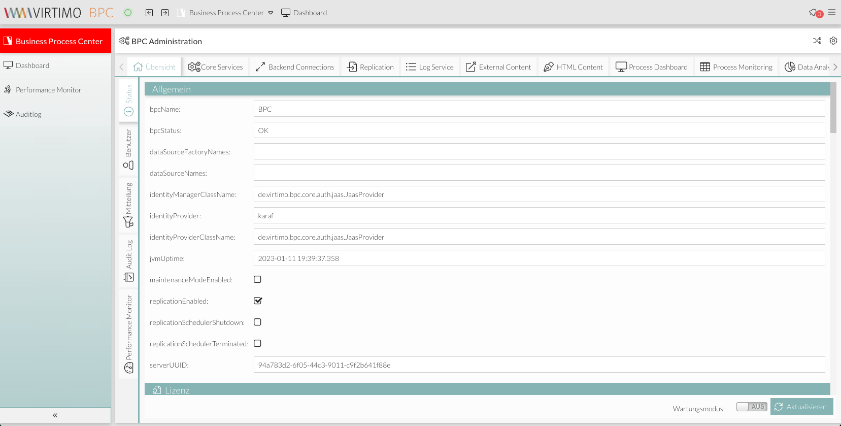
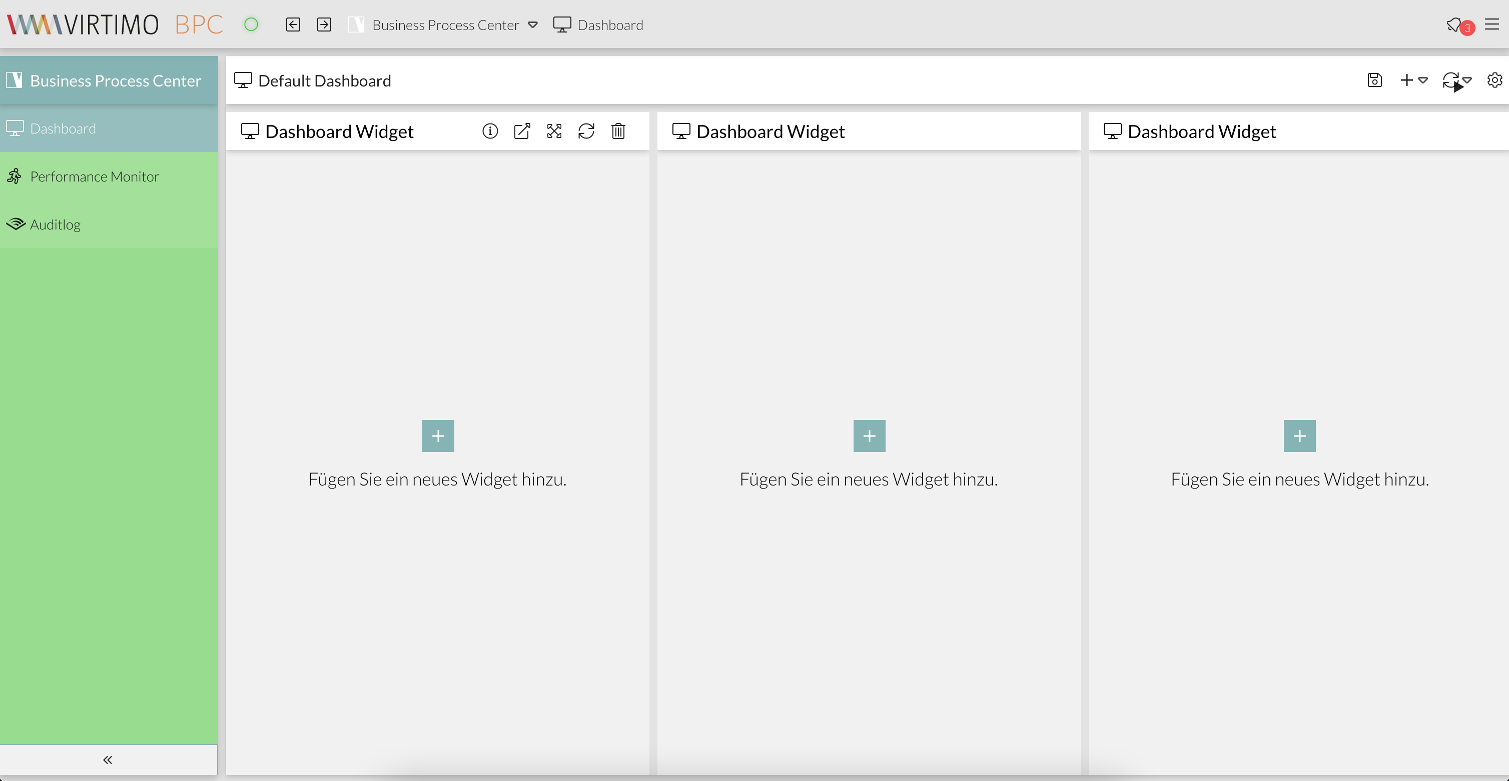
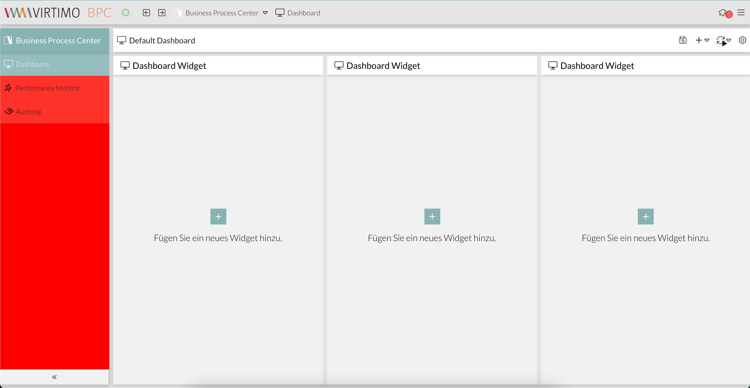
Background color and color gradient of the navigation bar
By default, the navigation bar is transparent and features a gradient of the primary color as a background effect.
ExtJS Variables
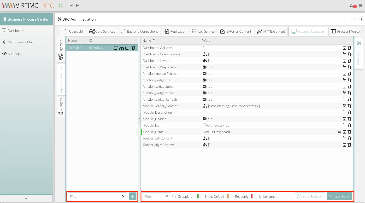
It is possible to use ExtJS SASS variables to customize the color of UI components in BPC. However, this option is only recommended for experienced experts in ExtJS development.
Examples of ExtJS SASS classes are listed below. Additional variables can be found in the official ExtJS documentation (see ExtJS - Theming Components)
Window
//************ Window
//background
$window-header-background-color : dynamic($VirtimoMainColor);
$window-body-background-color: dynamic($lighterBackgroundColor);
//text color
$window-header-color: dynamic($VirtimoMainContrastColor);
$window-header-glyph-color : dynamic($VirtimoMainContrastColor);
$window-body-color: dynamic($color);
$messagebox-info-glyph-color: dynamic($color);

//borders
$window_border_color: $VirtimoBorderColor;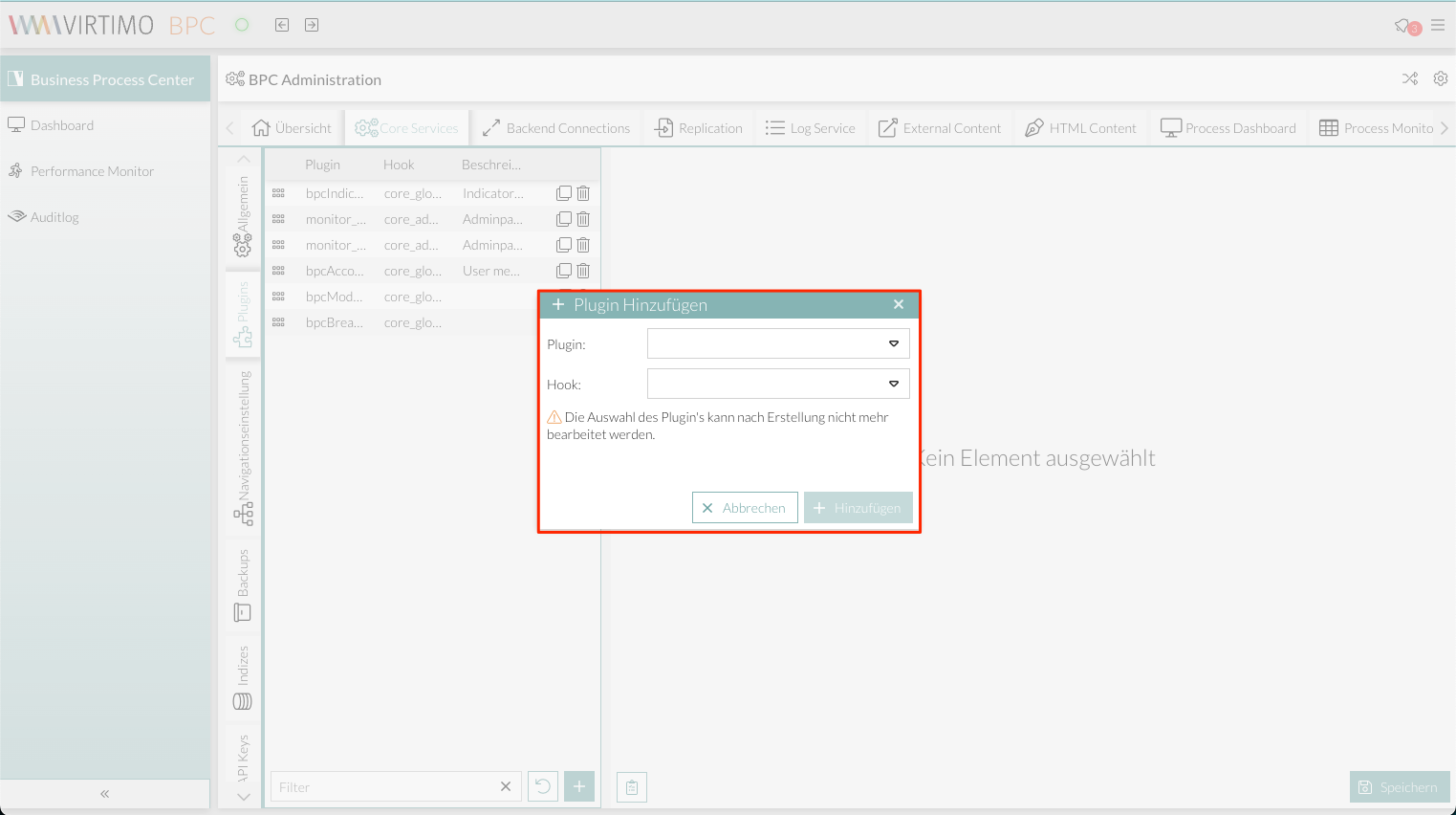
Grid
//background
$grid-header-background-color: dynamic(darken($mainViewBackgroundColor,10%));
$grid-row-cell-background-color: dynamic(rgba($mainViewBackgroundColor,0.7));
$grid-row-cell-alt-background-color: dynamic(darken($mainViewBackgroundColor, 5%));
$grid-row-cell-over-background-color: dynamic($VirtimoHighLightColorHover);
$grid-row-cell-focus-background-color: dynamic(transparent);
$grid-row-cell-selected-background-color: dynamic($VirtimoHighLightColorPressed);
$grid-grouped-header-background-color:  dynamic(darken($mainViewBackgroundColor,15%));
//text color
$grid-header-trigger-glyph-color: dynamic($color);
$grid-header-sort-glyph-color: dynamic($color);
$grid-column-header-color: dynamic($color);
$grid-column-header-focus-color: dynamic($color);
$grid-row-cell-color: dynamic($color);
$grid-row-cell-over-color: dynamic($color);
$grid-row-cell-selected-color: dynamic($VirtimoMainContrastColor);
$grid-actioncolumn-icon-glyph-color: dynamic($color);
$grid-checkcolumn-glyph-color: dynamic($color);
$grid-grouped-title-color: dynamic($color);
$grid-grouped-title-glyph-color: dynamic($color);
//borders
$grid-row-cell-border-color: dynamic(transparent);
$grid-row-cell-over-border-color: dynamic(transparent);
$grid-row-cell-selected-border-color: dynamic(transparent);
$grid-row-cell-focus-border-color: dynamic(transparent);
$grid-grouped-header-border-color:  dynamic(rgba($mainBorderColor,0.7));

//************Grid Editor
//background
$grid-row-editor-background-color: $darkerBackgroundColor;

//************ Tree
$tree-glyph-color: dynamic($VirtimoMainColor);

//************ TABS
//background
$tab-base-color: dynamic(lighten($darkerBackgroundColor, 10%));
$tab-base-color-active: dynamic($VirtimoMainColor);
$tab-base-color-over: dynamic($VirtimoHighLightColorHover);
$tab-base-color-focus-active: dynamic($VirtimoMainColor);
$tab-base-color-focus-over: dynamic(lighten($VirtimoMainColor,10%));
$tab-outline-offset-focus: dynamic($VirtimoMainColor);
$tabbar-base-color: dynamic($darkerBackgroundColor);
//text color
$tab-color: dynamic($color);
$tab-color-over: dynamic($color);
$tab-color-focus: dynamic($color);
$tab-color-focus-over: dynamic($color);
$tab-color-active: dynamic($VirtimoMainContrastColor);
$tab-color-focus-active: dynamic($VirtimoMainContrastColor);
$tabbar-scroller-glyph-color: dynamic($color);
$box-scroller-menu-arrow-base-text-color: dynamic($color);
// close icon color for closable tabs
$tab-closable-icon-glyph-color: dynamic($tab-color);
$tab-closable-icon-glyph-color-over: dynamic($tab-color-over);
$tab-closable-icon-glyph-color-focus-over: dynamic($tab-color-over);
$tab-closable-icon-glyph-color-active: dynamic($tab-color-active);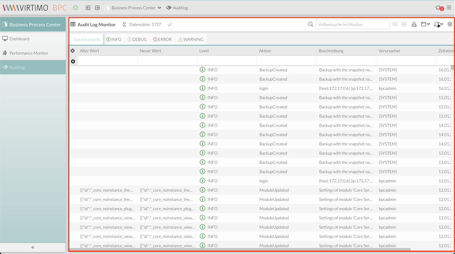
Combo box selection
//************ DropDown List
//background
$boundlist-background-color: dynamic($darkerBackgroundColor);
$boundlist-item-over-background-color: dynamic($VirtimoHighLightColorHover);
$boundlist-item-selected-background-color: dynamic($VirtimoHighLightColorPressed);
//text color
$boundlist-item-over-text-color: dynamic($color);
$boundlist-item-text-color: dynamic($color);
$boundlist-item-selected-text-color: dynamic($VirtimoMainContrastColor); //dynamic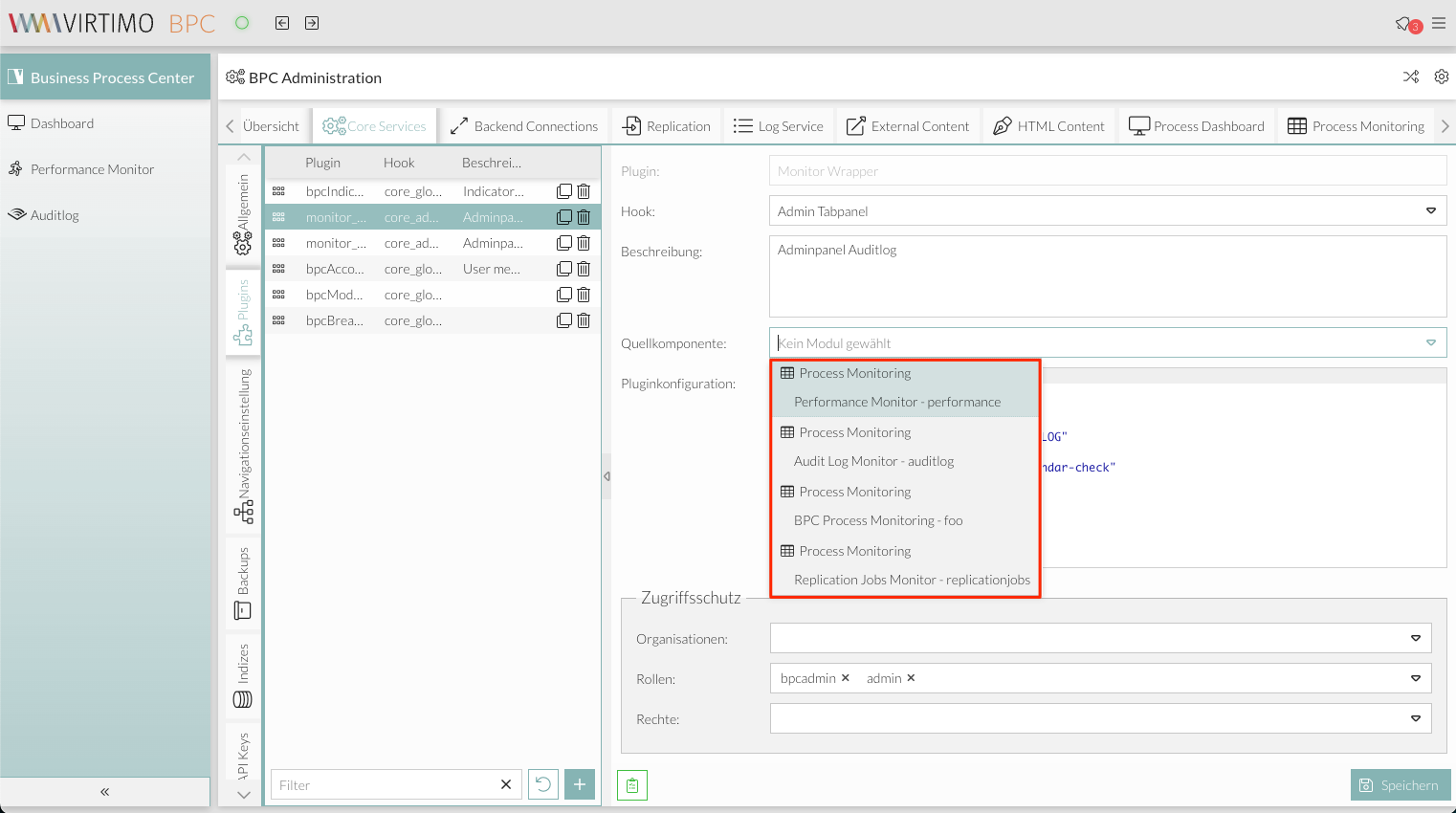
Menu
//background
$menu-background-color: dynamic($darkerBackgroundColor);
$menu-item-active-background-color: dynamic($VirtimoHighLightColorPressed);
//text color
$menu-item-color: dynamic($color);
$menu-item-checkbox-glyph-color: dynamic($color);
$menu-text-color: dynamic($color);
$menu-glyph-color: dynamic($color);
$menu-item-arrow-glyph-color: dynamic($color);
$menu-item-active-text-color: dynamic($VirtimoMainContrastColor);
//borders
$menu-separator-background-color: dynamic($mainBorderColor);
$menu-separator-border-color: dynamic($mainBorderColor);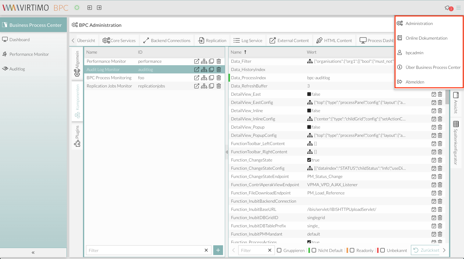
Date picker
//background
$datepicker-header-background-color: dynamic(darken($mainViewBackgroundColor,5%));
$datepicker-background-color: dynamic($darkerBackgroundColor);
$datepicker-item-selected-background-color: $VirtimoHighLightColorPressed;
$datepicker-item-hover-background-color : dynamic($VirtimoHighLightColorHover);
$datepicker-month-button-over-background-color : dynamic($VirtimoHighLightColorHover);
$datepicker-monthpicker-item-selected-background-color : dynamic($VirtimoHighLightColorPressed);
//text color
$datepicker-arrow-glyph-color: dynamic($color);
$datepicker-month-button-arrow-glyph-color: dynamic($color);
$datepicker-item-selected-color: dynamic($VirtimoMainContrastColor);
$datepicker-monthpicker-item-selected-color :$VirtimoMainContrastColor;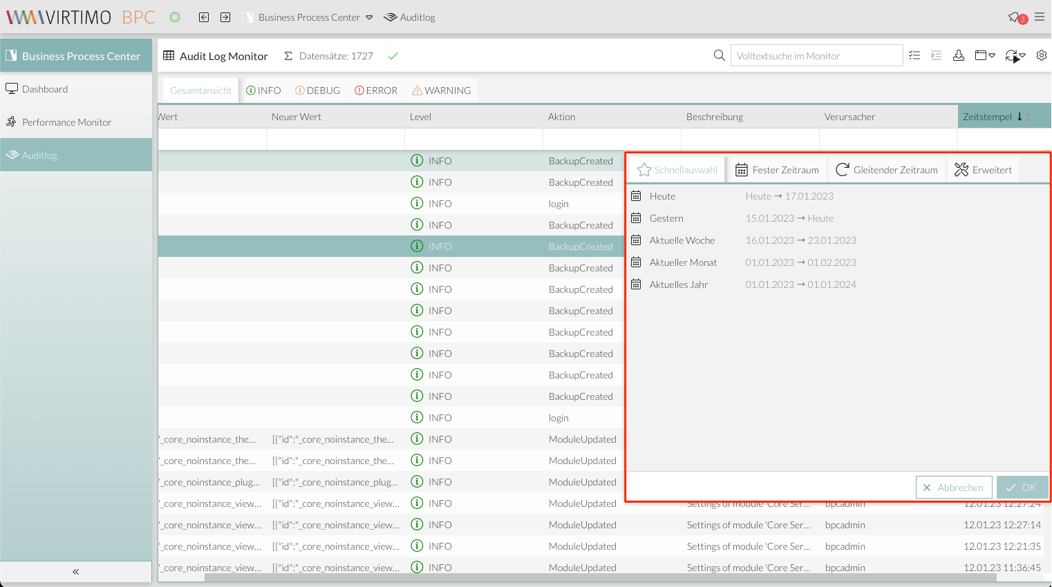
Form field
//************  Formfields
// formfields
$formfieldColor: dynamic($lighterBackgroundColor);
//backgrounds
$form-field-background-color: dynamic($formfieldColor);
$form-field-invalid-background-color: dynamic($formfieldColor);
$tag-field-item-background-color: dynamic($formfieldColor);
$fieldset-background-color: dynamic(rgba( darken($formfieldColor, 15%), 0.8));
//Text and glyph color
$form-field-color: dynamic($color);
$form-field-empty-color: dynamic($color);
$form-text-field-color: dynamic($color);
$form-label-font-color: dynamic($color);
$form-file-field-color:dynamic($color);
$form-trigger-glyph-color: dynamic($color);
$form-checkbox-glyph-color: dynamic($color);;
$form-toolbar-label-font-color: dynamic($color);
$tag-field-item-color: dynamic($color);
$tag-field-item-close-icon-glyph-color:dynamic($color);
$fieldset-header-color: dynamic($color);
//borders
$fieldset-border-color: dynamic($mainBorderColor);
$form-field-border-color: dynamic($mainBorderColor);