BPC Theme entwickeln
From Version BPC3 the theming process in BPC-Theme is made easier.
There are two different approaches : Basic (for Consultants) und Advanced (for Developer).
Template Theme
Theme Template could be used as example theme or starting point to create new themes.
Create the theme repository
Fork the Template
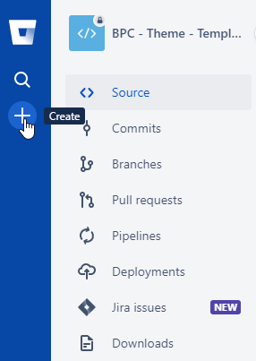
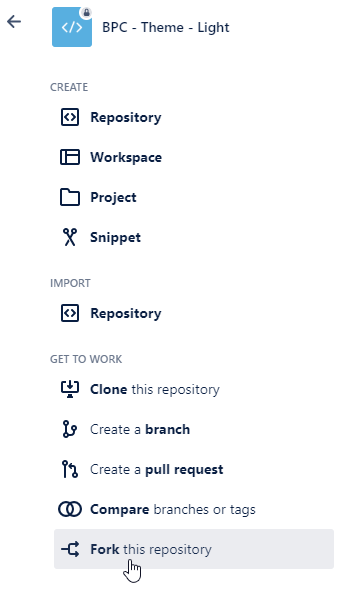
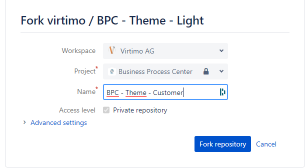
To create a customer theme, you have to fork this repo in Bitbucket:
The naming should follow the bpc-theme-[customer] convention.
Important: make sure you fork in the workspace Virtimo AG
Clone the repository
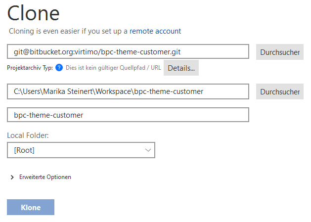
Clone the repository to your local file system and open it in the programm of your choice.
Here is an example for Sourcetree.
Rename to fit your needs
Here is an example for the Virtimo Dark Theme:
-
Rename the folder in
packages/local/bpc-theme-template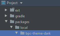
-
Go into the
packages/local/bpc-theme-[name]package.json file and edit the "name" property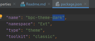
-
At
packages/local/bpc-theme-[name]edit the build.xml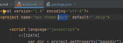
-
Go to the
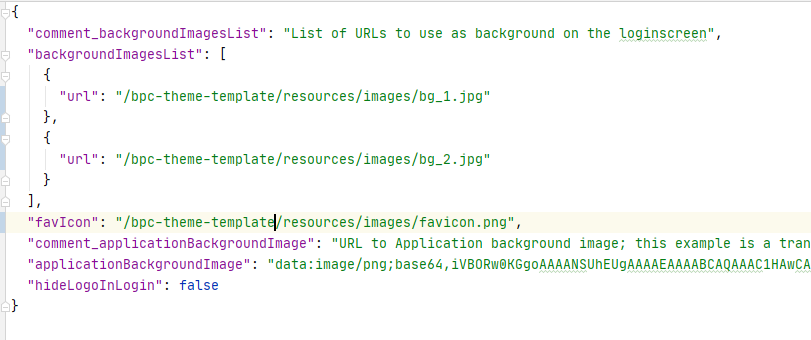
packages/local/resourcesfolder, find loginBackgrounds.json…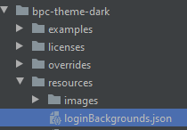
-
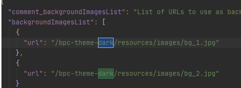
..and edit the path for background images for login
-
From Version 3.1 : Go to the
packages/local/resourcesfolder, find themeConfig.json -
…and edit the path for favicon image

-
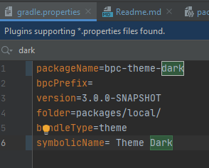
Open the gradle.properties file and edit the packageName and symbolicName properties
|
See also Theme Configuration with JSON Files |
Prepare dev environment
-
Make sure you linked extJs 7.x as ext in your project (for windows use mklink as admin, for linux use ln -s)
-
Add your sencha cmd the bpc repository (needed for extend: bpc3) : sencha repo add virtimo https://connect.virtimo.net/sencha-repo
-
Build the theme to test everything works fine: "gradlew --stacktrace"
Basic Theming - for quick results
In the theme folder under …\packages\local\bpc-theme-[customer]\sass\var` you will find the companyConfig.scss. This is you main config file for the process.
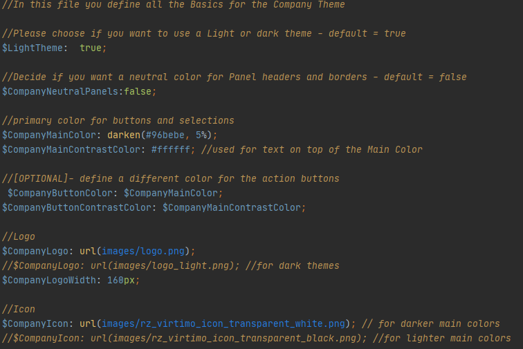
There are options for a LightTheme or DarkTheme ($LightTheme).
There is an option to decide if panels should be colorful ($CompanyNeutralPanels).
Two options for color settings: main color ($CompanyMainColor) and its contrast color ($CompanyMainContrastColor).
[OPTIONAL] Two options for color settings: main color ($CompanyButtonColor) and its contrast color ($CompanyButtonContrastColor).
And the logo ($CompanyLogo) and icon ($CompanyIcon) path.
This might be enough for most of theming cases.
Light and dark mode
If you want to maintaintain a light mode, just set the $LightTheme variable to true:
$LightTheme: true;
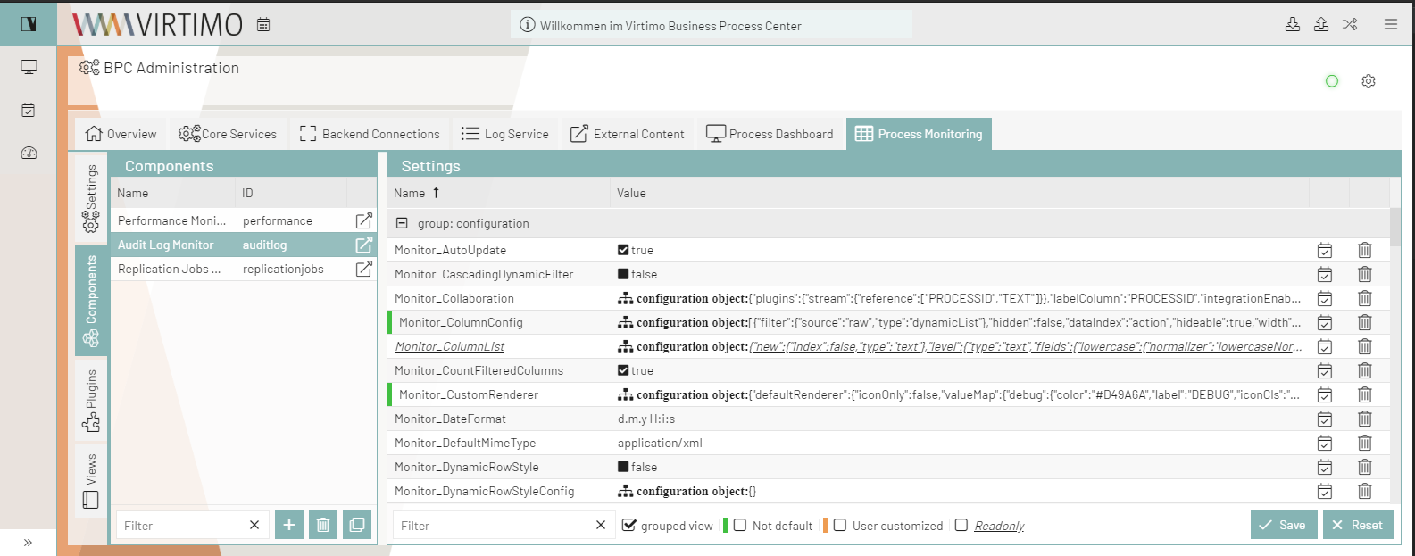
If you want to enable dark mode, just set the $LightTheme variable to false :
$LightTheme: false;
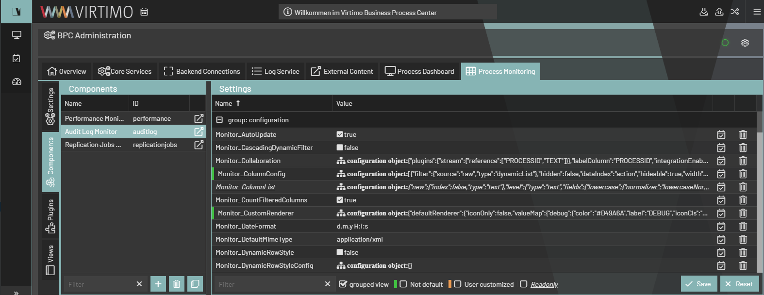
All the background colors, borders and so on will react to this change an switch to a Background color white (#FFFFFF) for LightTheme and to a dark gray (#333333) for DarkTheme.
All text colors, icons and glyphs will get a fitting contrast color, so that the contrast is high enough (Default for LightTheme: rgba(0,0,0,.87), DarkTheme rgba(255,255,255,.87)).
Colorful or neutral panels
Decide if you want a neutral color for Panel headers and borders - default = false $CompanyNeutralPanels:false;
If you let the Variable be default, panel headers and borders all across the client will take the Main Color as background and border color.
If you change $CompanyNeutralPanels to true:
The panel headers background and borders will turn into a settle gray, always taking in account the Theme you are using. The text color adjusts automatically.


This is usefull for customers with extra bright colors.
Highlighting/ Main color

To set a Maincolor you need to edit the $CompanyMainColor in the companyConfig.scss file. This has to be a Hex color code.
You also need to define a $CompanyMainContrastColor, for text on top of the defined color. This color should have a good contrast to the chosen color (#ffffff or #111111 works best)
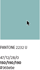
In this example the color used is $CompanyMainColor: darken(#96bebe, 5%);. Its one of virtimos company colors, darkend by 5% with a sass function.
The main color is used as a highlighting color for most of the colored items in the client. Its also used for hover colors and several icons and buttons etc..

If you want to set a main color for a customer theme, just insert the hex color code like this: $CompanyMainColor: #96bebe;
Manipulate colors
You can adapt the color by lighten oder darken the initial customer color with these functions:
lighten([color], [percentage]); or darken([color], [percentage]);
Expample:
$CompanyMainColor: lighten(#96bebe, 10%);
$CompanyMainColor: darken(#96bebe, 10%);
You can find more information about color manipulation here: https://sass-lang.com/documentation/modules/color
[OPTIONAL] Button Color

The button colors inherit the color from $CompanyMainColor and $CopanyMainContrastColor.
If you want to change the default color of buttons in the client. You can do this by changing $CompanyButtonColor and $CompanyButtonContrastColor from variabels to hex color codes.
Please make sure the text color has enough contrast.

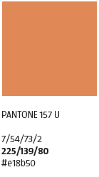
Here i used the Virtimo orange.
The Client now looks like this:
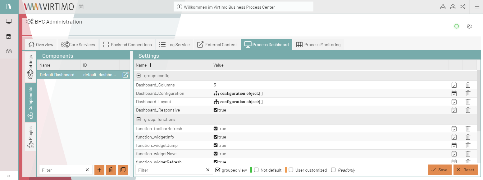

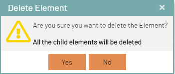
The buttons on the bottom every dialog and on hover the buttons in the AppToolBar, are now orange.
Logo & Icon & Background
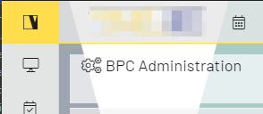
Company Logo
The height of the Logo is always 32px. The width is variable.
Here is an Expample:
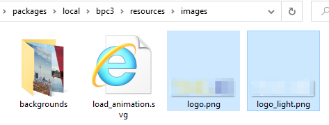
In the theme folder under …\packages\local\bpc-theme-<customer>\resources\images you will find the logo.png and logo_light.png, bg_1.jpg and bg_2.jpg.
You just need to replace those files with the logo and background of your customer.
If the name of the logo is different, you need to adjust the url path in the companyConfig.scss you might want to adjust the width.

In case your are using differnet names or number of backgrounds you need to adapt the loginBackgrounds.json (…\packages\local\bpc-theme-<customer>\resources):
Advanced Theming - for a deeper technical understanding
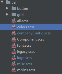
In the theme folder under …\packages\local\bpc3\sass\var you will find the important files to change the appearence of the client.
How the styles are build
The all.scss file imports all necessary files into onle sass styling sheet.
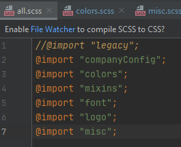
The order is very important. Because most Variables and styles defined in thoses files inherit information from each other.
-
So first we set the company variables in companyConfig.scss → these give information to define all colors
-
The colors.scss → from here all other style will get color information.
-
The mixins.scss file holds usefull mixin functions.
-
In the font.scss file we set font size and font face.
-
The logo.scss sets the styles for logo and icon.
-
The misc.scss overrides some Sencha styles and also styles custom components or custom behavior in te client. This file does not set variables, but syles for classes, using the defines variables.

Change colors - advancedConfig.scss
Necessary Settings
In the top of this file you will find the important variables, that take in the $Company[..] variables from the companyConfig.scss and also the switch for light an dark theming.

| Variable Name | Description | Defined in companyConfig.scss | Usage |
|---|---|---|---|
$VirtimoMainColor |
Its the highlight color. Everything that is colored uses this variable : active tabs, active table rows, buttons (if not defined otherwise), some icons, highlighting in menus and on tables etc… |
$CompanyMainColor |
|
$VirtimoMainContrastColor |
The textcolor for all elements on top of this color. This should be black or white, depending on the main background color. It is different from the $VirtimoTextcolor. |
$CompanyMainContrastColor |
See above |
$VirtimoBackgroundColor |
This is the universal background color all above the client. It is generated via if conditon . If $LightTheme → use #FFF, if NOT $LightTheme → #333. You can also set hex code. But then the themes would not work. |
$LightTheme |
|
$VirtimoTextColor |
The universal text color in the whole client. It is generated via if conditon . If $LightTheme → use black, if NOT $LightTheme → use black. You can also set hex code. But then the themes would not work. |
$LightTheme |
|
$VirtimoButtonColor |
This is the button background color for the main buttons in dialogs. |
$CompanyButtonColor |
|
$VirtimoButtonContrastColor |
The text color on every button. This should be black or white, depending on the button background color. |
$CompanyButtonContrastColor |
see above |
Optional Settings
In a second paragraph you will find a range of optional variables for more customization efforts.

Everything below just takes these Variables and generates the rest of the styling. Thee is no need to alter other variables.
| Variable Name | Description | Defined in or by other variable | Usage |
|---|---|---|---|
$VirtimoToolbarBackgroundColor |
This variable takes the background color and alters it to highlight the toolbar and navigation so it will work in both theme modes. |
$VirtimoBackgroundColor |
|
$bpcApplicationAreaSwitchButtonBackgroundColor |
The variable is the background color for the app icon. This color inherits from the $VirtimoMainColor. |
$VirtimoMainColor |
|
$bpcApplicationAreaSwitchButtonColor |
Textcolor for app icon button |
$VirtimoMainContrastColor |
See above |
$VirtimoBorderColor |
This variable defines the colorful borders arround dialogs, the app toolbar and arround panels. This color inherits from the $VirtimoMainColor. |
$VirtimoMainColor |
|
$VirtimoHighlightColor |
The variable defines the color for hover higlighting, selection colors etc. |
$VirtimoMainColor |
|
Custom Theming for all Components - advancedConfig.scss
If your Customer needs mor customization, ysou can overwrite all defined colors with the wishes of customers.
You just need to look up the Variables in the bpc3 colors.scss for the desired Component and overwrite it in the advancedConfig.scss.
If the original color was declared wrapped in a dynamic(); function, you should keep that, or else the new color definition will NOT work.
Here is an Example for the Module Navigation buttons.
The Original Code in bpc3 looks like this:
// Module Navigation Button in Toolbar
$toolbar-bpcNavBtn-background: dynamic(transparent);
$toolbar-bpcNavBtn-background-over: dynamic($VirtimoToolBarBackgroundColor);
$toolbar-bpcNavBtn-icon: dynamic($color);
$toolbar-bpcNavBtn-icon-over: dynamic($color);
Result
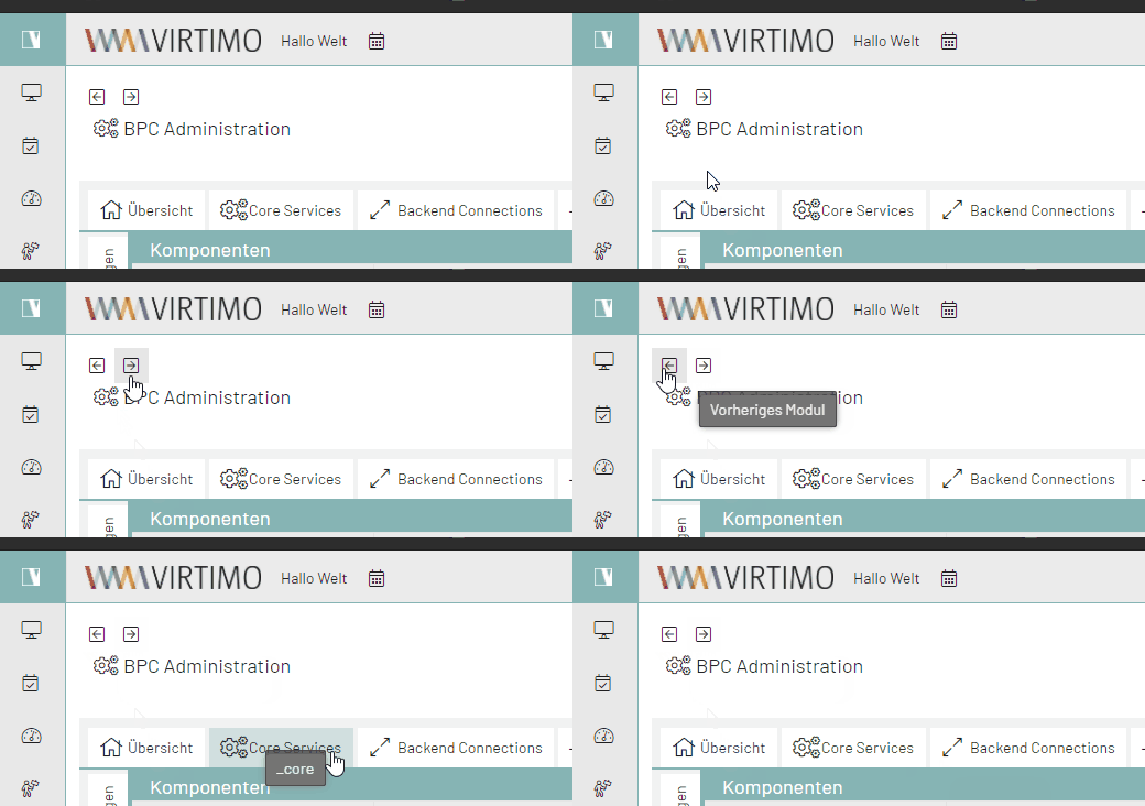
Just copy the Variables to your Theme and replace the Colors with your choice (This can also be Hexadicimal Codes):
// Module Navigation Button in Toolbar
$toolbar-bpcNavBtn-background: dynamic($VirtimoHighLightColorHover);
$toolbar-bpcNavBtn-background-over: dynamic($VirtimoMainColor);
$toolbar-bpcNavBtn-icon: dynamic($color);
$toolbar-bpcNavBtn-icon-over: dynamic($VirtimoMainContrastColor);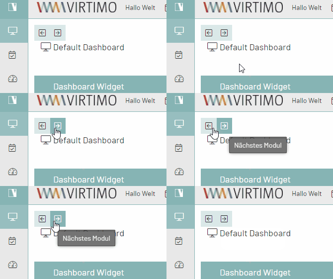
Here is a List of all colors in the colors.scss, you can overwrite*
//Apptoolbar (oben)
//background
$appToolbarBackgroundColor: dynamic(rgba($VirtimoToolBarBackgroundColor,0.8));
$appToolbarBackgroundColorOver: $appToolbarBackgroundColor;
//text color
$appToolbarColor: $color;
$toolbar-scroller-glyph-color: dynamic($color);
$appToolbarColorOver: $VirtimoButtonColor; //colorful
//borders
$appToolbarBorderColor: dynamic($bpcApplicationAreaSwitchButtonBackgroundColor);

//Remove implicit spaces
$toolbar-vertical-spacing: 0;
$toolbar-horizontal-spacing: 0;
$toolbar-separator-horizontal-margin: 0px;

// Unterer Panelbereich Hintergrundfarbe (button toolbar)
$toolbar-footer-background-color: $mainViewBackgroundColor;
$toolbar-background-color:$mainViewBackgroundColor;

// Module Navigation Button in Toolbar- BPC-5088
$toolbar-bpcNavBtn-background: dynamic($VirtimoHighLightColorHover);
$toolbar-bpcNavBtn-background-over: dynamic($VirtimoMainColor);
$toolbar-bpcNavBtn-icon: dynamic($color);
$toolbar-bpcNavBtn-icon-over: dynamic($VirtimoMainContrastColor);

// Navigation (links)
//background
$navToolbarBackgroundColor: dynamic(rgba($VirtimoToolBarBackgroundColor,0.8));
$navToolbarBackgroundColorOver: $VirtimoHighLightColorHover;
$navToolbarBackgroundColorActive: $VirtimoHighLightColorPressed;
$navToolbarBackgroundColorFocus: $VirtimoHighLightColorPressed;
$navToolbarBackgroundColorPressed: $VirtimoHighLightColorPressed;
//text color
$navToolbarColor: $color;
$navToolbarColorOver: $color;
$navToolbarColorPressed: $VirtimoMainContrastColor;
$navToolbarColorActive: $VirtimoMainContrastColor;
$navToolbarColorFocus: $VirtimoMainContrastColor;
//borders
$navToolbarBorderColor: dynamic($bpcApplicationAreaSwitchButtonBackgroundColor);

//************ Window
//background
$window-header-background-color : dynamic($VirtimoMainColor);
$window-body-background-color: dynamic($lighterBackgroundColor);
//text color
$window-header-color: dynamic($VirtimoMainContrastColor);
$window-header-glyph-color : dynamic($VirtimoMainContrastColor);
$window-body-color: dynamic($color);
$messagebox-info-glyph-color: dynamic($color);

//borders
$window_border_color: $VirtimoBorderColor;

//************ GRID
//background
$grid-header-background-color: dynamic(darken($mainViewBackgroundColor,10%));
$grid-row-cell-background-color: dynamic(rgba($mainViewBackgroundColor,0.7));
$grid-row-cell-alt-background-color: dynamic(darken($mainViewBackgroundColor, 5%));
$grid-row-cell-over-background-color: dynamic($VirtimoHighLightColorHover);
$grid-row-cell-focus-background-color: dynamic(transparent);
$grid-row-cell-selected-background-color: dynamic($VirtimoHighLightColorPressed);
$grid-grouped-header-background-color:  dynamic(darken($mainViewBackgroundColor,15%));
//text color
$grid-header-trigger-glyph-color: dynamic($color);
$grid-header-sort-glyph-color: dynamic($color);
$grid-column-header-color: dynamic($color);
$grid-column-header-focus-color: dynamic($color);
$grid-row-cell-color: dynamic($color);
$grid-row-cell-over-color: dynamic($color);
$grid-row-cell-selected-color: dynamic($VirtimoMainContrastColor);
$grid-actioncolumn-icon-glyph-color: dynamic($color);
$grid-checkcolumn-glyph-color: dynamic($color);
$grid-grouped-title-color: dynamic($color);
$grid-grouped-title-glyph-color: dynamic($color);
//borders
$grid-row-cell-border-color: dynamic(transparent);
$grid-row-cell-over-border-color: dynamic(transparent);
$grid-row-cell-selected-border-color: dynamic(transparent);
$grid-row-cell-focus-border-color: dynamic(transparent);
$grid-grouped-header-border-color:  dynamic(rgba($mainBorderColor,0.7));

//************Grid Editor
//background
$grid-row-editor-background-color: $darkerBackgroundColor;

//************ Tree
$tree-glyph-color: dynamic($VirtimoMainColor);

//************ TABS
//background
$tab-base-color: dynamic(lighten($darkerBackgroundColor, 10%));
$tab-base-color-active: dynamic($VirtimoMainColor);
$tab-base-color-over: dynamic($VirtimoHighLightColorHover);
$tab-base-color-focus-active: dynamic($VirtimoMainColor);
$tab-base-color-focus-over: dynamic(lighten($VirtimoMainColor,10%));
$tab-outline-offset-focus: dynamic($VirtimoMainColor);
$tabbar-base-color: dynamic($darkerBackgroundColor);
//text color
$tab-color: dynamic($color);
$tab-color-over: dynamic($color);
$tab-color-focus: dynamic($color);
$tab-color-focus-over: dynamic($color);
$tab-color-active: dynamic($VirtimoMainContrastColor);
$tab-color-focus-active: dynamic($VirtimoMainContrastColor);
$tabbar-scroller-glyph-color: dynamic($color);
$box-scroller-menu-arrow-base-text-color: dynamic($color);
// close icon color for closable tabs
$tab-closable-icon-glyph-color: dynamic($tab-color);
$tab-closable-icon-glyph-color-over: dynamic($tab-color-over);
$tab-closable-icon-glyph-color-focus-over: dynamic($tab-color-over);
$tab-closable-icon-glyph-color-active: dynamic($tab-color-active);

//************ DropDown List
//background
$boundlist-background-color: dynamic($darkerBackgroundColor);
$boundlist-item-over-background-color: dynamic($VirtimoHighLightColorHover);
$boundlist-item-selected-background-color:  dynamic($VirtimoHighLightColorPressed);
//text color
$boundlist-item-over-text-color: dynamic($color);
$boundlist-item-text-color: dynamic($color);
$boundlist-item-selected-text-color: dynamic($VirtimoMainContrastColor); //dynamic($VirtimoHighLightColorPressed);

//************ MENU
//background
$menu-background-color: dynamic($darkerBackgroundColor);
$menu-item-active-background-color: dynamic($VirtimoHighLightColorPressed);
//text color
$menu-item-color: dynamic($color);
$menu-item-checkbox-glyph-color: dynamic($color);
$menu-text-color: dynamic($color);
$menu-glyph-color: dynamic($color);
$menu-item-arrow-glyph-color: dynamic($color);
$menu-item-active-text-color: dynamic($VirtimoMainContrastColor);
//borders
$menu-separator-background-color: dynamic($mainBorderColor);
$menu-separator-border-color: dynamic($mainBorderColor);

//************ datePicker
//background
$datepicker-header-background-color: dynamic(darken($mainViewBackgroundColor,5%));
$datepicker-background-color: dynamic($darkerBackgroundColor);
$datepicker-item-selected-background-color: $VirtimoHighLightColorPressed;
$datepicker-item-hover-background-color : dynamic($VirtimoHighLightColorHover);
$datepicker-month-button-over-background-color : dynamic($VirtimoHighLightColorHover);
$datepicker-monthpicker-item-selected-background-color : dynamic($VirtimoHighLightColorPressed);
//text color
$datepicker-arrow-glyph-color: dynamic($color);
$datepicker-month-button-arrow-glyph-color: dynamic($color);
$datepicker-item-selected-color: dynamic($VirtimoMainContrastColor);
$datepicker-monthpicker-item-selected-color :$VirtimoMainContrastColor;

//********Accordion colors
//background
$accordion-background-color : dynamic($mainViewBackgroundColor);
$accordion-header-background-color : dynamic($VirtimoMainColor);
$accordion-header-over-background-color : dynamic($VirtimoMainColor);
//text color
$accordion-tool-glyph-color : dynamic($VirtimoMainContrastColor);
$accordion-header-color: dynamic($VirtimoMainContrastColor);

//************  Formfields
// formfields
$formfieldColor: dynamic($lighterBackgroundColor);
//backgrounds
$form-field-background-color: dynamic($formfieldColor);
$form-field-invalid-background-color: dynamic($formfieldColor);
$tag-field-item-background-color: dynamic($formfieldColor);
$fieldset-background-color: dynamic(rgba( darken($formfieldColor, 15%), 0.8));
//Text and glyph color
$form-field-color: dynamic($color);
$form-field-empty-color: dynamic($color);
$form-text-field-color: dynamic($color);
$form-label-font-color: dynamic($color);
$form-file-field-color:dynamic($color);
$form-trigger-glyph-color: dynamic($color);
$form-checkbox-glyph-color: dynamic($color);;
$form-toolbar-label-font-color: dynamic($color);
$tag-field-item-color: dynamic($color);
$tag-field-item-close-icon-glyph-color:dynamic($color);
$fieldset-header-color: dynamic($color);
//borders
$fieldset-border-color: dynamic($mainBorderColor);
$form-field-border-color: dynamic($mainBorderColor);
Other Generated Settings
The Variables defined above will set all the default Theme variables for the Sencha Theme to use. There are also custom Variables that get their value from the Variables in the first two sections.
Here you can see, that the main background colors, text color and border color is defined.
These Variables are used all over the client and multiple components.
As a rule of thumb you can assume, that all Variables with the name $Virtimo[…] use the $VirtimoMainColor, $VirtimoButtonColor or are contrast colors for this colors.
This makes it easy to spot styles with those colors involved.
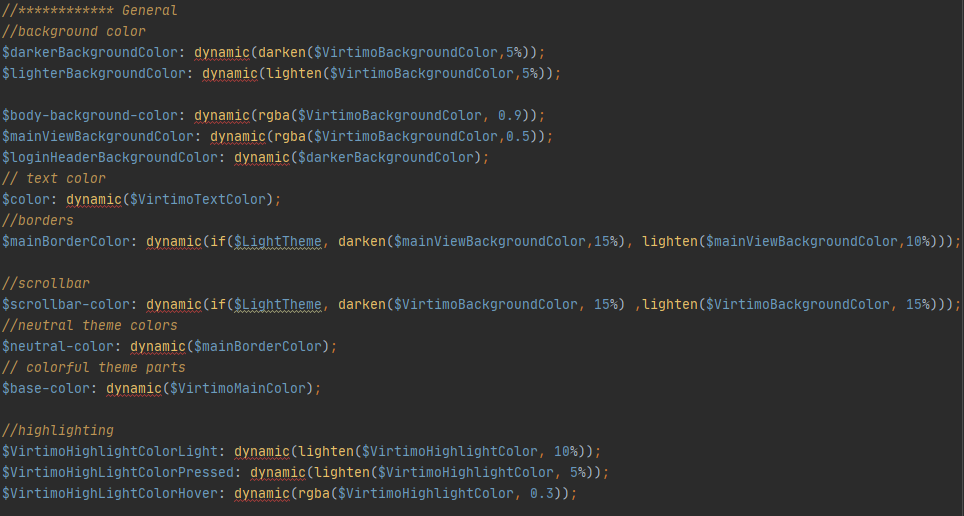
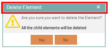
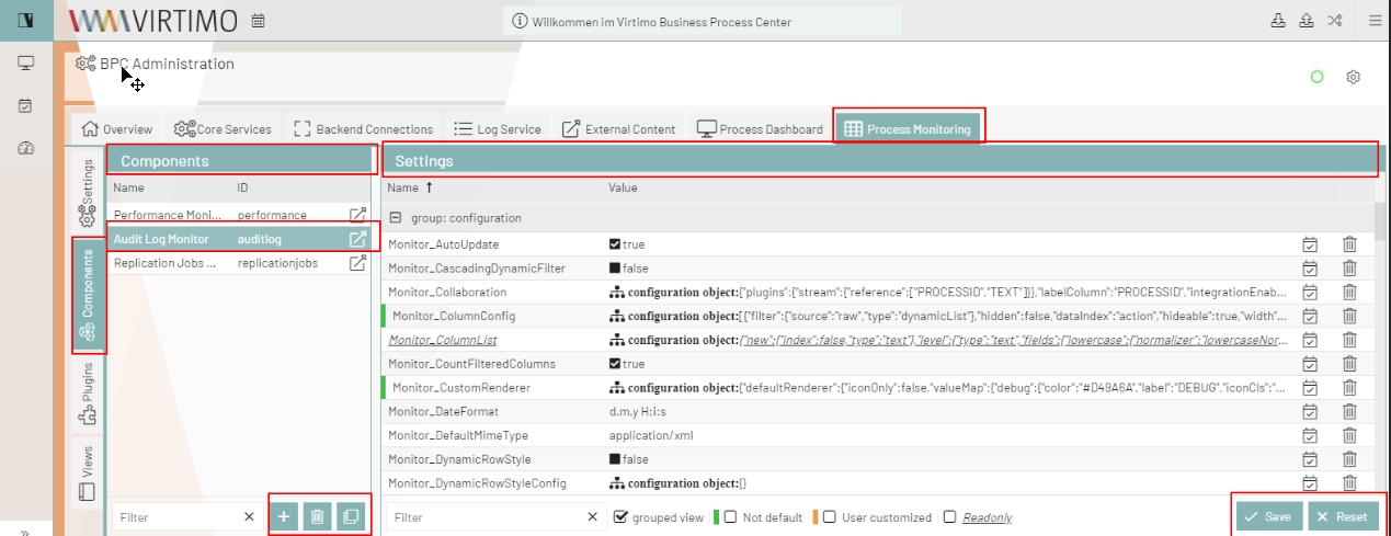
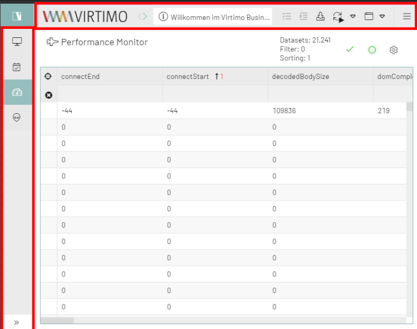
Here is an example:
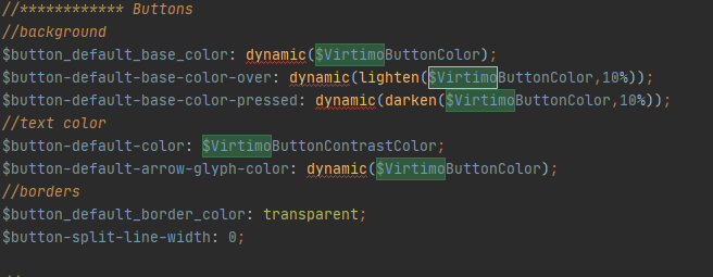
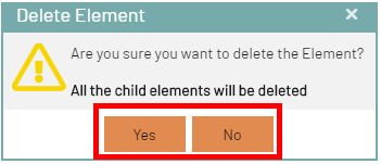
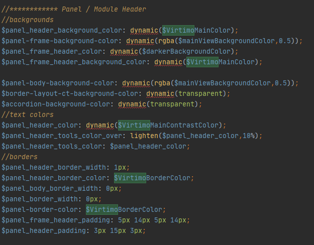
Here is another example The panel Component:
